Sep 28, 2025·8 min
How to Build a Mobile App for Learning Session Summaries
A step-by-step guide to designing, building, and launching a mobile app that captures learning sessions and turns them into clear summaries, notes, and reviews.
A step-by-step guide to designing, building, and launching a mobile app that captures learning sessions and turns them into clear summaries, notes, and reviews.
Before you plan screens or pick an AI model, get specific about who the app serves and what “success” looks like. A study summary app that works for a college student may fail for a sales team or a language tutor.
Pick a primary user first, then list secondary users.
Write a one-sentence promise for your primary user, such as: “Turn any learning session into a clean summary and a 5-question quiz in under two minutes.”
Define the session types your first version will support:
Each session type produces different outputs. A meeting needs action items; a lecture needs key concepts and definitions.
Focus on 3–4 outputs that feel immediately useful:
Choose measurable signals tied to the app’s value:
If you want a simple structure for these decisions, create a one-page “User + Session + Output” doc and keep it linked from your project notes (e.g., /blog/mvp-mobile-app-planning).
Feature lists grow fast on learning apps, especially when “summaries” can mean notes, highlights, flashcards, and more. The quickest way to stay focused is to decide what your app will accept as input, what it will produce as output, and which “learning helpers” genuinely improve retention.
Pick 1–2 input types for your first version, based on how your target users already study.
A practical MVP combo: typed notes + pasted text, with audio/PDF as planned upgrades.
Offer clear output formats so users can pick what they need in seconds:
Make these consistent across every session so the app feels predictable.
If summaries don’t lead to practice, learning fades. The most useful helpers are:
Users will want their work outside your app. Support a few “escape hatches”:
Copy to clipboard, export to PDF or Markdown, send via email, and optionally attach LMS links (even simple URL fields per session).
A good study summary app feels predictable: you always know what to do next, and you can get back to your notes quickly. Start by mapping the “happy path” end-to-end, then design screens that support it without extra taps.
Keep the core flow tight:
Every screen should answer one question: “What’s the next best action?” If you need multiple actions, make one primary (large button) and the rest secondary.
Design the home screen for return visits. Three elements usually cover 90% of needs:
A simple layout works well: a “Continue” or “New session” primary button, then a scrollable list of recent items with status (Draft, Summarized, Needs review).
People won’t review immediately. Build gentle re-entry:
Keep reminders optional and easy to pause. The goal is to reduce guilt, not create it.
Examples:
If users can always move forward with one clear tap, your flow will feel natural even before you polish visuals.
Good UX for learning summaries is mostly about reducing friction at two moments: when a session starts (capture) and when a learner returns later (review). The best patterns keep the “work” invisible and make progress feel immediate.
Use a single, primary Record button centered on the screen, with a large timer that confirms the app is actually listening. Add pause/resume as a secondary action (easy to hit, but not competing with Record).
A small notes field should always be available without changing screens—think “quick jot,” not “write an essay.” Consider subtle prompts like “Key term?” or “Question to revisit?” that appear only after a minute or two, so you don’t interrupt the flow.
If the user gets interrupted, preserve state automatically: when they return, show “Resume session?” with the last timer value and any notes already typed.
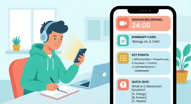
Structure the summary like a study sheet, not a paragraph. A reliable pattern is:
Make each block collapsible so users can skim fast, then expand details.
Add a dedicated “Review” tab with three quick actions: Flashcards, Quiz questions, and Bookmarks. Bookmarks should be one-tap from anywhere in the summary (“Save this definition”). Flashcards should support swipe (know/don’t know) and show progress for motivation.
Include font size controls, strong contrast, and captions if audio is present. Design screens to work offline: let users open existing summaries, review flashcards, and add bookmarks without connectivity, then sync later.
A great summary isn’t just “shorter text.” For learning session summaries, it needs to preserve what matters for recall: key concepts, definitions, decisions, and next steps—without losing the thread.
Offer a few clear formats and apply them predictably, so users learn what to expect each time:
If your study summary app supports flashcards from notes, structure helps: “definition” and “example” sections can be turned into cards more reliably than a single paragraph.
Small controls can dramatically reduce “good but wrong” summaries. Helpful knobs include:
Keep defaults simple, and let power users customize.
AI summarization can mishear names, formulas, or dates. When the model is unsure, don’t hide it—highlight low-confidence lines and suggest a fix (“Check: was it ‘mitosis’ or ‘meiosis’?”). Add lightweight editing so users can correct the summary without redoing everything.
Let users tap a key point to reveal the exact source context (timestamp, paragraph, or note chunk). This one feature boosts trust and makes review faster—turning your note-taking app into a study tool, not just a text generator.
If your study summary app supports voice notes or recorded sessions, transcription quickly becomes a core feature—not a “nice to have.” The choice you make affects privacy, accuracy, speed, and cost.
On-device transcription keeps audio on the user’s phone, which can boost trust and reduce backend complexity. It’s great for short recordings and privacy-sensitive users, but it may struggle on older devices and usually supports fewer languages or lower accuracy.
Server-based transcription uploads audio to a cloud service for processing. This often delivers better accuracy, more languages, and faster iteration (you can improve without app updates). The tradeoff: you must handle storage, consent, and security carefully, and you’ll pay per minute or per request.
A practical middle ground is: on-device by default (when available), with an optional “higher accuracy” cloud mode.
Study sessions aren’t recorded in studios. Help users get cleaner input:
On the processing side, consider lightweight noise reduction and voice activity detection (trim long silences) before transcription. Even small improvements can reduce hallucinated words and boost summary quality.
Store word- or sentence-level timestamps so users can tap a line in the transcript and jump to that moment in audio. This also supports “quote-backed” learning session summaries and faster review.
Plan for transcription costs early: long recordings can get expensive. Set clear limits (minutes per day), show remaining quota, and offer fallbacks like:
This keeps audio transcription predictable and prevents surprise bills—for you and your users.
A clear data model keeps your app reliable as you add features like search, exports, and flashcards. You don’t need to over-engineer it—just define the “things” your app stores and how they relate.
Start with these core entities:
The key idea: Session is the hub. Sources attach to sessions, transcripts attach to sources, summaries attach to sessions (and reference the inputs they were generated from), and cards reference the summary passages they came from. That traceability helps you explain results and rebuild summaries later.
Users expect to search across sessions, notes, and summaries in one box.
A practical approach:
If learners use the app in classrooms, commutes, or poor Wi‑Fi, offline-first is worth it.
For conflicts, prefer “last write wins” for small fields (title, tags), but for notes consider append-only revisions so you can merge or restore.
Audio recordings and attachments are big. Store them as files (“blobs”) separate from your main database, and save only metadata in the database (duration, format, size, checksum).
Plan for:
If your app records study sessions or stores summaries, trust is a feature—not a checkbox. People will only use a study summary app regularly if they feel in control of what’s captured, what’s stored, and who can see it.
Start with familiar sign-in options so users can keep their summaries across devices:
Explain what an account enables (sync, backup, restore) in one sentence at the moment it matters, not in a long onboarding screen.
Only ask for permissions when the user triggers the feature (e.g., tap “Record”). Pair the prompt with a plain-language reason: “We need microphone access to record your study session.”
When recording is active, make it obvious:
Also give users control over what gets summarized: allow pausing, trimming, or excluding a segment before generating a learning session summary.
Don’t force people to keep everything forever.
Offer:
Make retention settings easy to find from the session screen and in Settings.
At minimum, protect data while it moves and while it sits:
A simple privacy page at /privacy that matches your in-app behavior builds credibility quickly.
The best tech choice is the one that lets you ship a reliable first version, learn from real users, and improve quickly—without locking you into months of rework.
If you already know where your users are, start there. For example, a study tool for a university might skew iOS, while broader audiences may be more mixed.
If you don’t know yet, cross-platform can be a practical default because you can reach both iOS and Android with one codebase. The trade-off is that some device-specific features (advanced audio handling, background recording rules, or system UI polish) can take extra effort.
For a learning session summaries app (capture → summarize → review), all three can work. Choose based on your team’s experience and how soon you need both platforms.
If you want the simplest path, managed services (authentication, database, file storage) reduce setup and maintenance. They’re a strong fit when you need accounts, syncing notes across devices, and storing recordings.
A custom API makes sense if you have unusual requirements (complex permissions, custom billing rules, or you want to control every detail of data storage). It can also make it easier to switch providers later.
If you want to move even faster, you can also prototype the product end-to-end on a vibe-coding platform like Koder.ai—use chat to generate a React web app and a Go + PostgreSQL backend, iterate on the capture → summarize → review flow, and export source code when you’re ready to own the full stack. This can be especially useful for validating UX and onboarding before investing in a fully native mobile build.
Even for an MVP, add basic tracking so you know what’s working:
Keep it privacy-friendly: track events about actions, not the actual content of notes or recordings. If you publish later, link to clear policies from /privacy and /terms.
An MVP isn’t a “tiny version” of your dream app—it’s the smallest product that proves people will use it repeatedly. For a study summary app, that means nailing the loop: capture → summarize → find later → review.
Start with four core capabilities:
If you can do those well, you already have something people can rely on.
Scope control is what makes a shippable MVP. Explicitly postpone:
Write these into a “Not in MVP” list so you don’t re-debate them mid-build.
Keep milestones outcome-based:
Week 1: Prototype and flow
Lock the screens and the end-to-end journey (even with fake data). Aim for “tap through in 60 seconds.”
Week 2: Working capture + storage + search
Users can create sessions, save notes, and reliably find them again.
Week 3: Summaries and review
Add summarization, then refine how the results are displayed and edited.
Week 4 (optional): Polish and ship prep
Fix rough edges, add onboarding, and make sure the app feels stable.
Before you build everything, test a clickable prototype (Figma or similar) with real students or self-learners. Give them tasks like “capture a lecture,” “find last week’s summary,” and “review for a quiz.” If they hesitate, your MVP scope is fine—your screens aren’t.
Treat the first release as a learning tool for you: ship, measure retention, then earn the right to add features.
Testing a study summary app isn’t only about “does it crash?” You’re shipping something people rely on to remember and review—so you need to validate quality, learning impact, and day-to-day reliability.
Start with simple, repeatable checks.
Your app should improve study outcomes, not just produce tidy text.
Measure:
Summary apps often process audio and upload files, which can hurt the experience.
Test:
Make a small “torture test” set:
Log failures with enough context (device, network state, file length) so fixes don’t turn into guesswork.
Shipping is only half the job. A summary app gets better when real students use it, hit limits, and tell you what they expected to happen.
Start with a free tier that lets people experience the “aha” moment without doing math. For example: a limited number of summaries per week, or a cap on minutes of processing.
A simple upgrade path:
Keep the paywall tied to value (e.g., more summaries, longer sessions, exporting to flashcards from notes), not basic usability.
If you’re taking inspiration from other AI products, note that many platforms—including Koder.ai—use a tiered model (Free, Pro, Business, Enterprise) and credits/quotas to keep value clear and costs predictable. The same principle applies here: charge for what’s expensive (transcription minutes, summary generations, exports), not for simply letting people access their notes.
People don’t want a tour—they want proof. Make the first screen about action:
Before you submit, prepare:
Set up a visible support inbox and an in-app “Send feedback” button. Tag requests (summaries, audio transcription, exports, bugs), review weekly, and ship on a predictable cadence (e.g., two-week iterations). Publish changes in release notes and link to a simple /changelog so users see momentum.
Start by writing a one-sentence promise for a primary user (e.g., student, tutor, team lead). Then define:
Pick 1–2 input types that match how your target user already studies. A practical MVP combo is:
Then plan upgrades like audio recording (needs permissions + transcription) and PDF import (needs parsing + formatting edge cases).
Make “summary” a set of predictable formats, not a single blob of text. Common options:
Consistency matters more than variety—users should know what they’ll get every time.
Map a simple happy path and design one primary action per screen:
If a screen has multiple actions, make one clearly primary (big button) and keep others secondary.
Most people don’t review immediately, so add gentle re-entry:
Keep reminders easy to pause so the app reduces stress instead of adding it.
A reliable pattern is a study-sheet layout:
Make blocks collapsible and add one-tap bookmarking (“Save this definition”) to speed up repetition.
Give users small controls that reduce “good but wrong” results:
Default to simple settings, and hide advanced options until users ask for them.
Use two tactics:
This builds trust and makes corrections fast without forcing users to regenerate everything.
On-device is best for privacy and simplicity, but can be less accurate and limited on older devices. Server-based is typically more accurate and flexible, but requires strong consent, security, and cost controls.
A practical approach is on-device by default (when available) with an optional “higher accuracy” cloud mode.
Track metrics that reflect ongoing value, not just downloads:
For privacy, log actions (e.g., “exported summary”) rather than the content itself, and keep your disclosures consistent with /privacy.