Dec 04, 2025·8 min
How to Create a Lightweight Personal Tracking Mobile App
Learn how to plan, design, and build a lightweight personal tracking app: core features, data storage, privacy, UX, testing, and launch steps.
Define the Goal and the Smallest Useful Scope
A lightweight personal tracking app succeeds when it’s crystal-clear what the user is tracking and why. “Personal tracking” can mean many things: habits (walked today), mood (how I feel), symptoms (pain level), routines (took meds), or simple check-ins (slept well).
Start with one primary outcome
Pick the single main result you want users to get from the app:
- Awareness: “I want to notice patterns.”
- Consistency: “I want to do the thing more often.”
- Reporting: “I need a clean record I can review or share.”
Choosing one outcome keeps feature decisions honest. If your goal is awareness, a quick log plus a basic trend view may be enough. If it’s consistency, speed and reminders matter more than analytics.
Define the smallest useful scope
Resist building a “tracker for everything.” Start with:
- A single tracker, or
- A small set of templates (for example: Habit, Mood, Symptom) that share the same fast logging flow.
A good rule: if a new tracker type requires a new screen, new settings, and a new chart, it’s probably too much for version one.
Clarify how you’ll measure success
Success metrics should reflect “lightweight” behavior—people return because it feels easy.
Consider tracking:
- Time-to-log: median seconds from opening the app to saving an entry
- Daily active logs: how many days per week users record something
- Retention: how many users still log after 7 and 30 days
Write a one-sentence product promise (for your team):
“This app helps you ___ by letting you log ___ in under ___ seconds.”
That sentence becomes your scope filter.
Choose Your MVP Features for Lightweight Tracking
Your MVP should prove one thing: users can log consistently because the app feels quick, calm, and low-commitment.
Start with a few concrete user stories
Pick 2–3 stories that define “lightweight” in real terms:
- As a user, I want to log an entry in under 10 seconds so I can do it even when I’m busy.
- As a user, I want to edit or delete my last entry easily so mistakes don’t create frustration.
- As a user, I want to review my week in a simple view so I can notice patterns without doing math.
These stories become guardrails when deciding what makes the cut.
Define the minimum data per entry
For most trackers (habit tracker, mood tracker, symptoms, spending “quick check”), the MVP entry can be:
- Timestamp (auto-filled)
- Value (the one thing you’re tracking: yes/no, 1–5 rating, minutes, amount)
- Optional note (short text)
That’s enough to be useful while staying fast to enter. If users can’t explain the purpose of a field, remove it.
Decide what stays optional
To keep the app light, treat these as add-ons—not core requirements:
- Tags or categories
- Reminders
- Streaks, badges, gamification
- Attachments (photos, audio)
- Custom charts and deep analytics
Build a “not now” list to prevent feature creep
Write down what you’ll postpone (even if it’s exciting): social sharing, complex goals, integrations, multiple trackers at once, AI insights. A clear “not now” list protects your MVP and helps you ship something people will actually use daily.
Plan the User Flow: Log Fast, Review Later
Treat the “log” path as the main product, and make everything else secondary. If it takes more than a few seconds, people will skip it.
Map the shortest path
Start by drawing the minimum number of screens and taps from intent to completion:
- Open app → choose tracker → log → confirm
Aim for a flow that works even when the user is distracted, tired, or on the go. A quick confirmation (subtle haptic, a checkmark, or a tiny toast) reassures them the entry is saved without pulling them into extra steps.
Optimize for one-handed, quick actions
Design for one-handed use and quick taps. Keep primary actions within thumb reach, avoid tiny targets, and prefer simple controls (chips, sliders, preset buttons) over typing. If text is required, offer a short list first, then “Other…” as a fallback.
Use defaults and smart suggestions
Make the app feel like it remembers:
- Last used value (e.g., “Mood: OK”)
- Quick presets (e.g., “Great / OK / Low”)
- “Same as yesterday” for repeating routines
Defaults reduce decision fatigue and keep logging fast while still allowing edits.
Prevent blank-screen confusion
Avoid blank screens with examples or starter templates. When a user opens a new tracker, show suggested entry types and sample data (“Try logging water: 250ml, 500ml, 1L”) so they immediately understand what “logging” means in your app.
Separate logging from reviewing
Make “review later” a calm, dedicated place: a simple history list and a summary view. Logging should never force the user to analyze; reviewing should never block logging.
Design the Data Model and Entry Types
A tracking app feels “easy” when the data behind it is consistent. The goal is to support quick logging now while keeping future summaries accurate.
Pick a small set of entry types
Start with a few input types that cover most personal tracking needs:
- Checkbox (did it happen?): great for habits and yes/no outcomes
- 1–10 scale: ideal for mood, energy, pain, focus—simple but expressive
- Timer: useful for activities like reading, walking, study sessions
- Text note: optional context, kept short and skimmable
You can represent each of these as the same underlying “entry” with different fields, instead of building separate systems.
Decide: per-day, per-event, or both
Clarify whether users log:
- Per-day (one value per date, like “Mood today = 7”)
- Per-event (many entries, like multiple coffees)
- Both (a daily mood plus event-based notes)
Supporting both is often worth it, but only if the model stays simple: daily entries are keyed by a date, event entries are keyed by a timestamp.
Time zones and Daylight Saving (DST)
Daily tracking breaks easily around travel and DST. Store two things:
- A UTC timestamp for when the entry was created
- The user’s local date (e.g.,
2025-12-26) plus the time zone ID at creation
Summaries should group by the stored local date, not by “UTC day,” so a late-night entry doesn’t land on the wrong day.
Plan for edits and deletions
Edits and deletions shouldn’t corrupt trends. Prefer “soft delete” and version-friendly fields:
{
  "id": "uuid",
  "tracker_id": "mood",
  "type": "scale",
  "value": 7,
  "note": "Busy day",
  "event_ts_utc": "2025-12-26T21:15:00Z",
  "local_date": "2025-12-26",
  "tz": "America/New_York",
  "updated_at": "2025-12-26T21:20:00Z",
  "deleted_at": null
}
This lets summaries ignore deleted entries and recalculate cleanly when something changes.
Decide Storage, Sync, and Backups
Your storage choices determine whether your app feels instant—or frustrating. For lightweight tracking, prioritize speed, reliability, and user control over complicated infrastructure.
Start with local storage (fast and dependable)
Choose local-first storage so logging works even with poor connectivity and the app launches quickly. A common, practical option is SQLite: it’s stable, efficient, and well-suited to time-based entries like habits, moods, symptoms, or spending.
Local-first also reduces accidental data loss from network failures and keeps the core experience simple: open the app, log, move on.
Treat sync as optional (and add it later if needed)
Cloud sync can be valuable, but it adds complexity: accounts, conflict resolution, server costs, and support. If you include sync, make it opt-in.
A sensible plan is:
- Ship without sync (or with “manual export” only)
- Later add optional sync for users who want multi-device access
- Clearly communicate what sync does and what it doesn’t (for example, whether it syncs settings, entries, or both)
Even with sync, the app should remain fully usable without sign-in. Logging should never be blocked by authentication.
Provide backups and exports users can trust
Backups are part of user respect. Offer simple export options such as CSV (easy to open in spreadsheets) and JSON (good for re-importing and power users). Make export accessible from Settings and include a date range option if your dataset can grow.
Consider supporting a one-tap “Export all data” file so users can keep their own backup without depending on you.
Define retention: keep data until the user deletes it
For personal tracking, the default should be: keep entries indefinitely on the device until the user deletes them. Add clear controls for deleting a day, a tracker, or everything. This sets expectations, supports long-term trends, and avoids surprise data removal.
Build Privacy and Security Into the Basics
Keep full ownership
Export the source code when you are ready to extend or move it elsewhere.
A personal tracking app can feel reassuring or intrusive depending on how it handles data. If users sense risk, they’ll stop logging. Privacy and security don’t have to be heavy—start with a few clear defaults that protect people without adding friction.
Collect less, protect more
Begin by collecting only what you truly need for the app to work. Avoid sensitive fields by default (for example: exact location, contact lists, medical details, or free-form notes that invite highly personal entries). If a sensitive option is valuable for some users, make it optional and clearly labeled, with a short explanation of what’s stored and why.
Fewer fields also improves product quality: faster logging and fewer confusing edge cases.
Add a simple app lock
If the tracked data is personal (mood, symptoms, habits tied to health, finances), add an app lock early:
- PIN as a baseline
- Biometric unlock (Face ID / fingerprint) as a convenience option
Keep the lock behavior predictable: lock on app switch, after a short idle period, and on device restart. Provide a clear reset flow (for example, re-auth via device biometrics or OS-level account) so users don’t get permanently locked out.
Encrypt and handle exports carefully
Aim to encrypt data at rest where the platform allows it. Even if you’re not implementing complex cryptography yourself, you can still make smart choices: store data in protected app storage, avoid writing plain-text files to shared folders, and don’t log personal entries to analytics.
Exports are a common leak point. If you allow CSV/JSON/PDF exports:
- Warn users that exported files may be readable by other apps
- Offer “exclude sensitive fields” toggles
- If possible, protect exports with a passcode or encrypted archive
Explain choices in plain language
Inside Settings, add a small “Privacy” section that answers:
- What data is stored on the device
- Whether anything leaves the device (sync, backups)
- How users can delete data (specific entries and full reset)
Clear wording builds trust—and trust drives consistency.
Design a Calm UI That Encourages Consistent Use
A lightweight personal tracking app works when it feels easy to return to. The UI should be quiet, predictable, and forgiving—so logging takes seconds and never feels like “work.” Think of the design as a gentle container for daily habits, not a dashboard that demands attention.
Keep the visual style simple (and consistent)
Start with a small design system you can apply everywhere:
- Typography: choose 1–2 readable fonts and stick to a clear hierarchy (title, label, body).
- Spacing: use generous padding so screens don’t feel cramped. Consistent spacing also helps users scan faster.
- Color: limit yourself to 2–3 core colors (plus neutrals). Use one accent color for actions like Add entry.
This restraint makes the app feel calm and reduces decision fatigue.
Make it accessible by default
Accessibility isn’t only for edge cases—it improves comfort for everyone:
- Ensure strong contrast between text and background, especially for key labels and buttons.
- Use large tap targets for frequent actions (a good rule: buttons should feel easy to tap with one thumb).
- Avoid relying on color alone (for example, pair a red warning with clear text like “Couldn’t save”).
Put “Add entry” front and center
Your main screen should answer one question immediately: How do I log something right now?
Make Add entry the most prominent action (a primary button or persistent control). Keep secondary options—settings, export, advanced customization—present but visually quieter. If users have to hunt for settings every day, the app will feel heavier than it is.
Design empty states and error states that reduce stress
New users and imperfect conditions are guaranteed. Plan for them so the app stays reassuring.
Empty states should explain what to do next in one sentence and offer a single clear action (for example: “No entries yet. Add your first one.”).
Error states should be calm, specific, and actionable:
- Offline: “You’re offline. Your entry is saved and will sync later.” (or “Saved locally” if you don’t sync)
- Storage full: explain what happened and offer options like deleting old attachments or exporting data
- Permission denied: don’t scold—briefly explain why the permission matters and how to continue without it
When the UI stays steady—even when things go wrong—people trust it enough to use it every day.
Add Reminders and Motivation Without Making It Noisy
Build the web version
Generate a React web tracker with a Go backend and PostgreSQL data model.
Reminders can be the difference between “I meant to track” and “I actually did,” but they can also be the fastest way to get your app muted or deleted. Treat reminders as a tool the user controls—not a default behavior you impose.
Make reminders optional and easy to tune
Start with reminders turned off, or offer them during onboarding with clear choices (“Yes, remind me” / “Not now”). Let users set frequency per tracker (daily for meds, a few times a week for habits), and make changing settings a one-tap action from the main screen.
Support flexible schedules and quiet hours
Real life isn’t a perfect daily streak. Include options like:
- Weekdays only / weekends only
- Specific days (Mon, Wed, Fri)
- Multiple reminder windows (“morning” and “evening”)
- Quiet hours (no notifications during meetings or sleep)
If you support time zones, reminders should adapt automatically when the phone’s local time changes.
A “missed day” flow that avoids guilt
When someone skips logging, avoid punitive copy and red badges. Instead, offer a gentle path: “Log yesterday?” with a quick retroactive entry option. Keep it lightweight: pre-fill the date, keep the same fast entry UI, and don’t force explanations.
Motivation that feels calm, not pressuring
Favor “gentle progress” over streak obsession. Small touches work well:
- A weekly check-in card (“You logged 4 days this week”)
- Subtle trends (“Mornings are your most consistent time”)
- Encouraging language (“Welcome back”) after gaps
The goal is to make tracking feel supportive—something users return to because it helps, not because it nags.
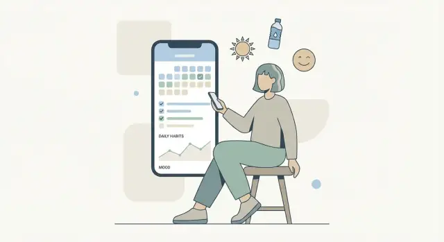
Create Simple Summaries and Trends
People stick with a tracking app when it gives quick “what happened?” answers without turning life into a spreadsheet. Summaries should feel like a calm check-in: clear, readable, and optional.
Start with 2–3 views that cover most needs
Keep reporting small and predictable so users can build a habit of reviewing:
- Daily history: a simple timeline or list of entries for today (and easy swipe to yesterday). This is for recalling context.
- Weekly trend: one screen that shows how things moved across the last 7 days. This is the most useful time window for many trackers.
- Simple totals: counts or sums over a chosen range (e.g., “Workouts: 3 this week” or “Caffeine: 420 mg”). This helps users see progress at a glance.
Use clear charts and readable labels
Choose the chart type that matches the data:
- Line chart for values that change over time (mood score, hours slept).
- Bar chart for counts (habits completed, symptoms logged).
Make charts easy to read on a phone:
- Label axes plainly (“Mon–Sun”, “Score 1–5”).
- Show units (“mins”, “mg”, “times”).
- Avoid clutter: fewer grid lines, fewer colors, and no tiny legends.
Filters: let users answer one question at a time
Add lightweight controls that don’t overwhelm the screen:
- Date range: Today / 7 days / 30 days / Custom.
- Tracker selector: pick one tracker (or compare two, only if it stays simple).
Default to the most common choice (often “Last 7 days”) so the screen loads with an instant, meaningful view.
Keep insights descriptive and neutral
Resist the urge to diagnose or interpret. Instead of “Your mood is declining because you slept less,” use language like:
- “Average mood this week: 3.4 (last week: 3.7).”
- “You logged 4 days of exercise.”
- “Sleep was below 7 hours on 3 nights.”
This tone supports reflection without judgment—and keeps the app useful for many different tracking styles.
Choose the Tech Stack and Set Up the Project
Your tech stack should make it easy to ship improvements quickly while keeping the app fast and small. For a lightweight personal tracking app, you’re optimizing for quick UI updates, dependable offline storage, and minimal maintenance overhead.
Pick a stack that supports fast iteration
You can succeed with either native or cross-platform—choose based on your team and the kind of UI you want.
- Native (Swift/Kotlin): best for top-tier performance, smooth system integrations, and long-term platform consistency.
- Cross-platform (Flutter/React Native): best when you want one shared codebase and faster feature iteration across iOS and Android.
A practical rule: if you’re a solo builder or small team and need to launch on both platforms, cross-platform is usually the shortest path. If you’re leaning heavily on platform-specific widgets, health APIs, or system behaviors, native can reduce friction.
Consider a faster path to a working prototype
If your biggest risk is “will people actually log every day?”, it can be worth validating the core flow before you invest in a full custom build.
Platforms like Koder.ai can help you prototype an MVP from a chat-based spec: you describe the logging flow, entry types, and summary screens, and generate a working web app (React) and backend (Go + PostgreSQL) with an agent-based workflow under the hood. For early iterations, the practical benefits are speed (ship a testable version quickly), planning support (planning mode), and reversibility (snapshots and rollback). When you’re ready, you can export the source code, deploy, and add custom domains—useful if your tracking app evolves into a larger product.
If you go this route, keep your spec aligned with the same principles in this guide: one outcome, minimal entry data, and a time-to-log target.
Set up a clean project structure
Start with a simple, boring structure that keeps decisions reversible:
- Models: entry types (mood, habit, note, measurement) and validation rules.
- Storage layer: a small interface like
EntryRepositoryso you can change databases later without rewriting the UI. - UI layer: screens for “log” and “review,” plus reusable components (buttons, pickers, cards).
- Events/analytics layer: a separate module that receives app events and decides what gets recorded.
This separation is what keeps “lightweight” from turning into “fragile” as you add features.
Add basic instrumentation (without collecting sensitive content)
You still need product learning, but a privacy-first design means you measure behavior, not personal details. Track events like:
- app_open, log_entry_started, log_entry_saved
- reminder_enabled/disabled
- export_started/completed
Avoid sending raw entry text, mood labels, or anything that could reveal someone’s health or routines. If you need funnels, use coarse metadata (for example: “entry type = mood”) and keep it optional.
Set performance goals early
Lightweight apps feel instant. Set a few simple targets and check them regularly:
- Fast launch: the main screen should appear quickly.
- Low battery use: avoid constant background work; batch sync when possible.
- Small app size: be cautious with heavy libraries and large assets.
A good setup now saves you from painful rewrites when real users start logging several times a day.
Test for Reliability, Speed, and Real-World Edge Cases
Design privacy from day one
Draft privacy basics like app lock and export rules before you write features.
A lightweight tracking app only feels lightweight if it’s dependable. If logging takes too long, the keyboard lags, or entries disappear, people stop using it—even if the feature list is perfect. Testing should focus on speed, clarity, and the messy situations that happen on real phones.
Prove the core flows are fast
Start by timing your two most important actions: log an entry and review recent history. Test them on multiple screen sizes and OS versions (at least one older device if possible). Watch for small but painful slowdowns like delayed button taps, long loading spinners, or a form that jumps around when the keyboard opens.
A practical benchmark: can a user log a typical entry in under 10 seconds without thinking?
Run usability tests that measure time-to-log
Do short sessions with new users and give them realistic prompts (e.g., “log a mood,” “add a note,” “correct a mistake”). Pay attention to:
- Do they understand what each entry type means?
- Can they find today’s log quickly?
- Do they feel confident the entry was saved?
Clarity beats cleverness: labels, confirmations, and undo options should be obvious.
Stress-test real-world edge cases
Include scenarios that often break tracking apps:
- Time zone changes (travel, daylight saving time)
- Device restart during or after logging
- Low storage conditions and “nearly full” devices
Also test poor connectivity if you support syncing, and confirm the app behaves predictably offline.
Add crash reporting and a feedback channel
Use crash reporting so you learn about failures you can’t reproduce. Add a simple in-app feedback option (one screen, minimal fields) so users can report confusion or bugs right when they happen.
Launch, Onboard Users, and Plan Iterations
Launching a lightweight tracker is less about a big reveal and more about removing friction: users should understand the value in seconds, log their first entry quickly, and feel confident their data is safe.
Prepare store assets that show the app’s promise
Your screenshots should tell a simple story without reading paragraphs:
- 1–2 screenshots of logging (one-tap or minimal typing)
- 1–2 screenshots of reviewing (simple summaries or trends)
- A final screenshot that highlights a key differentiator (offline support, privacy-first design, or customization)
Write your store description like a checklist of outcomes: “Track mood in 5 seconds,” “See weekly patterns,” “Works offline.” Keep it specific and measurable.
Onboarding that takes under 60 seconds
Aim for a first session that feels like using the app, not learning it.
Structure:
- Pick a tracking type (habit, mood, symptom, spending—whatever your MVP supports).
- Set one preference (time of day reminders, units, or labels).
- Create the first entry immediately.
Use plain language and avoid settings screens during onboarding. Any optional customization can wait until after the first successful log.
Plan iterations with a lightweight v2 roadmap
Ship with a short, realistic roadmap so you can say “not yet” without losing direction. A good v2 list for a personal tracking app often includes sync across devices, reusable templates, and home-screen widgets.
Collect feedback with one in-app question after a few days of use: “What stopped you from logging?” Then prioritize improvements that reduce time-to-log, prevent data loss, or clarify summaries.
If you have related pages (pricing, help, or a blog), direct interested users there from the app’s settings—without interrupting the core tracking flow.
FAQ
How do I define a clear goal for a lightweight personal tracking app?
Define one primary outcome—awareness, consistency, or reporting—and use it as a filter for every feature. Then write a one-sentence promise like: “This app helps you notice patterns by letting you log mood in under 10 seconds.”
If a feature doesn’t directly support that promise, put it on the “not now” list.
What is the smallest useful scope for an MVP tracking app?
Start with either:
- A single tracker (one use case), or
- A small set of templates (e.g., Habit, Mood, Symptom) that share the same fast logging flow.
A practical rule: if a new tracker type needs a new screen, new settings, and a new chart, it’s probably too big for v1.
What data should each log entry include in the MVP?
Keep each entry minimal:
- Timestamp (auto-filled)
- Value (yes/no, 1–5, minutes, amount)
- Optional note (short text)
If users can’t explain why a field exists, remove it—extra fields increase time-to-log and abandonment.
Which features should I intentionally postpone to keep the app lightweight?
Treat these as optional add-ons, not MVP requirements:
- Tags/categories
- Reminders
- Streaks, badges, gamification
- Attachments (photo/audio)
- Deep analytics or custom charts
- Social sharing, integrations, AI insights
Write them down in a “not now” list so you can ship without feature creep.
How do I design the user flow so logging stays under 10 seconds?
Design the shortest path:
- Open app → choose tracker → log → confirm
Optimize for one-handed use with large tap targets, simple controls (chips/sliders), and minimal typing. Use subtle confirmation (toast/haptic/checkmark) so users feel confident without extra steps.
How should I structure entry types and the data model?
Use one underlying “entry” model and vary input types:
- Checkbox (did it happen?)
- 1–10 scale (mood/energy/pain)
- Timer (activities)
- Optional text note
Keep daily vs event logging explicit: daily entries keyed by local date; event entries keyed by timestamp.
How do I handle time zones and daylight saving time for daily tracking?
Store:
- A UTC timestamp (when the entry happened)
- The user’s local date (e.g.,
2025-12-26) and time zone ID at creation
Group summaries by the stored local date (not “UTC day”) so late-night logs and travel don’t shift entries into the wrong day.
What’s the best way to support edits and deletions without corrupting trends?
Use a version-friendly approach:
- Allow easy edit/delete of the last entry
- Prefer soft deletes (e.g.,
deleted_at) so summaries can ignore deleted entries - Recompute aggregates from source entries rather than storing fragile totals
This prevents trends from breaking when users correct mistakes.
Should I start with local storage or cloud sync, and how do backups work?
Start local-first (e.g., SQLite) so logging is instant and works offline. Treat sync as optional:
- Ship with local storage + manual export (CSV/JSON)
- Add opt-in sync later if needed
- Never block logging behind sign-in
Also provide “Export all data” so users can keep their own backups.
What baseline privacy and security features should a personal tracking app include?
Keep privacy simple and explicit:
- Collect only what you need; avoid sensitive defaults
- Add an app lock (PIN + biometrics)
- Keep exports safe: warn users, offer “exclude sensitive fields,” and avoid writing plain-text to shared locations
- Don’t send personal entry content to analytics
A short Settings → Privacy section should clearly explain storage, sync, and deletion.