

How to Create a Mobile App for Managing Personal Projects
Learn how to plan, design, build, and launch a mobile app for managing personal projects, from MVP scope and UX to data, testing, and release.
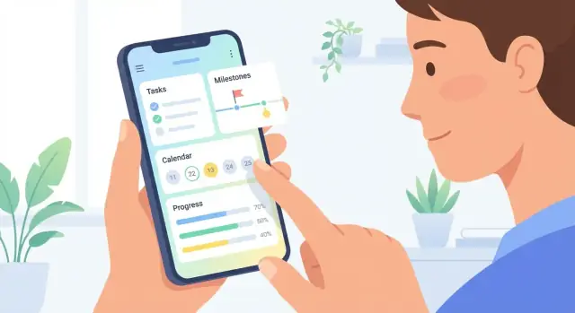
Start With the User Problem and Goals
A “personal project” can mean very different things: a student planning a thesis, a freelancer juggling client work, a hobbyist rebuilding a motorcycle, or someone running a weekend side hustle. Before you design screens or features, define the specific problem your app will solve for a specific group of people.
Define what “personal projects” means
Write a one-sentence definition your users would agree with. For example: “A personal project is a goal with multiple steps that competes with daily life and needs gentle structure.” Then list the typical project types, time horizons (days vs. months), and constraints (offline use, irregular schedules, motivation swings).
Pick a target audience (and say “no” to the rest)
Choose one primary audience to design for first:
- Students: deadlines, research notes, milestones
- Freelancers: multiple projects, client feedback, time tracking
- Hobbyists: checklists, parts/materials, progress photos
- Side hustlers: recurring tasks, sales/admin, quick planning
You can support other audiences later, but your first version needs a clear “home base.”
Define 3–5 core outcomes
Focus on outcomes users want, not features you want to build. A solid set for personal projects is:
- Plan: turn an idea into a doable next step
- Track: see what’s in progress vs. blocked
- Finish: hit meaningful milestones, not just “more tasks”
- Reflect: learn what worked and reuse it next time
Decide success metrics early
Pick a few measurable signals that match your outcomes:
- Weekly active use (are users returning?)
- Completion rate (are projects moving forward?)
- Retention (do they still use it after 4 weeks?)
Write these metrics into your product brief so later decisions stay grounded in user goals (see also /blog/mvp-mobile-app).
Choose the Right Project Management Model
The “right” model depends on what your users are trying to finish. A personal project management app should feel natural for everyday projects—planning a trip, studying for an exam, organizing a move—not like enterprise software.
Pick a primary view (and keep the rest optional)
Different people think in different shapes. Decide what your app is best at, then add alternate views later (or keep them lightweight):
- Task list + checklists: Best for errands, packing lists, study plans, and any project with clear next actions. Easy to build and easy to understand.
- Kanban board (To do / Doing / Done): Great for projects with ongoing work and prioritization (home renovation steps, content planning). It helps users “see” work-in-progress.
- Timeline: Useful when order and dependencies matter (renovation phases, multi-week courses). It can be harder to keep accurate on mobile.
- Calendar: Ideal when tasks are time-bound (appointments, deadlines, revision sessions). It can frustrate users if everything must have a date.
A common approach: start with Task list as the default, then offer Kanban as an optional view for the same tasks.
Use project templates to reduce setup time
Templates make the app feel instantly helpful. Offer a few starter projects users can copy and tweak:
- Home renovation (rooms, contractors, shopping lists)
- Studying (topics, sessions, practice tests)
- Event planning (venue, guests, budget, day-of checklist)
Keep templates editable and allow users to save their own as “My templates.”
Make progress visible without turning it into pressure
Progress tracking should motivate, not nag. Consider simple options:
- Milestones (key moments like “Book venue”)
- Percent complete (auto-calculated from completed tasks)
- Streaks (optional, for habits inside a project)
Let users choose what they see, and avoid guilt-inducing messaging.
Include notes, attachments, and links where decisions happen
Personal projects often rely on reference material. Support:
- Quick notes per task/project
- Attachments (photos, PDFs) when needed
- Links to docs, maps, or reference pages
The key is speed: adding a note or link should take seconds, not a mini-form.
Define MVP Features and a Realistic Scope
A personal project management app succeeds when it does a few core jobs extremely well. Your MVP (minimum viable product) should be the smallest version that still feels complete, trustworthy, and useful—something you can ship in 6–10 weeks.
Must-have features (ship these first)
Start with the basics people expect when they open a personal project management app:
- Create a project (name, optional note)
- Create tasks inside a project
- Due dates (including “no date”)
- Reminders (local notifications are fine for MVP)
- Simple status (e.g., To do / Doing / Done, or just Completed)
If any of these are shaky, everything else will feel pointless. Spend your time here: fast task entry, easy edits, and a clear “what’s next?”
Nice-to-have features (only if time remains)
These can improve the experience, but they’re not required to prove the concept:
- Tags to filter tasks across projects
- Priority (low/medium/high)
- Recurring tasks (weekly chores, monthly bills)
- Widgets (today list, quick add)
Prevent scope creep with a “Not now” list
Scope creep often happens because good ideas arrive mid-build. Capture them—don’t implement them.
Create a visible “Not now” list in your project doc with examples like: collaboration, heavy attachment management, full calendar sync, advanced AI planning, time tracking, integrations, custom themes. This keeps the team aligned while preserving future roadmap options.
Example MVP scope that fits 6–10 weeks
Define what “done” means in plain terms:
- Projects + task lists with status toggle
- Due dates + reminders
- Search (or at minimum, basic filter by project/status)
- Simple settings (notification on/off)
- Basic onboarding (1–2 screens)
- Analytics/crash reporting (lightweight)
Anything beyond this should earn its place by directly improving daily use, not by being merely “nice.”
Sketch User Flows and App Navigation
Before you polish colors and icons, sketch how someone actually gets value from your app in under a minute. A simple personal project management app succeeds when the next action is always obvious—and never more than a couple taps away.
Start with the core screens
Map the key places users will spend time:
- Home: a focused overview (Today, Next, or Upcoming) plus a clear “Add” action
- Project: project goal, progress, and the list of tasks grouped in a predictable way
- Task: details, due date, reminders, notes, and status (incomplete/complete)
- Calendar (optional, but common): due dates and scheduled work sessions
- Settings: notifications, data export, account (if any), and privacy controls
Keep each screen’s purpose narrow. If your Home screen tries to show everything (projects, tags, calendar, stats), it becomes a dashboard people ignore.
Keep navigation predictable
For most productivity apps, bottom navigation tabs work well because they keep primary areas visible:
- Home
- Projects
- Calendar
- Settings
If you don’t have enough main sections, use three tabs and move the rest into Settings. Avoid hiding essential areas inside a hamburger menu—people forget they exist.
Design for quick capture
“Quick capture” is the moment when users decide whether they’ll stick with your app. Make adding a task feel effortless:
- A one-tap add button available on Home and inside Projects
- Default sensible fields (task name only) with optional details behind “More”
- Consider voice input as an optional enhancement, not a requirement
A practical flow: tap Add → type task → choose project (or default “Inbox”) → save.
Plan empty states and onboarding
New users will hit empty screens immediately. Turn those moments into guidance:
- Home empty state: “Add your first task” with a button
- Projects empty state: “Create a project” plus a short example
- Calendar empty state: “Tasks appear here when they have due dates.”
Keep onboarding lightweight: 2–3 tips during first use beats a long tutorial. The goal is to help users succeed once, fast, so the app earns a spot in their routine.
Design UI That Stays Simple and Fast
A personal project management app only feels “productive” when it’s effortless: quick to scan, quick to edit, and hard to mess up. Your UI should reduce thinking time, not add new decisions.
Start with low-fidelity wireframes
Before polishing visuals, sketch the MVP screens with simple boxes and labels. Focus on the few moments users repeat every day:
- Project list (what am I working on?)
- Project detail (what’s next?)
- Add/edit task (capture in seconds)
- Today / Upcoming view (what should I do now?)
Keep the wireframes intentionally rough so it’s easy to delete, rearrange, and simplify. If a screen needs a long explanation, it’s a sign the flow is too complex.
Write microcopy that prevents confusion
Good microcopy is tiny, specific, and reassuring. Draft text for:
- Buttons: “Add task” is clearer than “Create”
- Empty states: “No tasks yet—add one to get started”
- Errors: “Title is required” (and highlight the field)
- Reminders: “Remind me tomorrow at 9:00 AM”
Aim for consistency in tone and verbs. Users should never wonder what happens after a tap.
Set a simple visual system
A lightweight design system keeps your app feeling fast and coherent—even as you add features:
- Typography: 1–2 font sizes for body, 1 for headings
- Spacing: use a small set (e.g., 8/16/24) to keep rhythm
- Color: one primary action color, neutral backgrounds, limited accents
- Icons: pick a single style and use icons only when they add meaning
Prioritize readability over decoration. A clean hierarchy (title → due date → status) makes scanning effortless.
Cover accessibility basics from day one
Accessibility also improves speed and usability for everyone:
- Contrast: ensure text stands out on backgrounds
- Touch targets: make tappable elements comfortably large
- Font scaling: support system text size without breaking layouts
If your UI still works at larger text sizes and with one-handed use, it’s likely simple enough for your MVP.
Select a Build Approach and Platform Strategy
Before you design every screen, decide where your app will run and how you’ll build it. This choice affects speed, budget, and what “good enough” looks like for your first release.
Pick your platforms: iOS, Android, or both
- iOS first can be simpler if your audience skews toward iPhone users (common for paid productivity apps in some markets). Fewer device variations can mean faster QA.
- Android first may fit better if you expect broader global reach or need more device price diversity.
- Both from day one is best when your app relies on sharing, collaboration, or word-of-mouth—users won’t wait if their friends can’t install it.
If you’re unsure, validate with a lightweight landing page and waitlist, then pick the platform your early adopters actually use.
Compare build approaches
Native (Swift for iOS, Kotlin for Android)
Best performance and the most polished platform feel, but you’ll likely need two codebases and often two specialists.
Cross-platform (Flutter, React Native)
One shared codebase, faster iteration, and easier feature parity across platforms. Great for a personal project management app unless you need very platform-specific UI or heavy on-device processing.
No-code/low-code (or “vibe-coding” platforms)
Great for getting to a working MVP quickly—especially when you want to validate UX, onboarding, and the core loop before investing in a full engineering pipeline. For example, Koder.ai lets you build web, backend, and mobile app foundations from a chat interface, then export source code when you’re ready to take full control. This can be a practical way to prototype your project/task model, iterate on screens, and keep scope tight while you learn from early users.
Decide what works offline vs. online
Productivity apps win when they’re reliable:
- Make core actions offline: view projects, add tasks, edit notes.
- Use the internet for sync, backup, collaboration, and notifications.
This implies you’ll need local storage on the phone plus a clear sync strategy (even if collaboration isn’t in your first version).
Estimate cost, timeline, and hiring
A practical way to plan:
- Native (both platforms): higher cost, longer timeline; usually 2 mobile developers + backend support.
- Cross-platform: mid-range cost; often 1–2 developers can ship both apps.
- No-code/low-code: lowest upfront cost; budget extra for tooling, integrations, and possible rebuild later.
Whichever path you pick, write it down as a decision with trade-offs—future-you will thank you.
Plan Data, Sync, and Storage Early
Your feature list can be perfect, but if the data model and syncing rules are vague, the app will feel unreliable. Planning this early keeps later UI and backend decisions simpler—and helps you avoid painful migrations after users already have real projects inside the app.
Start with the core objects
Define the “things” your app stores and how they relate:
- Users (even if you start without accounts, you may add them later)
- Projects (name, status, due dates, notes)
- Tasks (within a project, with priority, due date, completion state)
- Tags (many-to-many with tasks/projects)
- Reminders (time-based notifications tied to tasks)
- Attachments (images/files linked to tasks or projects)
Be explicit about rules like: Can a task belong to multiple projects? Are tags shared across projects? Do reminders survive if a task is deleted?
Choose your storage approach
You’ll typically pick one of three paths:
On-device only: fastest to build and great for privacy, but switching phones is painful unless you add backups.
Cloud sync: best cross-device experience, but requires accounts, server costs, and careful handling of offline edits.
Hybrid: store locally for speed/offline, then sync to cloud when available. This is often the best UX, but more complex.
Decide how sync conflicts work
If users edit the same task on two devices, what happens?
- “Last edit wins” is simple, but can overwrite changes.
- Field-level merges can preserve more data, but take time to implement.
- A “conflict” view (“Choose version A or B”) is transparent, but adds UX work.
Write down your rule per field (title, notes, due date, completion) so behavior is predictable.
Plan export, backups, and restore
Even early on, users will ask: “Can I get my data out?” Support basic CSV export for tasks and PDF export for project summaries. Also define backup expectations: manual backup, scheduled backups, and what happens during restore (does it merge or replace?).
Add Key App Services Without Overbuilding
Once your core task and project flows work smoothly, you can add a few “support services” that make the app feel complete—without turning it into a pile of half-finished features. The rule: each service should reduce friction for the user or protect their data, not just sound impressive.
Authentication: let people start fast
Offer more than one way to get in, but keep the first session effortless:
- Guest mode is great for quick trials (with a clear “save your data” prompt later).
- Email sign-in works everywhere and is easy to understand.
- Apple/Google sign-in reduces password fatigue and improves conversion.
If you support guest mode, plan the “upgrade” path: how a guest account becomes a real account without losing projects.
Notifications: helpful reminders, not noise
Reminders should support intentions (“work on this tonight”), not nag.
Focus on:
- User-controlled timing (quiet hours, preferred reminder times)
- Frequency limits (avoid multiple pings for the same item)
- Clear value (“You planned 30 minutes for Project X”) instead of generic alerts
A simple strategy: start with one reminder type (e.g., due-time reminders) and only add more after users ask for them.
Integrations: design for later, don’t rush
Calendar sync, email import, and advanced attachment workflows can be powerful—but they add edge cases (permissions, duplicates, conflicts). Consider them “phase 2” unless your app’s core promise depends on them.
You can still prepare by keeping tasks, due dates, and attachments as clean, well-defined data fields.
Analytics: measure decisions, not vanity
Track a small set of events tied to product choices, such as:
- onboarding completion
- first project created
- first task completed
- notification opt-in
Use analytics to answer practical questions (“Do reminders increase weekly return rate?”), and avoid collecting extra data “just because.” For privacy expectations, align your events with the controls you describe in your privacy section and app settings.
Set Up Monetization and Upgrade Paths
Monetization works best when it feels like a natural extension of the value your app already provides. For a personal project management app, users need to trust that the core product won’t suddenly become unusable because they didn’t upgrade.
Pick a pricing model that matches the product
Most apps in this category fit one of these models:
- Free: good for growth, but you’ll need another revenue source (sponsorships, services, or a future paid tier).
- Freemium: the most common option—let people manage projects for free, then charge for power features.
- Subscription: works well if you’ll keep shipping improvements (sync, calendar integrations, advanced templates). Monthly and annual plans are typical.
- One-time purchase: appealing to some audiences, but harder to sustain long-term updates and support.
Decide what stays free vs. paid
A simple rule: keep core usage free so the app is genuinely useful without payment. Then charge for features that expand capacity or save significant time.
Good free foundations:
- Create tasks and projects
- Basic reminders
- Simple lists and statuses
Good paid upgrades:
- Cross-device sync, offline-first with conflict handling
- Advanced views (timeline, calendar), custom filters
- Automations, recurring task patterns, smart templates
- Collaboration or shared projects (if you add it later)
Avoid dark patterns and make upgrades reversible
Be clear about what’s included in each plan, and keep the upgrade path easy to undo. Avoid “nag” screens that interrupt task entry or lock users out of their existing data.
A practical approach is a small, honest upgrade screen with:
- A short list of benefits
- Transparent pricing
- Easy cancel/refund info
Choose a paywall moment after value is proven
Don’t ask for payment at install. Instead, place a paywall at a moment when the user already understands the benefit—like enabling sync, creating a 4th project, or trying an advanced view.
If you want examples, add a short “Compare plans” page at a relative link like /pricing so users can decide without pressure.
Build Trust: Privacy, Security, and User Controls
People will only rely on a personal project management app if it feels safe and predictable. Trust isn’t a marketing add-on—it’s part of the product experience. Start by making clear decisions about what you collect, where it lives, and what the user can change.
Collect only what you need
Practice data minimization: if a feature works without personal data, don’t ask for it. For example, a to-do list doesn’t need contacts, location, or access to photos. Optional fields (like “work email” for syncing) should be truly optional.
Be clear about what’s stored (and where)
Explain storage in plain language inside onboarding and Settings:
- On device: “Your projects are stored on this phone only.”
- In the cloud: “Your projects are synced to your account so they appear on your other devices.”
Also state what happens offline and how conflicts are handled (“last edit wins” vs. “we’ll ask you to choose”).
Secure the basics
You don’t need complicated jargon, but you do need fundamentals:
- Encryption in transit: use HTTPS/TLS for all network calls.
- Secure storage: store tokens/keys in the platform’s secure storage (Keychain/Keystore).
- Password rules: allow password managers, support long passphrases, and add rate limiting for login attempts.
If you offer sign-in, consider passkeys or “Sign in with Apple/Google” to reduce password risk.
Give users real controls
Trust grows when users can manage their own data:
- Delete account and delete data (with a clear confirmation step)
- Export data (CSV/JSON) so users aren’t trapped
- Notification settings that are granular (due dates vs. reminders vs. weekly digest)
Keep these options easy to find in Settings, not buried in a help article.
Test, Iterate, and Validate With Real Users
Testing a personal project management app isn’t just about “no bugs.” It’s about confirming that real people can finish the job they opened the app for—quickly, confidently, and without surprises.
Start by testing the core flows
Before polishing animations or adding new features, verify the essentials end-to-end:
- Create a project
- Add tasks (including due dates and notes)
- Complete a milestone and see progress update correctly
Run these flows on different devices and screen sizes. Pay attention to how many taps it takes and where users hesitate—those moments usually signal unclear labels, missing affordances, or awkward navigation.
Don’t skip edge cases (they create support tickets)
Productivity apps break trust when data feels inconsistent. Actively test scenarios that are easy to miss:
- Timezone changes (travel, daylight savings) affecting due dates and reminders
- Missed reminders and what happens when a user opens the app later
- Offline edits: adding/completing tasks with no connection, then syncing cleanly
Even in an MVP, decide what the “safe” behavior is (for example: show a clear “Not synced yet” state rather than guessing).
Use a small beta group and structured prompts
A beta group of 10–30 people can uncover most usability issues if you ask the right questions. Instead of “What do you think?”, use prompts like:
- “Set up a project you’re actively working on this week.”
- “Find the next task you should do—how did you decide?”
- “What did you expect to happen when you marked this complete?”
Combine quick interviews with lightweight analytics (drop-off points, time-to-complete key actions).
Fix crashes and confusing UI before expanding scope
Prioritize stability, clarity, and speed over new options. A smaller feature set that feels reliable beats a bigger one that feels unpredictable. Once your core flows are consistently smooth, you’ll know exactly which upgrades are worth building next.
Launch, Market, and Improve After Release
Launching isn’t a finish line—it’s the moment your app meets reality. A smooth release helps you collect honest feedback early, avoid support chaos, and build momentum for a personal project management app that people actually keep.
Prepare App Store / Play Store assets
Treat your store page as onboarding before the download. Create:
- Screenshots that show the core loop (capture task → plan week → mark done). Use short captions.
- A clear description focused on outcomes (stay organized, finish side projects), not features.
- Keywords that match what users search (e.g., “personal project tracker,” “tasks and goals”).
If you have a simple landing page, link to it from your store listing and keep it consistent with the app’s tone.
Create a practical launch checklist
Before you submit, make sure the basics are ready:
- Privacy policy (even if you collect minimal data)
- Support email and an in-app “Contact support” link
- A short FAQ (sync issues, notifications, exporting data)
- Analytics events for the few actions that matter (first project created, first task completed)
Plan the first post-launch updates
Expect early fixes. Prioritize:
- Crash and bug fixes
- Faster startup and smoother navigation
- Onboarding improvements (fewer steps, clearer defaults)
- Performance on older devices
Build a roadmap from data, not guesses
Combine three inputs: store reviews, support tickets, and usage data. Tag requests by theme (e.g., reminders, templates, calendar view) and validate impact before building.
Publish a lightweight “What’s next” note in your release updates to show progress without promising dates you can’t meet.
FAQ
How do I define what “personal projects” means for my app?
Start with a one-sentence definition your users would agree with, then validate it with examples:
- What counts as a “project” vs. a “task”
- Typical time horizons (days, weeks, months)
- Real constraints (irregular schedules, offline use, motivation swings)
If users disagree with the definition, your features will drift because you’re solving different problems for different people.
How do I choose a target audience without excluding potential users?
Pick one primary audience for v1 and explicitly say “no” to the rest until later. Choose the group whose workflow you can serve end-to-end with the smallest feature set (e.g., students with deadlines, hobbyists with checklists).
A practical test: can you describe your ideal user and their top 3 frustrations in one paragraph? If not, your audience is still too broad.
What are good core outcomes for a personal project management app?
Aim for 3–5 outcomes that describe what users accomplish, not what you build. Common outcomes for personal projects:
- Plan: turn an idea into the next doable step
- Track: see what’s in progress vs. blocked
- Finish: reach milestones (not just add tasks)
- Reflect: reuse what worked next time
Use these outcomes to decide what features make the MVP and what goes on the “Not now” list.
Which success metrics should I decide before building?
Use a small set of signals that map to your outcomes and can be measured early:
- Weekly active use (are people coming back?)
- 4-week retention (does it stick?)
- Project/task completion rate (is work moving forward?)
Write these into your product brief so feature decisions stay grounded (for example, avoid adding “nice” views that don’t improve completion or retention).
What project management model should the app use (list, Kanban, timeline, calendar)?
Start with one primary view that matches everyday projects, then add optional views later.
Common choices:
- Task list: simplest and fastest for “next actions”
- Kanban: great for work-in-progress and prioritization
- Timeline: useful for dependencies, harder to maintain on mobile
- Calendar: best for time-bound tasks, frustrating if everything needs a date
A reliable MVP pattern is Task list as default + optional Kanban on the same tasks.
What features belong in an MVP for this kind of app?
A realistic MVP is the smallest version that feels complete and trustworthy—often ship-ready in 6–10 weeks.
Must-haves usually include:
- Projects + tasks
- Due dates (including “no date”)
- Reminders (local notifications are fine)
- Simple status (To do/Doing/Done or Completed)
- Basic search or filtering
Keep a visible “Not now” list (e.g., collaboration, AI planning, deep integrations) to prevent scope creep.
How should I structure the main screens and navigation?
Design for “quick capture” and a predictable home base.
A practical navigation structure is bottom tabs such as:
- Home (Today/Next/Upcoming)
- Projects
- Calendar (optional)
- Settings
For task entry, optimize this flow: Add → type task → choose project (or Inbox) → save. Hide optional fields behind “More” so capture takes seconds.
How do I handle offline use and sync without making the app unreliable?
Plan offline behavior up front so the app feels reliable.
A common approach:
- Offline-first for core actions: view projects, add/edit tasks, edit notes
- Online for: sync, backup, collaboration, account features
Also define conflict rules early (e.g., “last edit wins” vs. field-level merges) so users don’t see unpredictable changes after reconnecting.
Which app services should I add early (auth, notifications, analytics, integrations)?
Give users a fast start, then add “completeness” features only where they reduce friction.
Good early choices:
- Authentication: guest mode + email and/or Apple/Google sign-in
- Notifications: user-controlled timing (quiet hours) and frequency limits
- Analytics: track a small set of events (onboarding completion, first project created, first task completed)
Avoid rushing complex integrations; design your data fields cleanly so you can add them later without migrations.
How do I approach privacy, security, and monetization without hurting adoption?
Make trust and sustainability part of the product, not add-ons.
For privacy/security:
- Collect only what you need
- Be clear about where data is stored (device vs. cloud)
- Use HTTPS/TLS and secure token storage (Keychain/Keystore)
- Provide real controls: export, delete account/data, granular notification settings
For monetization, keep core usage genuinely useful for free, and charge for expansion features (e.g., cross-device sync, advanced views, automations). Place paywalls after value is proven (like enabling sync or adding an advanced view).