Jul 18, 2025·8 min
How to Create a Mobile App for Medical Follow-Ups & Reminders
Learn the key steps to plan, design, build, and launch a mobile app for medical follow-ups and reminders—features, privacy, UX, and testing tips.
Learn the key steps to plan, design, build, and launch a mobile app for medical follow-ups and reminders—features, privacy, UX, and testing tips.
Before you design screens or debate features, get specific about the problem you’re solving. “Follow-ups and reminders” can mean many things—medication adherence, post-op check-ins, lab result follow-ups, physical therapy homework, or simply getting people to show up.
Start with a plain-language statement you can validate:
A useful shortcut is to pick one primary failure point first. For example: “Patients forget to book their 2-week follow-up after discharge,” or “Reminders are sent, but patients ignore them because they’re too frequent and not actionable.”
Most medical reminder apps have more than one audience. Define each group and what they actually do inside the app:
Be honest about who must use the app versus who can stay in existing tools. If clinicians have to log into yet another system daily, adoption may stall.
Pick 2–4 measurable outcomes tied to real operations. Examples:
Define how you’ll measure this early—otherwise you can’t tell whether the app is helping or just generating more notifications.
Constraints aren’t obstacles—they’re design inputs. Write them down now:
Once the use case, users, success metrics, and constraints are clear, feature decisions (and tradeoffs) become much easier—and you’ll avoid building a medical reminder app that’s polished but irrelevant.
Before choosing features, map what actually happens between a visit and the next touchpoint. A patient follow-up app succeeds when it matches real care routines—especially the messy parts like reschedules and changing instructions.
Pick a handful of high-value paths and document them end-to-end:
For each workflow, write down the trigger (what starts it), the steps, who owns each step, and what “done” looks like.
Prompts aren’t just “take your meds.” Look for moments where people forget or feel uncertain:
Treat each prompt as a decision: what action is expected, by when, and what happens if it’s missed?
Define roles early:
Clarify who can edit a care plan, who can see sensitive notes, and how consent is granted and revoked.
Write rules for:
A simple journey map per workflow—steps, prompts, roles, and edge cases—gives you a blueprint for your medical reminder app without guessing.
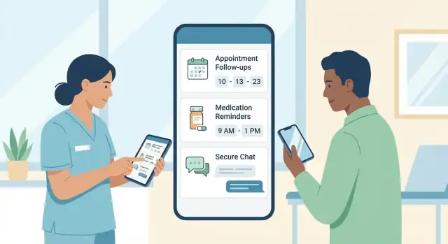
An MVP for a medical reminder app should do a few things exceptionally well: help patients remember what to do next, reduce no-shows, and give care teams visibility when follow-ups slip. Keep the first release focused so you can launch, learn, and iterate safely.
A practical day-one MVP usually includes:
If you’re tempted to add wearables, AI, or complex analytics, park them for later—an MVP wins by reliability and clarity.
Make your reminder engine support the most common follow-up tasks:
Use channels patients already respond to:
Define what happens when reminders are ignored: after X hours/days, send a second nudge; after Y misses, notify a care coordinator or caregiver (if authorized); for urgent pathways, prompt the patient to call the clinic or go to urgent care.
Clear escalation rules prevent silent drop-offs without overwhelming staff.
A follow-up and reminder app succeeds or fails on usability. People open it when they’re tired, anxious, in pain, or in a hurry. Good UX isn’t about fancy screens—it’s about making the next right action obvious, with as little effort as possible.
Design the first screen around what most patients actually need in the moment:
If you only get one screen perfect, make it this one. It reduces searching, forgetting, and accidental missed steps.
Healthcare instructions can be complex, but the interface shouldn’t be. Aim for short, scannable phrases (think one sentence, not a paragraph). Use:
When something needs explanation, hide it behind a “Learn more” link instead of putting it in the main path.
Accessibility is much easier when it’s built into designs from day one:
Also consider real-world conditions: dim rooms, glare outdoors, and shaky connectivity.
Many patients rely on partners, adult children, or professional caregivers. Your app can support them with permissioned access, for example:
Design this carefully with consent in mind: the UX should make it obvious who can see what—and how to change it.
A reminder feature is only helpful if patients keep it turned on. The goal is to support follow-through without creating constant noise.
Design your reminder engine as a flexible system that can adapt to different care plans, routines, and tolerance for notifications.
Different follow-ups have different “acceptable” timing. Let patients (or caregivers) choose:
Defaults matter: start with clinician-approved templates, then allow light personalization rather than forcing a full custom schedule.
A reminder engine should record what happened, not just what was sent. After a reminder, provide quick actions:
This turns reminders into a usable history for care plan tracking, not a nag.
Prevent alert fatigue by combining low-urgency tasks into a single summary and respecting quiet hours. Use priority levels so critical items (e.g., post-op warning signs, time-sensitive meds) can be louder than routine check-ins.
On the clinician side, summarize trends: adherence rates, common reasons for misses, and flagged symptoms. Keep it scannable so teams can act quickly during follow-ups rather than digging through logs.
Privacy and compliance aren’t “extras” for a medical reminder app—they shape what you can build, what you can store, and how you communicate with patients. Getting the basics right early prevents rework later and helps you earn trust.
Start by mapping where you operate and what kind of data you handle. Common examples include HIPAA (US), GDPR (EU/UK), and local health privacy rules (often state/province-specific). Whether you’re a healthcare provider, a vendor, or both can change your obligations.
Bring in the right people before you finalize features:
A practical output to aim for: a short data flow diagram (what data you collect, where it’s stored, who can see it) and a policy checklist signed off by stakeholders.
For follow-ups and reminders, you often don’t need full medical history. Minimization reduces risk and simplifies compliance.
Ask, feature by feature:
Define retention rules early: what gets deleted, when, and how patients can request deletion where applicable.
Consent isn’t a single checkbox. Users should understand what they’re agreeing to, in plain language:
Offer meaningful controls: notification preferences, quiet hours, and caregiver access options. Link to your /privacy policy from consent screens and settings.
Compliance often requires proving “who did what, and when.” Plan for audit-friendly logging from day one:
Logs should be tamper-resistant and retained per policy. The goal is accountability—not collecting extra patient data.
Security isn’t a single feature you “add later.” For a medical reminder app or patient follow-up app, it’s a set of defaults that protect patient information at every step—on the phone, in your servers, and across any integrations.
Use encryption whenever data moves (app to server, server to lab/EHR, etc.) and when it’s stored.
Just as important: protect API keys and secrets. Store them in a dedicated secrets manager (not in source code, app builds, or shared documents). Rotate keys on a schedule and immediately after any suspected exposure.
Patients, caregivers, and clinicians have different needs. Start with secure basics:
Avoid “one shared login” patterns in clinics—those are hard to audit and easy to abuse.
Give each user only the access they need to do their job.
For example, a scheduler may need appointment status but not clinical notes; a care manager may view follow-up tasks but not billing details. RBAC also makes it easier to prove who accessed what during incident reviews.
Notifications are convenient—and risky—because they can appear on lock screens.
Use minimal, non-sensitive wording by default (e.g., “You have a reminder”) and let patients opt in to more detail. Keep protected data inside the app after authentication, especially for medication reminders or lab-related follow-ups.
Integrations are what turn a reminder app into a reliable follow-up tool. Without them, staff end up re-entering data, and patients get messages that don’t match what the clinic actually scheduled.
Start by listing systems that already “own” the truth:
A practical rule: integrate the system that creates the event you’re reminding about (appointment, lab draw, follow-up visit) before you integrate “nice-to-have” data.
You don’t need to become an expert in healthcare standards, but it helps to design around common concepts:
Many vendors expose these via FHIR APIs; others provide HL7 feeds or proprietary APIs. Even when the connection is custom, mapping to these concepts keeps your app flexible if the clinic changes vendors later.
Decide how you’ll match app users to EHR records. Avoid “best guess” matching (name + DOB) alone.
Prefer a verified identifier (MRN plus an additional factor, or an invite link generated by the clinic). Also plan for merges: the EHR may later combine duplicates—your app must follow that change.
Define how quickly updates must appear:
Finally, set conflict rules. For example: if a patient edits a reminder time in the app, does it override the clinic schedule, or create a personal reminder while keeping the official appointment unchanged?
Your tech approach should follow your users and your budget—not the other way around. A clear, simple architecture also makes compliance and support much easier later.
Start by asking where your patients actually are. If your clinic population is mostly iPhone users (common in some regions and age groups), iOS-first can speed up delivery. If you serve a broad community, you’ll likely need both iOS and Android.
Cross-platform (one codebase for both) is often a practical choice for a medical reminder app because the core experience—care plan tracking, appointment reminders, and medication reminders—doesn’t usually require heavy device-specific features.
The tradeoff is that some “native” polish or very advanced device integrations may take extra work.
Even if the app looks simple, the backend is where the reliability lives. At minimum, plan for:
Think of the backend as the “source of truth” that keeps reminders accurate across devices.
Patients often have poor connectivity—inside hospitals, on public transit, or in rural areas. Design for “graceful offline” behavior:
A patient follow-up app needs a staff-facing admin console to stay manageable:
If you build the admin console early, you avoid turning “simple changes” into expensive engineering requests.
If you need to validate workflows quickly—especially the admin console + reminder rules—tools like Koder.ai can help teams prototype a patient follow-up app via chat, iterate in a planning mode, and use snapshots/rollback as requirements change. It’s a practical way to pressure-test your MVP scope (React front end, Go + PostgreSQL back end, and Flutter for mobile when needed) before you invest in a longer development cycle.
Good content is what turns a reminder system into a supportive experience. Patients don’t just need pings—they need clarity, context, and control.
Start with the next step, then add only the details needed to act.
Examples:
Keep it short, respectful, and free of medical jargon. Avoid guilt (“You missed…”) and use neutral language (“It’s time to…”). If the notification might be seen by others, avoid sensitive details unless the patient has opted in.
Patients are more likely to follow through when they understand why they’re being contacted.
In the reminder screen, include a simple “Why am I seeing this?” line, such as:
Always provide a clear path to adjust preferences: snooze options, quiet hours, channel choice (push/SMS/email), and frequency changes.
If your audience is diverse, plan early for multilingual content. Localize:
Even in one language, consider plain-language rewrites for low health literacy.
Every message flow should include a quick escape hatch: a short FAQ, a “Contact clinic” option, and clear emergency guidance like: “If this is urgent, call your local emergency number.”
You can link to /help for FAQs and /contact for support.
Testing a medical reminder app isn’t just about finding bugs—it’s about proving that the app behaves safely when real patients rely on it. Plan testing around the moments where people could miss care, misunderstand instructions, or get overwhelmed.
Start with the journeys that must work every time, even for first-time users. Run them on real devices (not only simulators) and include caregivers if your app supports shared care.
Key flows to validate:
Build a checklist with clinical stakeholders to review scenarios that could cause harm. You’re looking for confusing wording, unsafe defaults, and missing escalation paths.
Examples to test:
Notification reliability varies by OS version and manufacturer settings. Test:
Before a full launch, pilot with a small set of patients and staff. Track missed reminders, drop-offs, support tickets, and qualitative feedback (“What confused you?”). Use the pilot to refine wording, reminder cadence, and escalation thresholds before expanding access.
Launching a medical reminder app isn’t a finish line—it’s the start of learning what actually helps patients follow through. A good launch pairs clear logistics (so people can use the app) with measurement (so you can prove it’s working).
Prepare your app store assets early: screenshots that show the reminder flow, a plain-language description, and a short privacy summary.
On the operational side, define support workflows (who answers tickets, expected response times, escalation rules) and create training materials for staff who will introduce the app to patients.
If you’re onboarding clinics, include a one-page “how to prescribe the app” guide: when to recommend it, what to say, and how to troubleshoot common issues like notification permissions.
Choose a small set of metrics tied to real follow-up success:
Set up monitoring for crashes, notification failures, API errors, and support ticket trends.
Treat “silent failures” (reminders scheduled but not delivered) as top priority, because they erode trust quickly.
Use early data to plan improvements: new reminder types (labs, post-op check-ins), deeper integrations, and clinician dashboards that highlight overdue follow-ups and at-risk patients.
Keep a lightweight public changelog on /blog to show progress and reinforce credibility.
Start by choosing one primary failure point to solve first (e.g., missed post-discharge follow-up booking, missed meds, incomplete labs). Write it as a plain-language statement you can validate with real patients and staff, then expand to secondary problems later.
A tight first problem makes workflows, features, and metrics much easier to decide.
Define 2–4 measurable outcomes tied to operations, such as:
Also decide how you’ll measure them (EHR reports, scheduling system, in-app events) before shipping, so you can tell if the app helps or just sends more notifications.
Map 3–4 high-value workflows end-to-end (trigger → steps → owner → “done”), such as discharge follow-up, chronic check-ins, or post-op monitoring.
Then add rules for edge cases:
This prevents “perfect-path” designs that break in real clinics.
At minimum, define:
A practical pattern is permissioned caregiver access (shared visibility for tasks and schedules) while restricting sensitive notes unless explicitly allowed.
Design the reminder engine to be flexible and respectful:
Defaults should come from clinician-approved templates, with light personalization rather than complex setup.
Support the channels patients actually respond to, typically:
Keep notification text action-first and, by default, non-sensitive for lock screens. Let patients opt into more detail if they want it.
Use quick, neutral actions right after a reminder:
This produces a usable history for care teams without shaming patients—and helps you spot system issues like refill gaps or confusing instructions.
Start by identifying the regulations and stakeholders that apply to where you operate (e.g., HIPAA, GDPR, local rules). Then implement:
Link to your policy from settings and consent screens (e.g., /privacy-policy) and define retention/deletion rules early.
Security fundamentals that matter most early:
These defaults reduce risk and make later compliance reviews much easier.
Integrate the systems that “own the truth” for what you’re reminding about:
Plan identity matching carefully (avoid name+DOB alone; use clinic-generated invites or verified identifiers), and define sync/conflict rules (what’s official vs personal reminders).