Jun 09, 2025·8 min
How to Create a Mobile App for Meeting Action Items
Learn how to plan, design, and build a mobile app that captures meeting action items, assigns owners, sets due dates, and tracks completion end to end.
Define the Problem and the Audience
A meeting action items app isn’t just a to-do list with a different name. Action items are commitments made in a group setting—often tied to a decision, a next step, or a risk—where speed and clarity matter more than perfect formatting.
What “action items” are (and why they vanish)
An action item should answer four questions: What needs to be done? Who owns it? When is it due? What’s the context? They get lost after meetings because notes are scattered (paper, chat, email), details are vague (“follow up with vendor”), and ownership is implied rather than assigned. Once everyone leaves the room, urgency drops and the work disappears into personal systems.
Problems your app must solve
Think of the product as a workflow for turning spoken commitments into trackable tasks:
- Capture: record action items in seconds while the conversation is happening.
- Clarity: encourage specific wording (verb + outcome) and attach lightweight context (meeting name, decision, link).
- Ownership: make assignment explicit, with one accountable owner (even if others are collaborators).
- Deadlines: add due dates that match how teams actually work (e.g., “next Friday” during the meeting, refine later).
- Follow-up: provide a simple way to review what’s open, nudge owners, and confirm completion.
If you don’t solve capture and clarity, you’ll end up with a “meeting minutes app” that produces long notes but weak accountability.
Who the app is for
Define one primary audience first, then support others:
- Managers and project leads: need team accountability and fast status checks.
- Assistants and facilitators: need rapid entry and clean summaries.
- Cross-functional teams: need shared visibility without extra meetings.
Also consider where it will be used: in-person meetings, video calls, hallway chats—each has different constraints.
Define success metrics early
Pick a few metrics that tell you if the app is truly improving meeting follow-up automation:
- Completion rate of action items within the due window.
- Time-to-assign: how quickly an item gets an owner after it’s created.
- Adoption: weekly active users and “meetings with at least one action item captured.”
These metrics will guide every later decision in your action item workflow.
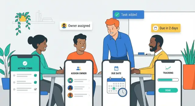
List Must-Have Features vs Nice-to-Haves
A meeting action items app succeeds or fails on a few core moments: capturing an action quickly, making ownership clear, and ensuring follow-through. Before you design screens or pick tools, separate what must ship in version 1 from what can wait.
Must-have features (your MVP)
Start with user stories that map to the simplest action item workflow:
- Create an item in seconds (title + optional notes)
- Assign an owner (one person accountable)
- Set a due date (or explicitly choose “No due date”)
- Mark done / reopen with a visible status
Add only the minimum structure needed for task tracking from meetings: a way to group items by meeting (or project), plus a basic list view for “My items” vs “All items.” If your app can’t do these reliably, extra features won’t save it.
Nice-to-haves (power features)
These can significantly improve action item management, but they’re not required for initial validation:
- Recurring items (weekly check-ins)
- Dependencies (blocked by another task)
- Checklists (sub-steps)
- Attachments (photos, docs, links)
Treat them as experiments: each should have a measurable outcome (e.g., higher completion rate or fewer overdue tasks).
Decide offline vs online early
For a mobile app for meetings, offline behavior matters because Wi‑Fi can be unreliable in conference rooms.
A practical MVP rule: capture and edits should work offline, then sync automatically. Collaboration features (seeing others’ updates instantly) can be online-first at launch, as long as the user never loses what they entered.
Design the Action Item Data Model
A good meeting action items app feels “smart” because it stores the right details, consistently, every time. The data model is the set of fields you save for each action item—and the relationships that make follow-up easy.
Where action items originate
Action items usually come from a few predictable places:
- Agenda topics (“Budget review” → “Send revised numbers”)
- Decisions (“We agreed to…” → “Draft the announcement”)
- Chat messages during the meeting (“@Sam can you…?”)
Capture the source so people can trace an item back to context. Even a simple field like Origin with values (Agenda / Decision / Chat / Other) can reduce confusion later.
Capture methods you should support
Plan for multiple ways to create the same action item:
- Manual entry (fast typing, autocomplete owners)
- Voice dictation (turn speech into a title + notes)
- Templates (common items like “Send recap,” “Share deck,” “Book next meeting”)
No matter how it’s captured, it should land in the same standardized fields.
Standard fields (the “minimum viable clarity”)
Include these core fields:
- Title (what will be done)
- Owner (single person accountable)
- Due date (or “No due date” explicitly)
- Priority (Low/Medium/High)
- Notes (details, links, acceptance criteria)
- Meeting link (connect to the meeting, invite, or minutes)
Prevent ambiguity with hints and examples
Most action items fail because they’re vague. Add lightweight guardrails:
- Title hint: “Start with a verb (e.g., ‘Send Q1 draft to Finance’)”
- Owner hint: “One owner only; add others as watchers in notes”
- Due date hint: “Pick a date or mark ‘None’—don’t leave it blank”
These prompts keep data clean without making entry feel strict.
Map the User Flows (Capture, Review, Track)
User flows are the “happy paths” people repeat every week. If these are smooth, your meeting action items app will feel effortless; if they’re clunky, even great features won’t get used.
1) Capture flow (during the meeting)
Design capture for speed and minimal thinking. The core screen should open directly to a list for the current meeting with a prominent one-tap Add button.
Use smart defaults so each new item is nearly complete on creation: default assignee (last used or meeting host), default due date (for example, “next business day”), and a lightweight status (Open). Make quick assign accessible without leaving the keyboard: type a name, tap a suggestion, done.
A good capture flow ends with action items created in a few seconds each—no mandatory fields beyond the action text.
2) Review flow (right after the meeting)
After the meeting, switch from “speed” to “accuracy.” Present a short review checklist: confirm owner, due date, and wording for each item.
This is also where your app should reduce vague tasks. Nudge users to rewrite “Follow up” into something measurable (“Send vendor proposal options to Alex”). Only after review should the app send notifications or share a summary, so people don’t get spammed with half-baked items.
3) Track flow (day-to-day follow-through)
Tracking needs two perspectives:
- Daily personal view: “My action items,” automatically sorted by due date, with overdue at the top.
- Team view: filter by meeting, owner, status, and overdue, so managers and facilitators can spot blockers quickly.
Keep actions simple: mark done, change due date, reassign, add a comment. Everything else should be optional.
Plan the UI: Key Screens and Navigation
A meeting action items app succeeds or fails on how quickly someone can find the right meeting, capture a task, and confirm who owns it. The UI should feel familiar within seconds—especially when users are walking to their next call.
Choose a simple, consistent navigation
For most apps, a bottom navigation bar is the easiest to learn and use one-handed. Keep it to 3–5 destinations and make labels explicit.
A common structure:
- Meetings (the source of truth)
- Action Items (all tasks across meetings)
- Inbox/Review (optional: items needing triage)
- Profile/Settings
Avoid hiding core areas behind nested menus. If you need filtering, add it inside the screen (tabs, chips, or a lightweight filter drawer), not as separate navigation levels.
Draft the key screens (keep them boring—in a good way)
Start with four screens and make them excellent:
- Meeting list: upcoming and recent meetings, with quick search.
- Meeting detail: title, date, attendees, and a prominent “Add action item” button.
- Action item list: sortable by due date, owner, status, and “overdue.”
- Item detail + create/edit: owner, due date, status, notes, and a clear save/complete action.
Keep screen titles consistent (“Action Items,” not “Tasks” in one place and “To‑dos” in another).
Design for on-the-go readability
Use readable typography, generous line spacing, and big tap targets for common actions (add, complete, reassign). Status should be scannable: use status chips (e.g., Open, In progress, Done, Blocked) and a single accent color for urgency (like overdue).
Build a lightweight design system early
Define a small set of reusable components—buttons, inputs, chips, list rows, empty states—so new screens don’t drift. A tiny design system speeds iteration and keeps the app feeling cohesive as features grow.
Make Data Entry Fast and Low-Friction
Ship the mobile experience
Create a Flutter mobile app for fast action-item capture, then refine UI and defaults.
If adding an action item feels slower than scribbling it on paper, people will stop using your app. Treat data entry like a “capture mode”: minimal fields, smart defaults, and zero hunting through menus.
Fewer taps, smarter defaults
Aim for a flow where a user can create a solid action item in under 10 seconds.
Reduce steps by making common choices instant:
- Assignee: show recent attendees first and allow one-tap assignment.
- Due date: offer default options like “Tomorrow,” “End of week,” or “Next meeting,” based on team norms.
- Priority: keep it lightweight (Low/Medium/High) and default to the most common setting.
A good rule: hide anything optional until after the action item is saved.
Auto-suggest that learns
Typing names and project titles is repetitive. Add auto-suggest where it matters:
- As the user types an assignee, suggest people from the meeting roster, then the wider org directory.
- Suggest projects/tags based on recent selections and the meeting title.
- Remember last choices (e.g., “Project: Q1 Launch” or “Type: Follow-up email”) so the next entry is faster.
Make sure suggestions are editable—auto-fill should never feel like auto-lock.
Templates for recurring meetings
Recurring meetings produce predictable action items. Offer templates that pre-fill typical fields:
- Meeting-level templates (default attendees, project, standard due-date rule)
- Action-type templates (“Send recap,” “Book vendor call,” “Prepare deck”) with prewritten titles users can tweak
This also improves consistency for reporting later.
Keyboard-friendly and voice-friendly input
Support fast entry styles:
- Keyboard: “Next” button behavior, sensible tab order, and quick date picking.
- Voice: a simple voice note or dictation for the title, then a quick confirm step (“Assign to Alex, due Friday?”).
If you perfect one screen, make it the “Add action item” sheet—it’s the moment your app either earns trust or creates friction.
Notifications and Reminders That People Won’t Disable
Reminders are the difference between “we agreed to do it” and “we actually did it.” But the fastest way to lose users is to nag them. Design notifications as a helpful safety net, not a megaphone.
Pick a mix: push, email, and in-app
Use push notifications for time-sensitive nudges, email for summaries, and in-app reminders for “while I’m already using the app” moments.
A practical baseline:
- Push: due soon, overdue, or you were mentioned/assigned
- Email: daily or weekly summary (opt-in)
- In-app: a badge or “Today” view when the user opens the app
Notification rules that feel smart
Good rules match how meeting follow-up works:
- Due soon: e.g., 24 hours before the due date (and optionally 2 hours before)
- Overdue: a gentle nudge the morning after it slips, then space out follow-ups
- Reassigned: notify the new owner immediately; notify the previous owner once (to close the loop)
- Mentioned: if someone @mentions a user in notes or comments, alert them right away
Keep the copy specific: include the action item title, due date, and meeting name so users don’t have to open the app to understand the ask.
Give people control (so they don’t mute you)
Add simple controls in Settings: frequency, quiet hours, weekends on/off, and channel preferences (push vs email). Let users snooze an item for a day or until a chosen date—snooze is often better than disable.
Weekly digest: high impact, low noise
A weekly digest drives completion without constant pings. Include:
- Items due this week
- Overdue items
- Newly assigned items
Link each item to the exact screen where it can be completed or updated, reducing friction and keeping the app feeling useful rather than noisy.
Collaboration and Integrations
Design it before you build
Use Planning Mode to map screens, fields, and roles before generating your app.
Action items rarely stay inside one app. People want to share outcomes quickly, keep everyone aligned, and avoid copying the same tasks into three different tools. Designing collaboration early prevents your meeting action items app from becoming an isolated notebook.
Sharing that matches how teams work
Support multiple sharing styles so users can choose what fits the meeting:
- Individual assignments: send each person only the items they own (ideal for accountability).
- Team summary: a clean recap of all action items, owners, and due dates for the whole group.
- Export options: PDF/CSV for compliance-heavy teams, plus “copy to email” for quick follow-ups.
A small touch that matters: make shared summaries deep-link back into the relevant meeting and item so updates don’t fork into different versions.
Integrations worth prioritizing
Focus on integrations that remove repetitive work in task tracking from meetings:
- Calendar (Google/Microsoft): attach action items to the meeting event, pull attendee lists, and show upcoming meetings inside the app.
- Slack/Teams: post a meeting summary to a channel, and allow a “mark done” or “snooze” action from the message.
- Email: one-tap follow-up emails to owners, with due date reminders and context.
- Task tools (Asana/Trello/Jira/Todoist): push action items out when teams already live there.
If integrations are a paid tier, be transparent about it and link to /pricing.
Light permissions planning (without slowing teams down)
Even before full role management, define basics: who can view, edit, reassign, and comment on items. For external guests, consider “view-only summary” sharing so sensitive notes stay private while action item management stays clear.
Accounts, Permissions, and Security Basics
Action items often include sensitive context (budget numbers, HR follow-ups, customer issues). If people don’t trust the app, they won’t use it—so plan accounts, permissions, and security early.
Authentication options
Support at least one low-friction sign-in method, and add stronger options for larger teams:
- Email magic link: great for quick adoption; no password resets.
- OAuth providers: “Sign in with Google/Microsoft/Apple” reduces friction.
- SSO (SAML/OIDC): required in many companies; also simplifies offboarding.
If you expect both work and personal devices, let users manage multiple workspaces from one account.
A simple role model
Keep roles minimal, then expand only if real workflows demand it:
- Admin: manages workspace settings, integrations, retention, security policies.
- Organizer: creates meetings, assigns action items, invites attendees.
- Attendee: receives and completes assigned items; can comment and update status.
- Guest: limited access (e.g., view/acknowledge only) for external participants.
Pair roles with object-level permissions (who can view/edit a meeting, who can see private notes) so sensitive meetings don’t leak across teams.
Data security basics
Cover the fundamentals from day one:
- Encryption in transit (TLS) for all API calls.
- Secure storage on device for tokens (Keychain/Keystore) and minimal cached data.
- Audit logs for key events: sign-ins, role changes, exports, deletions, action item reassignments.
Privacy considerations
Meeting notes can contain personal data. Offer controls like private notes, data retention rules, and export/delete requests. Be explicit about what’s shared when someone forwards an action item, so “need-to-know” stays intact.
Pick the Tech Stack and Architecture
The tech stack should match your MVP goals: fast capture in meetings, reliable sync afterward, and room to grow. The “best” stack is usually the one your team can ship and maintain.
Native vs cross‑platform
Native (Swift for iOS, Kotlin for Android) is a good fit if you need the smoothest offline behavior, deep OS integration (widgets, share sheets, shortcuts), or you expect heavy usage of platform-specific UI patterns.
Cross-platform (Flutter or React Native) is often the fastest way to launch on both iOS and Android with one codebase. It’s a strong choice for an iOS and Android meeting app because most screens are forms, lists, and filters.
A practical rule: if you have 1–2 mobile engineers, cross-platform usually wins for MVP speed; if you have dedicated iOS/Android developers already, native may reduce long-term friction.
Backend essentials (what you actually need)
Even a simple app benefits from a backend to support team workflows:
- API for action items, meetings, comments, status changes
- Database (relational is often simplest) for users, teams, tasks, assignments, due dates
- File storage for attachments or exported summaries
- Search (start with basic DB search; add dedicated search later if needed)
- Background jobs for reminders, recurring nudges, and email/Slack digests
If you want to accelerate early development, a vibe-coding platform like Koder.ai can help you prototype the full workflow quickly (mobile + backend) via chat, then export the source code when you’re ready to customize. It’s especially relevant here because the common building blocks—Flutter mobile UI, a Go API, and a PostgreSQL data model—map well to this kind of action item system.
Real-time vs sync (and offline)
Real-time collaboration is nice, but it adds complexity. For MVP, consider offline-first capture + background sync:
- Store changes locally first.
- Sync in the background when the network returns.
- Handle conflicts with simple rules (e.g., “last edit wins” for titles, merge comments, track status history).
If you do need real-time (e.g., multiple people editing the same action item during a meeting), isolate it to a few screens and define clear conflict behavior.
Keep it simple—and document trade-offs
Start with a modular, boring architecture: mobile client + REST/GraphQL API + one database. Write down what you’re postponing (real-time, advanced search, complex permissions) and why—future you will thank you.
Testing: Reliability Under Real Meeting Conditions
Make it team-ready
Launch your pilot on a custom domain so the app feels like a real internal tool.
Meeting follow-up apps fail when they’re tested only on fast Wi‑Fi and relaxed demo data. Your goal is simple: action items captured in a meeting should be saved correctly, show up where users expect, and stay trustworthy even when conditions are messy.
Write acceptance criteria per core flow
For each primary flow—capture, assign, set due date, edit, complete, and sync—define acceptance criteria that anyone on the team can verify. Example: “When a user creates an action item offline, it appears immediately in the local list, shows an ‘Unsynced’ indicator, and syncs automatically within 30 seconds of connectivity returning without creating a second copy.”
Acceptance criteria keep “it works on my phone” debates from dragging on and make regression testing much faster.
Stress test real-world scenarios
Build test cases that mirror actual meetings:
- Offline capture → late sync: create items, edit them, then reconnect hours later.
- Duplicate items: two people create similar items; ensure your dedupe rules (or lack of them) are predictable.
- Conflicts: edit the same item on two devices; verify what wins and how users are informed.
- Time zones: due dates set in one time zone should display correctly for teammates elsewhere, including DST changes.
Include “bad input” cases too: missing assignee, vague titles, or due dates in the past.
Usability tests under time pressure
Run short sessions with real meeting participants. Give them 2–3 minutes to capture five action items while listening to a mock agenda. Watch for friction: too many taps, confusing fields, or accidental dismissals. Measure time-to-first-item and error rate, not just opinions.
Accessibility checks that prevent silent drop-off
Verify contrast, Dynamic Type scaling, and screen reader labels for every interactive element—especially quick-add controls and due date pickers. If VoiceOver/TalkBack can’t explain an action item clearly, users will abandon the tool.
Launch, Measure, and Iterate
A meeting action items app only proves itself after real teams rely on it. Treat launch as the start of learning—not the finish line.
Set up analytics that match real success
Before you ship, decide what “working” means and instrument it. A simple starter dashboard can cover:
- Activation: users who create their first action item (or import from a meeting template) within 24 hours.
- Items created: volume per active user—helps you see whether the app is used only occasionally.
- Items completed: completion rate and time-to-complete (by team, by meeting type).
- Retention: users who return weekly to review and update items.
Pair event tracking with a lightweight qualitative prompt like: “Did this meeting produce clear owners and due dates?”
Pilot with a small group first
Run a pilot with one or two teams for 1–2 weeks. Ask for feedback in context: right after meetings, and again after they’ve tried to follow up. Focus on where the workflow breaks: unclear ownership, forgotten due dates, or action items that get rewritten multiple times.
Roll out with an onboarding plan
Adoption improves when you remove setup work:
- An onboarding checklist (create team, set meeting cadence, add default assignees)
- A sample meeting template with common action item categories
- A small help center at /help that answers “How do I…?” in one minute
If you’re building in public, consider incentives that drive early distribution: for example, Koder.ai runs an earn-credits program for users who create content about what they built, and referrals can also offset tooling costs—useful patterns if your own app will rely on team-by-team adoption.
Iterate based on what you learn
Your first post-launch improvements should usually target:
- Capture speed (fewer taps, smarter defaults)
- Reminders (timing and tone that drive completion)
- Reporting (overdue items, team accountability summaries)
Ship small changes weekly, and re-check activation and retention after each release.
FAQ
What makes a “meeting action item” different from a normal to-do?
An action item is a commitment made during a meeting that should be trackable afterward. To keep it from disappearing, capture four essentials:
- What: a specific verb + outcome (“Send revised Q1 numbers to Finance”)
- Who: one accountable owner
- When: a real due date (or explicitly “No due date”)
- Context: meeting name, decision, or link so it’s understandable later
Who should a meeting action items app be built for first?
Start with one primary audience and optimize the core flows for them:
- Managers/project leads: need team visibility, overdue filtering, quick status
- Assistants/facilitators: need ultra-fast entry and clean summaries
- Cross-functional teams: need shared visibility without extra meetings
Pick one first (often facilitators or managers), then add views and permissions that support everyone else.
What are the must-have MVP features for a meeting action items app?
A practical MVP is just the workflow from commitment → accountability:
- Create an item quickly (title + optional notes)
- Assign one owner
- Set a due date (or “No due date”)
- Mark done / reopen with visible status
- Basic grouping by meeting (or project) plus “My items” and “All items” views
If these aren’t reliable, integrations and advanced features won’t matter.
Which “nice-to-have” features are worth adding later?
Treat them as experiments you add only after the MVP works:
- Recurring items for weekly meetings
- Dependencies (“blocked by”)
- Checklists/sub-steps
- Attachments (links, docs, photos)
Each nice-to-have should tie to a measurable improvement (e.g., fewer overdue items or higher completion rate).
Should the app work offline in meetings?
Yes—at least for capture and edits. A practical rule:
- Offline-first: creating/editing items should work without Wi‑Fi
- Auto-sync: changes sync when connectivity returns
- Online-first (optional at launch): live collaboration and instant updates
The key promise is: users never lose what they entered during a meeting.
What data fields should every action item include?
Use “minimum viable clarity” fields and standardize them across capture methods:
- Title
- Owner (single accountable person)
- Due date (or explicit “None”)
- Priority (simple)
- Notes (links, acceptance criteria)
- Meeting link (invite/minutes)
- Origin (Agenda / Decision / Chat / Other)
Then add lightweight prompts to prevent vagueness without slowing entry.
What user flows should the app nail to feel effortless?
Design three repeatable “happy paths”:
- Capture (during meeting): one-tap add, smart defaults, quick assign, minimal required fields
- Review (after meeting): confirm owner/due date, rewrite vague titles, then send summaries
- Track (day-to-day): “My items” sorted by due date + a team view with filters (owner/status/overdue)
Keep common actions fast: complete, reassign, change due date, comment.
What are the key screens and navigation patterns to prioritize?
Keep navigation boring and obvious (3–5 primary tabs), then perfect four screens:
- Meeting list (upcoming/recent + search)
- Meeting detail (attendees + prominent “Add action item”)
- Action item list (filters/sort: due date, owner, status, overdue)
- Item create/edit (owner, due date, status, notes)
Use consistent naming (“Action Items” everywhere) and large tap targets for on-the-go use.
How do you design reminders users won’t disable?
Use a mix of channels with smart defaults and user control:
- Push: due soon, overdue, assigned/mentioned
- Email: optional daily/weekly digest
- In-app: Today view/badges
Make notifications specific (title, due date, meeting). Add , weekend toggles, frequency controls, and so users don’t mute the app entirely.
Which integrations and permission basics should be planned early?
Start with the basics that remove duplicate work:
- Calendar (Google/Microsoft): pull attendees, link items to meeting events
- Slack/Teams: post summaries; quick actions like mark done/snooze
- Email: one-tap follow-ups with context
- Task tools (Asana/Trello/Jira/Todoist): push items where teams already execute
For permissions, define who can view/edit/reassign/comment early, and consider a view-only summary for external guests.