Oct 29, 2025·8 min
How to Build a Micro‑Learning App for Daily Lessons
A practical guide to creating a micro-learning mobile app with daily lessons: define your audience, design lesson formats, build an MVP, and improve with analytics.
What a Micro-Learning Daily Lesson App Is
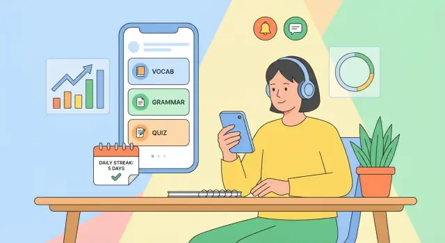
A micro-learning daily lesson app delivers small, focused lessons that take just a few minutes—often 2–10—to complete on a phone. Instead of long courses people binge once and forget, the app is built around a simple habit: open it every day, learn one thing, and move on.
In an app context, micro-learning means each lesson has one clear objective (one concept, one skill, one step). Content is chunked so users can finish it while waiting in line, on a commute, or between meetings.
Daily lessons means the product has a cadence. The app decides what the learner should do today and makes that decision easy to follow—through scheduling, reminders, and a clear “Today” screen.
What this guide is for (and who it’s for)
This guide is written for non-technical founders, educators, and product teams who want a practical plan to build a microlearning app without getting lost in jargon.
You don’t need to be an engineer to make good decisions about:
- what your MVP should include
- how lessons should be structured
- how users move through onboarding → first lesson → daily habit
- what to measure to know if people are learning and returning
What to expect from the rest of the post
The goal is an end-to-end plan—not a theoretical overview. You’ll see how to go from idea to a mobile app MVP with a clear learning content model, a workable content flow, and a measurement plan.
By the end, you should be able to:
- define a realistic MVP scope for a daily lesson app
- pick the core features that support habit-building (without overbuilding)
- design a lesson format that fits microlearning and scales to more content
- plan essentials like spaced repetition, progress tracking, push notifications, and offline lessons
- set up learning analytics to track both learning outcomes and product health
As you build, treat the app as two systems working together:
- a product system (onboarding, scheduling, reminders, progress)
- a content system (authoring, QA, publishing)
The sections below show how to design both so they reinforce daily learning—without annoying users or burning out your team.
Choose Your Audience and the Learning Promise
A micro‑learning app succeeds when it’s built for a specific person in a specific moment—not “anyone who wants to learn.” Start by narrowing your audience until you can picture their day.
Define a narrow target audience
Get concrete about:
- Age / life stage: high‑school students, new parents, early‑career professionals
- Goal: pass an exam, learn travel phrases, build a calmer morning routine
- Constraints: low attention, limited time, noisy environments, inconsistent schedules
- Motivation: urgency (test date), identity (“I’m becoming fluent”), accountability (streaks)
A useful check: if your audience description fits on a dating profile (“likes learning”), it’s too broad.
Pick 1–2 core use cases
Choose a single learning job your app will do exceptionally well. Common winners for daily lessons include:
- Language vocabulary (recognition + recall)
- Exam prep (definitions, formulas, key facts)
- Wellness habits (tiny actions + reflection)
Avoid stacking unrelated goals early (e.g., vocab + grammar + pronunciation + conversations). That’s how daily lesson apps become cluttered.
Describe the learning moment
Define when people will use the app and how long a session should take:
- Commute: 2–5 minutes, one‑handed, sound optional
- Work breaks: 3–7 minutes, quick win, easy resume
- Evenings: 5–10 minutes, more focus, review + progress check
Decide the promise
Your “learning promise” should be one sentence users can repeat:
- Skill improvement: “Learn 10 new words a day you can actually recall.”
- Habit building: “Do one small action daily to feel better in two weeks.”
- Knowledge refresh: “Stay sharp with a 3‑minute daily review.”
This promise will later shape lesson length, difficulty, reminders, and pricing—so make it specific and measurable.
Validate the Idea and Define the Value Proposition
Before you design screens or write lessons, get clear on why your daily lesson app should exist—and why a learner should pick it over what they already use. Validation here isn’t about proving the entire business; it’s about removing the biggest uncertainties fast.
Pick one clear differentiator
Most microlearning apps blend together. Choose a single “center of gravity” your product will be known for, then align everything else around it:
- Format: ultra-short audio lessons, swipeable cards, 1-minute drills, or a daily “tiny test.”
- Subject: narrow and specific (e.g., “business email phrases” vs. “learn English”).
- Coaching: personalized practice based on mistakes, not just a content feed.
- Community: accountability groups, peer review, or friendly challenges.
If you can’t describe your app in one sentence (“A daily 3-minute lesson that helps nurses learn medical Spanish for shift handovers”), your value proposition is still too broad.
Study competitors for patterns to match—or avoid
You don’t need a full market report. Scan 3–5 direct/adjacent apps and note what they do repeatedly:
- Streaks: motivating for some, anxiety-inducing for others.
- Reminders: timing controls and “snooze” options vs. spammy nudges.
- Quizzes: quick checks after every lesson vs. larger weekly reviews.
- Leveling/gamification: points and badges vs. skill-based progress.
- Onboarding promises: clear outcomes vs. vague “learn every day” claims.
Your goal: decide which norms you’ll follow (so users feel familiar) and where you’ll intentionally differ.
Stay focused: define what you will not do in v1
Write a short “not now” list to protect your MVP:
- No full course catalog—start with one track.
- No social feed/community features.
- No advanced authoring tools—use a simple internal process.
- No multi-language support.
Draft simple success criteria (what “better” looks like)
Make outcomes concrete and user-centered. Examples:
- “After 14 days, I can recall 50 key phrases without notes.”
- “I finish today’s lesson in under 4 minutes, 5 days/week.”
- “My quiz accuracy improves from 60% to 80% in 3 weeks.”
If you can measure progress in a sentence, you can build the right MVP—and market it clearly.
Design the Lesson Format and Content Strategy
Your app will live or die by how the daily lesson feels. A clear, repeatable lesson format makes learning effortless—and makes content production predictable.
Pick lesson types that match the skill
Choose a small set of lesson types and use each where it fits best:
- Flashcards for terminology, facts, and quick recall
- Mini‑quizzes (3–7 questions) for checking understanding
- Short video for demonstrations or “show, don’t tell” moments
- Reading snippets for concepts, examples, and rules of thumb
- Audio for pronunciation, listening practice, or hands‑free review
Mixing types is fine, but avoid random variety. Learners should quickly recognize what they’re about to do.
Set a consistent lesson structure
A simple template keeps lessons tight and helps learners build a habit. A common pattern is:
Intro → Practice → Recap
- Intro (10–20 seconds): what you’ll learn and why it matters
- Practice (1–3 minutes): one focused exercise, not a “chapter”
- Recap (10–20 seconds): the key takeaway plus a quick check (“Can you recall X?”)
Decide your target lesson length (for many apps, 2–5 minutes) and enforce it in your content guidelines.
Plan a difficulty curve and tagging
Daily lessons work best when difficulty rises gradually. Design a curve (e.g., beginner → core → stretch) and tag every item with:
- Topic (e.g., “past tense,” “saving money”)
- Level (beginner/intermediate/advanced or numeric)
- Prerequisites (what must be known first)
Tagging enables coherent sequences, smarter recommendations, and cleaner analytics later.
Decide where content comes from
You have four realistic options:
- In‑house: highest quality control, slower to scale
- Licensed: faster launch, ongoing cost and restrictions
- User‑generated: scales well, needs strong moderation and templates
- Mixed: common choice—core lessons in‑house, expansion via partners or users
Define what “daily lesson” means
Make the rule explicit:
- One fixed lesson per day (simple, predictable)
- A queue (linear path, easier to manage prerequisites)
- Personalized mix (adaptive, but harder to keep coherent)
Whichever you choose, write it into your content plan so lesson creation and scheduling stay aligned.
Map the User Flow and MVP Scope
Your MVP should make one promise effortless: a learner opens the app each day, completes a short lesson, and feels progress. Start by mapping the flow end-to-end before you design features.
Critical screens (the “must work” loop)
Onboarding: Explain what “daily” means (time commitment, format), let users choose a goal or level, and set expectations (e.g., 3–7 minutes/day).
Today’s lesson: The home base. It should immediately show what to do next, how long it takes, and a clear “Start” button.
Practice: The interaction screen (quiz, flashcards, short exercise). Keep it fast: minimal navigation, large tap targets, quick feedback.
Results: Show a simple outcome (“You got 4/5”), one learning takeaway, and the next step (“Come back tomorrow” or “Review mistakes”).
Library: A lightweight archive of past lessons and saved items. In an MVP, this can be minimal—just a list and search.
A basic journey: day 1, day 7, day 30
Day 1: Install → onboarding → first lesson → results → opt into reminders. The goal is completion, not customization.
Day 7: The user should see a streak/progress indicator, an obvious “catch up” option if they missed a day, and confidence that lessons adapt to them (even if adaptation is simple).
Day 30: The user needs proof of value: clear progress summary, milestones, and a reason to continue (next level, new track, or weekly recap).
Define the minimum scope (what you ship first)
- Sign-in: Optional is best for reducing friction. Allow “guest mode,” then prompt account creation after a few completed lessons.
- Progress: Store completed lessons, basic streak, and a simple accuracy score.
- Reminders: One daily reminder setting with a quiet default and an easy off switch.
Nice-to-haves to postpone
Save these for iteration: social features, leaderboards, complex personalization, multi-device sync edge cases, deep content recommendations, advanced streak mechanics, and custom study plans. Shipping a tight daily loop beats shipping a crowded app.
Plan Scheduling, Spaced Repetition, and Progress Data
Prototype the daily lesson UX
Prototype a Today screen, lesson player, and results view, then iterate based on tester feedback.
A daily lesson app feels “smart” when it shows the right lesson at the right time—and remembers what the learner struggled with. That requires two things: a clear scheduling rule and a lightweight progress data model.
A simple progress data model (start small)
For an MVP, keep the core entities boring and explicit:
- Users: profile, timezone, notification preferences.
- Lessons: the daily unit (title, estimated time, version, publish status).
- Items / questions: the atomic learning pieces inside a lesson (flashcard, multiple choice, prompt).
- Attempts: every time a user answers an item (timestamp, chosen answer, correct/incorrect, response time).
- Progress: derived or stored summaries (streak, lesson completion, item mastery level).
This structure lets you answer product questions later (e.g., “Which items cause drop-off?”) without tracking everything.
Decide how lessons are scheduled
You typically have three scheduling patterns:
- Fixed calendar: Lesson 1 on day 1, Lesson 2 on day 2. Simple, great for cohort-based challenges or language “daily bites.”
- Spaced repetition: The app re-shows items at increasing intervals based on how well the learner remembers them.
- Hybrid: A fixed “daily lesson” plus a short review block powered by spaced repetition.
Hybrid often works best: it keeps the promise of “one lesson a day” while protecting long-term memory.
Spaced repetition (plain-English version)
Spaced repetition means: review right before you’re likely to forget. If a user answers correctly, the next review is pushed further out (tomorrow → in 3 days → next week). If they miss it, the item returns sooner.
Use it when your content is recall-heavy (vocabulary, formulas, facts, key concepts), less so for purely motivational or reflective lessons.
Content updates: versioning, publishing, rollback
Treat lessons like releases:
- Add a version to each lesson/item so edits don’t corrupt past progress.
- Use draft → published states to prevent half-finished updates from going live.
- Keep a basic rollback path (e.g., republish the previous version) if an edit introduces errors or confusing answers.
This prevents “yesterday’s lesson changed under me” frustrations and keeps analytics trustworthy.
UX Patterns That Keep Daily Learners Coming Back
Daily micro-learning succeeds when the app makes “do today’s lesson” feel effortless, rewarding, and safe to return to—even after missed days.
Onboarding: get to a first win in under a minute
Keep onboarding short and concrete: one screen to choose a goal (e.g., “5 minutes/day”), one to pick a level, then immediately show a sample lesson. Avoid long questionnaires.
Make the first session end with a quick, satisfying outcome: a completed card set, a mini-quiz score, or a “You learned 3 new terms” recap. This first win teaches users what “done for today” looks like.
Motivation loops: progress you can feel
Design a loop users recognize:
- Cue: “Today’s lesson is ready.”
- Action: 3–7 minutes of learning.
- Reward: visible progress + gentle encouragement.
- Investment: save progress, set a goal, or choose tomorrow’s topic.
Streaks can help, but build them with kindness: show “best streak” and allow easy recovery (e.g., a “streak saver” earned by learning, not purchased). Pair streaks with meaningful metrics like “concepts mastered” so the app doesn’t become a calendar-checking game.
Gamification that supports learning (not tapping)
Use game elements only when they reinforce mastery:
- Reward correct recall and completion of review sessions.
- Keep points secondary to “mastered / needs review” indicators.
- Prefer milestones (“10 lessons completed,” “5 concepts mastered”) over endless coins.
Small celebrations work best when they’re subtle and tied to learning outcomes.
Accessibility basics that widen retention
Accessibility is retention: if the lesson is hard to read, people quit.
Use readable font sizes, strong contrast, and clear touch targets. Support captions for audio, respect system text-size settings, and ensure screen readers can navigate lessons in a logical order (title → content → actions). Provide “reduce motion” friendly transitions so daily use stays comfortable.
Notifications and Reminders Without Annoying Users
Measure learning and retention
Create basic analytics views for activation, completion, retention, and mastery.
Notifications can be the difference between “I’ll do it later” and a completed lesson—yet they’re also a top reason people disable alerts or uninstall. Treat reminders as a supportive feature, not a growth hack.
When to notify (and when not to)
Use notifications when there’s a clear, time-sensitive action that benefits the learner: a daily lesson is ready, a short review is due (especially with spaced repetition), or a streak is at risk and the user has opted in.
Avoid notifying for vanity events (“New badge!”) or frequent nudges that don’t map to learning outcomes. Also avoid sending reminders when the app already knows the user is active (e.g., they opened the app in the last hour) or has completed today’s lesson.
Put users in control
Give simple settings during onboarding and later in Settings:
- Frequency: daily, weekdays only, or “only when reviews are due”
- Quiet hours: e.g., 9pm–8am, plus time zone aware scheduling
- Opt-in choices: reminders vs. progress updates vs. new content announcements
If someone chooses “no notifications,” respect it—don’t keep asking every session. Provide a gentle route back (e.g., a banner in /settings).
Notification copy that earns the tap
Keep copy specific, short, and benefit-focused:
- “2‑minute review: lock in yesterday’s words”
- “Today’s lesson: one tip to improve your emails”
Avoid guilt (“You’re behind!”). Add clarity: what it is, how long it takes, what they gain.
Fallback channels that feel less intrusive
Offer alternatives for learners who dislike push:
- An in‑app inbox for queued reminders and “next up” items
- Home screen widgets showing today’s lesson and review count
- Optional email summaries (weekly is often enough)
Done well, reminders feel like personalization—not pressure.
Analytics: Measure Learning and Product Health
Analytics in a daily lesson app should answer two questions: Are people learning? and Is the product habit-forming without being stressful? The goal isn’t to track everything—it’s to track the few signals that help you improve lessons and the experience.
What to Track (the core metrics)
Start with a small set you can review weekly:
- Activation: % of new users who finish onboarding and complete their first lesson within 24 hours.
- Lesson completion: started vs. completed lessons, plus average time-to-complete.
- Retention: day 1, day 7, day 30 return rate (and return rate after a missed day).
- Streaks: distribution of streak lengths, streak breaks, and how quickly users recover.
- Mastery: a learning outcome metric, such as “% of items answered correctly twice in a row” or “units mastered per week.”
A useful rule: pair every “product” metric (retention, streaks) with a “learning” metric (mastery, accuracy) so you don’t optimize engagement at the expense of progress.
Instrument Key Events (minimal but meaningful)
Define events that map to the user journey:
onboarding_completedlesson_started/lesson_completedquestion_answered(include correctness, time-to-answer, and question type)review_session_started/review_item_correctreminder_sent/reminder_opened(and whether it led to a lesson)
Keep event properties consistent (lesson_id, level, day_index) so you can segment results by content and cohort.
Dashboards and a Weekly Review Habit
Create 1–2 simple dashboards: Funnel (install → first lesson → day-7 retention) and Learning (accuracy → mastery over time). Review them on a fixed day each week, write down one hypothesis, and pick one change to ship.
Experiments Worth Running
A/B test only one variable at a time:
- Lesson length (3 vs 5 minutes)
- Reminder timing (user-chosen vs “best guess”)
- Onboarding steps (short vs guided)
Define success before you launch the test—e.g., “improves day-7 retention without lowering mastery.”
Tech Choices: Platform, Backend, Offline, and Privacy
Tech decisions for a daily lesson app should support one thing: reliable learning every day, even when life (and connectivity) gets messy. Start with a simple stack you can build and maintain.
Platform: iOS, Android, or Cross‑Platform?
- Native iOS + native Android: best performance and platform-specific UX, but higher cost and slower to ship because you maintain two codebases.
- Cross‑platform (React Native, Flutter): often the fastest way to reach both iOS and Android with a small team. Great for an MVP when budget, speed, or limited mobile skills are constraints.
- One platform first (iOS-only or Android-only): lowest initial cost and fastest learning loop. Useful if your audience strongly favors one platform.
A practical rule: if you’re validating a new product, cross‑platform or one‑platform-first usually wins.
If you’re optimizing for speed with a small team, a vibe-coding platform like Koder.ai can also help you move faster: you can describe your daily-lesson flow in chat and generate a working web app (often React) with a Go + PostgreSQL backend, then iterate quickly using features like snapshots and rollback. It’s especially useful for spinning up an internal admin dashboard, early analytics views, or a lightweight MVP you can host and share with testers.
Core Technical Needs (Keep the MVP Tight)
At minimum, you’ll need:
- Content delivery: lessons and any required media, plus versioning so updates don’t break older clients.
- Authentication: email/Apple/Google login, or “continue as guest” with an upgrade path.
- Storage: user progress, streaks, quiz answers, and spaced-repetition state.
- Sync: keep data consistent across devices and after offline usage.
- Admin tools: a simple web dashboard (or headless CMS) for authoring, reviewing, scheduling, and publishing lessons.
Offline Mode Basics
Offline matters for daily habits. Start small:
- Cache the next N lessons (for example, the next 7 days) and any required media.
- Queue results (completed lessons, answers) locally when offline.
- Handle conflicts by using timestamps and “last write wins” for simple fields, and by appending events (completion records) rather than overwriting them.
Privacy and Safety Essentials
- Collect minimal data: you usually don’t need birthday, contacts, or location to teach.
- Clear consent: explain what you track (progress, reminders) and why.
- Secure storage: encrypt sensitive tokens, use HTTPS, and apply least-privilege access in your backend.
- Privacy-by-default analytics: avoid logging raw lesson text responses if it’s not required.
If you monetize later, set this foundation early—you’ll move faster without reworking trust later.
Content Operations: Authoring, QA, and Publishing
Make it feel real
Launch your app on a custom domain when you are ready for a branded beta.
A daily lesson app lives or dies by consistency. Treat content like a product with a lightweight “supply chain,” even if you’re starting with a small team.
Pick a content management approach that matches your stage
For an MVP, a spreadsheet can be enough: one row per lesson, columns for prompt, answers, explanation, tags, difficulty, media URLs, and release date. This keeps editing fast and collaboration simple.
As soon as volume grows, consider a basic admin panel (custom or low-code) that enforces required fields and previews lessons exactly as users will see them. A headless CMS can also work if you need versioning, roles, and an API out of the box—just make sure it supports your lesson structure, not only long-form articles.
If building admin tools would slow you down, consider generating an internal content workflow app in Koder.ai first (draft → review → scheduled → published) and exporting the source code later when you’re ready to fully customize it.
Define a clear workflow (and make it visible)
Keep the pipeline predictable:
- Author drafts the lesson and marks it “Ready for review.”
- Reviewer checks accuracy, tone, and instructional clarity.
- Publisher schedules, assigns segments/tags, and pushes to production.
Even with one person wearing multiple hats, keep these states distinct to avoid half-finished content shipping.
QA checks that prevent churn
Build a short checklist you run every time:
- Typos, broken formatting, and consistent terminology
- Correct answer keys and explanations (especially for multi-select)
- Audio/video playback on real devices; captions if you support them
- Difficulty balance across a week (no accidental spikes)
Plan localization early (even if you delay it)
Separate app strings (buttons, error messages) from lesson content (prompts, explanations). Localize UI first, then roll out content language-by-language in batches, starting with your highest-retention audience. Keep lesson IDs stable across languages so progress and analytics stay comparable.
Launch, Monetization, and Iteration Plan
A daily-lesson app improves fastest after real learners use it. Treat launch as an experiment: ship a focused version, learn what keeps people returning, then expand.
Pick a launch strategy
Choose one path that gives you tight feedback loops:
- Small beta: 50–200 users via TestFlight/closed track; best for fixing confusing flows and content pacing.
- Waitlist: simple landing page + email capture; great if you need time to build content before exposure.
- Classroom cohort: one teacher/group uses it for 2–4 weeks; perfect for structured feedback and retention insights.
- Niche community launch: a subreddit, professional group, or creator audience; strong early engagement if the topic is specific.
Monetization options that fit micro-learning
Common models for a microlearning app:
- Freemium: free daily basics, paid depth and convenience.
- Subscription: monthly/annual for full access and progress features.
- One-time packs: topic bundles (e.g., “30-day Business English”) without recurring billing.
- B2B licensing: sell seats + admin tools to teams, schools, or training providers.
Pricing and paywall patterns
Keep the paywall aligned with daily habits:
- Free trial (7–14 days) of everything, then paywall.
- Limited daily lessons (e.g., 1 per day free; more requires Pro).
- Premium packs: advanced topics, certificates, offline downloads, or extra practice modes.
Post-launch roadmap (what to add next)
Prioritize improvements that increase long-term learning:
- Personalization (adaptive difficulty, goal-based plans)
- Social features (friend streaks, group challenges—optional)
- Advanced reports (parents/managers, mastery breakdowns)
Practical checklist
- Define success metrics (D1/D7 retention, lessons completed, subscription conversion)
- Launch to one channel (beta, waitlist, cohort, or niche community)
- Ship a clear paywall and one simple pricing page (/pricing)
- Collect feedback weekly and review churn reasons
- Run one improvement cycle at a time (content, onboarding, or retention)
- Publish a monthly roadmap update to users to build trust
FAQ
What is a micro-learning daily lesson app?
A micro-learning daily lesson app delivers short, focused lessons (often 2–10 minutes) designed for mobile. Each lesson targets one objective, and the product is built around a daily cadence with a clear “Today” experience, scheduling, and reminders.
The goal is habit-based learning: open the app, complete one small unit, and leave with a clear sense of progress.
How do I choose the right audience for a daily lessons app?
Start by narrowing to a specific person, goal, and constraint set:
- Who: life stage and context (e.g., early-career professionals)
- Goal: one measurable outcome (e.g., recall 50 phrases in 14 days)
- Moment: when they’ll use it (commute vs. breaks vs. evenings)
- Constraints: noise, low attention, inconsistent schedules
If your audience description could fit “anyone who wants to learn,” it’s still too broad.
How can I define a strong value proposition for a microlearning app?
Pick one clear differentiator and make it the center of gravity—format, subject focus, coaching, or community.
A good test is a one-sentence description that’s specific: “A daily 3-minute lesson for nurses to learn medical Spanish for shift handovers.” If you can’t say it that clearly, your value proposition likely needs tightening.
What lesson structure works best for micro-learning?
A reliable template is Intro → Practice → Recap:
- Intro (10–20s): what you’ll learn and why it matters
- Practice (1–3m): one focused exercise (not a “chapter”)
- Recap (10–20s): key takeaway + quick self-check
Keep lesson types limited (e.g., flashcards + mini-quizzes) so users recognize the pattern and content production stays predictable.
What should be in the MVP for a daily lesson app?
Your MVP should support one loop: open → do today’s lesson → feel progress → come back tomorrow.
Minimum features usually include:
Do I need spaced repetition, and when should I use it?
Use spaced repetition when the skill is recall-heavy (vocabulary, formulas, key facts). The idea is to review right before you forget:
- Correct answers push reviews further out (tomorrow → 3 days → next week)
- Missed items come back sooner
Many apps do best with a hybrid: one fixed daily lesson plus a short review block driven by spaced repetition.
What progress and data model should I track from day one?
Start with a small, explicit model:
- Users (timezone, notification prefs)
- Lessons (estimated time, publish status, version)
- Items/questions (atomic prompts inside lessons)
- Attempts (timestamp, correctness, response time)
- (streak, completion, basic mastery)
How do I use reminders without annoying users?
Treat notifications as learner support, not a growth hack:
- Notify when there’s a clear benefit (lesson ready, review due)
- Don’t notify after the user already completed today’s lesson
- Provide controls: frequency, quiet hours, and opt-in types
- Use benefit-focused copy (e.g., “2-minute review to lock in yesterday’s words”)
Also offer lower-friction alternatives like an in-app inbox, widgets, or weekly email summaries.
What analytics should a daily microlearning app measure?
Track a few metrics weekly that cover both product health and learning outcomes:
- Activation: onboarding completed + first lesson within 24h
- Completion: started vs. completed lessons; time to complete
- Retention: D1/D7/D30 (including return after a missed day)
How do I manage content updates and monetization without breaking trust?
Plan lightweight ops early:
- Use draft → review → published states so half-finished content doesn’t ship
- Add versioning to lessons/items so edits don’t corrupt past progress
- Keep a simple rollback path for mistakes
- Run a repeatable QA checklist (typos, answer keys, device playback, difficulty spikes)
For monetization, align paywalls with daily habits (free trial, limited daily lessons, premium packs) and keep pricing information on a clear page like .