Nov 08, 2025·8 min
Create a High-Signal Tracking App with Minimal User Input
Learn how to design a mobile tracking app that captures meaningful data with minimal taps. Includes UX patterns, data model tips, and launch checklist.
Learn how to design a mobile tracking app that captures meaningful data with minimal taps. Includes UX patterns, data model tips, and launch checklist.
“Minimal input” doesn’t mean your app is simplistic. It means the user can log what happened in seconds—often with one tap—without typing, scrolling, or making lots of decisions.
“High signal” means those quick logs reliably lead to useful patterns: what changes over time, what triggers what, and what actions help. The goal isn’t to collect more data—it’s to collect the right data.
Minimal input is a concrete limit you design for, such as:
High signal is also concrete. A log is “high signal” if it can support a clear insight, like “sleep under 6 hours increases afternoon cravings” or “headaches cluster on days after long meetings.”
The same principle works across categories:
Notice what’s missing: long questionnaires, detailed journaling, and mandatory notes.
Many tracking apps confuse activity with progress: they ask for lots of fields “just in case,” then struggle to turn it into insights. Users feel punished for being thorough—more tapping, more effort, and no payoff.
A good litmus test: if you can’t name the decision or insight each field supports, remove it or make it optional.
When you prioritize minimal input and high signal, you get fewer taps, clearer insights, and higher retention. Users return because logging feels easy and the results feel obvious.
A high-signal tracker starts by being opinionated about what it’s for. If you try to support “anything people might want to track,” you’ll end up asking for more input, generating noisier data, and making the app feel like homework.
Pick a single core question your app will answer for a typical user, stated in plain language. Examples:
A good question is specific enough that it suggests what to log (and what not to log). If the question doesn’t clearly imply a small set of events, it’s probably too broad.
Tracking only matters if it leads to action. Define the decision your user will make from the data, then design backward from that.
For example:
If you can’t name the decision, you’re not designing a tracking app—you’re designing a diary.
Set measurable signals that tell you whether the goal is working:
Keep these metrics tied to the single goal; avoid vanity metrics like total logs.
Write down what must be true for your goal to work, then test those assumptions early:
Lock the goal, then resist adding features until these assumptions are validated.
A tracking app feels “effortless” when it behaves like a loop, not a form. Each pass through the loop should take seconds, produce a clear takeaway, and suggest a small next step.
Start by writing the simplest flow a user repeats every day:
If any step is missing—especially feedback—the app becomes “data entry,” and retention drops.
High-signal tracking usually relies on a handful of event types that answer: “What happened?” and “Did it help?” Examples: did the habit, skipped, symptom occurred, slept poorly, craved, completed session.
Prefer fewer event types with consistent meaning over many specialized ones. If you can’t explain why an event exists in one sentence, it’s probably not core.
For every logging screen, label inputs:
Make nice-to-have inputs optional and hidden by default so the fastest path stays fast.
Real users miss days and log partially. Design for that:
A good loop rewards honesty and consistency, not perfection.
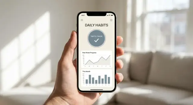
High-signal tracking fails when logging feels like homework. The best input patterns reduce decisions, typing, and context switching—so users can record an event in seconds and get back to their day.
Start every log screen with something already selected. Pre-fill fields with the last-used value, the most common option, or a sensible baseline (for example, “30 min” for a workout duration or “Medium” for mood intensity). Then let users change it only when needed.
Smart suggestions work best when they’re predictable:
This turns logging into confirmation instead of configuration.
Whenever possible, logging should be a single action:
If an entry needs details, let the first tap save the log immediately, then make “add details” optional. Many users will skip extras—and that’s fine if your core signal is captured.
People repeat routines. Give them templates like “Usual workout” or “Typical meal” that bundle multiple fields into one tap. Templates should be editable over time, but never required to set up before the app becomes useful.
A simple rule: if a user logs the same combination twice, the app should offer to save it as a template.
If logging fails when the network is weak, users stop trying. Allow entries to be saved instantly on-device and synced later. Make offline mode invisible: no scary warnings, no blocked buttons—just a subtle “Syncing when available” status so users trust nothing is lost.
A high-signal tracking app doesn’t need a complicated database. It needs a clear “unit” of tracking and a structure that preserves the truth of what happened while still enabling fast, friendly insights.
Start by deciding what one user action represents in your system:
Pick the smallest unit that users can log effortlessly, then build summaries on top.
To keep high-signal data, store raw events as your source of truth, then compute summaries for speed and clarity.
A practical baseline:
id, user_id, type, timestamp, optional value (number), optional notedate, type, total_count, total_value, streak, last_event_timeRaw events protect you from losing detail later. Summaries make charts load instantly and enable features like streaks without reprocessing everything.
Context should earn its keep. Add it when it meaningfully changes interpretation:
If a context field is optional but rarely used, consider auto-suggestions or defaults instead of forcing input.
Edits are unavoidable: mis-taps, late logging, duplicates. Decide early how to keep visualizations stable:
deleted_at) to preserve auditability and avoid confusing “missing data” artifacts.This model supports reliable trends, streaks, and retention-friendly feedback without drowning users in forms.
Collecting logs is only half the job. The value of a minimal-input tracker is that it turns tiny data points into answers a person can act on.
Rather than drowning users in raw events, compute a small set of metrics that summarize progress:
These are easy to understand and work well even when users skip days.
Insights should be anchored to time windows that match how habits change:
Use simple, defensible signals such as: crossing a threshold (e.g., “less than 3 days/week”), sustained improvement for two weeks, or a noticeable shift in average. Avoid treating one great (or terrible) day as a turning point.
If users log irregularly, exact numbers can mislead. Prefer:
Translate insights into light-touch suggestions that don’t sound clinical:
Frame recommendations as experiments the user can choose, not diagnoses or promises. The goal is fewer numbers, more clarity, and one next step.
A minimal-input tracker only feels “worth it” when the payoff is immediate. If users log something and can’t see what changed, they’ll stop—even if the data is technically being collected.
Your home screen should answer two questions in under a second:
Design the home screen around today’s action + a quick view of progress. That quick view can be as small as a single number (“3-day streak”), a tiny sparkline, or a simple status (“On track this week”). The key is that it’s visible without tapping into a dashboard.
Consistency beats variety. Pick 1–2 chart types and use them everywhere, so users learn the “visual language” once. Good options for most tracking apps:
Whatever you choose, make charts readable:
Avoid tiny text, faint colors, or “clever” axes. A chart that requires interpretation is a chart that won’t get used.
Freeform notes can quickly turn “minimal input” into homework. Add notes sparingly, only when they help explain outliers.
A good pattern is an optional, lightweight prompt after unusual events:
This keeps the core loop fast while still capturing context when it matters.
Reminders should feel like a helpful nudge at the right moment—not a demand for attention. The goal is to support the user’s routine so logging stays effortless and consistent.
Generic “Don’t forget to track!” messages train users to ignore you. Instead, tie prompts to moments that already happen:
This works because the reminder piggybacks on an existing habit, so it feels timely rather than random.
People have different tolerance for notifications. Put the controls upfront and keep them simple:
A good rule: fewer default notifications, clearer opt-ins. Users who choose reminders are far less likely to resent them.
A reminder should let users finish the job immediately. If they tap and land on a complex screen, you’ve added friction.
Design notifications that can log with one tap, such as:
This keeps the “prompt → action” loop under a few seconds.
Missed streaks happen. Avoid shaming language or dramatic alerts. Use gentle, specific prompts after a gap:
Offer an easy reset and adjust the plan. The best reminder strategy adapts to real life rather than punishing it.
A tracking app only works if people feel safe using it. When you ask for personal logs—mood, symptoms, cravings, spending, focus—you’re asking for trust. Earn it by collecting less, explaining more, and giving users control.
Start by deciding what the app must store to deliver the promised insight, and what’s merely “nice to have.” Every extra field increases risk and drop-off.
If something is optional, make that explicit in the UI. Optional data should never block the core experience, and it shouldn’t quietly change the app’s behavior without the user noticing.
The first run experience should answer three questions clearly:
Avoid legal-sounding text. Use short sentences and concrete examples, like “We use your check-ins to show weekly patterns” rather than “We process personal data to improve services.”
For many minimal-input trackers, on-device storage is enough for an MVP and reduces exposure.
If you store data locally:
If you add sync later, treat it as a product feature with its own consent screen and clear trade-offs.
Trust increases when users can take their data with them and remove it when they want.
Include:
When people understand what you collect and can control it, they’ll log more honestly—leading to higher-signal insights with less input.
An MVP for a minimal-input tracker isn’t “a smaller version of the full app.” It’s a carefully limited product that proves one thing: people will log quickly, and the app will return a result worth coming back for.
Keep the scope intentionally narrow:
This constraint forces the product to earn its value with signal, not features.
You have three practical paths:
Your “best” option is the one that helps you test the core loop with the least time spent on infrastructure.
If you want to move fast without locking yourself into a heavy pipeline, a vibe-coding workflow can help. For example, Koder.ai lets you build and iterate on a tracker from a chat interface, generate a React web app (with a Go + PostgreSQL backend), and even extend to Flutter for mobile—useful when your priority is validating the loop (log → feedback → next action) before polishing every edge case.
Before building real storage and charts, create a clickable prototype that simulates:
Test with a handful of people and measure: How many seconds to log? Where do they hesitate? Do they understand what the app will do for them after logging?
Define “success events” early so you can learn quickly:
If the MVP can’t clearly answer whether logging is easy and insights feel worthwhile, it’s not scoped tightly enough.
A minimal-input tracker only works if logging feels effortless and the feedback feels worth it. Your goal in testing is to prove (or disprove) that users can log in seconds, understand what the app is “for,” and return because the insights help.
Pick testers who match your target user, not just friends who like trying new apps. Aim for a mix of motivation levels: a few “super organized” people and a few who usually quit trackers.
Before they start, ask two quick questions:
Keep the test short and structured so you can compare results.
Measure:
Also watch for drop-off points: day 2 and day 5 are common “silent quit” moments.
Numbers tell you what happened; interviews tell you why. Do a 10–15 minute call or voice note check-in mid-week and at the end.
Prompts that surface confusion and waste:
Create simple materials that prevent misunderstandings:
Plan weekly reviews for the first month. Prioritize:
If your build setup supports fast iteration (for example, snapshots/rollback and quick redeploys—features available in platforms like Koder.ai), it becomes much easier to keep simplifying without fear of breaking what already works.
If retention improves when you simplify, you’re moving in the right direction.
It means users can record an event in seconds (often one tap) while the data still reliably produces actionable patterns.
A practical target is one screen, 1–3 choices per log, and under 10 seconds per entry.
Because extra fields increase friction and reduce consistency, which lowers data quality.
If you can’t name the specific insight or decision a field supports, make it optional or remove it.
Pick one core question the app answers for most users (e.g., “What triggers my afternoon cravings?”).
If the question doesn’t clearly imply what to log (and what not to log), it’s too broad for v1.
Define the decision the user will make from the data, then design backward.
Example:
Design it as Log → Learn → Act:
If feedback is delayed or hidden, the app will feel like data entry.
Use fewer event types with consistent meaning (e.g., did/skip, symptom occurred, craving happened).
If you can’t explain an event type in one sentence—or it rarely changes insights—it probably isn’t core.
Default-first input turns logging into confirmation:
Users should usually tap “save” without configuring anything.
Plan for missed days and partial entries:
This rewards honesty and keeps users from quitting after imperfection.
Start with a simple unit and structure:
This supports fast charts and reliable edits without a complex database.
Use simple, defensible insights:
Avoid medical claims and avoid overreacting to single-day spikes.