Sep 17, 2025·8 min
How to Create a Mobile App for On-the-Go Expense Notes
Learn how to build a mobile app for quick expense notes: key features, UX flows, offline capture, receipt scanning, data sync, security, testing, and launch.
What You’re Building and Why It Matters
An “on-the-go expense notes” app is a simple mobile tool for capturing spending the moment it happens—on a street corner, in a taxi, in an airport line. The emphasis is speed: minimal typing, a couple of taps, and you’re done. If the app requires long forms or perfect data entry, people won’t use it when real life gets busy.
Who it’s for
This type of app is especially useful for freelancers who track business expenses, small teams that need lightweight reimbursement records, and travelers juggling multiple currencies and receipts. It’s also helpful for anyone who regularly forgets what that “$18.40” charge was by the end of the week.
What you’ll build (and decide) in this guide
By the end of the article, you’ll have a clear plan for an MVP expense notes app that can:
- Capture a quick expense (amount, category, short note)
- Attach a receipt photo when available
- Work reliably when you’re offline and sync later
- Export simple expense reports when it’s time to invoice, file, or reimburse
You’ll also make a few practical decisions—what “fast capture” means for your users, which scanning approach fits your budget, and how to handle privacy without adding friction.
MVP first, then iterate
The goal isn’t to build a full accounting system. Start with a version people can use daily without thinking. Once you see real usage patterns, you can add smarter suggestions, better reports, and deeper integrations.
This guide stays focused: the intent is a shippable first release without getting lost in unnecessary complexity.
User Needs and Core Use Cases
If your app is meant for on-the-go expense notes, the core need is simple: capture the expense the moment it happens, even if the details are messy. People don’t want to “do accounting” at the checkout counter—they want a quick record they can trust later.
Key user jobs
Most users cycle through three jobs:
- Capture now: amount (or photo), merchant, and a quick hint like “client lunch.”
- Fix details later: category, tax/tip split, project/client, payment method.
- Submit/export later: share to finance, reimbursements, or personal budgeting tools.
Common pain points to design around
Speed problems are what usually break expense tracking habits:
- Lost receipts (paper fades, gets tossed, or never printed).
- Forgetting context (who the meal was with, which job it belongs to).
- Slow forms (too many required fields, too many screens, too much typing).
Pick a primary scenario
Choose one “default moment” your app nails better than anything else: coffee/taxi/meals while moving—one hand on the phone, bad lighting, limited time, spotty signal. This scenario should drive your MVP decisions (big buttons, minimal typing, graceful offline behavior).
Success metrics that keep you honest
Define measurable outcomes early:
- Time to log an expense: e.g., under 10–15 seconds for a basic entry.
- Completion rate: % of captured items that get finalized within 48 hours.
Simple user stories
- “As a traveler, I want to snap a receipt and save it instantly, so I don’t lose it before the hotel.”
- “As a consultant, I want to add a note like ‘Project Delta’ in one tap, so I can submit expenses correctly later.”
- “As a manager, I want a clean export, so reimbursements don’t require back-and-forth.”
MVP Feature Checklist for Expense Notes
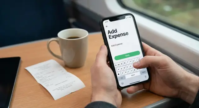
An expense notes app succeeds when it captures the essentials in seconds, then gets out of the way. For an MVP, focus on a single “Add expense” flow that reliably saves a record and makes it easy to find later.
Required fields (the minimum that still feels complete)
Start with these as your non-negotiables:
- Amount (with decimal support and clear currency display)
- Merchant (who you paid)
- Category (at least a small starter set)
- Date (when it happened)
- Note (a short description that helps later)
- Photo (optional to attach, but the app must support it)
Optional fields (useful, but shouldn’t block saving)
Add only if they’re fast to enter and clearly valuable:
- Project/client (for freelancers and teams)
- Payment method (cash, card, reimbursable, etc.)
- Tags (for flexible grouping like “travel” or “tax”)
What can be auto-filled
Auto-fill reduces friction and improves accuracy:
- Date/time set to “now” by default, editable.
- Currency based on device locale; allow manual change.
- Location only if the user opts in; keep the MVP usable without it.
Define what “note” means
Decide early: is “note” free text, or do you also offer templates (e.g., “Taxi to airport”, “Client lunch”)? For MVP, free text is enough. If you want more speed later, add a few quick-pick suggestions.
MVP scope vs. “later” list
MVP scope: create expense, edit, list/search, basic categories, photo attachment, simple totals.
Later: OCR scanning, smart category suggestions, exports, multi-currency conversions, team sharing.
UX Flow for Fast Capture in Real Life
A good expense notes app is built for the moment you’re actually spending money: standing at a counter, walking to a meeting, or juggling bags. The UX goal is simple—capture a usable record in seconds, with minimal thought.
Start with a one-tap entry point
Don’t make users hunt for the app. Offer at least one fast launch option:
- Lock screen widget or home screen widget for “New expense”
- App quick action (long-press icon) to jump straight into entry
- OS shortcuts (voice shortcut or automation) for frequent users
When the app opens, it should land directly on the capture screen—not a dashboard.
Choose an input pattern that matches speed
Two patterns work well:
- Single screen: amount, merchant, category, and note in one place. Best for experienced users and quick edits.
- Step-by-step: amount → category → details. Best when you want big inputs and fewer distractions.
If you choose step-by-step, keep the number of steps small and allow skipping optional fields.
Reduce typing with defaults and smart suggestions
Make the “right” entry easy by pre-filling:
- Last used payment method and category
- A default currency (with a quick toggle when traveling)
- Suggested merchants from recent history
Use a large numeric input for the amount, and keep text fields optional.
Support “save now, edit later”
Real life is messy. Let users tap Save as soon as they have an amount (or even just a receipt photo), then refine later.
A practical flow is:
- Save immediately → show a lightweight confirmation
- Send to an “Uncategorized” or “Needs review” list
- Allow quick edits from the list without reopening a full form
Accessibility basics that prevent friction
Fast capture fails if it’s hard to tap or read. Use large tap targets, clear labels (not icon-only), strong contrast, and reliable dark mode support. Ensure the primary action (Save) is reachable with one hand.
Receipt Photos and OCR Scanning Options
Receipt capture is where an expense notes app either feels effortless—or annoying. Your goal is simple: get a readable receipt photo with minimal friction, even when someone is standing in a queue or walking to a taxi.
Camera capture goals
Design the camera flow to “just work”:
- Auto-focus and auto-exposure tuned for paper (often glossy, often wrinkled).
- Clear framing hints (edge guides) and instant feedback like “Too dark” or “Move closer.”
- Fast capture with one hand: big shutter button, haptics, and quick retake.
Treat scanning as optional. Users should be able to save a photo instantly and move on, then let extraction happen in the background.
OCR options: on-device vs server-based
On-device OCR is great for privacy, offline use, and speed (no upload). It can struggle on older devices, unusual receipt formats, or low-quality photos.
Server-based OCR can be more consistent across devices and easier to improve centrally, but it adds upload time, requires network access, and raises privacy/compliance questions. If you go this route, be explicit about what is uploaded and how long it’s kept.
A practical approach is hybrid: try on-device first, then offer server OCR when the user is online and opts in.
What to extract (and what not to)
Start with high-confidence fields that power reporting:
- Total amount
- Merchant name
- Date
- Tax (optional)
- Currency (from symbol + locale hints)
Line items can wait; they add complexity and often aren’t needed for simple expense reports.
When OCR fails: make edits fast
Always provide a clean manual entry screen with quick edits: tap-to-fix amount/date, merchant suggestions, and a “Mark as unreadable” option.
Prevent duplicates
Add lightweight anti-duplicate checks: warn when a new receipt closely matches an existing one by total + time window + merchant similarity, and let users confirm rather than blocking them.
Offline Mode, Storage, and Sync Strategy
Iterate Without Fear
Experiment safely with snapshots and rollback when you change data models or sync behavior.
An expense notes app only feels “on-the-go” if it works in a subway, a client basement, or a parking garage. Treat offline as the default: users should be able to add an expense, attach a receipt photo, and move on—whether there’s a signal or not.
Offline-first: write locally, sync later
When a user taps Save, store the expense on the device immediately. Don’t block saving on a network call. That single decision removes most frustration and prevents lost entries.
For local storage, think in terms of a small encrypted database on the phone (for example, an encrypted SQLite-based store). It should hold:
- Expense fields (amount, currency, date, category, notes)
- Receipt metadata (filename, status, timestamps)
- A sync queue (what needs uploading)
Sync rules that won’t surprise people
Sync is where apps get weird. Pick a rule and communicate it.
- Last-write-wins is simplest: the newest edit overwrites older versions. It’s usually fine for expense notes because people rarely edit the same item on two devices at once.
- If you expect frequent multi-device edits (e.g., shared accounts), consider a light field-level merge: changing the category on one device shouldn’t erase a note edited on another.
Also decide what happens when an item is deleted on one device but edited on another. A common approach is a “soft delete” (marked deleted, synced, then cleaned up later).
Background uploads for receipt images
Receipt photos are large and often the first thing to fail. Save images locally, then upload in the background when online (and preferably on Wi‑Fi unless the user opts in). Uploads should be resumable so a spotty connection doesn’t restart from zero.
Clear feedback: queued, syncing, failed
Give users visible, calm status:
- Queued (saved and waiting)
- Syncing…
- Failed with a Retry button and an optional “retry all”
This turns sync from a mystery into a predictable part of the experience.
Tech Stack Choices Without Overthinking
You can build a great expense notes app with many different tools. The goal isn’t to pick “the best” stack—it’s to pick one your team can ship and maintain.
Platform: iOS, Android, or Cross-Platform
If your team already knows Swift/SwiftUI or Kotlin/Jetpack Compose, native apps are often the quickest path to a polished, reliable capture experience (camera, offline storage, share sheet).
If you need both platforms with a small team, choose one cross-platform option and commit:
- Flutter: strong performance, consistent UI, good camera and offline packages.
- React Native: fast iteration if you already know web/JS, large ecosystem.
A practical MVP rule: if you have one mobile engineer, go cross-platform; if you have dedicated iOS + Android talent, go native.
App architecture: keep it predictable
Use a simple, consistent pattern so features like “edit expense,” “attach receipt,” and “sync status” don’t turn into spaghetti:
- MVVM (common in native and Flutter) works well for forms and state.
- Redux-style state (common in React Native) is great when offline + sync introduces lots of app states.
Don’t over-engineer: a clean separation between UI, state, and data layer is usually enough.
Backend: only what you actually need
Many MVPs need four things:
- Auth (email, Apple/Google sign-in)
- Database (expenses, categories, settings)
- File storage (receipt photos)
- Search/export (basic filtering and CSV/PDF generation)
A managed backend (Firebase, Supabase) reduces setup time. A custom backend (Node/Django/Rails) gives more control if you expect complex reporting or strict compliance.
If you want to move fast without rebuilding your whole pipeline, a vibe-coding platform like Koder.ai can also be useful at the MVP stage: you can prototype the core flows (expense list, capture form, receipt upload, export screens) through a chat-driven workflow, then export source code when you’re ready to take over maintenance. It’s particularly aligned with common MVP choices like a React web dashboard plus a Go + PostgreSQL backend, and it supports planning mode, snapshots, and rollback to keep iteration safe.
API shape (keep it boring)
Design endpoints around the core objects:
POST /expenses,PATCH /expenses/{id}POST /receipts(upload), link to an expenseGET /expenses?from=&to=&category=POST /exports(returns a downloadable file)
Cost and complexity tradeoffs
Cross-platform saves build time but can add effort for camera/OCR edge cases. Managed backends lower cost early, while custom backends can be cheaper long-term once you have scale and a clear roadmap. If you’re unsure, start managed and leave a path to migrate later (see /blog/offline-sync-basics).
Security, Privacy, and Permissions
Build Exports That Work
Create a simple CSV or PDF export screen and refine the report format with real users.
An expense notes app quickly becomes a container for personal and business-sensitive information. Treat security and privacy as core product requirements, not “nice to have” tasks for later.
What counts as sensitive data?
Even if you’re not storing bank details, you’ll still handle information that can reveal spending habits or business activity:
- Receipt photos (often include partial card numbers, store addresses, and tax IDs)
- Merchant names, line items, and totals
- Dates, timestamps, and (if you add it) location context
- Notes like “client dinner” or “team travel”
Basic protections that users expect
Start with a simple, defensible baseline:
- Encryption in transit: use TLS for all API calls so data isn’t readable over public Wi‑Fi.
- Encryption at rest: encrypt sensitive data on-device (where possible) and in your cloud database/storage.
- Least-privilege access: keep receipt images and parsed data in separate buckets/collections with strict rules.
If you use third-party OCR, be explicit about what gets uploaded, how long it’s stored, and whether vendors can use it for model training.
Permissions: ask only when needed
Permissions are a trust moment. Request them at the point of use, with plain-language explanations:
- Camera: only when the user taps “Scan receipt.”
- Photos/Media library: only when they choose “Upload from gallery.”
Avoid requesting location by default; many users don’t expect it for expense notes.
Account access and app-level lock
For most MVPs, email + magic link/OTP is enough. Add SSO later if your target users are in workplaces that need it.
Also consider a device-level lock option (Face ID/Touch ID/PIN) for opening the app or viewing receipts—especially for shared devices.
Retention and deletion as product features
Make privacy controls visible:
- Export then delete: allow users to download an expense report and remove the underlying data.
- “Delete account” that actually removes receipts, OCR text, and backups within a clear timeframe.
- Optional retention rules (e.g., keep receipts for 90 days or 7 years).
Clear settings here reduce support requests and increase confidence when users store real receipts in your app.
Categories, Currency, and Smart Suggestions
Good organization is what turns a pile of quick notes into something you can actually report on later. For an expense notes app, that usually means three things: a category model that doesn’t get in the way, currency handling that’s “good enough” for travel, and lightweight suggestions that remove repetitive typing.
A simple categorization model (that can grow)
Start with a short fixed list most people recognize (e.g., Meals, Transport, Lodging, Office, Entertainment, Fees). Keep it under ~10–12 to avoid choice overload.
Then add custom categories as an escape hatch. Two practical rules:
- Let users rename/delete their custom categories.
- Don’t allow duplicates that differ only by casing (“Taxi” vs “taxi”).
Smart suggestions with lightweight rules
You don’t need “AI” to feel smart. Build a tiny rules layer:
- Track frequent merchants and suggest the last-used category for that merchant.
- Suggest recently used categories at the top of the picker.
- If a user changes the category, ask (once) whether to “remember this for next time.”
This reduces capture time without forcing automation.
Multi-currency basics without overcomplication
Store both:
- Original amount + original currency (what the receipt shows)
- Converted amount + base currency (what reports use)
Conversion can use a daily rate (good enough for MVP). Show the rate used and date so totals don’t feel mysterious.
Tax/VAT fields: only if your users need them
Unless you’re targeting business reimbursements from day one, keep VAT as optional: a single “Tax included?” toggle or a separate “Tax” field hidden behind “Add details.”
Search and filters that match real questions
Make it easy to answer: “What did I spend on X last month?” Support filters for date range, category, amount, and merchant, plus a simple keyword search across notes and merchant names.
Exports and Simple Expense Reports
Capturing expenses is only half the job—eventually you need something you can hand to accounting, upload to a reimbursement portal, or save for your own records. Exports are where an expense notes app becomes a practical tool.
Export formats to support (now vs. later)
Start with formats that are easy to generate and widely accepted:
- CSV for spreadsheets and accounting tools (the best “universal” option).
- PDF summary for a clean, read-only report you can email or upload.
If you plan to integrate with tools later (e.g., accounting platforms), design your export data model so you can add integrations without changing how entries are stored.
A simple “expense report” flow
Keep the reporting experience predictable:
- Select range (this month, last month, custom dates).
- Review (totals by category, missing receipts, uncategorized items).
- Export / share (save to files, email, share sheet).
Add an optional filter like project/client if your app supports it, but don’t make it mandatory.
Receipts: links vs. embedded attachments
Decide how receipts travel with the report:
- CSV + receipt links: include a URL or local file reference for each entry.
- PDF with embedded thumbnails: better for auditors, larger file size.
Whichever you choose, make it obvious when a receipt is missing.
File naming conventions that stay organized
Use consistent names such as:
expenses_2025-01-01_to_2025-01-31_jordan.pdfexpenses_2025-01_project-acme.csv
Audit-friendly fields to include
Even a lightweight app should export:
- Created time and edited time
- Source (manual vs. OCR)
- Currency, category, merchant (if available), and notes
These details reduce back-and-forth when someone asks, “When was this entered, and where did it come from?”
Testing for Real-World Conditions
Launch a Solid Stack
Set up a React plus Go plus PostgreSQL foundation without wiring everything by hand.
An expense notes app succeeds or fails on messy moments: bad lighting, no signal, and one hand free while walking. Testing should reflect that reality, not just “happy path” demos.
Essential functional tests
Start with a small set of tests that protect your core flow (capture → save → sync → export):
- Form validation: required fields (amount, date), sane limits, negative values, currency formatting, and “unknown merchant” handling.
- Offline queue: create/edit/delete expenses with no connection and confirm they’re stored locally and shown in the UI immediately.
- Sync retries: simulate network drops mid-sync and verify backoff, conflict handling (same item edited twice), and “last synced” status.
- OCR fallback: when OCR fails, ensure users can still save with manual entry, and that partial OCR results are clearly editable.
Device and environment testing (the stuff that breaks camera features)
Manually test on a few real devices (not just one flagship):
- Poor lighting and glare on glossy receipts
- Shaky capture (walking, one-handed), and focus delay
- Airplane mode and low-signal areas (including switching Wi‑Fi ↔ cellular)
- Low storage warnings and limited memory conditions
Performance checks that users feel
Measure a few “felt” timings and keep them consistent across builds:
- App launch time to the capture screen
- Camera startup time and time to first clear frame
- Time from tap “Save” to seeing the expense in the list (even if syncing happens later)
Crash reporting and basic analytics
Set up crash reporting early so you catch device-specific issues. Add lightweight event tracking for key steps (open capture, receipt photo taken, OCR success/failure, sync success/failure), and avoid logging sensitive text or full receipt images.
Run a small beta with a short survey
Invite 10–30 people who actually travel or submit expenses. Keep feedback structured:
- What was the last time capture felt slow or confusing?
- Did they trust offline mode?
- How often did receipt capture or OCR fail?
- What did they export, and was the exported report usable?
Launch, Onboarding, and Iteration Plan
A smooth launch isn’t about having every feature—it’s about making sure the first-time experience proves the app’s value in under a minute: log an expense, attach a receipt, and find it later.
Launch checklist (what to ship with)
Prepare store presence and compliance details early so you’re not rushing the week before release:
- App store metadata: clear title/subtitle, keyworded description, and a one-line value promise (e.g., “Save receipts and export expense reports fast”).
- Screenshots: show the capture flow first (amount → category → receipt), then offline mode, then export.
- Privacy details: explain what you collect (email, device ID, analytics), what stays on-device, and how receipt photos are handled.
- Support basics: a short FAQ, contact email, and a simple “report a problem” form.
Onboarding (3–5 screens, max)
Keep onboarding short and action-driven:
- Show Quick Capture (amount, category, optional note).
- Ask for only essential permissions when needed (camera at “Add receipt,” not upfront).
- Offer a sample expense users can edit, then prompt them to log their first real one.
Pricing options
Pick one model and keep it easy to understand:
- Free tier: manual entry + limited monthly exports.
- Subscription: unlimited receipts/OCR and cloud sync.
- Team plans: shared workspaces, approval flow, admin controls.
(If you’re building with Koder.ai, these tiers map cleanly to staged capability: start with a free MVP, then gate advanced features like OCR, cloud sync, and team workspaces behind Pro/Business—while keeping Enterprise options available for compliance and custom deployment needs.)
Post-launch metrics that actually matter
Track behavior tied to user value:
- Retention: D1/D7/D30.
- Expenses logged per week per active user.
- Export usage: how many users generate a report (and how often).
Iteration roadmap
Use real usage to prioritize:
- Shortcuts: widgets, “repeat last expense,” quick category chips.
- Integrations: accounting tools, email forwarding, shared drives.
- Approvals: submit → review → reimburse.
- Automation: smarter category suggestions, mileage, recurring expenses.
FAQ
What is the goal of an on-the-go expense notes app?
Focus on speed and trust: users should be able to save an expense in seconds, even with messy details.
A solid MVP usually supports:
- Quick capture (amount, merchant, category, short note)
- Optional receipt photo
- Offline saving with later sync
- Simple search/filtering and basic totals
- Export (CSV and/or a simple PDF)
What should the MVP capture flow optimize for in real life?
Design for the “one hand, no time, bad lighting, spotty signal” moment.
Practical MVP choices:
- One-tap entry point (widget/quick action)
- Default date/time = now
- Minimal required fields (keep optional fields skippable)
- Big tap targets and a reachable Save button
- “Save now, edit later” with a Needs review list
What fields should be required vs. optional in an MVP?
A good minimum set is:
- Amount (with clear currency)
- Merchant
- Category (small starter list)
- Date
- Note (short context like “client lunch”)
How should I handle categories without slowing users down?
Start with a short, familiar list (around 10–12 categories) to avoid choice overload.
Then add custom categories as an escape hatch:
- Allow rename/delete
- Prevent duplicates that differ only by casing
- Keep “Uncategorized/Needs review” for fast saves
How do I design receipt photo capture so it feels effortless?
Make receipts optional and frictionless:
- Fast camera startup, big shutter button, quick retake
- Edge/framing hints and simple feedback (e.g., “Too dark”)
- Save the photo instantly, then process later
Treat OCR as a later enhancement or a background step—not something that blocks saving.
Should I use on-device OCR or server-based OCR?
On-device OCR:
- Pros: better privacy, works offline, no upload latency
- Cons: can be weaker on older devices or poor photos
Server-based OCR:
- Pros: more consistent results, easier to improve centrally
- Cons: needs network, adds upload time, raises privacy/compliance concerns
A practical compromise is : on-device first, then optional server OCR when online and opted in.
How do I implement offline-first behavior and reliable sync?
Treat offline as the default: save locally first, sync later.
Key practices:
What’s the simplest way to handle sync conflicts and deletes?
Keep it predictable and low-friction:
- Last-write-wins is often enough for single-user expense notes
- Use soft delete (mark deleted, sync, then clean up)
- If you expect edits from multiple devices/users, consider field-level merge (e.g., category change shouldn’t overwrite a note edit)
How should I handle permissions and privacy without adding friction?
Request permissions at the point of use and explain why in plain language:
- Ask for Camera only when the user taps “Scan receipt”
- Ask for Photos/Media only when they choose “Upload from gallery”
- Avoid Location by default (offer opt-in later)
Also consider app-level lock (Face ID/Touch ID/PIN) if receipts may be sensitive.
What export options should an MVP include for expense reports?
For MVP, prioritize the formats people can actually use:
- CSV (universal for spreadsheets/accounting tools)
- PDF summary (easy to email/upload)
Include audit-friendly fields:
- Created/edited timestamps
- Source (manual vs. OCR)
- Currency, merchant, category, notes