Jun 23, 2025·8 min
How to Create a Mobile App for Online Learning & Courses
Plan, design, and build a mobile learning app: course structure, video, quizzes, payments, analytics, and launch steps for iOS and Android.
Plan, design, and build a mobile learning app: course structure, video, quizzes, payments, analytics, and launch steps for iOS and Android.
A learning app can’t be “for everyone” and still feel great. Before you think about screens and features, get crisp on who you’re building for, what pain you’re removing, and how you’ll know it’s working.
Pick one main group and design decisions will get easier:
Write it as a sentence: “This app is for busy working adults who learn in short sessions on their commute.”
Keep it outcome-focused (not features). Examples:
If a feature doesn’t help solve one of these, it’s probably not MVP.
Pick a single “north star” metric that matches your goal:
Define it precisely (e.g., “% of new users who finish Lesson 1 within 48 hours”).
Decide what you’re optimizing for:
Your model influences onboarding, pricing screens, and what you measure from day one.
Before you pick features or screens, decide what “learning” should feel like in your app. A clear learning experience helps you design the right course structure—and prevents you from building a random collection of videos with no path.
Most online learning apps follow a predictable flow. Sketch it early so each step has a purpose:
Discover course → enroll → learn → test → earn certificate.
For each stage, note what the learner needs to see and do on mobile. For example, “discover” may require search, filters, and previews, while “learn” needs reliable playback and a clear “next lesson” action.
Pick the primary format first, then add secondary formats only if they support the goal.
A clean hierarchy helps learners understand “where they are” and helps you organize content at scale. A common model is:
Categories → courses → modules → lessons.
Keep naming consistent (don’t mix “chapters,” “units,” and “modules” unless they mean different things). On mobile, learners should always be able to:
Even a great course can feel frustrating if the delivery isn’t mobile-friendly. Decide up front whether you need:
These choices influence your course structure. For example, offline mode is easier when lessons are discrete units with clear download boundaries, rather than long streams.
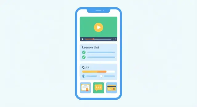
A great mobile learning app isn’t defined by how many features it has—it’s defined by whether each role can reliably complete their job: learn, teach, or run the business. Below is a practical feature checklist you can use for your online course app or LMS mobile app.
Start with a smooth onboarding flow: sign up (email, Apple/Google), pick interests, and get a quick “how it works.” After that, the essentials are about discovery and momentum.
Engagement isn’t a gimmick—it’s reducing friction.
For a course creator app, the creator workflow matters as much as the learner experience.
Trust features directly impact conversion and retention.
If you’re planning eLearning app development for an MVP, prioritize: catalog → purchase/enroll → lesson player → progress → basic instructor uploads. Everything else can layer on without breaking the core.
Mobile learning succeeds when the app feels effortless: learners can resume quickly, find the next lesson in seconds, and never wonder “where am I?” A clean structure and a few consistent patterns beat fancy screens every time.
Aim for a bottom navigation with four core areas: Home, Search, My Learning, and Profile. This keeps common actions one tap away and reduces “back button” fatigue.
Within My Learning, show active courses first and make “Continue” the primary action. Learners often open an online course app for a 3–5 minute session—optimize for fast re-entry.
Before polishing visuals, wireframe the screens that drive learning outcomes:
These screens set the tone for your LMS mobile app and prevent feature creep.
Accessibility isn’t a “nice to have,” especially for long reading and video content.
Use readable typography (avoid tiny text), strong contrast, and large tap targets. Support Dynamic Type (iOS) and font scaling (Android). Ensure buttons and form fields work well with screen readers, and don’t rely on color alone to indicate correct/incorrect quiz answers.
Design for small phones first, then scale to tablets. Test orientation changes, especially in the lesson player and quizzes. Account for one-handed use, commuting glare, and intermittent attention by keeping controls reachable and progress always visible.
If you want a deeper UX checklist for your mobile app MVP, keep a running set of rules in your product doc and validate them during every design review.
Great learning apps feel “instant”: the next lesson loads quickly, the app remembers where you stopped, and practice happens right after the concept. This section covers the delivery building blocks that make that experience.
Plan for adaptive streaming (HLS/DASH) so the app automatically adjusts quality to the learner’s connection. Add resume playback (continue from the last timestamp across devices) and consider picture-in-picture only if your lessons benefit from multitasking (e.g., following along in another app).
A small but important detail: show clear loading states and a “next lesson” action so learners don’t bounce after finishing a video.
Offline access is often the difference between “I’ll learn later” and “I learned on the train.” Define rules early:
Quizzes drive retention, but only if they’re quick to take and easy to understand. Support a few common question types (multiple choice, multi-select, true/false, short answer). For credibility, add timers, randomization, and attempt limits where needed.
Make feedback intentional: instant explanations for practice quizzes, or delayed results for graded tests.
Certificates should be tied to clear completion rules (e.g., watch 90% of videos + pass final quiz). Offer download/share options and a verification link that anyone can open to confirm authenticity.
If you include live sessions, keep it simple: scheduling, reminders, basic attendance, and automatic access to recordings after the class ends.
Monetization isn’t only “how you charge.” It’s also how you package access so learners feel confident buying, and so support requests don’t explode later.
Start by defining what a learner gets immediately after paying—and what they can try before paying.
A few patterns that work well for an online course app:
Be explicit about access duration: lifetime access, 12 months, or “while subscribed.” Avoid surprises.
Most mobile learning apps use one (or a mix) of:
If you plan to offer corporate or group access later, keep your pricing model flexible enough to add “seats” without rewriting everything.
You generally have two implementation paths:
Decide based on your audience and operational needs, then design your account system so purchases reliably unlock content on every device.
Plan early for:
Even a simple MVP benefits from a clear “Billing” screen with purchase history and renewal status.
For packaging and pricing guidance, see /pricing. If you need help choosing a checkout approach, reach out via /contact.
Your learning app lives or dies on the “boring” foundation: who the user is, what they’re allowed to do, and what the app remembers about them. If you get this right early, everything else—courses, quizzes, certificates, payments—gets easier to ship and maintain.
Most apps begin with email + password and add convenience logins later.
Tip: design your account system so a user can link multiple login methods to one profile, avoiding duplicate accounts.
Define roles early and keep them crisp:
Instead of hard-coding behavior everywhere, map actions to permissions (e.g., “create course,” “publish lesson,” “issue certificate”). This prevents messy “if role == …” logic as the app grows.
At minimum, plan for these entities:
Keep progress data event-based (e.g., “completed lesson X at time Y”) so you can rebuild summaries later.
Use push notifications for reminders and course updates; add in-app announcements for messages users can revisit. Email is optional, but helpful for receipts and account recovery.
For privacy, collect only what you need, explain why, and get clear consent for marketing. Also make it easy to manage notification preferences and delete an account when required.
Tech decisions can stall a project. For a mobile learning app, keep it simple by choosing options that fit your timeline, budget, and the learning experience you’re building (video-heavy? offline? enterprise users?).
Native (Swift iOS, Kotlin Android) is best when you need top performance, deep device features, or very polished offline playback. The tradeoff is higher cost because you’re maintaining two codebases.
Cross‑platform (Flutter or React Native) is a strong default for most online course apps: one shared codebase, fast iteration, and good performance for video, quizzes, and downloads.
PWA (Progressive Web App) is the quickest way to validate demand. It’s great for lightweight learning and content browsing, but has limitations around app store distribution and some background/offline behaviors.
If you’re trying to move fast on a prototype, a vibe-coding workflow can help you validate flows before committing to a long build. For example, Koder.ai lets teams describe screens and backend needs in chat, generate a React web app or Flutter mobile app with a Go + PostgreSQL backend, and export the source code when you’re ready to take it further.
If you want a fully custom product and monetization model, building your own backend (API + database) gives you flexibility: user accounts, enrollments, progress tracking, certificates, and admin tools.
If speed matters more, consider integrating an LMS and extending it. You keep course management, roles, and reporting “out of the box,” then build a mobile front end and add only what’s missing (custom UI, payments, community features). This can reduce risk for your first release.
For a video learning app, avoid serving video from your main server. Use video hosting/streaming (adaptive bitrate), put content behind a CDN, and optimize images (multiple sizes, modern formats). Plan early for offline mode: downloaded lessons should be encrypted or access-controlled, not just saved as open files.
You don’t need “AI recommendations” on day one. Start with categories, tags, and filters, plus basic search across course titles and lesson names. Add “popular” and “continue learning” sections to make the app feel smart without heavy engineering.
Use HTTPS everywhere, token-based authentication (short-lived access tokens, refresh tokens), and secure file access (signed URLs or authenticated streaming). Also log key events (logins, purchases, downloads) so you can investigate issues without guessing.
A great mobile learning app doesn’t start with every feature you can imagine—it starts with a complete, reliable “learning loop” users can finish. Your MVP should let someone discover a course, enroll, learn, and see progress without friction.
Ask: “What’s the minimum set of screens and flows needed for a learner to get value on day one?” If the app can’t deliver a full experience end-to-end, you’ll struggle to learn what’s working.
A practical MVP scope for an online course app often includes:
This is enough to validate demand, pricing, retention, and content quality—key for eLearning app development.
Many features sound essential but don’t help you validate the core loop early. Consider postponing:
You can still design your UX to “leave room” for them later.
Create a backlog that’s easy to execute:
A clear roadmap keeps your mobile app MVP focused, helps stakeholders align, and prevents scope creep from slowing down your first release.
Analytics and progress tracking answer two different questions: Are learners succeeding? and Is the app succeeding as a business? If you define both early, you’ll avoid collecting random data that never gets used.
Treat analytics as a “minimum viable language” your product speaks. A good starter set of analytics events for a mobile learning app includes:
Keep event names stable, and add properties like course_id, lesson_id, and device/OS version so you can segment issues later.
Raw event counts don’t tell you whether the learning experience works. Focus on learning metrics that are easy to explain to non-technical stakeholders:
If you see a sharp drop at one lesson, review that specific content first (video length, clarity, prerequisites) before assuming the whole course is the problem.
To understand revenue health, track:
Numbers tell you what happened; feedback helps explain why. Add lightweight channels:
Make sure every feedback item is tied to course/lesson IDs so it’s actionable.
Plan A/B tests carefully and only when you have enough users. Start with high-impact, low-risk tests (e.g., onboarding copy), run one test at a time, and define success metrics upfront so you don’t “fish” for a positive result.
Testing is where a learning app earns trust. If lessons don’t load, progress resets, or quizzes mark correct answers as wrong, learners won’t come back—no matter how good the content is.
Start with the flows that happen every day:
Test on a mix of devices (small/large screens, older phones, tablets) and major OS versions for both iOS and Android. Include accessibility checks: scalable text, screen reader labels on buttons, sufficient contrast, and usable tap targets. A course app should be comfortable for long sessions, not just “works on my phone.”
Set measurable targets and fail builds that miss them:
Do a final review of permissions and data handling: what you collect, where it’s stored, and how it’s protected. Verify auth flows, session timeouts, and that private course content isn’t accidentally exposed via share links or cached files.
A good rule: if you’re tired of testing, learners are about to start using it.
A great learning app can still fail at launch if users don’t understand what it does, can’t sign up smoothly, or run into issues on day one. Treat launch as a planned project: store readiness, onboarding, and a sustainable ops routine.
Before you submit, prepare your store assets like you would a mini landing page.
Also plan for the practical constraints: app review timelines, age rating, privacy disclosures, and the wording of any subscription or trial. A common mistake is launching with store text that doesn’t match what the user sees after installing.
A staged rollout reduces risk and gives you real feedback before marketing spend.
Closed beta → public release → first content expansion is a simple, effective sequence.
Your onboarding should guide users into a first lesson within minutes.
Make it feel like a coach, not a form:
After launch, the real work is consistency.
Set up an internal workflow for:
Finally, schedule a weekly app health review: top complaints, top drop-off step, and the next improvement to ship. Operations is how your launch turns into retention.
Start by writing a one-sentence audience statement (e.g., “busy working adults who learn in 5–10 minute sessions”). Then pick the top 3 outcomes you’ll deliver and one north-star metric (like “% of new users who finish Lesson 1 within 48 hours”).
If a feature doesn’t clearly support those outcomes, it’s likely not MVP.
You can, but it usually feels generic. Choose one primary audience and a clear “runner-up” so product decisions stay consistent.
For example:
Design the core flow for the primary group, then add role-specific features later.
A practical, outcome-focused set is:
Keep these phrased as learner outcomes, not features, so scope stays tight.
Pick one primary metric that matches your business goal and define it precisely.
Common options:
Example definition: “Percent of new users who complete Lesson 1 within 48 hours of signup.”
A clean hierarchy makes navigation, progress, and scaling easier. A common structure is:
On mobile, ensure learners can always:
Choose one primary format first, then add secondary formats only if they support the learning goal.
Typical picks:
Make a decision early because it affects content structure, storage, and DRM/security.
Practical rules to define:
Offline is easiest when lessons are discrete, well-bounded units.
A solid MVP usually includes:
Add streaks, community, and advanced analytics later without breaking the core loop.
Use a small, consistent event set and tie it to course/lesson IDs.
Track events like:
Then analyze learning quality with completion rate, time-to-complete (median), and drop-off by lesson.
It depends on your timeline, budget, and requirements.
Choose based on the learning experience you’re shipping (video-heavy, offline, enterprise SSO, etc.).
“Blended” works best when the structure stays consistent lesson to lesson.