Sep 25, 2025·8 min
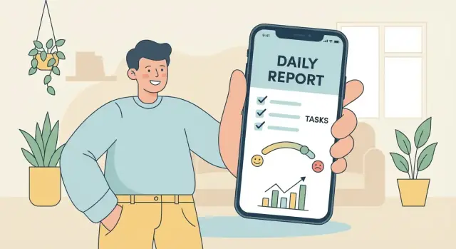
How to Build a Mobile App for Personal Daily Reports
Learn how to plan, design, and build a mobile app for personal daily reports—data fields, UX, storage, privacy, reminders, testing, and launch steps.
What a Personal Daily Reports App Is (and Why Build One)
A personal daily reports app is a simple place to log how your day went—quickly, consistently, and in a format you can review later. Think of it as a lightweight personal tracker app that turns small daily inputs into a reliable record.
What “daily reports” can include
Daily entries can be as structured or flexible as you want. Common examples include habits (did you exercise, read, drink water), mood (a 1–5 rating plus a short note), health signals (sleep hours, symptoms, medication), and work notes (top tasks, blockers, wins). Some people add spending, meals, or a short reflection prompt like “What helped today?”
Who it’s for
This kind of daily report app can be built for:
- Self-use: a mood journal app or habit tracking tool tailored to your routines.
- A small team: quick daily check-ins (what I did / what I’ll do / blockers) without heavy project tools.
- Coach + client: a shared log for accountability, where the client submits entries and the coach reviews patterns.
The difference isn’t just features—it’s privacy, sharing, and how “official” the reports need to be.
Why build one (instead of using an existing app)
Building your own MVP mobile app lets you keep the template exactly as you like, avoid clutter, and control your data. Even a basic version can reduce forgotten details, improve consistency, and make progress visible.
This guide stays practical and non-technical: you’ll build an MVP first (the smallest useful version), then expand.
Set Clear Goals and a Simple Use Case
A personal daily reports app can be many things: a mood journal, a habit tracker, a lightweight work log, or a private “what happened today?” notebook. If you try to serve all of those from day one, you’ll end up with a cluttered form that people avoid.
Start with the outcome you want
Before you sketch screens, write down the main outcome in plain language. Most daily report apps aim for one (or two) of these:
- Reflection: capture thoughts, energy, mood, and learnings
- Accountability: record whether you did what you planned (habits, routines)
- Trend tracking: spot patterns over weeks (sleep vs. mood, stress vs. workouts)
- Documentation: keep a reliable record (work updates, symptoms, caregiving notes)
Pick the outcome that matters most, because it should dictate what your daily entry asks for—and what it does not ask for.
Choose 1–2 primary use cases
Keep your MVP centered on a single daily ritual. Examples:
- Daily mood + 3 habits: quick sliders/toggles, plus an optional note
- Work standup notes: “Yesterday / Today / Blockers” with tags for projects
If you’re tempted to add a second use case, make sure it shares the same entry flow and doesn’t require a separate set of screens.
Define success metrics you can actually measure
Decide how you’ll know the app is working:
- Daily completion rate (e.g., % of days with an entry)
- Time to log (target: under 60–90 seconds)
- Retention (do people still log after 2–4 weeks?)
List constraints early
Write down constraints that will shape your design decisions: available build time, budget, privacy requirements (local-only vs. cloud sync), and whether the app must work offline first. Clear constraints prevent feature creep and keep the app easy to use.
Design Your Daily Report Template (Fields and Rules)
A daily report app succeeds or fails on the template. If it’s too long, people skip days. If it’s too vague, you can’t learn anything later. Start with a small set of fields you’ll actually fill in when you’re tired, busy, or traveling.
Decide what to capture (and keep it scannable)
Pick 6–10 inputs max for your first template, mixing “fast taps” with one optional free-text field.
Common field types that work well:
- Text: “What went well?” (1–3 lines)
- Sliders: mood, stress, energy (0–10)
- Checkboxes: workouts, vitamins, meditation, alcohol
- Numbers: hours slept, steps, spending, pages read
- Photos: meal photo, whiteboard snapshot (optional; can be storage-heavy)
- Tags: “work”, “family”, “travel”, “sick” (great for later filtering)
If you’re unsure, prefer sliders/checkboxes over text. They’re faster and easier to analyze.
Required vs. optional fields (your “minimum viable entry”)
Define a clear “save” rule:
- Required fields should be the ones you can answer in under 20 seconds (e.g., mood + one note).
- Optional fields add richness when you have time (photos, longer reflections, extra metrics).
This prevents the template from feeling like homework while still creating a consistent record.
Time rules: cutoff and time zones
Daily reports need a single, predictable definition of “today.” Decide:
- When a day “ends” (midnight, 3 a.m., or a custom cutoff for night owls)
- What happens when someone travels (store both local time and a home time zone reference)
A simple option: base the entry on the user’s current local day, but keep an internal timestamp so exports stay accurate.
Editing policy: fixing yesterday without breaking history
People will forget or want to correct entries. Allow editing at least the previous day (often the last 7 days). If insights matter, consider tracking changes:
- Store
created_atandupdated_at - Optionally keep a lightweight “revision history” (old value + timestamp) for key fields
These rules make your daily report app feel forgiving while keeping your data trustworthy.
Map the User Flow and Keep the UI Friction Low
A personal daily reports app succeeds when logging feels effortless. Before you polish visuals or add analytics, map the simplest path a person will take each day: open the app, record a few details, and move on.
Start with 3–5 core screens
Keep the first version small and predictable:
- Home: today’s status (logged/not logged), a prominent “New report” button, and a quick glance at yesterday.
- New Report: the form (or checklist) with smart defaults.
- History: a calendar or list to browse past entries and edit if needed.
- Insights: simple trends (streaks, averages)—even one chart is enough.
- Settings: reminders, export, privacy options.
If you can’t explain what each screen does in one sentence, it’s probably doing too much.
Make logging fast (seconds, not minutes)
Reduce typing and decisions:
- Pre-fill fields with defaults (today’s date, last-used tags).
- Prefer quick taps: sliders, chips, yes/no toggles, and short pickers.
- Offer last-used values for recurring items (same workout, same location, same project).
- Add voice input only if it truly speeds up your audience (for example, a “Dictate note” button).
Accessibility and microcopy that prevent drop-off
Accessibility basics improve everyone’s experience: large tap targets, readable font sizes, strong contrast, and an optional dark mode.
Pair that with clear microcopy:
- Labels that match real language (“Energy” vs. “Vitality score”).
- Short hints (“One sentence is enough”).
- Friendly empty states in History/Insights (“No entries yet—add your first report to see trends”).
When in doubt, optimize for the fastest successful entry—even if it means fewer features on screen.
Choose MVP Features vs. “Later” Features
An MVP isn’t a “tiny version” of your idea—it’s the smallest set of features that makes the app genuinely useful in the first week. For a personal daily reports app, that usually means: can I fill it in quickly every day, find past entries, and get a small payoff for being consistent?
A good “first week” MVP scope
If someone installs your app on Monday, they should be able to:
- Create a daily entry in under 60 seconds
- Trust that it’s saved (even if they close the app)
- Review what they wrote yesterday
- See a simple pattern by the weekend
Example MVP feature set
Keep the first release focused on daily capture and retrieval:
- Daily form (your template fields)
- Save + edit (including “oops, I forgot” changes)
- Calendar or list view to browse days
- Search (even basic keyword search is surprisingly valuable)
- Basic charts (e.g., mood over time, counts of a few tags)
This set gives users a complete loop: record → store → find → learn.
“Later” features to postpone
These can be great, but they add complexity and slow down learning what people actually want:
- AI summaries or insights
- Community, sharing, or social feeds
- Advanced automation (integrations, rules engines, shortcuts)
- Highly customizable dashboards
- Gamification systems with points, streak recovery, badges, etc.
Build a simple backlog and prioritize
Create a backlog with three columns: Idea, User value, Effort. Then prioritize what’s high value / low effort first.
A quick rule: if a feature doesn’t help a user complete a daily entry or review past entries, it’s probably not MVP. Save it for iteration once you have real usage data and feedback.
Pick the Tech Approach That Matches Your Skills and Budget
Own the App You Build
Keep control by exporting source code when you are ready to own the stack.
The “right” tech stack is the one you can finish, ship, and maintain. For a personal daily reports app (mostly forms, reminders, and simple charts), you don’t need fancy technology—you need steady progress.
If your goal is to validate the workflow quickly, a vibe-coding approach can work well: for example, Koder.ai lets you describe screens, fields, and logic in chat, then generates a working web app (React) or mobile app (Flutter) with a Go + PostgreSQL back end when you need it. It’s a practical way to ship an MVP fast, iterate on the template, and still keep an option to export the source code later.
Four build paths (from simplest to most flexible)
No-code (fastest to test): Tools like Glide, Adalo, or Bubble can get you a working prototype in days. Great if you want to validate your template, reminders, and habit tracking flow before investing in custom development. Limits show up later with offline-first behavior, custom charts, and polished native UI.
Low-code (more control, still quick): Options like FlutterFlow or Draftbit let you build faster than coding everything, while allowing more customization. Best if you’re comfortable learning a tool but not ready for full engineering.
Cross-platform (one codebase):
- Flutter: Strong UI consistency and smooth performance; a solid choice if you like a design-first approach.
- React Native: Great if you (or a friend/contractor) already knows JavaScript/TypeScript and wants to reuse web skills.
Native iOS/Android (most work, most polish): Best when you need platform-specific features, top performance, or you plan to scale a team later.
Back end options (how “online” your app needs to be)
- None (local only): simplest and cheapest; ideal for a private mood journal app. Add exports so users aren’t trapped.
- Lightweight cloud: sync across devices using Firebase/Supabase; good balance for most MVPs.
- Full server: custom API + database when you need advanced analytics, integrations, or enterprise-style controls.
Decision checklist
Choose the approach that best matches:
- Budget: $ (no-code/local) → $$$ (native/full server)
- Speed to MVP: days/weeks (no/low-code) vs. months (native)
- Maintenance: who will fix bugs and updates in 6 months?
- Offline-first need: important for daily entries on the go
- Data sensitivity: if storing in the cloud, plan privacy and access rules early
Plan Data Storage, Sync, and Exports
If your app is a daily habit, the data has to feel safe and effortless. Most people expect entries to save instantly, work without signal, and be easy to get out later.
Local storage: what it is and why it’s usually step one
Local storage means your reports are saved on the phone itself. For a mobile app, that typically looks like:
- SQLite (an on-device database): best when you have structured fields (sleep hours, mood score, notes) and you want fast search/filtering.
- Device file storage: useful for large items like photos, audio notes, or PDFs; the app saves the file and stores a reference to it in the database.
A simple pattern is “database for text and numbers, files for attachments.” This keeps the app quick and avoids bloating the database.
When cloud sync actually matters
Cloud sync adds complexity, so only do it if it supports a real use case, such as:
- Using the app on multiple devices (phone + tablet)
- Having automatic backups if the phone is lost
- Sharing with a coach/therapist or accountability partner (even if it’s just read-only)
If you add sync later, build your data model now with that possibility in mind (unique IDs, timestamps, and clear “last updated” logic).
Data model essentials (keep it boring and predictable)
At minimum, you’ll want:
- User (even if it’s a local-only profile)
- Report date (one entry per day, or multiple—define the rule)
- Fields (your template values: ratings, checkboxes, notes)
- Attachments (links to photos/audio/files)
- Tags (like “work,” “training,” “travel”) for later filtering
Exports: help users leave with their data
Exports build trust and make the app more useful. Common options:
- CSV for spreadsheets and analysis
- PDF for sharing or printing a clean weekly/monthly summary
- Email export or the system share sheet so users can send it to themselves, a coach, or another app
Handle Privacy and Security from Day One
Launch a Private Beta
Deploy and host your MVP so testers can use it in real life.
A daily reports app often contains the most sensitive kind of data: moods, health notes, personal reflections, and routines. Treat privacy as a core feature, not a nice-to-have.
Start by defining what private by default means in your app: new entries are visible only to the device owner, sharing is always opt-in, and nothing leaves the device unless the user explicitly enables sync/export.
“Private by default” decisions to make early
Be explicit about your default settings:
- No public profiles, feeds, or discovery.
- No automatic posting to other apps.
- No analytics that capture entry text (if you use analytics at all, keep it to basic, non-content events).
Basic protections that users expect
Even a simple MVP should protect access:
- App lock: passcode and/or biometric unlock (Face ID/Touch ID where available).
- Screen privacy: hide content in the app switcher preview.
- Encryption at rest: if your platform/database supports it, enable encryption for stored entries. If not, be transparent and compensate with a strong app lock and minimal data retention.
Permissions hygiene (ask less, earn trust)
Request permissions only at the moment they’re needed, and explain why:
- Notifications for reminders.
- Photos only if the user attaches an image.
- Health data only if you offer specific health-related fields.
If a feature works without a permission, don’t ask.
Deletion, backups, and tradeoffs
Users should know what “delete” means. Ideally, provide:
- Delete entry (and confirm).
- Delete all data.
- Optional export before deletion.
If you offer cloud sync or device backups, clarify the tradeoff: deleting inside the app may not remove copies already stored in a separate backup or third-party sync service. Keep the wording practical and avoid promises you can’t guarantee.
Add Reminders and Lightweight Motivation
A daily report app only works if people actually open it. Reminders should feel like a helpful tap on the shoulder, not a nagging alarm.
Pick reminder types that fit real routines
Offer a few options so different users can stick with the habit:
- Push notifications for quick “log today” prompts.
- Calendar reminders for people who live by their schedule (create a recurring event they can edit).
- In-app nudges like a subtle banner when the app opens: “Today’s report is waiting.”
Whatever you choose, make the reminder actionable: tapping it should take the user straight to today’s report, not a home screen they have to hunt through.
Give users control (and respect quiet time)
Let users decide:
- Frequency (daily, weekdays, custom days).
- Time windows (morning vs. evening check-ins).
- Quiet hours (no pings after 9pm, or during meetings).
- Message style (neutral, encouraging, or minimal).
Include an easy “Pause reminders for a week” option—people often drop apps because they can’t temporarily step away.
Motivation without guilt
Streaks and goals can help, but they can also backfire if missing a day feels like failure. Consider:
- Flexible streaks (e.g., “5 of the last 7 days”) instead of all-or-nothing.
- Gentle copy: “Want to log a quick check-in?” instead of “You missed yesterday.”
- Small goals like “2-minute entry” to lower the barrier.
Keep the tone supportive. The goal is consistency, not perfection.
Turn Daily Entries into Useful Insights
A daily report app becomes worth it when it gives something back: clarity. Focus on insights people actually use—simple, stable metrics that help you notice patterns without turning your life into a spreadsheet.
Insights people actually want
Start with a small set of outputs that feel immediately actionable:
- Trends: “My mood is trending up over the last 3 weeks.”
- Streaks: “I’ve logged 5 days in a row.”
- Averages: “Average sleep: 6h 45m this month.”
- Correlations (shown gently): “On days I exercised, my stress score was usually lower.”
Keep the wording human. “Usually” is often more honest than “causes.”
Keep charts simple
Most users need just a few views:
- Weekly view for quick feedback (great for habit momentum)
- Monthly view for patterns (sleep, spending, mood)
- Filters by tag (e.g., #work, #family, #travel) to compare contexts
Use clear defaults: last 7 days, last 30 days, and “all time” as an optional tab.
Avoid misleading stats
Personal data is messy. Protect users from false conclusions:
- Flag small sample sizes (“Only 3 entries—trend may be unreliable”)
- Show missing days explicitly so gaps aren’t mistaken for “zero”
- Separate median vs. average where outliers matter (sleep, spending)
Add reflection prompts
Numbers are better with meaning. Add lightweight prompts at the end of a week:
- “What improved this week?”
- “What made things harder?”
- “One thing to try next week?”
These turn insights into decisions—without making the app feel preachy.
Test the App with Real Users and Real Days
Build Your Daily Reports MVP
Describe your daily report screens in chat and get a working app fast.
A daily reports app only proves itself after a week of real life: late nights, missed days, poor reception, and rushed check-ins. Testing should focus less on “does it work on my phone” and more on “does it still feel easy when I’m tired and busy.”
Run a practical testing checklist
Before inviting testers, do a pass that targets the failure points common to daily logging:
- Form validation: required fields, character limits, numeric ranges, and helpful error messages that point to the exact field.
- Time zones: entries created around midnight, travel days, and how “Today” is defined if the user changes time zone.
- Offline mode: create, edit, and delete entries with no network; make sure the UI clearly shows saved state.
- Sync conflicts: two devices editing the same day, or an offline edit that later syncs—decide rules (last-write-wins, merge, or prompt).
Usability test with 3–5 people
Recruit a small set of non-technical users and watch them log entries for a few days. Don’t explain the UI; observe.
Pay attention to:
- Logging speed: can they complete an entry in under a minute?
- Confusion points: unclear labels, hidden buttons, or steps that feel mandatory when they shouldn’t.
- Drop-off moments: places where they hesitate, back out, or abandon the entry.
Ship a beta and measure what matters
Use a simple distribution path (e.g., TestFlight for iOS, internal testing or closed tracks on Google Play). Then track a few core metrics:
- Time-to-log (open app → entry saved)
- Completion rate (started entries vs. saved)
- Crash-free sessions (stability over time)
These signals tell you whether the app is genuinely daily-friendly, not just feature-complete.
Launch, Collect Feedback, and Maintain It Over Time
Launching isn’t the finish line—it’s the moment your app starts teaching you what people actually do with it. Keep your first release small, stable, and easy to understand.
App store basics
Treat the store listing as part of the product. Clear expectations reduce bad reviews and support emails.
- Screenshots: show the daily entry screen, the calendar/history view, and one simple insight screen.
- Description: explain the core use case in the first 2–3 lines (“Log a daily report in under a minute”). List key features and what you don’t collect.
- Privacy labels: be specific about data collection, analytics, and whether entries leave the device.
- Onboarding: a 2–3 screen walkthrough that shows how to add an entry, where to find past days, and how reminders work.
Pricing choices (if you monetize)
Pick one model and keep it understandable:
- Free: good for early traction; consider donations later.
- One-time purchase: simple and user-friendly, but you’ll need enough volume.
- Subscription: fits ongoing cloud sync or advanced insights.
- Optional upgrades: keep core logging free; charge for exports, themes, or advanced analytics.
If you’re building with a platform like Koder.ai, pricing can be staged the same way: start free during testing, then decide whether cloud sync, hosting, and custom domains justify a paid tier for your users.
Post-launch plan
Set a steady rhythm:
- Week 1–2: fix crashes, broken flows, and anything that blocks saving entries.
- Ongoing: add an in-app “Send feedback” button and ask one question (e.g., “What’s missing from your daily template?”).
- Monthly: ship 1–2 small improvements based on real usage, not brainstorming.
Next features once the MVP is stable
A short, realistic roadmap helps you prioritize:
- Exports to CSV/PDF and share sheet support
- Custom templates (add/remove fields)
- Better streaks and gentle motivation settings
- Optional cloud sync and multi-device support
- Tagging and search across entries
If you maintain a changelog or help page, keep it linked inside the app (e.g., /changelog, /support) so users can see progress.