Aug 15, 2025·8 min
Create a Mobile App for Personal End‑of‑Day Reviews
Learn how to design, build, and launch an end-of-day review app: key features, UX, data storage, reminders, privacy, and iteration tips.
Learn how to design, build, and launch an end-of-day review app: key features, UX, data storage, reminders, privacy, and iteration tips.
Before you sketch screens or write prompts, get specific about what “end-of-day review” means in your app. People use nightly check-ins for different reasons, and trying to handle every use case in one flow is the fastest way to make it feel heavy.
An end-of-day review can be:
Pick a clear center of gravity. You can still support the other pieces later, but one should lead the MVP.
Decide what success looks like for the user:
Be explicit about tradeoffs. A productivity-first daily reflection app can feel too “work-like” for stress reduction. A mood tracking flow that’s too detailed can hurt consistency.
Choose one primary audience to design around (you can expand later): students, busy professionals, parents, or shift workers. Their schedules, energy levels, and privacy needs differ—shift workers may review at 2 a.m.; parents may need a 60‑second mode.
Pick a few measurable signals to guide decisions:
These metrics keep the MVP honest and prevent “nice-to-have” features from becoming the product.
An end-of-day review app succeeds when it feels effortless. Before you add charts, streaks, or a template library, anchor the MVP around the core jobs users hire a nightly check-in to do.
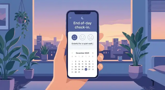
Most users want a simple loop:
Aim for 3–5 actions per session. A solid default:
Choose a mood + 1–10 rating
Write one “win”
Write one “lesson”
Pick tomorrow’s top task
Optional fifth: a short gratitude line or “anything else.” If users regularly take longer than two minutes, the experience starts to feel like homework.
For a mobile app MVP, keep the must-haves tight.
Must-have: save entries, simple prompts, basic calendar/history view, edit/delete, local search.
Nice-to-have (later): templates, tags, analytics trends, export/PDF, habit tracking features, attachments, advanced filters, streaks.
A good rule: if a feature doesn’t improve the nightly loop, it probably belongs in version two.
A daily review succeeds or fails in the first few seconds. At night, people are tired, distracted, and often using one hand in low light. Your flow should feel like a single calm action—not a mini project.
Keep the happy path short:
Auto-save matters: if someone closes the app mid-entry, they shouldn’t lose anything.
Mix structured and flexible inputs so users can finish quickly:
Avoid stacking too many prompts. Three to five elements total is usually enough for an MVP.
Typing at night is friction. Build small accelerators:
The goal is to make “doing something small” feel successful.
Treat time as a feature requirement. Use a single scrollable screen or a very short stepper (2–3 screens max). Keep text readable, buttons large, and the tone gentle. If users want more depth, let them expand sections—don’t force it by default.
End with a lightweight finish state: “Saved for today” plus an optional one-sentence reflection summary they can edit or ignore.
Prompts are the heart of an end-of-day review app. If they feel vague, repetitive, or too long, people will skip them. If they feel personal and lightweight, users build a habit without needing “motivation.”
Begin with a focused set that covers common reasons people reflect:
These work because they produce clear answers without requiring an essay.
Prompt preferences vary a lot. Some people love gratitude; others find it forced. Give users control:
Customization makes the app feel like a personal tool, not a generic journaling app.
A common failure mode is asking too many questions every night. Aim for a “complete in a few minutes” default. If you have more prompts than you want to show at once, rotate them:
This keeps the experience fresh without adding cognitive load.
Users often get stuck staring at an empty box. Provide optional help:
The best prompts feel like a friendly nudge: specific enough to answer quickly, flexible enough to fit any day.
Good information architecture makes a reflection app feel calming instead of complicated. The goal is to reduce decisions at the end of the day: users should instantly know where to go, what to do next, and how to look back.
Most end-of-day review apps work best with four core areas:
Use bottom tabs for clarity: Today, History, Insights, Settings. Add a prominent Review action that’s easy to reach with one thumb—either a centered tab or a primary button on the Today screen.
A good rule: the user should be able to start tonight’s review in one tap from the moment the app opens.
Empty states are where many wellness apps either feel cold or pushy. Plan them intentionally:
End-of-day use often happens in low light and when users are tired, so optimize for readability:
Done well, these screens create a predictable “home” for reflection—so users can spend their energy on the review, not on navigating the app.
A calm daily reflection experience depends on boring things done well: how you store entries, how they sync, and how users keep their data. Good data design also makes your MVP easier to build and less error-prone.
Most end-of-day review apps can be modeled with a few core objects:
A lightweight schema sketch:
Entry: {id, entry_date, created_at, updated_at, timezone, mood, note}
Response: {id, entry_id, question_id, value_text, value_number}
Tag: {id, name}
EntryTag: {entry_id, tag_id}
Offline-first is usually the right default: people write at night, on planes, or with spotty reception. Store everything locally and (optionally) sync when connected.
If you add sync, define conflict rules. “Latest edit wins” is simple; “merge answers by question” can feel safer. Keep it consistent and explain it plainly in settings.
Decide whether users can edit older entries freely, for a limited window (e.g., 7 days), or with an “edited” label. Whatever you choose, store both entry_date and the timezone used, so travel doesn’t shuffle entries into the wrong day.
Plan exports early: plain text for readability, CSV for analysis, and PDF for sharing/printing. If you support accounts, offer a simple backup/restore path and make it obvious where the data lives (device, cloud, or both).
A daily reflection app can feel intimate even if it never asks for “medical” details. Trust isn’t a feature you add later—it’s a set of choices you make from day one: what you collect, where you store it, and how clearly you explain it.
Start with the smallest set of inputs that still makes the end‑of‑day review useful. If a question isn’t essential to the core experience, don’t store it. Avoid sensitive categories by default (health conditions, precise location, contacts, kids’ info). If you add optional fields like mood tracking or journaling, make them truly optional and easy to delete.
Users should know exactly where their reflections live:
In the app, summarize this in plain language: “Your entries are stored on your phone” or “Your entries sync to your account so you can use multiple devices.” Avoid vague phrasing.
Add lightweight protections that match how personal the content feels:
Prepare a formal privacy policy, but also include a short in‑app “Privacy Summary” that answers: what you collect, why, where it’s stored, whether you sell/share data (ideally no), how deletion works, and how to contact you. Make account deletion and data export easy to find.
Reminders can make or break an end-of-day review app. The goal isn’t “compliance”—it’s gentle support that feels personal, optional, and easy to ignore without consequences.
Different people close their day differently, so give options rather than one default:
Default to gentle settings: one reminder per day, with quiet hours enabled out of the box. Let people set a window like “Don’t notify me after 10 PM” or “Not during work hours.”
If you support multiple nudges, make them opt-in and transparent: “Up to 2 reminders on days you haven’t checked in.” This keeps push notifications from feeling spammy.
Avoid guilt-based streak pressure. Use encouraging, non-judgmental copy.
Examples:
Even the best habit tracking app can’t prevent busy weeks. Design for lapses:
This supports long-term use without making the app feel needy.
A good tech stack is the one that lets you ship a calm, reliable daily review experience quickly—and keep improving it without rewrites. Start by choosing a platform strategy, then pick the simplest tools that support your MVP.
If your audience is mostly iPhone users (common for paid wellness apps), go iOS first. If your users skew global or you expect a wide device mix, Android first can make sense. If you need both early (or your team is small), choose cross-platform to avoid building everything twice.
For an end-of-day review app, cross-platform is often enough—your complexity is usually in UX and habit loops.
You may not need a backend for an MVP if entries stay on-device. Add a backend when you need accounts, sync across devices, encrypted backups, or analytics. Even then, start small: authentication, a simple entries API, and event tracking.
If you want to move faster without rebuilding your whole pipeline, a vibe-coding platform like Koder.ai can help you prototype the full product (web admin, backend, and mobile client) from a chat-driven spec. It’s especially useful for generating a clean baseline quickly—React on the web, Go + PostgreSQL on the backend, and Flutter for mobile—then exporting the source code when you’re ready to take over. Features like Planning Mode, snapshots, and rollback can also reduce risk while you iterate.
Prototype → MVP (core flow + local storage) → beta (notifications, cloud sync if needed, crash reporting) → public release (subscription/paywall if applicable, onboarding polish) → ongoing iterations (new prompts, themes, exports).
A daily review app lives or dies on friction. Before you write much code, get something people can try, then watch where they hesitate. The goal isn’t to “prove” your idea—it’s to find what makes the review feel quick, safe, and worth repeating.
Begin with rough sketches of the core flow: open app → answer prompts → review summary → done. Paper sketches or simple wireframes are enough to reveal unnecessary steps.
Once the flow makes sense, build a clickable prototype (Figma or similar). Keep it narrow: one daily review session plus a basic history view. Avoid polishing colors and animations too early; you’re testing clarity and effort, not aesthetics.
If you prefer to validate with a working build (not just a prototype), tools like Koder.ai can be useful for spinning up a testable app quickly, then iterating on copy and flow based on what users actually do.
Recruit 5–10 people who match your intended audience. Ask them to complete a review while thinking out loud. Measure:
Keep sessions short. One realistic scenario—“It’s 10 pm, you’re tired, do a quick check-in”—tells you more than abstract opinions.
In wellness apps, words are UI. Review your prompts, button labels, and error messages for warmth and clarity. “Save” vs. “Finish review” changes how confident people feel. Prompts should be specific enough to answer, but not so personal they feel invasive.
Use what you observed to simplify: reduce steps, offer optional prompts, add quick-select answers, and make the history view easy to scan. Then re-test the updated prototype to confirm the improvements actually reduce effort and confusion.
Analytics should help you improve the experience, not peek into someone’s private life. For an end-of-day review app, the best metrics focus on whether the flow is working—not what people wrote.
Pick a small set of signals tied to clear questions:
These numbers tell you where users get stuck: onboarding, the review flow, or specific prompts.
Instrument “behavior events” rather than content. Examples:
review_started, review_completedprompt_shown, prompt_skipped, prompt_answeredreminder_sent, reminder_opened, reminder_snoozedAvoid sending journal text, mood notes, or free-form reflections into analytics. If you need sentiment trends, keep them on-device or store only user-approved summaries. Minimize identifiers and retain analytics data for the shortest useful period.
Numbers explain what happened; feedback explains why.
Add a simple end screen question like: “Was this helpful?” with Yes/No. If the user taps “No,” offer an optional comment box. Keep it clearly optional, with a note like “Don’t include private details.”
Use what you learn to refine:
Treat each change as a small experiment, and watch for improvements in completion and retention without increasing annoyance or data collection.
Launching your end-of-day review app is less about a “big reveal” and more about starting a reliable cycle: ship a clear version, listen carefully, and keep improving without breaking trust.
Treat your store page like part of the product. A confusing listing attracts the wrong people and increases refunds.
People open reflection apps when they don’t know what to write. Ship with enough variety that day 3 doesn’t feel repetitive.
Create a small set of starter prompt packs (e.g., Gratitude, Stress reset, Work wins, Relationships) and a few weekly recap templates (e.g., “Best moment,” “Hardest moment,” “One thing to try next week”). Keep language friendly and specific so users can answer quickly.
Maintenance is the quiet work that keeps ratings stable.
Prioritize:
Publish short release notes in human language so users see progress.
Set expectations early. Offer a strong free core (daily review flow and basic history), then add optional upgrades:
Avoid overpromising timelines. It’s better to under-sell and deliver than to sell “coming soon” features that slip.
After launch, focus on one improvement at a time: completion rate of a daily review, reminder opt-in, and returning users after week one. Small changes—clearer prompts, faster load times, fewer taps—often beat flashy features.
Start by choosing a clear “center of gravity” for the nightly flow:
Design everything else as optional so the experience stays light at night.
Pick one primary audience (for now) and design around their constraints:
You can expand later, but one audience keeps the MVP coherent.
Keep each session to 3–5 actions so it never feels like homework. A strong default loop is:
Everything beyond that (templates, analytics, streaks) can wait until you confirm retention.
Aim for 1–3 minutes by designing a short “happy path”:
If users routinely need more than a couple minutes, completion rates usually drop.
Use a mix of structured and flexible inputs:
Limit prompts shown per day and rotate optional ones to avoid fatigue.
Make skipping normal and reduce typing with defaults:
The goal is “small success,” not perfect journaling.
A simple, calming structure is usually enough:
Bottom tabs work well because users can predict where things are without thinking.
Start with a simple, flexible schema:
Store both and so travel doesn’t shift entries into the wrong day. If you add sync later, define conflict rules (e.g., latest edit wins, or merge by question).
Build trust from day one with clear, lightweight protections:
Also add a short in-app privacy summary that mirrors your formal policy.
Measure flow health without collecting private content:
Track events like review_started and prompt_skipped, but avoid sending journal text to analytics. Add a simple optional feedback prompt like “Was this helpful?” at the end.