Sep 17, 2025·8 min
Create a Mobile App for Personal Time Awareness: A Guide
Plan, design, and build a mobile app that helps users see where time goes, set goals, log activities, and reflect with gentle insights.
Plan, design, and build a mobile app that helps users see where time goes, set goals, log activities, and reflect with gentle insights.
A personal time awareness app isn’t just a timer with charts. It’s a gentle mirror: it helps people notice where their time actually goes, compare it with what they thought was happening, and make small, realistic adjustments.
Different people need different kinds of clarity:
Choose a definition that fits your target user. “Time awareness” can mean:
Make the value statement simple:
The app should help users move from “I’m always busy” to “I know what’s taking my time, and I can choose what to change.”
Be explicit: this is guidance, not a medical tool, therapy, or a guarantee of productivity gains. People may be dealing with stress, ADHD, burnout, chronic illness, or unpredictable schedules. Your product should respect that reality and focus on clarity and reflection.
A good time awareness app supports outcomes like:
A personal time awareness app can do a lot—track, analyze, coach, nudge. Your first version shouldn’t try to solve every time problem at once. Start with one specific “pain sentence” a person would actually say.
Choose a single, concrete situation you can design around, such as:
A good use case has:
Metrics should be easy to understand and hard to “game.” Pick one primary metric and one optional supporting metric:
Avoid starting with complicated scores. Early users need clarity more than precision.
Make it testable and time-bound. For example:
“Within 7 days, a new user can log at least 5 days and view one insight that changes what they do tomorrow (e.g., shifting 30 minutes from ‘scrolling’ to ‘exercise’).”
That statement keeps every design and feature decision honest.
Your tracking method determines whether people stick with the app after day one. The goal isn’t “perfect data”—it’s a flow that matches how users actually move through a day.
Manual tracking is the easiest to understand and the easiest to trust.
A classic option is task timers: a clear Start/Stop button for the current activity, plus a “resume last” shortcut. Make corrections painless: allow users to adjust the start/end time, split an entry, or change the category without hunting through settings.
Also include quick entries for people who won’t run timers: one tap for “Just finished: commute / social / chores.” This captures reality even when users forget to start a timer.
Semi-auto tracking reduces effort without pretending to be magic. Examples: suggested activities based on time of day, calendar import prompts, or “You’re still on ‘Work’—keep it running?” confirmations.
Optional context can make logs more meaningful, but keep it truly optional: mood, energy, and location only if you can explain why it helps and how it’s used.
Fully automatic tracking (sensors, background detection) can boost accuracy, but it raises privacy concerns and can misclassify activities. If you offer it, make it opt-in, explain the tradeoffs, and provide an easy “fix it” review screen.
People switch constantly. Support:
Design for forgiveness: users should feel in control, not judged by the UI.
Categories are the “buttons people press” all day long, so your system should feel small, friendly, and forgiving. If users hesitate because they can’t find the perfect label, they’ll stop logging.
Begin with 8–12 categories max. That’s enough to cover most days without turning logging into a classification task. Keep wording neutral and descriptive rather than moral:
A good default set might include: Work/Study, Meetings/Admin, Commute, Meals, Chores, Exercise, Social/Family, Leisure, Rest/Sleep, and Errands.
People’s lives vary, so support:
A simple rule: categories answer “what kind of time is this?” while tags answer “in what context?”.
Allow renaming categories at any time. If someone sees “Exercise” and would rather log “Movement”, that’s a comfort upgrade, not an edge case. Consider an optional “hide category” feature so unused defaults don’t clutter the picker.
Behind the scenes, store categories with stable IDs and treat renames as display-only changes. For merges (e.g., “Commute” into “Travel”), keep old entries intact but map them for reporting.
Provide a lightweight “Manage categories” screen with clear actions: rename, merge, archive, and reorder.
An MVP for a personal time awareness app should feel useful on day one, even if it’s “small.” The goal is to help someone capture what they did, then reflect on it in a way that nudges better choices.
Keep the core loop tight:
If you can’t do these three things smoothly, extra features won’t matter.
Design the app around a few predictable places users will return to:
Avoid shipping “maybe later” complexity:
Write a one-page spec with: target user, core loop, the five screens above, and acceptance criteria like “Add/edit an entry in under 10 seconds” and “Show a week summary in two taps.” This keeps product, design, and engineering aligned when tradeoffs arrive.
Onboarding should do one job: get someone to a “useful day” of data as quickly as possible. If setup feels like a questionnaire, people bounce before they’ve logged anything.
Aim for a four-step flow that fits on a single progress bar:
Start with defaults that feel “normal”:
Add a calm “You can change this anytime” link to /settings, but don’t push customization up front.
Replace feature names with examples:
A tiny sample entry (pre-filled) helps users understand the format without thinking.
The first week should feel forgiving. Offer a daily nudge like “If you missed earlier, just log your last hour.” Celebrate consistency (“3 days logged”) more than perfection, and allow “Skip today” so people don’t quit after one busy day.
If logging feels like homework, people will quit—even if they love the insights. The goal of your logging UX is simple: capture “good enough” data quickly, then make it painless to correct later.
Design a one-tap entry that works even when the user is busy or distracted. A strong pattern is:
If your app requires multiple screens before saving, users will postpone logging—and then forget.
People will make mistakes: wrong category, late start, forgot to stop a timer. Build an easy edit flow that supports common fixes in seconds:
A helpful detail: show a clear “before/after” preview so edits feel safe.
Offer templates for routines that repeat daily or weekly (e.g., morning routine, school run, gym). A template should create an entry (or a sequence of entries) with preset categories, typical durations, and optional reminders—without forcing users into strict schedules.
Instead of punishing gaps, help users repair them. Use an end-of-day recap prompt that’s light-touch: “Want to fill the missing blocks?” Then show a simple timeline with suggestions like “Likely Work” or “Unlogged,” letting users confirm or adjust quickly.
When logging feels forgiving, users stick around long enough to benefit from the habit.
Insights are where a personal time awareness app earns trust—or loses it. The goal isn’t to “grade” users. It’s to help them notice patterns quickly, spot mismatches between intention and reality, and make one small change tomorrow.
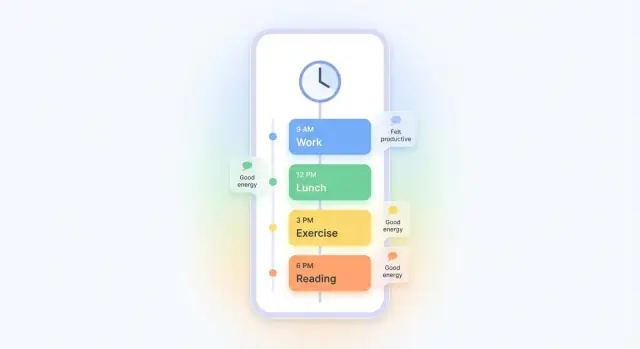
Give users a clean, scrollable day view that answers one question: “Where did my time go?”
A good default is a chronological timeline with:
In a weekly view, focus on patterns by day and category rather than dense visualizations.
For example: “Tue and Thu have the most ‘Admin’ time” or “Evenings trend toward ‘Scrolling’.” A lightweight grid (days × categories) with color intensity often works better than multi-axis charts.
Let users set optional “time budgets” per category (e.g., Work: 8h, Exercise: 30m, Social: 1h). Then show a calm comparison:
This keeps planning flexible while still revealing tradeoffs.
Offer one optional prompt at the end of the day or week, such as:
Make it skippable, saveable in one tap, and visible alongside the timeline so reflection connects to real entries. Avoid pop-ups that interrupt logging; place prompts on the home/summary screen instead.
Notifications are a trade: they can help people stay aware, but they can also become noise fast. The goal isn’t “more reminders”—it’s fewer, better-timed prompts that users feel in control of.
For most people, a small rhythm works better than frequent pings. A good default set is:
Keep each notification actionable and tiny: one tap should open the exact screen needed, not a generic home view.
Let users choose:
Offer these controls during onboarding and keep them easy to change later in /settings.
“Smart” nudges can be helpful if they’re based on the user’s behavior, but they must be optional. Examples:
Avoid pressure or guilt (“You missed your goals”). Use encouraging language (“Want to take 30 seconds to capture your day?”) and provide easy Snooze options (e.g., 15 min, 1 hour, tomorrow). When in doubt, fewer notifications—with better timing—wins.
A personal time awareness app can feel intimate: it reflects routines, priorities, and sometimes stress. Trust is not a “nice to have”—it’s a core feature that affects whether people log consistently.
Start with the smallest set of data that still delivers value:
Avoid collecting sensitive data by default (precise location, contacts, microphone, background app usage) unless you can clearly explain why it improves outcomes for the user. If a feature needs it, make it opt-in and easy to disable.
Give users a clear choice during onboarding or in Settings:
Use simple copy like “Stored on this phone” vs “Synced to your account,” and state what you can and cannot see as the app provider.
Offer a visible “Data controls” area that includes:
When you make privacy practical—clear options, minimal collection, and easy exits—people are more willing to log honestly and stick with the app.
A time-awareness app lives or dies on reliability. If logging fails, sync duplicates entries, or charts look “off,” people won’t trust the insights—so plan the build around correctness first, polish second.
No-code prototype is best when you’re still validating the flow: quick screens, basic storage, and a clickable demo to test onboarding and logging UX. It won’t handle complex offline sync well, but it’s perfect for learning what users actually need.
Cross-platform (React Native/Flutter) gives you one codebase for iOS and Android with near-native performance. This is often the best MVP choice when you want to ship to both stores without doubling effort.
Native (Swift/Kotlin) is worth it if you need deep OS integrations (widgets, advanced background tracking, tight battery control) or you’re optimizing heavily for one platform first.
If you want to move faster from idea → working product, a vibe-coding platform like Koder.ai can help you prototype the core loop (logging, timeline, basic insights) via a chat interface, then iterate with “planning mode” before you commit to deeper engineering. It’s also useful if you want a clean handoff: you can export source code, and evolve it into a production-grade stack.
Most MVPs need the same core components:
Assume users will log on the subway or during travel.
Run lightweight usability tests early (5–8 people) focused on “Can you log an activity in 10 seconds?” Then add targeted edge-case tests:
A reliable app doesn’t need fancy tech—it needs predictable behavior users can depend on every day.
A time awareness app gets better when you treat launch as the start of learning—not the finish line. The goal is to ship something stable, observe real behavior, and make small, confident improvements.
Start with a small beta (TestFlight/closed testing) and a short “first-week checklist” for users: log 3–5 entries/day, edit at least once, and review insights on day 3. This gives you comparable early data.
Add lightweight feedback loops right inside the app:
Avoid metric overload. Track simple signals that map to your core value:
Pair numbers with a handful of user comments each week so you understand why metrics move.
Use what you learn to refine three areas first:
Once the core loop is sticky, consider upgrades users often ask for:
Keep a public “What’s next” page (e.g., /roadmap) so users see progress and feel heard.
A time awareness app helps people notice how they spend time, compare it to what they expected, and make small adjustments.
It’s less about “being productive” and more about clarity: where time goes, what patterns repeat, and what tradeoffs are happening.
Pick one audience and define time awareness in their terms:
Then write a simple promise like “See where your evenings go in 7 days.”
Start with one concrete “pain sentence” and one time window, for example:
Your MVP should answer that one question better than anything else, before expanding.
Use 1–2 metrics that are easy to understand and hard to game:
Avoid complex scoring early; clarity beats precision in the first version.
It depends on your user and your build capacity:
If accuracy and trust are critical, start manual or hybrid.
Design for constant switching:
The goal is “forgiving logs,” not perfect diaries.
Keep categories small, neutral, and easy to choose:
Also allow rename/merge/archive so the system can evolve without breaking history.
The minimum useful loop is:
If any of these are slow or confusing, extra features won’t save retention.
Onboarding should get users to a “useful day” fast:
Optimize for first-day success, not perfect setup.
Collect the minimum needed and make choices explicit:
Trust improves consistency—privacy controls are part of the product.