Aug 18, 2025·8 min
Create a Mobile App for Personal Weekly Reviews: Step-by-Step
Learn how to plan and build a mobile app for personal weekly reviews, from core features and UX to data storage, privacy, MVP scope, and launch.
Learn how to plan and build a mobile app for personal weekly reviews, from core features and UX to data storage, privacy, MVP scope, and launch.
Before you sketch screens or list features, define what “weekly review” means in your app. For some people it’s reflection (What went well? What was hard?). For others it’s planning (What matters next week?), habit check-ins, or noticing patterns in mood and energy. If you don’t choose a clear definition, the app can feel like a messy mix of journaling, to-do lists, and habit tracking—without being great at any one thing.
A good weekly review app makes a specific promise users can feel after 10–15 minutes of use. Examples include:
The key is coherence: the questions, summaries, and outputs should all point toward the same kind of progress.
Choose a primary outcome for your MVP and treat everything else as supporting. Common “north stars”:
This decision affects your template, your “done” screen, and even your notification language.
A weekly review app for students might emphasize workload, deadlines, and stress. For professionals, it may focus on priorities, meetings, and work-life boundaries. For creators, it might center on output, momentum, and inspiration. If your audience is “anyone new to journaling,” the app should reduce pressure with gentle prompts, examples, and an easy path to finish.
Define how you’ll know the app is working. Simple, meaningful metrics include:
These metrics keep your weekly review app focused on outcomes—not just features.
Before you design screens, get clear on what people already expect from a weekly review app—and what they struggle with. A few hours of structured research can save weeks of rework.
Look at three adjacent categories: journaling apps, habit trackers, and calendar/notes tools. Common patterns you’ll likely see:
Notice what feels calming versus demanding. Weekly reviews should reduce mental load, not create a new chore.
Write user stories that describe intent, not features. Examples:
These stories become MVP acceptance criteria: the app succeeds if it reliably fulfills them.
Weekly review apps can expand endlessly. Decide early what you will not build in version 1, such as:
Make a “later list” so you don’t re-litigate scope every sprint.
Run a short survey (5–8 questions) or show a clickable prototype of the core flow: pick a week → answer prompts → save → view past reviews. If people can’t explain why they’d use it weekly, your prompts or flow need tightening.
An MVP for a weekly review app should help someone finish a meaningful review in minutes, not turn it into another project. Aim for a simple, repeatable loop: capture what happened, reflect briefly, decide what to do next, and close the week with a sense of progress.
Pick 3–5 prompts that cover reflection without feeling like homework. A solid default set:
Keep each prompt focused, with an obvious “skip” option. Skipping is better than abandoning the review.
People often know the “shape” of their week before they can write about it. Let them start with quick taps and add detail only if they want.
This supports both minimalist users and journaling-oriented users without forcing one style.
A weekly review feels most useful when it connects reflection to action. Include a lightweight goals feature:
Continuity matters: last week’s goals should appear automatically in the next review so users can close the loop.
Add two fields that make the review feel “complete” and easy to look back on:
These become anchors for history later, without requiring long entries every time.
A weekly review app lives or dies by how quickly someone can get from “I opened it” to “I feel better and I’m done.” The UX flow should reduce friction, make the next step obvious, and never punish users for low-energy weeks.
Design the flow as a single loop that repeats weekly:
Onboarding → first review → reminders → weekly archive.
Onboarding should get users to their first review quickly, not teach every feature. Treat the first completed review as the “aha moment,” then use the archive to create a sense of progress.
Keep onboarding to a few screens:
End onboarding with a clear CTA like “Start your first weekly review.” Avoid presenting templates, tags, insights, and exports here—those can come later.
5-minute mode should feel like a guided sprint:
Deep dive mode can be the expanded version of the same review (not a different product): more prompts, optional notes, and a planning step. Users should be able to start in 5-minute mode and expand into deep dive without losing what they already entered.
Start each review with a simple screen: the next prompt, a clear input, and a “Next” button. Advanced features should appear only when relevant:
This keeps first-time users from feeling like they have to “set up” journaling.
Keep the main navigation stable and limited to:
Home should always show a single primary action: “Continue review” or “Start review.” When the review is finished, replace it with “View this week” and “Plan next week.”
After submitting a review, show a short completion screen that reinforces value:
Make it easy to revisit and edit later, but avoid turning editing into a second chore.
A weekly review app lives or dies on whether “this week” feels obvious. The template can be beautiful, but if weeks shift, overlap, or disappear when someone travels, trust drops quickly.
Start by picking a default week definition—most people expect either Mon–Sun or Sun–Sat. Then make it adjustable in settings so the app fits different regions, work schedules, and cultural norms.
A practical approach is:
Users may cross time zones, change device settings, or travel for work. If your app recalculates week boundaries purely from the current time zone, a Sunday night entry could jump into a different week after a flight.
To prevent that, treat each entry and each weekly review as having:
Then compute the “week key” predictably (for example, based on the user’s chosen week start and the entry’s local date when it was created). This anchors the review to how the moment was experienced, not where the phone is today.
Templates should change prompts, not the whole app. Provide a few curated options:
Let users edit prompts lightly (rename, reorder, hide) while keeping a safe default.
Missed weeks are normal. Add a gentle “Catch up” option that:
A weekly review app feels simple on the surface, but users judge it by two things: whether their data feels safe, and whether they can take it with them. Getting the data model and storage choices right early prevents painful rewrites later.
You typically have three options:
For an MVP, on-device or optional sync is usually enough—especially for a personal reflection app where privacy expectations are high.
Keep the structure readable and flexible. A good starting point:
Store raw text and ratings, not just calculated insights. You can always compute trends later.
Exports signal “your data belongs to you.” Plan for:
Even if exports ship after the first release, designing the model around exportable fields avoids awkward gaps.
Let users control their footprint:
Clear, predictable data controls reduce anxiety and make users more willing to write honestly.
A weekly review app can feel like a private notebook. If users sense their reflections might leak, they’ll either self-censor or abandon the app. Trust isn’t a marketing claim—it’s a set of product choices that reduce risk by default.
Start with data minimization: only store what’s required for the app to work. If features don’t require an account, skip sign-ups. If you do need identity (for sync, for example), keep the profile minimal and avoid collecting “nice to have” details like birthday, contacts, or location.
Also decide what can remain on-device. For many MVPs, local storage is enough and dramatically simplifies privacy.
Add an in-app lock using a PIN and, where available, biometrics. Make it optional but easy to enable during onboarding and later in Settings.
Protect sensitive screens from being exposed in system app switchers and notifications. Blur content previews when the app is backgrounded, and keep notification text generic (“Time for your weekly review”) instead of showing private entries.
Ask for permissions only at the moment they’re needed. Explain plainly why:
Avoid dark patterns like guilt messages or repeated prompts after a “No.” Respecting a user’s choice is part of safety.
Include a short privacy note in Settings written for normal people: what data is stored, where it’s stored (on-device vs. cloud), how exports work, and how to delete data. Keep it readable, specific, and updated as features change.
The goal at this stage isn’t to predict every future feature—it’s to make a few smart choices that let you ship a reliable MVP and learn quickly.
Start with where your users already are. If your target audience is primarily iPhone users (common in some regions and workplace groups), iOS-first can reduce device variability. If you expect a broader range of phones, Android-first may give you more reach. If you don’t have strong evidence either way, cross-platform can be a pragmatic MVP path—especially for a weekly review app where the UI is form-based and text-heavy.
Pick one primary platform (or one cross-platform stack) and commit. Splitting energy across multiple codebases too early is a frequent reason MVPs stall.
Weekly reviews happen on trains, in airplanes, or in “no-signal” corners of life. Design the app so writing always works offline, with sync as an enhancement.
If you support multi-device sync later, keep conflict rules simple and predictable:
Support system font scaling, maintain clear contrast, and add meaningful screen reader labels (especially for buttons like “Save,” “Done,” and mood selectors). These basics help everyone, not only users with assistive needs.
Set lightweight targets early: fast launch, instant opening of the current week, and smooth typing with no lag. Limit heavy animations, avoid unnecessary background work, and be careful with frequent auto-saves (batch them) to protect battery and keep the editor responsive.
If you want to validate the flow before committing to a full engineering pipeline, a vibe-coding platform like Koder.ai can help you stand up a working prototype quickly from a chat-driven spec. It’s a practical way to iterate on onboarding, prompts, reminders, and the weekly archive UX—then export the source code when you’re ready to harden privacy, storage, and sync.
Notifications should feel like an invitation, not a demand. The goal is simple: help users show up for their weekly review consistently, while keeping them fully in control.
Start with one primary reminder per week. Let users pick the day, time, and “tone” (e.g., gentle, neutral, energetic). Also include an easy “skip this week” option so they don’t feel punished for missing.
A good default is Sunday evening or Monday morning, but defaults should never trap users—make timing editable from the first week.
Offer add-on nudges users can toggle individually:
Keep these nudges lightweight: they should take under a minute to dismiss or complete.
Build guardrails that make the experience calmer by default:
Notification copy should assume good intent and avoid guilt. Test variations like “Ready for a quick weekly reset?” instead of “You haven’t reviewed this week.” Track what users keep enabled—and what they turn off—to refine tone over time.
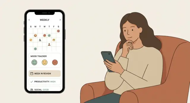
Most people don’t open a weekly review app to stare at charts. They open it to remember what happened, spot patterns, and choose one or two small changes for next week. Keep insights lightweight, readable, and grounded in what the user wrote.
Begin with a small “snapshot” panel that rewards consistency without turning the app into a scoreboard:
These are easy to understand and implement, and they give users a reason to keep going.
Numbers alone don’t drive insight. Add a couple of plain-language summaries that encourage reflection:
Keep this descriptive. The app should never imply diagnoses or mental health conclusions. Prefer phrasing like “You often mentioned…” rather than “This means you’re…”.
A review history should feel like a personal library:
If users can quickly find the last time they struggled—or succeeded—they’ll trust the app as a practical tool, not just a diary.
Shipping a weekly review app is less about building “everything” and more about proving one thing: users can complete a review smoothly, feel good about it, and want to come back next week. Treat v1 as a focused experiment you can ship in weeks, not months.
A practical v1 usually fits into a handful of screens:
If a screen doesn’t directly help a user start, complete, or revisit a weekly review, it’s probably not MVP.
Use a simple three-tier backlog so decisions stay clear when time gets tight:
This structure helps you avoid accidental scope creep (for example, adding habit tracking features that turn the app into a full habit tracker).
Test the review flow early with simple prototypes, then again with a working build. With 5–8 participants, you’ll usually surface the biggest usability issues without over-investing.
Focus tasks:
Measure completion rate, time to finish, and where people hesitate. Iterate on the flow first (prompt order, wording, progress indicator) before polishing visuals.
A weekly review app succeeds or fails on trust. Your definition of done should include:
Make the checklist a release gate, not a “nice-to-do.” It’s better to ship fewer features than ship a personal reflection app that feels unreliable.
Launching a weekly review app isn’t just “publish and hope.” A good launch sets expectations, reduces surprises, and gives you clean signals about what to improve next.
Even for an MVP, treat your store listing as part of the product:
Start with a small beta group before a full public release. A beta helps you learn the uncomfortable truths early: confusing prompts, bugs during save/export, notification annoyance, or onboarding drop-offs.
After 1–2 iteration cycles, move to a public release with a narrow promise: a simple weekly review that users can reliably complete and revisit.
Make it easy to give feedback at the moment something feels off:
Track metrics that reflect a weekly habit, not just downloads:
If you can’t explain your numbers in plain language, you’re tracking the wrong ones.
Start by choosing a single primary outcome for v1 (e.g., clarity, goal follow-through, mood insights, or time awareness). Then align everything—prompts, summary screen, reminders, and history—around that outcome so users feel a clear “before vs after” in 10–15 minutes.
A strong default is 3–5 prompts that cover reflection and next steps without feeling like homework:
Keep each prompt skippable; skipping is better than abandoning the review.
Use quick-tap inputs to reduce friction, and keep free text optional:
This supports both minimalist users and people who like journaling—without forcing either style.
Offer two modes that share the same data model and flow:
Let users start in 5-minute mode and expand mid-review without losing what they entered.
Make “this week” unambiguous:
Compute a stable “week key” from the entry’s local date when created, so travel doesn’t shift weeks unexpectedly.
Keep it lightweight but continuous:
Auto-carry last week’s goals into the next review so users can “close the loop” without re-entering context.
For an MVP, choose either:
Design your data model around exportable fields (text, ratings, tags, goals) so you can add PDF/Markdown/CSV exports without restructuring everything.
Focus on “collect less, protect more”:
Add a short plain-language privacy note in Settings explaining what’s stored and where.
Make reminders feel like an invitation:
Use neutral copy like “Ready for a quick weekly reset?” instead of guilt messaging.
Track metrics tied to the weekly habit:
Validate with quick usability tests (5–8 people) on key tasks: start review, finish, find last week, change reminder time.