Nov 14, 2025·8 min
How to Create a Mobile App for Student Homework Planning
Step-by-step guide to plan, design, and build a student homework and planning app, from MVP features and UX to tech choices, testing, and launch.
Step-by-step guide to plan, design, and build a student homework and planning app, from MVP features and UX to tech choices, testing, and launch.
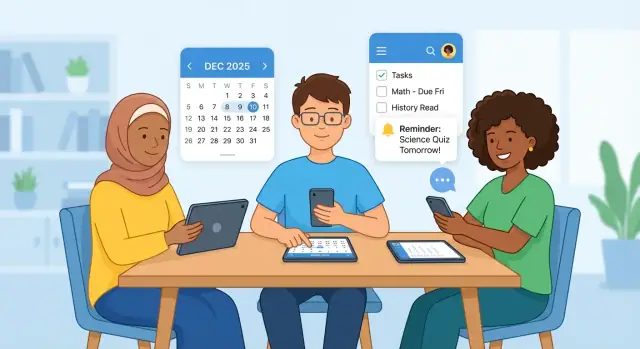
A homework planning app only works if it fixes a real pain—not just a vague desire to “be more organized.” The core problem for many students isn’t a lack of effort; it’s the combination of missed deadlines, scattered assignments, and fragile routines that collapse the moment school gets busy.
Assignments live in too many places: a teacher’s LMS, a class chat, a paper handout, a note scribbled during class, an email, or a calendar reminder that never got created. Students often intend to track everything, but the workflow is brittle. One missed entry can snowball into late submissions, stress, and the feeling of always being behind.
Pick a single primary audience for v1. For this guide, we’ll start with high school students.
High school is a sweet spot: students have multiple classes and shifting deadlines, but they’re still developing planning habits. They also tend to use their phones frequently, which makes a student planner app feel natural—if it’s faster than their current method.
Once you nail high school needs, you can expand later toward middle school (more parent involvement) or college (more autonomy and more complex schedules). But mixing these audiences too early usually produces a bloated, confusing product.
Before features, define outcomes. Success for a homework tracking app should be measurable, like:
These outcomes help you decide what to build, what to cut, and what to improve after launch.
Next, we’ll walk through the practical steps to create a focused study schedule app:
The goal: a small, usable v1 that students stick with—because it saves time and reduces missed deadlines.
Before you decide what to build, get clear on who you’re building for and how homework planning actually happens during a normal week. A little structured research now will save you months of building features students won’t use.
Start with simple personas you can refer to in every product discussion. Keep them specific enough to help you make trade-offs.
Sketch a “typical week” and mark where your app can reduce friction:
This journey helps you identify the moments that matter: fast entry, realistic scheduling, and a clear “done” vs “submitted” distinction.
Aim for 10 quick conversations with students across ages and achievement levels. Keep it lightweight: 10–15 minutes each, or a short survey with a few open questions.
Good prompts:
Look for repeated patterns and the exact phrases students use. Those words often become your best UI labels.
Student apps live inside real limits. Validate these before you commit to features.
Document these constraints alongside your research notes. They’ll directly shape your MVP, especially around sign-in, sync, and reminders.
An MVP for a student planner app should help a student answer three questions quickly: What do I need to do? When is it due? What should I work on next? Everything else is secondary.
Start with a simple homework tracking app core: a list of assignments with due date, subject, and status. Keep statuses minimal—to do / doing / done—because students will use it more if updating takes two taps.
Include lightweight sorting and filtering (e.g., “Due soon” and “Overdue”), but avoid complex tagging systems in v1.
A study schedule app needs a clear time view, not just a list. Offer:
Let students add a basic class schedule (days, times, class name). The calendar should show both classes and assignment due dates so the student doesn’t have to mentally merge them.
Reminders should be reliable and easy to understand:
Don’t overdo customization at first. Start with smart defaults and allow edits.
Students often get assignments verbally or on paper. Support a quick capture flow:
The photo acts as a safety net even if the student doesn’t type everything immediately.
Keep analytics motivational, not judgmental: a streak or a weekly overview (“5 assignments completed”). Make it optional so it doesn’t distract from the core planning flow.
The fastest way to derail a student planner app is to treat v1 like a “complete school platform.” Boundaries keep the product clear, the setup painless, and the first-time experience focused on one job: capture homework, see what’s due, and get reminded at the right time.
These can be valuable, but they’re rarely essential for the first release:
If you add them too early, they tend to create extra screens, settings, and edge cases—without proving the core workflow is loved.
Feature creep doesn’t just slow development; it confuses students:
Only add a feature if it directly supports the core workflow: add homework in seconds → understand what’s next → finish on time.
If a feature primarily helps “power users” or needs lots of preferences to work well, it’s probably not a v1 feature.
A student planner app succeeds or fails on structure. If students can’t find today’s homework in a few seconds, they won’t stick with it—no matter how many features you add later. Start with a simple information architecture that mirrors how school actually works.
A clean approach is:
Classes → Assignments → Calendar → Settings
Classes are the “containers” students already understand (Math, English, Biology). Assignments live inside a class (worksheet, essay, quiz). The calendar is a cross-class view that answers one question: What’s due and when? Settings should stay small in v1—only what’s necessary to make the app usable.
Before writing code, sketch these screens so you can sanity-check the flow end-to-end:
The fastest app wins. Reduce typing and decision fatigue with:
Consider a single, consistent “Quick add” button that opens the add assignment screen with the last-used class preselected.
Accessibility is easiest when it’s part of the structure, not a late fix:
If you get this structure right, later sections—like notifications, calendar integration, or parent/teacher features—can be added without breaking the core flow.
A homework planning app succeeds when it feels faster than doing it “the old way.” The best UX patterns reduce typing, reduce decisions, and give students a clear next step—without turning schoolwork into an anxiety dashboard.
Design the “add” flow like quick capture, not a form. The default screen should ask only what’s essential, then let students refine later.
A practical pattern is one primary field + smart defaults:
Use chips or tap-to-select options for common details (Math, English, Essay, Worksheet). Keep typing optional. If you support voice input, treat it as a shortcut (“Math worksheet due Thursday”) rather than a separate mode.
Students often abandon planners when everything feels urgent. Instead of complex priority matrices, use friendly, low-pressure labels:
These should be one-tap toggles, not another decision-heavy screen. Avoid red “overdue” overload; a subtle “Needs attention” state often works better than constant alarms.
A small UX win: show one recommended focus item (“Start: History notes (10 min)”) but let students ignore it easily.
Homework is repetitive—your UI should reward completion in a calm way. Simple patterns work best:
The weekly view should feel like reflection, not judgment: “3 tasks moved to next week” is better than “You missed 3 deadlines.”
Notifications should prevent surprises, not create noise. Offer a minimal default and let students opt into more.
Good patterns include:
Let students control reminders per assignment and globally, with plain-language settings (“Remind me the evening before”). If you later add calendar integration, keep it optional so students don’t feel trapped by their schedule.
A homework planner lives or dies by trust: if tasks disappear, reminders fire late, or logins are confusing, students will abandon it fast. Your architecture should prioritize reliability over cleverness.
Pick one primary sign-in path and make everything else optional.
A practical approach: start with Google/Apple + email, and add guest mode only if you see onboarding drop-offs.
You don’t need an elaborate schema. Start with a small set of entities you can explain in one sentence:
Design assignments so they can exist without a class (students sometimes track personal tasks too).
If you’re unsure, a hybrid often works well: local storage for instant use, cloud sync for backup.
Even v1 benefits from simple admin needs: crash/error reporting, account deletion handling, and a lightweight way to flag suspicious activity if you allow shared content. Keep tools minimal, but don’t skip them entirely.
Tech choices should support the simplest version of your product: fast, reliable homework capture, clear reminders, and a schedule that doesn’t break. The “best” stack is usually the one your team can ship and maintain.
Native (Swift for iOS, Kotlin for Android) often gives the smoothest performance and the most polished feel. It also makes it easier to use platform-specific features (widgets, calendars, accessibility details). The trade-off is building the app twice.
Cross-platform (Flutter, React Native) lets you share much of the code across iOS and Android, which can cut time and cost for v1. The trade-off is sometimes more effort to match each platform’s “natural” behavior, plus occasional edge cases with device integrations.
If you’re targeting both platforms from day one with a small team, cross-platform is usually the practical starting point.
A managed backend (Firebase, Supabase) is faster to launch because user accounts, databases, and storage are mostly ready-made. This is a good fit for an MVP.
A custom API (your own server + database) gives more control (data models, special rules, integrations with school systems), but costs more time and requires ongoing maintenance.
If you want to explore a custom stack without spending weeks on scaffolding, a vibe-coding platform like Koder.ai can help you generate a working baseline quickly (for example, a React web admin + a Go backend with PostgreSQL), then iterate through planning mode and snapshots as you test with real students.
Push notifications require:
To avoid spam, keep notifications event-based (due soon, overdue, schedule change), allow quiet hours, and provide simple controls (“Remind me 1 hour before”).
Homework often includes photos (worksheet, whiteboard, textbook page). Decide:
Storage can become a real cost driver, so set limits and consider optional cleanup policies from day one.
Students (and parents, teachers, and schools) will only stick with a homework planner if it feels safe. Privacy isn’t just a legal checkbox—it’s a product feature. The simplest way to earn trust is to collect less, explain more, and avoid surprises.
Start by listing the absolute minimum you need to make the app useful: homework title, due date, class name, and reminders. Everything else should be optional. If you don’t need birthdays, contacts, precise location, or a full name, don’t ask for them.
Write your data explanation in normal language inside the app (not only in a long policy). A short “What we store” screen during onboarding can prevent confusion and reduce support issues later.
Permissions are one of the fastest ways to lose trust. Only request access at the moment it’s needed, and explain why.
For example:
If you can support a feature without a permission (e.g., manual entry instead of reading the calendar), that’s usually a better v1 choice.
Even an MVP should cover the basics:
Also consider a low-friction option like “Sign in with Apple/Google” if it fits your audience and reduces password handling.
Rules vary depending on who you serve and where. Before launch, confirm whether you need to account for:
If you plan parent/teacher features later, design data ownership early: who can see what, who can invite whom, and how consent is recorded. It’s much easier to do this now than to retrofit trust after release.
A student homework planning app succeeds when the basics feel effortless: add work quickly, see what’s due, and get reminded at the right time. The safest way to reach that is to validate the flow before you write code, then build in small, testable steps.
Start with a clickable mockup (Figma, Sketch, or even paper turned into linked screens). Test only the core journeys:
Run quick sessions with 5–8 students. If they hesitate, you’ve found your next design change—cheaply.
Ship a thin, working slice, then expand:
Homework list: title, due date, subject, status (open/done)
Calendar view: week view that mirrors the list (no complex scheduling yet)
Reminders: basic push notifications (e.g., evening before + morning of)
Attachments: photo of assignment, teacher handout, or link
Each step should be usable on its own, not a half-finished promise.
If you want to move faster without locking yourself into a messy codebase, consider building the thin slice in Koder.ai first: you can iterate by chat, keep changes reviewable with snapshots/rollback, and export the source code once your MVP flow is proven.
Before adding more features, confirm:
Use short milestones (1–2 weeks each) and a weekly review:
This rhythm keeps the app focused on real student behavior, not a wish list.
Testing a homework planning app isn’t about asking students if they “like it.” It’s about watching whether they can complete real tasks quickly, without help, and without making mistakes that break their routine.
Recruit a mix of grades, schedules, and devices. Give each student 10–15 minutes and ask them to do four core actions:
Avoid explaining features during the test. If a student asks “What does this do?”, note it as a UI clarity problem.
Track a few metrics you can compare across builds:
Pair the numbers with short notes like “thought ‘Due’ meant class start time.” Those comments tell you what to rename, reorder, or simplify.
Student schedules are messy. Test:
Fix in this sequence:
A slightly awkward flow can be improved later. Lost homework data won’t be forgiven.
A great student planner app can fail if the first five minutes are confusing. Treat launch and onboarding as product features—not marketing chores.
Your store page should answer three questions fast: what it does, who it’s for, and what it looks like.
Onboarding should get students to a “win” quickly: they see their week and one upcoming deadline.
Consistency beats complexity. Build habits with small nudges:
Decide pricing early (free + premium, or school licenses) and keep it transparent—see /pricing.
Set up support before you need it (FAQ, bug report form, response times). Add a lightweight feedback loop: an in-app “Send feedback” button, plus an email option via /contact.
Start with one primary user group for v1—this post recommends high school students because they have multiple classes and deadlines but still need habit support.
Ship for one audience first, then expand (e.g., middle school with more parent involvement, or college with more autonomy) once retention is strong.
Define success as outcomes you can track, such as:
These metrics make feature decisions easier and keep the MVP focused.
Do a small round of structured research before building:
This prevents building features students won’t adopt.
A solid v1 should answer three questions fast: What do I need to do? When is it due? What should I do next?
Practical MVP features:
Skip anything that adds screens, settings, or edge cases before the core workflow is proven, like:
A simple rule: only add a feature if it directly supports capture homework in seconds → see what’s next → finish on time.
Use a quick-capture pattern:
If you add voice input, treat it as a shortcut (e.g., “Math worksheet due Thursday”), not a separate workflow.
Keep notifications minimal, clear, and user-controlled:
Prioritize trust by collecting less and explaining more:
If you plan premium or support paths, keep them transparent (e.g., /pricing) and make it easy to reach support (/contact).
Choose based on real constraints:
A common compromise is hybrid: local storage for instant use + cloud sync for backup, with careful handling of conflicts and time zones.
Test real tasks, not opinions:
Fix issues in this order: crashes/login → data loss/sync → reminder failures → UX polish.
Everything else is secondary until this loop feels effortless.
Too many alerts usually leads to disabled notifications or uninstalls.