Sep 04, 2025·8 min
How to Create a Mobile App to Track Learning Progress
A step-by-step guide to plan, design, and build a mobile app that tracks learning goals, lessons, and progress—features, UX tips, data, and launch checklist.
A step-by-step guide to plan, design, and build a mobile app that tracks learning goals, lessons, and progress—features, UX tips, data, and launch checklist.
A learning progress app helps someone answer two simple questions: “Am I getting better?” and “What should I do next?” To answer those well, your app needs (1) a clear definition of “progress” and (2) a way to make that progress obvious at a glance.
Progress isn’t only finishing lessons. Depending on the subject and the learner, it can include:
The best apps pick one or two primary signals and treat everything else as supporting context. If everything is “progress,” nothing is.
A learning progress app feels very different depending on the main user:
Trying to serve all of them from day one usually makes the app confusing. Choose one primary user and design around their daily routine.
Set expectations early: your first version should track a small set of behaviors reliably (for example: goal + daily practice + a weekly check-in). Once you see real usage, you can add richer learning analytics and more advanced views.
A good learning progress app should lead to:
A learning progress app can serve many audiences—students, parents, teachers, self-learners, tutors—but trying to satisfy all of them in v1 usually creates a cluttered product. Start by choosing one primary user group and one main use case that you can deliver exceptionally well.
Instead of “students,” pick something like: “busy college students who study independently and want proof they’re improving.” Or: “language learners preparing for an exam in 8–12 weeks.” The tighter the group, the easier it is to make decisions about onboarding, features, and messaging.
Define the single job your learning progress app must do. Examples:
Write a one-sentence promise: “This app helps [user] achieve [outcome] by [tracking method].”
Keep them concrete and measurable:
Pick a few signals that show real value:
List “not now” items to protect your mobile app MVP: social feeds, complex gamification, teacher dashboards, multi-device syncing, or advanced learning analytics. You can revisit these after you validate the core loop:
log → see progress → feel motivated → return.
A learning progress app feels “smart” when its tracking model is simple, predictable, and hard to misinterpret. Before you design charts or streaks, decide what the unit of learning is and how a learner moves through it. This is the foundation for trustworthy student progress tracking and useful learning analytics.
Choose the unit that best matches the real behavior you’re supporting:
For a mobile app MVP, pick one primary unit and optionally map others to it later. For example, a “study session” can be the umbrella that contains videos watched and quizzes taken.
Keep states few and unambiguous. A common set is:
“Mastered” should mean something specific (not just “done”). If you can’t define it yet, leave it out until your education app development has real data.
Evidence should match your learning unit:
Be careful mixing signals. If “completed” sometimes means “watched 90% of a video” and other times means “scored 80% on a quiz,” your goal tracking app reports will feel inconsistent.
Once you define rules, apply them everywhere: onboarding, progress bars, streak logic, and exports. Consistency is what makes a learning progress app feel fair—and what keeps your charts believable over time.
An MVP for a learning progress app should prove one thing: people can set a goal, log learning, and see progress in a way that makes them want to return tomorrow. Everything else can wait.
Start with daily and weekly targets that are easy to understand: “20 minutes/day,” “3 sessions/week,” or “Finish 2 lessons.” Let users pick one primary goal during onboarding and adjust it later.
Reminders should be opt-in and specific (“Ready for a 10‑minute review?”). Avoid spammy frequency. A good MVP includes: reminder time selection, a snooze option, and the ability to pause reminders during busy weeks.
Manual logging is enough for version one—as long as it’s fast.
Support a single-tap “Log session” with fields like duration, topic, and activity type (reading, practice, class). Add shortcuts such as “Repeat last session” and recent topics to reduce typing.
Automatic tracking (from calendars, video platforms, or LMS tools) can be a later upgrade. It’s harder to build, harder to trust, and often creates messy data early on.
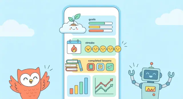
The dashboard is your retention engine. Keep it focused:
Use clear labels and avoid overly detailed analytics in the MVP.
Add quick check-ins that take under a minute: a 3-question quiz, a confidence rating, or “Can you explain this without notes?” This gives users a sense of mastery—not just activity.
A short “What did you learn?” note box helps users remember and improve. Include prompts like “What worked?” and “What to try next time.” Keep it private by default and easy to skip.
A learning progress app succeeds or fails on one thing: can a user tell what to do next, and do they feel rewarded when they do it?
Keep onboarding short and practical. In a couple of screens, let people:
Use plain language and defaults that work. If someone skips, don’t punish them—offer “Set this later” and start with a simple, editable plan.
Design the home screen like a to-do list, not a report. Put the next recommended action at the top (the next lesson, a 10‑minute review, or today’s session).
Stats should be secondary and supportive: a small weekly summary, streak status, and goal progress. This reduces decision fatigue and keeps the app feeling light.
Progress should answer: “How far am I?” and “What changed since last time?” Use clear labels (“Lessons completed,” “Minutes this week,” “Goal: 3 sessions/week”) and simple charts.
A good rule: prefer one clean bar chart over three confusing widgets. If you show percentages, also show the raw number (e.g., “6/10 lessons”).
Readable text sizes, strong contrast, and generous tap targets (especially for the primary action button) are not optional. They also reduce mis-taps when users log sessions quickly.
Logging a session should take seconds: one tap to start, one tap to finish, optional notes. If users need multiple screens to record progress, they’ll stop using it.
Consider offering quick actions on the dashboard (e.g., “Log 15 min,” “Mark lesson complete”) so progress always feels close and achievable.
Your tech stack should support the first version of your learning progress app—not your dream roadmap. The goal is to ship an MVP that tracks progress reliably, feels fast, and is easy to iterate on.
Native apps (iOS with Swift, Android with Kotlin) usually feel the smoothest and integrate best with platform features (notifications, widgets, offline storage). The tradeoff is cost: you’re effectively building two apps if you want both platforms.
Cross-platform apps (Flutter or React Native) let you build one codebase for iOS and Android. For most progress-tracking features—lists, charts, reminders—performance is excellent, and development is typically faster than two separate native apps. You may hit edge cases with advanced platform-specific UI or newer OS features.
Web apps (responsive web / PWA) are the quickest to launch and easiest to update. They’re great for validating the idea, but they can feel less “app-like,” and background reminders, offline use, and deep OS integration are more limited depending on the device.
If your budget is tight, a practical approach is: pick one platform (often iOS or Android based on your audience), ship the MVP, then expand once retention proves the app is valuable.
Keep your first stack boring and well-supported. You’ll improve the product faster by simplifying decisions now than by chasing “perfect” technology up front.
If your main goal is to validate the core loop quickly, a vibe-coding platform like Koder.ai can help you go from specs to a working product via chat—useful for rapid iterations on onboarding, logging flows, dashboards, and reminder settings.
Koder.ai supports building web apps (React) and backends (Go + PostgreSQL), and it can also generate Flutter mobile apps. It’s a straightforward way to prototype, test with users, and export source code when you’re ready to take the project into a more traditional pipeline.
Accounts are not a requirement on day one—but they can unlock the parts of a learning progress app that users care about most: syncing across devices, saving history, and getting a personalized plan.
Consider letting users begin as guests so they can log their first learning session within seconds. This reduces drop-off during onboarding and proves the app’s value early.
Once they have something worth saving (a goal, a streak, a week of progress), prompt them to create an account to:
A simple “Save my progress” moment works better than a forced sign-up screen.
For an MVP, pick 1–2 sign-in methods that match your users:
It’s better to support fewer options reliably than to offer every method and struggle with edge cases.
A profile should only ask for information that directly improves the experience. Good “minimal-but-useful” fields include:
Avoid collecting age, school, or detailed demographics unless you truly need them for the core use case.
If your app is designed for family or classroom use, roles can be helpful:
If roles aren’t central to your MVP, skip them. You can still design your data model so roles can be added later without rewriting everything.
Personalization should improve motivation and clarity: suggested weekly targets, a default goal template, or a “continue where you left off” view. Keep it transparent—users should understand why the app is recommending something and be able to change it easily.
A learning progress app lives or dies by how well it remembers what the learner did—and how confidently it can turn that history into a clear “you’re improving” story. Good data design doesn’t have to be complex, but it does need to be consistent.
Start with a small set of objects you can build on:
Design Activity to be flexible: it should work for “I studied for 12 minutes” and also “I finished Lesson 3.”
Progress data gets confusing fast unless you define rules early:
Assume learners will log progress on a subway or in a classroom with poor Wi‑Fi.
Cache the essentials locally (recent goals, today’s activities). Queue new activities offline, mark them as “pending sync,” and resolve conflicts with a clear rule (often “latest edit wins,” with a warning if two edits collide).
If progress matters, users will ask: “What if I switch phones?” Offer at least one:
Even a basic export makes your app feel more trustworthy—and reduces support headaches later.
Notifications can either feel like a helpful coach or an annoying alarm. The difference is simple: make every alert clearly connected to something the user said they care about (a goal, a schedule, or a deadline), and give them control.
Instead of “Time to study!”, tie nudges to what the user is tracking:
A good rule: if you can’t explain why the app is sending the notification in one sentence, don’t send it.
Let people decide how the app communicates. In onboarding (and anytime in settings), offer:
This keeps reminders supportive for students with different routines—early birds, night learners, or parents squeezing learning into small windows.
Smart notifications feel personal because they respond to recent activity. Examples:
Milestone celebrations work best when they’re meaningful (“10 sessions completed” or “5-day streak”) and not too frequent.
People drop apps when they feel judged for missing a day. Add gentle escape hatches:
This keeps streaks motivating without being brittle. Consider a “streak freeze” or “make-up session” concept so one missed day doesn’t erase progress—especially important for long-term learning goals.
If you want to go deeper on user control, connect these settings to your onboarding flow in the next section (see /blog/app-onboarding-basics).
A learning progress app can feel personal: it reflects someone’s goals, routines, and sometimes their struggles. Trust is a feature, and it starts with being clear about what you collect, why you collect it, and how users can control it.
Keep your data model understandable in plain language. For an MVP, you usually only need:
If you want analytics, prefer aggregated events like “completed a session” rather than storing detailed notes.
Avoid collecting anything you don’t need to deliver the core experience. In most cases, you can skip real names, birthdays, school names, precise location, contacts, and free-form “journal” text (which often turns into sensitive data). If you don’t store it, you can’t leak it.
Add a simple Privacy screen in settings: what you collect, what you share (ideally nothing by default), and toggles for analytics and reminders. If you’re working with minors or schools, plan for explicit consent and age-appropriate flows.
Make “Delete my data” easy to find. Include both delete account and export data options, explain what’s removed, and how long deletion takes. A clear removal flow prevents support headaches and builds credibility.
Analytics isn’t about spying on users—it’s about learning whether your app is actually helping people keep momentum. The trick is to measure a few meaningful signals, then use lightweight feedback loops to understand the “why” behind the numbers.
Start with metrics that connect directly to learning progress and habit formation:
Avoid vanity metrics (like downloads) as your main KPI. For a learning progress app, the most useful early measure is: “Did they log learning this week?”
You don’t need hundreds of events. A small, consistent event set gives you clarity without noise. Good starter events include:
Add basic properties that help you interpret behavior (e.g., goal category, beginner/intermediate, manual vs. timer-based session logging). Keep all tracking aligned with your privacy approach (see the privacy section), and prefer aggregated insights.
Numbers tell you what happened; feedback tells you why. Two reliable options:
Keep surveys optional and infrequent. The goal is to collect patterns, not paragraphs.
Before you invest in bigger functionality, run quick tests with 5–8 people from your target audience. Give them tasks like: create a goal, log a session, find last week’s progress, and change reminders. Watch where they hesitate.
Usability tests often reveal high-impact fixes—like unclear labels or a hidden progress screen—that improve retention more than adding new features. Use what you learn to refine onboarding and the progress view first, then expand.
Launching a learning progress app isn’t a single moment—it’s a small, practical sequence: prepare, test, release, then learn from real use. If you keep the first launch lightweight, you’ll improve faster (and avoid building features nobody wants).
Before you hit “Submit,” make sure you have the basics ready:
Run a beta with 10–30 people who match your target users. Give them one mission (“Set a goal and log progress for 3 days”), then watch for blockers:
Fix the biggest friction first, even if it means delaying new features.
After launch, use real behavior to decide what’s next: where users drop off, which goal types stick, and whether habit streaks actually motivate. Keep a short roadmap (3–5 items) and revisit it monthly.
If you’re iterating quickly, tools that support rapid rebuilds and rollback can help. For example, Koder.ai includes snapshots and rollback (useful when a new logging flow hurts retention), plus deployment/hosting and source code export when you’re ready to scale beyond an MVP.
Start with a free MVP to validate the core. Once you see consistent retention, add optional upgrades (advanced learning analytics, extra goal templates, export). If you have a pricing page, keep it simple and transparent: /pricing.
Define it in terms of signals your app can measure consistently. Common options are:
Pick one primary signal for the MVP and treat the rest as supporting context so users don’t feel like progress is “random.”
Start with one primary user because students, parents, and teachers want different things.
Choosing one audience makes onboarding, dashboards, and reminders dramatically simpler to design and test.
A strong core use case is a single job the app does exceptionally well, such as:
Write a one-sentence promise: “This app helps achieve by .”
Choose the learning “unit” that matches real behavior:
For an MVP, one unit is enough. You can map other activities into it later (e.g., quizzes inside a session).
Use a small, unambiguous set such as:
Only add Mastered if you can define it with evidence (e.g., “80%+ on 2 quizzes a week apart”). Too many states make progress feel inconsistent.
A practical MVP feature set is:
Make the home screen answer “What should I do next?” first, and “How am I doing?” second.
Good patterns:
The dashboard should feel like a lightweight plan, not a complex report.
Start with manual logging and make it extremely fast:
Auto-tracking (calendar/LMS/video) is harder to build and often creates untrusted, messy data early. Add it only after you’ve validated the core loop: log → see progress → return.
Often, no—at least not on day one. A strong approach is:
Accounts are most useful for backup and sync, but forced sign-up can increase onboarding drop-off in an MVP.
Make reminders clearly tied to the user’s goal and give control:
If you use streaks, avoid punishment: consider “skip today,” “make-up session,” or a limited “streak freeze” so one missed day doesn’t wipe motivation.
Everything else (social, advanced analytics, integrations) can wait until retention is proven.