Sep 30, 2025·8 min
How to Create a Podcast Website with Episodes and Transcripts
Step-by-step guide to building a podcast website with episode pages, embedded players, readable transcripts, and clear links to Apple, Spotify, and more.
Plan the Essentials: Episodes, Transcripts, and Subscribe Links
Before you pick a theme or drag blocks around, decide what your podcast website must do for a first-time visitor. Most people arrive with one simple question: “Can I listen right now?” Right behind it are: “Can I skim what this episode is about?”, “Where do I subscribe?”, and “Can I share this?”
What your site should do (listen, read, subscribe, share)
A solid website for a podcast typically supports four actions:
- Listen: an embedded podcast player (or on-page audio) that loads quickly
- Read: useful podcast show notes and optional resources
- Subscribe: clear Apple Podcasts link, Spotify podcast link, and other apps in one place
- Share: copyable links and clean episode URLs people are comfortable sending
If those actions are frictionless, everything else you add later will work better.
Decide what matters most: growth, accessibility, search, credibility
Different goals lead to different priorities:
- Growth: push visitors to subscribe, join your email list, or follow on social
- Accessibility: prioritize podcast transcripts and readable formatting (helpful for hearing-impaired audiences, noisy environments, and skimmers)
- Search traffic: invest early in transcripts + structured episode pages (a big lever for podcast SEO)
- Credibility: clear “About,” guest info, and a professional contact path
You don’t have to pick only one, but you should choose a “main” goal so the homepage and podcast episode pages aren’t trying to do everything at once.
Pick success metrics you’ll actually track
Choose 2–3 metrics so you know if the site is working:
- Subscribers/follows (clicks to Apple/Spotify and other podcast distribution links)
- Downloads/plays (from your host analytics)
- Email signups (best if you plan to launch offers later)
- Contact inquiries (great for interview requests, sponsors, or consulting)
Write these down now—then you can design the site to support them.
Must-have pages vs. nice-to-have pages
Must-have (start here): a homepage, an episodes index, individual podcast episode pages with show notes, transcripts (either as a section on each episode page or as dedicated transcript pages), and a simple subscribe hub that lists your Apple Podcasts link and Spotify podcast link.
Nice-to-have (add later): a resources page, newsletter archive, press kit, sponsor/partner page, guest application form, and a searchable “Topics” page.
If you’re unsure, choose simpler: publish consistently, keep transcripts readable, and make subscribing obvious on every page.
Choose a Platform, Domain, and Hosting (Simple Options)
Before you touch design, make three decisions that keep your podcast website easy to run: your domain (address), your platform (how you build pages), and your hosting (where the site files live).
Pick a domain that people can say out loud
Your best domain is usually your show name—short, memorable, and easy to spell after hearing it once.
A few practical checks:
- Avoid hyphens, numbers, and clever spelling (they don’t survive word-of-mouth).
- If the exact .com is taken, consider a clear alternative like .fm or .show.
- Make sure it’s close to your podcast name and artwork so listeners feel confident they’re in the right place.
Choose a platform based on how you’ll publish
Most podcasters fit into one of these paths:
- Website builder (Squarespace, Wix, Webflow): Best if you want an all-in-one editor and you’ll publish show notes manually. Quick setup, predictable costs.
- Podcast hosting “site” (from your podcast host): Fastest if your host auto-creates episode pages from your RSS feed. Great for a basic archive, but often limited for transcript formatting and deeper podcast SEO control.
- Custom CMS (WordPress, Ghost, headless CMS): Best if you want more control (templates, transcript formatting, internal linking). Slightly more setup, but scales well.
If you plan to publish transcripts for every episode, prioritize a platform that makes long-form pages easy to format and update.
If you want a more custom website for podcast workflows (episode pages, transcript layouts, subscribe hub) without a traditional build cycle, a vibe-coding platform like Koder.ai can help you generate a React-based front end and a Go/PostgreSQL backend through a chat interface—then export the source code, deploy, and iterate quickly (with snapshots and rollback if you need to undo changes).
What “hosting” means (plain English)
Hosting is the service that stores your website and serves it to visitors. Look for:
- Speed and reliability (your pages shouldn’t stall when an episode drops)
- Easy backups (one-click restore is ideal)
- Simple support (chat/email that answers quickly)
Don’t skip the basics: HTTPS, backups, updates
- Turn on HTTPS (the “lock” icon). Many hosts provide it free.
- Confirm automatic backups run daily (or at least weekly).
- Enable security updates for your platform/plugins and keep themes current.
These choices aren’t glamorous, but they prevent broken pages, lost posts, and subscriber confusion later.
Design Your Site Structure So Episodes Are Easy to Find
A podcast website works best when it behaves like a simple library: visitors should instantly understand where to start, how to browse, and how to search.
Recommended top navigation
Keep your main navigation short and predictable. A clean default is:
- Home (the “start here” page)
- Episodes (the full archive with filters/search)
- About (what the show is, who hosts it, why it exists)
- Contact (listener questions, guest pitches, sponsorship inquiries)
If you’re tempted to add more items, put them in the footer or under one hub page instead of crowding the top bar.
Supporting pages that pay off
These pages aren’t required, but they make the site more useful and easier to grow:
- Guests: a browsable list that links to each guest’s episodes (great for sharing and discovery)
- Resources: tools, books, links mentioned on the show
- Sponsors: current sponsor info plus “Advertise with us”
- Newsletter: a simple signup page that explains what subscribers get
Organize seasons and categories (especially for big back catalogs)
If you have many episodes, add lightweight structure:
- Use Seasons when your show has clear arcs (Season 1, Season 2…)
- Use Categories/Topics when listeners search by theme (e.g., Interviews, Case Studies, Q&A)
On /episodes, offer filters like “Season” and “Topic,” plus a search box.
Create a consistent URL pattern
Pick a URL format early and stick to it. Consistency helps people recognize episode links and helps search engines understand your archive.
Good options:
- Episodes:
/episodes/ep-42-guest-name-topic - Seasons:
/seasons/season-2and/seasons/season-2/ep-1-title
Avoid changing URLs later. If you must restructure, use redirects so old links (from podcast distribution links pages and social posts) don’t break.
A final check: from the homepage, a new visitor should reach any episode in three clicks or less.
Build a Homepage That Converts Visitors Into Listeners
Your homepage has one job: help a first-time visitor hit Play (or subscribe) with zero confusion. If they need to hunt for the audio, you’ll lose them.
Put listening first (above the fold)
At the top of the page, treat the audio like the main call-to-action.
Include:
- A “Listen on” row with clear buttons: Apple Podcasts, Spotify, YouTube Music, and any other top channels for your audience
- A single primary action (for example, “Listen to the latest episode”) that takes them straight to audio
- A short trailer (or “Start here” episode) for newcomers—2–5 minutes is enough to explain the vibe and value
Don’t hide these links in a menu. Put them where they’re instantly visible.
Explain the show in two sentences (with a human face)
Right after the hero area, add short “What this show is about” copy:
- Who the show is for
- What they’ll get from listening
- How often you publish (optional, but reassuring)
Pair it with a friendly host photo (or co-host photos). This tiny detail builds trust fast—especially for people discovering you from search.
Showcase the right episodes (not just the newest)
New visitors usually shouldn’t start with episode #127. Help them choose.
Add two sections:
- Latest episode (with a one-paragraph teaser and a “Read show notes” link)
- Popular episodes plus a curated “Starter playlist” (3–6 episodes) like:
- “Start here”
- “Best beginner episodes”
- “Most shared”
A curated set beats an endless list because it reduces decision fatigue.
Repeat subscribe links near the footer
People often scroll, skim, then decide. Add the same “Listen on” links again near the footer, plus a simple email signup if you have one.
If you offer transcripts, add a quick link to your episode library (for example, /episodes) so readers can browse and search later.
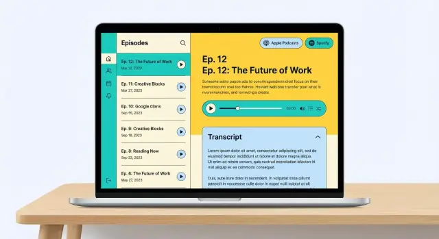
Create Great Episode Pages (Show Notes That People Use)
Build your podcast site fast
Describe your podcast site in chat and generate a React-based homepage and episode template.
An episode page should do two jobs at once: help existing listeners get value fast, and help new visitors decide whether your podcast is worth their time. The easiest way to achieve that is to make each episode page consistent, scannable, and action-oriented.
Start with a clean episode header
Put the essentials right at the top so people don’t hunt for context:
- Episode title (use a clear format like “E42: Topic — Guest Name”)
- Publish date and duration
- Guest info (name, role, company, and one link—avoid a wall of bios)
If you have categories or tags, add them near the header so visitors can jump to related episodes later.
Use a show-notes structure people can skim
Good podcast show notes aren’t a transcript pasted under a player. Aim for a predictable layout:
- 1–3 sentence summary: what this episode is actually about
- Key links: tools, resources, people, and references mentioned
- Timestamps: “00:00 Intro”, “12:40 Biggest takeaway”, etc.
- Takeaways: 3–7 bullet points that capture the core lessons
When you add links, use descriptive anchor text (“Guest’s reading list”) instead of “click here.” It helps both readers and podcast SEO.
Add clear calls to action (without clutter)
Pick one primary action and make it obvious:
- Subscribe: link to your subscribe hub (e.g., /subscribe)
- Newsletter: a simple form or link (e.g., /newsletter)
- Follow: a short row of social links, not a full directory
Place a CTA near the top and repeat it once at the bottom for people who finish the page.
Include a shareable highlight
Add one pull-quote or “highlight” block that’s easy to copy and share. For example:
“Most podcast growth comes from fixing your episode page, not chasing new platforms.”
That small touch encourages sharing and makes your episode page feel purposeful—not just a container for an audio file.
Add an Audio Player That Works Everywhere
A podcast website succeeds or fails on one simple moment: someone taps “play.” Your audio player should be obvious, fast, and reliable on any device.
Option 1: Use the embedded player from your podcast host
Most hosts (Buzzsprout, Libsyn, Captivate, Transistor, etc.) provide an embed code per episode. This is usually the simplest choice because:
- It “just works” with your existing RSS/hosting setup
- Analytics often stay in one place
- You don’t have to manage audio files on your website
The trade-off is styling and performance: some embedded players are heavier than a native site player.
Option 2: Use a website audio player (self-hosted or plugin-based)
A site-based player can match your branding and sometimes loads faster—especially if it’s lightweight. It can also support features like a persistent “sticky” player across pages.
If you go this route, make sure you’re not accidentally double-hosting audio (paying your host and also serving large MP3 files from your site).
Make playback effortless on mobile
Mobile visitors should see a large play button near the top of the episode page. Keep the player above long show notes so users don’t have to scroll to listen.
Also watch page speed: avoid stacking multiple players (one per segment) and limit heavy scripts around the player.
Offer a direct download link (when appropriate)
Some listeners prefer downloading for offline listening. A simple “Download MP3” link is helpful—especially for long episodes or unreliable connections.
Test it like a listener would
Before publishing, test playback on:
- Chrome, Safari, and Firefox (desktop + mobile)
- iOS and Android
- Normal and private/incognito windows
Confirm it plays inline without popups, doesn’t require a separate app, and still works when ad blockers are enabled.
Publish Transcripts That Are Readable and Search-Friendly
Transcripts aren’t just a “nice extra.” They make your episodes usable in more situations (quiet offices, hearing differences, skimming for key points) and give search engines real text to understand what each episode is about.
Pick the right transcript format
Different shows benefit from different levels of polish:
- Full transcript (verbatim): Best for accuracy and accessibility. Includes every “um,” false start, and side comment.
- Cleaned-up transcript (edited): Keeps meaning, removes filler, fixes grammar, and reads like a conversation. This is the most popular option for podcast websites.
- Highlights (partial transcript): A curated set of key quotes or segments. Useful when you can’t publish full transcripts, but it’s less helpful for search and accessibility.
How to generate transcripts
You have three practical paths:
- Human transcription: Highest accuracy, especially with multiple speakers and jargon, but costs more.
- AI transcription + review: Fast and affordable. The review step is non-negotiable if you want it to feel professional.
- Transcription services (hybrid): Tools and vendors that combine AI with human editing. Good middle ground when you want speed and quality.
Editing checklist (what makes transcripts readable)
Before publishing, do a quick pass for:
- Speaker labels (consistent names like “Host:” and “Guest:”)
- Punctuation and paragraph breaks (long walls of text get ignored)
- Names, brands, and places (spellings matter for credibility and search)
- Jargon and acronyms (expand the first time they’re used)
- Timestamps (optional, but helpful for long episodes or tutorials)
Where to place transcripts on your site
Keep it simple and predictable:
- On the episode page (recommended): Best for visitors and helps the episode page rank.
- As a separate tab/accordion: Cleaner layout, but make sure the transcript text still loads in the page HTML (not only after a click).
- On a separate URL: Useful if transcripts are very long or you want a dedicated format. If you do this, link prominently from the episode page.
Make transcripts searchable with headings and anchors
Structure the transcript so people can jump to what they need:
- Add on-page headings for major segments (Intro, Topic 1, Q&A, Wrap-up).
- Create anchors for common jumps (e.g., “Pricing discussion,” “Tool recommendations”).
- If you include timestamps, format them consistently so users can scan (and potentially map them to your audio player).
A good rule: if someone lands on the transcript from search, they should understand the episode’s promise within 10 seconds—and find the part they came for within 30.
Add Distribution Links and a Simple Subscribe Hub
Own your project output
Keep full control by exporting your source code whenever you need it.
People rarely “subscribe” the same way. Some are loyal to Apple Podcasts, others live in Spotify, and many now prefer YouTube. Your job is to remove friction: give them a clear choice and a single place to find it.
Create a simple “Listen on” block
Use a small set of prominent buttons labeled with words, not just icons. Clear labels help on mobile, help accessibility tools, and avoid confusion for new listeners.
Good examples:
- Listen on Apple Podcasts
- Listen on Spotify
- Watch on YouTube
Keep button styling consistent (same shape, size, and color rules), so the block reads as one action: “pick your app.” If you use icons, pair them with text.
Don’t forget the RSS link (for power users)
Include your RSS feed link for listeners who use alternative podcast apps or want to add your show manually. Make it visible but not dominant—usually a smaller text link under the main buttons works well.
You can label it plainly:
- RSS feed
Put subscribe links in three key places
To catch people at the moment they’re ready, place the same subscribe options:
- On your homepage (near the top, and optionally again near the latest episodes)
- On every episode page (near the audio player or right under the episode title)
- On a dedicated page like /subscribe
Your /subscribe page should be simple: a short sentence about choosing a platform, followed by the full button set, plus the RSS link.
Add one newsletter signup near the subscribe options
If you have a newsletter, include a single signup form next to (or just below) the “Listen on” buttons. Keep it minimal: name (optional) + email + one clear promise like “Get new episodes and notes.” Avoid multiple forms across the page—one is enough.
If you already have a menu item like “Subscribe,” link it to /subscribe so visitors always know where to go next.
Make Episodes Discoverable with Basic Podcast SEO
Good podcast SEO is mostly good page hygiene: clear titles, readable structure, and pages that search engines can actually crawl. You don’t need fancy tactics—just make each episode page stand on its own.
Write titles and descriptions that match real searches
Give your show homepage a descriptive page title (e.g., “Show Name — Weekly Interviews on Remote Work”) and a short meta description that explains who it’s for.
For episode pages, use a consistent pattern:
- Page title: “Episode 42: [Topic] with [Guest] — [Show Name]”
- Meta description: 1–2 sentences summarizing the key takeaway, plus the guest’s name or notable company
This helps your pages appear for both topic searches and guest-name searches.
Use headings that make show notes scannable
On each episode page, structure the content with headings so both people and search engines understand it:
- H2: Summary
- H2: Key takeaways
- H2: Resources
- H2: Transcript
Within the transcript, use H3 subheadings for segments (timestamps, topics, or questions). This improves readability and can help pages rank for specific subtopics.
Link your content together (lightly, but consistently)
Internal links are an easy win because they guide visitors to more listening and help search engines discover older episodes.
Add a couple of relevant links on each episode page:
- Link to related episodes (“If you liked this, try Episode 18…”)
- Link to a guest page (if you have one) that lists all their appearances
- Link back to your episode archive or season page
Make sure episodes are crawlable
Avoid hiding show notes and transcripts behind tabs that only load via heavy scripts. When possible, keep the core text in the HTML of the page.
Also generate a sitemap that includes your episode URLs, and submit it in your search console. Your platform may do this automatically; if not, add a standard sitemap file.
Consider basic schema (if supported)
If your site builder or podcast website platform supports structured data, look for options like PodcastSeries (for the show) and PodcastEpisode (for each episode). Don’t force it with fragile plugins—use built-in support when available.
Cover Accessibility, Privacy, and Content Rights
Iterate without fear
Experiment with layouts and roll back quickly if a change does not work.
A podcast website isn’t just a place to host podcast episode pages and podcast transcripts—it’s also where you make listening (and reading) possible for more people, and where you set clear expectations about data and reuse.
Accessibility basics (simple wins)
Start with transcripts. Every episode should have a transcript that’s easy to find from the episode page (not hidden behind a download). If you’re using an embedded podcast player, don’t assume it covers accessibility on its own—some players are better than others.
Also check the basics:
- Readable contrast and font sizes so show notes and transcript text aren’t tiring to read.
- Keyboard navigation: you should be able to tab through the page, reach the audio controls, and activate links without a mouse.
- Clear headings on podcast episode pages (Episode title → key links → show notes → transcript) so screen readers can skim.
Alt text for episode artwork and guest photos
If you include guest headshots, sponsor logos, or episode artwork, add descriptive alt text.
Good alt text is specific and short, like: “Photo of Jane Kim, founder of Brightwell Studio.” If the image is purely decorative (for example, a background texture), use empty alt text so screen readers skip it.
Privacy, cookies, and embedded tools
A podcast website often includes analytics, an embedded podcast player, or third-party widgets (email forms, social embeds). These can set cookies or collect usage data.
At minimum, include:
- A Privacy Policy page that states what you collect (e.g., analytics events, IP address), why you collect it, and how users can contact you.
- A note about third-party embeds (common with Spotify, Apple Podcasts, YouTube, etc.).
- If required for your audience/region, a cookie banner or consent tool—especially if analytics or ads are involved.
Keep this practical: list the tools you use and link to their policies.
Content rights: music, quotes, and clips
Show notes and transcripts can accidentally publish content you don’t have rights to.
- Music: don’t assume intro/outro music is okay because it’s “just a few seconds.” Use properly licensed tracks and keep proof of license.
- Third-party clips: if you play a clip from a show, video, or another podcast, get permission (or be confident your use is legally defensible in your jurisdiction).
- Quotes in transcripts: a short quote is usually fine, but avoid reproducing large passages from books/articles. Link to the source instead.
If you host guest content, clarify in writing who owns what (you, the guest, or shared), and what you’re allowed to publish on the website for podcast distribution links and episode pages.
A simple way to handle corrections
Transcripts aren’t perfect—names, acronyms, and technical terms get misheard. Add a visible contact option on every episode page (or in the site footer) for corrections.
A simple line works: “Spotted an error in this transcript? Email us at corrections@… or use the form at /contact.” This builds trust and keeps your podcast transcripts accurate over time.
Launch, Measure, and Maintain a Repeatable Publishing Workflow
A podcast website is never really “done.” The good news: if you set up a simple workflow, publishing becomes routine—and the site steadily gets more useful (and more discoverable) over time.
Launch: test the full listener journey
Before you announce your site, do a quick pass as if you’re a first-time visitor on a phone.
Launch checklist (15–30 minutes):
- Click every Subscribe button and confirm it opens the right destination (Apple/Spotify/YouTube, etc.).
- Press play on the embedded audio player on mobile and desktop.
- Open a few episode pages and make sure headings, links, and formatting look clean.
- Check transcript sections for readability (spacing, speaker labels if you use them, and working “jump to section” links if present).
- Trigger a couple of intentional errors: visit a nonsense URL to verify your 404 page exists and guides people back to episodes.
Measure: track what actually moves the show forward
Basic analytics is enough. You want visibility into site traffic and outbound clicks to listening apps.
Focus on a small set of metrics:
- Episode page views (which topics pull people in)
- Transcript reads (often a strong signal of search traffic)
- Newsletter signups or contact form submissions (your owned audience)
- Outbound clicks to Apple Podcasts and Spotify (proof that the site turns visitors into listeners)
If your analytics tool supports it, create events for “Click Apple Podcasts” and “Click Spotify” so you can compare which pages drive the most subscriptions.
Maintain: a repeatable publishing checklist
Keep a consistent order each time you release:
- Publish the episode page (title, summary, key links, resources).
- Update show notes (timestamps, guest links, products mentioned).
- Add the transcript and double-check formatting.
- Share one canonical episode URL across social and email so all traffic consolidates.
If you’re building custom templates, consider documenting your “episode page schema” (the sections you always include). Teams that use tools like Koder.ai often turn this into a repeatable build: you can describe the layout once (player, show notes, timestamps, transcript, subscribe links), generate the pages and components, and then iterate as your podcast grows—without rewriting the site from scratch.
Improve over time (only if it’s useful)
Once the basics are stable, consider additions that compound value: a guest directory, on-site search, a simple /blog for related posts, or a /pricing page if your podcast supports consulting, membership, or sponsorship packages.
FAQ
What are the essential things a podcast website should let visitors do?
Start with four frictionless actions:
- Listen: a fast, reliable on-page player
- Read: scannable show notes (summary, links, timestamps, takeaways)
- Subscribe: clear buttons to Apple Podcasts, Spotify, and others
- Share: clean, stable episode URLs people can copy
If visitors can do these instantly, everything else you add later performs better.
Which metrics should I track to know if my podcast website is working?
Pick 2–3 metrics you’ll actually review weekly, such as:
- Outbound clicks to Apple Podcasts/Spotify
- Episode page views and top landing pages
- Newsletter signups or contact inquiries
Then design around them: place subscribe links near the player, keep episode pages consistent, and use one canonical URL per episode so sharing and measurement are clean.
What pages are must-haves for a new podcast website?
A practical minimum is:
- Home
- Episodes (archive)
- About
- Contact
- A /subscribe hub
- (with show notes + transcript)
How do I choose a good domain name for my podcast website?
Use a domain that listeners can say and spell after hearing it once:
- Avoid hyphens, numbers, and clever spellings
- If
.comis taken, consider clear alternates like.fmor.show - Keep it consistent with your podcast name and artwork so it feels trustworthy
Which platform is best for publishing episodes and transcripts?
Choose based on how you publish:
- Website builders (Squarespace/Wix/Webflow): great for manual show notes; quick setup
- Podcast host website: fastest if it auto-creates pages from RSS; can be limiting for transcript formatting/SEO
- Custom CMS (WordPress/Ghost/headless): best control for templates, internal linking, and long transcripts
If transcripts are a priority, pick a platform that makes long-form editing painless.
How should I structure navigation so episodes are easy to find?
Keep navigation short and predictable:
- Home
- Episodes
- About
- Contact
For larger catalogs, add light structure on the Episodes archive:
- Filters for Season and/or
What’s a good URL format for podcast episode pages?
Pick one pattern early and stick to it, for example:
/episodes/ep-42-guest-name-topic/seasons/season-2/ep-1-title
Avoid changing URLs later. If you must restructure, add redirects so old links from social posts and listening apps don’t break.
What should my podcast homepage include to convert new visitors into listeners?
Put listening and subscribing above the fold:
- A prominent “Listen on” row (Apple Podcasts, Spotify, YouTube Music, etc.)
- A primary CTA like “Listen to the latest episode”
- A short trailer/Start here episode (2–5 minutes)
Then guide newcomers with plus a curated (3–6 episodes) to reduce decision fatigue.
How do I write show notes that people will actually use?
A strong episode page is consistent and skimmable:
- Clear header: title, date, duration, guest info
- Show notes with:
- 1–3 sentence summary
- key links (with descriptive anchor text)
- timestamps
- 3–7 takeaways
- One primary CTA (subscribe/newsletter) near the top and repeated at the bottom
Add a copyable highlight quote to encourage sharing.
What’s the best way to publish podcast transcripts for accessibility and SEO?
Use a format that matches your time and quality needs:
- Verbatim: best accuracy, least readable
- Cleaned-up (edited): most popular for websites
- Highlights only: faster, but weaker for accessibility and SEO
Keep transcripts readable with speaker labels, paragraph breaks, correct names, and (optional) timestamps. Ideally, place the transcript so the text is crawlable and useful for search.