Jul 24, 2025·8 min
How to Build a Small Restaurant Website: Menu, Booking, Contact
Learn how to build a small restaurant website with an online menu, reservations, and contact forms—plus SEO, photos, mobile design, and a launch checklist.
Learn how to build a small restaurant website with an online menu, reservations, and contact forms—plus SEO, photos, mobile design, and a launch checklist.
Before you pick a website builder or design a single page, get clear on what the site must do for your restaurant. A restaurant website isn’t a brochure—it’s a tool that should move people from “maybe” to “booked” (or at least “calling”).
Choose the main action you want visitors to take:
You can support all three, but picking a #1 goal makes everything easier: what goes on the homepage, which button is most prominent, and what success looks like.
Your in-person vibe might be obvious, but online visitors need quick signals that say “this place is for me.” Identify your biggest audience segment:
Once you know the audience, you’ll know what questions to answer first (parking? dietary options? private dining?).
At minimum, plan for:
Decide what “working” means so you don’t guess later. Common metrics include completed reservations, tap-to-call clicks, and direction/map clicks. If your goal is walk-ins, direction clicks and “hours viewed” can be just as important as bookings.
Before you design anything, make three decisions that will save you time later: your domain name, what you’ll build the site with, and how many pages you actually need.
Keep it close to your restaurant name, easy to spell, and short enough to say over the phone.
A few practical tips:
If your restaurant name is common, add a simple location cue (e.g., lunabistroboston.com).
You generally have three options:
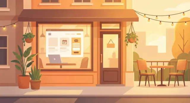
A newer option (especially if you want to move faster than traditional dev without getting boxed into rigid templates) is a vibe-coding platform like Koder.ai. It lets you describe what you need in chat (menu, reservations, contact form, local SEO pages), then generates a real application you can host, deploy, and export source code from—useful if you want the speed of a builder but the flexibility of custom development.
Whichever path you choose, confirm it supports the basics you’ll need from day one: scannable menu layouts, an online booking widget, and a contact form (plus spam protection). If it’s hard to add these, you’ll feel the pain every week.
Restaurants don’t need dozens of pages. Keep it straightforward so people can find the menu and book a table in seconds.
A clean structure might look like:
This keeps navigation focused—and makes your menu, booking, and contact options impossible to miss.
These four pages are where most guests make a decision. Keep them simple, quick to load, and consistent: one clear “next step” on every page (View Menu, Book a Table, Call).
Your home page should answer: What kind of place is this, where is it, and what should I do next? Lead with a short description that signals cuisine and vibe (“Seasonal Italian small plates” / “Family-friendly ramen bar”), then place your location and hours near the top.
Add two primary buttons above the fold: View Menu and Reserve (or Call if you don’t take bookings). If you have a signature item, happy hour, or live music night, mention it briefly—then link to details instead of writing an essay.
Structure the menu in clear categories (Starters, Mains, Desserts, Drinks). Make it easy to scan: dish name + short description + price, with optional dietary labels (V/VE/GF) and spice indicators.
Avoid posting only a PDF—many people will leave if it’s slow or hard to read on a phone. If you must include a PDF, also provide a text menu on the page.
Put the booking widget or form at the top, followed by concise policies only if needed (party size limits, seating time, cancellation rules). If reservations aren’t available, offer clear alternatives: “Call to book” and a link to /contact.
Include phone, email, address, hours, and a map embed. Add practical details guests look for: parking, public transit, accessibility notes, and how to reach you for private events.
A great restaurant website menu is designed for scanning—on a phone, in bright daylight, with a hungry customer deciding in seconds.
If possible, build your online menu as a normal web page instead of uploading only a PDF. Web menus load faster, work better on mobile, and are easier for search engines to understand. If you still need a PDF (for printing), offer it as an optional download link—don’t make it the only choice.
Use familiar categories and keep each item easy to skim:
Add short descriptions (one line is often enough) and put the most important info first: what it is, key ingredients, spice level, and what makes it special.
Help guests self-select quickly with simple tags like V (vegetarian) and GF (gluten-free). If you can, include common allergen notes (nuts, dairy, shellfish).
Add a short disclaimer such as: “Allergen information may change—please confirm with our staff.” This sets expectations while still being helpful.
Nothing hurts confidence like outdated prices or missing items. Set a simple routine:
If you do rotating specials, consider a small “Today’s Specials” area at the top of the Menu page so repeat customers see what’s new immediately.
Reservations should feel effortless for guests and manageable for your team. The best setup depends on how busy you are, how often availability changes, and whether you want real-time confirmations.
Phone-only works for very small teams, but it forces every guest to call and can lead to missed calls during service.
Request form (you confirm manually) is a good middle ground. Guests submit details, and you reply with a confirmation.
Live booking widget (real-time availability) is the smoothest experience for guests and reduces back-and-forth—especially on weekends.
Don’t hide booking behind a menu item nobody taps. Put a clear “Reserve a table” button on:
If you’re adding a widget, keep the rest of the page simple: short instructions, your phone number for edge cases, and key policies.
Every extra field lowers completion. In most cases, ask for:
If it’s a request, say what happens next: “We’ll confirm by text within 2 hours.” If you can’t respond quickly, guide urgent requests to call and link to /contact.
A clear confirmation message (or email/text) reduces no-shows and prevents duplicate bookings.
A contact form should do one job: help guests reach you and get a timely reply. If it’s hard to find, too long, or sends messages into a black hole, people will default to calling—or they’ll give up.
For most small restaurants, a simple form is enough for general questions and event inquiries. Aim for 4–6 fields:
If you host private events, add one extra field like “Date (preferred)” to reduce back-and-forth.
Spam will pile up fast if your form is unprotected. Use one of these options:
After submission, show a clear confirmation message (and set expectations): “Thanks—if you’re asking about an event, we’ll reply within 1 business day. For same-day changes, call us at …” This prevents duplicate messages and reduces phone calls.
Some guests won’t use forms. Place these near the form (and in the footer):
If everything goes to a single personal email, messages get missed on days off. Route by topic (e.g., “Private events” → events@, “Press” → marketing@) or forward to a shared inbox.
Before launch, submit test messages on desktop and mobile and confirm:
Put your contact form on /contact and link it from the main navigation so it’s never more than one tap away.
Most diners will visit your site from their phone—often while walking, driving past, or comparing options with friends. A mobile-first site isn’t a “smaller desktop site”; it’s a site designed for quick decisions.
Make the primary actions easy to hit and hard to miss: View Menu, Book a Table, Call, Get Directions. Buttons should be large enough for a thumb tap, with comfortable spacing so people don’t mis-tap.
Keep text readable without pinching: use a clear font, strong contrast, and short sections. If your menu or hours require zooming, you’ll lose people.
Even on mobile, diners want to scan first, then read. Use consistent formatting for item names, descriptions, and prices. Add clear headings (Starters, Mains, Desserts), and give each item breathing room.
If you use a PDF, ensure it’s mobile-friendly and lightweight—but a web-based menu page is usually faster to scan and easier for search engines.
Slow sites cost reservations. Compress photos (especially hero images), avoid auto-playing video, and be picky with plugins and widgets—each one can add loading time.
A simple rule: if a widget isn’t directly helping people book, call, or find you, reconsider it.
Accessibility is practical: it helps real customers. Use good contrast, add alt text for key images, and label form fields clearly (so “Name” and “Phone” aren’t placeholders that disappear).
Test quickly: open your site on your phone, try one-handed navigation, and book a table using only the on-screen keyboard. If anything feels fiddly, fix it.
Your website should feel like walking through your front door. Before tweaking colors or fonts, decide what you want guests to sense in the first five seconds: cozy and family-style, modern and bright, upscale and quiet, or quick and casual.
Stock photos make a restaurant look generic. A small set of authentic images builds trust and helps people picture their visit.
Prioritize:
Keep edits light. Aim for accurate colors and portions—your best marketing is when expectations match reality.
Add a few lines that answer “Why here?” without forcing a long scroll. A simple structure works well:
Example: “Chef Maya’s menu focuses on wood-fired vegetables and seasonal small plates, inspired by the markets she grew up visiting every weekend.”
People often visit your site to confirm logistics. Put these details near your menu and reservations so they’re hard to miss:
A short review snippet can help, but only if you cite the source (and keep it current). For example:
“Best pasta in town.” — Google review, Aug 2025
If you can’t verify the source, skip it and let your photos, menu, and clear details do the convincing.
Local SEO is about showing up when someone searches “Thai food near me” or “best brunch in [your neighborhood].” A few focused updates can make a noticeable difference—without turning your website into a tech project.
Set unique page titles and meta descriptions for your most important pages (Home, Menu, Reservations, Contact). Avoid using the same title everywhere.
For example:
Keep the wording natural, and include your city/neighborhood where it makes sense.
Your name, address, and phone (NAP) should match exactly across the site—especially in the footer and Contact page. Use one “official” format (e.g., “St.” vs “Street”) and stick to it. Consistency helps search engines trust the listing and helps customers call the right number.
On your Contact page, embed a map for quick orientation, then add a prominent “Get directions” link that opens the customer’s maps app. This reduces friction for mobile visitors and can increase walk-ins.
Create or refresh your Google Business Profile, then link to your website.
Make sure the basics are accurate:
If you have multiple locations, create a dedicated page per location and link to the correct one from your profile(s).
A restaurant website isn’t “done” after launch. A few simple measurements tell you whether guests are finding what they need quickly—or getting stuck and leaving.
Start with Google Analytics 4 (GA4) if you already use Google tools. If you’d rather minimize tracking, choose a privacy-friendly option like Plausible or Matomo.
Whatever you pick, the goal is the same: understand which pages get visits and which actions actually lead to diners.
Page views are nice, but conversions are what pay the bills. Set up events for:
If you can only track a few things, start with reservation clicks and call clicks.
Put a small QR code on tables, the host stand, and printed receipts linking to /menu (and optionally a second one to /reservations). This helps guests browse specials, share the menu, or book their next visit without searching.
Once a month, check:
Then adjust one thing at a time: move the “Reserve a Table” button higher, simplify the first screen, or rewrite a confusing label (for example, “Book Now” instead of “Check Availability”). Small tweaks compound fast when your site is getting steady local traffic.
A restaurant website doesn’t need to feel “legal,” but it should be clear, safe, and respectful with guest data. A few basics now can prevent headaches later.
If you collect any personal info (name, email, phone, booking details) through a contact form, reservations, or email signup, add a simple Privacy Policy page (e.g., /privacy).
Keep it plain-language and include:
For regular contact and reservation confirmations, you usually don’t need a marketing consent checkbox. Add a checkbox only if you’re signing someone up for promotional emails (and make it optional and unchecked by default). If you do email marketing, link to your /privacy page near the checkbox.
Basic compliance is also about avoiding surprises. Make sure your footer or Contact page clearly lists:
At minimum:
If you take deposits or sell gift cards, let a trusted payment provider handle the card details—don’t store payment info on your site.
A restaurant website is never really “done.” The best sites launch cleanly, then stay accurate—especially the basics diners rely on when they’re hungry: hours, address, phone, and booking.
Open the site on multiple phones (iPhone/Android) and at least two browsers (Chrome/Safari). Tap through the critical paths:
Double-check every place your core info appears (header, footer, Contact page, Google map embed):
Set a recurring reminder:
If you’re building a custom site (or using a platform like Koder.ai that can generate and host a full web app), snapshots and rollback can be a practical safety net: you can update menus or pages, then revert quickly if something breaks right before a busy weekend.
Once live:
Staying current builds trust—and trust gets bookings.
Pick one primary action for the site (usually Reserve, Call, or Get Directions) and design every page around it.
Practical quick wins:
Most small restaurant sites work best with 5–7 pages so guests can find key info in seconds.
A common structure:
Choose a domain that’s easy to say, spell, and remember.
Guidelines:
A website builder (Squarespace/Wix) is usually best if you want to update hours, photos, and menu items quickly without technical maintenance.
Consider WordPress if you need more flexibility and you can handle (or outsource) hosting, updates, and plugins.
No matter what you choose, confirm it supports:
A web page menu is almost always better for guests and search engines.
Why:
If you need a PDF for printing, include it as an optional download, not the only menu format.
Use the least-friction option your team can reliably run:
Place booking where people expect it:
Keep your form short and set expectations.
Best practices:
Test it on mobile and desktop before launch to ensure messages don’t go to spam.
Focus on the tasks diners do on their phone:
A simple rule: if it doesn’t help someone , it may be slowing your site down for no benefit.
Start with basics that directly affect local visibility:
If you collect personal info via forms or reservations, you should have a simple Privacy Policy page (e.g., /privacy).
Keep it plain-language:
Also make sure your site uses and that your platform/plugins stay updated.