Apr 06, 2025·8 min
Create a SaaS Website with a Deep FAQ & Learning Hub
Step-by-step plan to build a SaaS website that converts: clear messaging, key pages, deep FAQs, and a self-education hub that reduces support load.
Step-by-step plan to build a SaaS website that converts: clear messaging, key pages, deep FAQs, and a self-education hub that reduces support load.
A deep FAQ and self-education hub only work when they serve a specific business goal and a specific audience. Otherwise, you’ll publish a lot of “helpful” content that doesn’t move signups, reduce support, or improve adoption.
Decide what the website is mainly trying to generate:
Choose one as the north star, then treat the others as secondary. This keeps your pricing page, CTAs, and education content from pulling in different directions.
Go beyond “SMBs” or “enterprise.” Write down:
Each role arrives with different anxieties and decision criteria. Your FAQ should sound like it understands their day-to-day.
Collect these from sales calls, support tickets, competitor reviews, and onboarding drop-off points. Typical buckets include:
These questions should directly shape your FAQ structure and your learning hub curriculum.
Be explicit about outcomes. Examples:
Tie content to measurable signals:
With goals, audience, and metrics set, every page you build has a clear job to do.
Your best website copy sounds like your customer’s inner monologue. If your audience searches “automate month-end close” and your homepage says “AI-powered finance platform,” you’ll miss both the click and the trust.
Write one sentence that a customer would recognize immediately:
For [who], [product] helps you [outcome] by [how].
Example (adjust to your SaaS): “For small finance teams, AcmeClose helps you finish month-end close in days instead of weeks by centralizing approvals, reconciliations, and reporting.”
Then repeat that same idea across your homepage hero, meta titles, and first paragraphs on key pages. Consistency is what makes your message stick in search results.
The “aha” moment is the first time a user feels, “This solved my problem.” Name it clearly in your messaging and show the shortest route:
This language becomes your headings: “Connect X in 5 minutes,” “Get your first Y today,” “See Z instantly.”
Most people search by problem, not by feature. Identify your top use cases and give each its own page with:
These pages capture high-intent searches and keep your homepage from trying to do everything.
Pick terms and use them the same way everywhere:
Align your wording with what users type: use their labels for roles, tasks, and deliverables. When your copy matches search language, SEO improves—and so does comprehension.
A good SaaS site map does two jobs at once: it helps new visitors understand what you do in seconds, and it gives high-intent buyers a straight path to “Is this right for me?” and “Can I trust you?” Start by mapping pages to decision stages, not to your internal org chart.
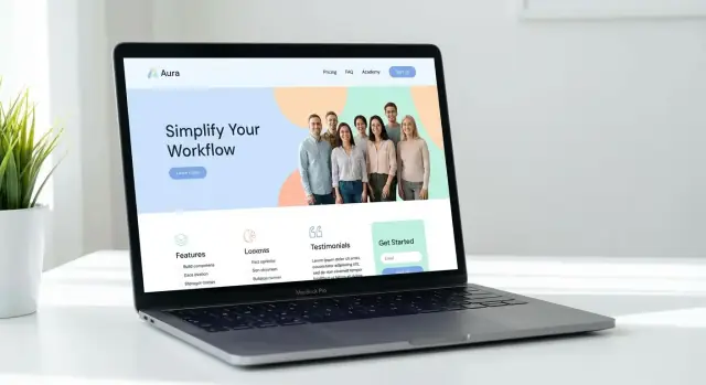
Your Home page should quickly answer three questions: what outcome you deliver, who it’s for, and why your approach works.
Place the primary CTA above the fold (for example, “Start free trial” or “Book a demo”), then support it with proof: short customer quotes, recognizable logos (only if real), and a quick visual of the product. Keep secondary CTAs (watch video, read docs) visible but not competing.
Instead of listing every feature as a separate page, group product pages around the jobs users hire your tool to do (e.g., “Automate approvals,” “Monitor usage,” “Reduce churn”). This makes navigation intuitive and helps prospects self-qualify.
A simple structure is:
Pricing should include plans, key limits, and what happens when customers grow. Call out add-ons and common questions directly on the page: contract terms, billing, cancellation, support tiers, and what’s included in onboarding.
If you can’t publish exact prices, still publish a clear pricing model and what affects cost.
Most SaaS buyers look for reassurance before they convert. Add a “Trust” cluster in the map:
These pages don’t need to be long; they need to be specific, current, and easy to reach from the header or footer.
A deep FAQ and an Academy only help if people can find the right answer in a few clicks. Your information architecture should make learning feel like a normal part of the product journey, not an afterthought.
Keep the primary navigation predictable and business-focused, then make learning easy to spot:
This structure helps new visitors evaluate quickly, while existing users can self-serve without hunting.
You have two common models:
Whichever you choose, avoid burying either behind multiple menus. If customers frequently need it, it deserves a first-class spot.
Use breadcrumbs in the Academy/knowledge base so users understand where they are (and can jump up a level). Add a small Related articles module to:
Templates prevent a messy help center. Define standard layouts for FAQ entries, Academy lessons, troubleshooting articles, and onboarding guides. Keep headings, “Who this is for,” steps, and next actions consistent so users recognize the format instantly.
High-intent pages are where curious visitors turn into users. They work best when they answer a specific “Should I choose you?” question and remove friction from the next step.
For feature, use-case, and solution pages, keep the storyline simple:
Avoid treating every page like a homepage. A page should focus on one job-to-be-done and guide the reader toward a single next step.
If prospects commonly evaluate you against a known competitor or category (spreadsheets, agencies, legacy tools), create “X vs. Y” pages.
Keep them fair and practical:
A good comparison page reduces back-and-forth with Sales and increases confidence for self-serve buyers.
Create pages for key roles (e.g., Ops, Marketing, Finance) or industries you actively serve. Make them specific:
Use clear calls to action across high-intent pages:
On your pricing page, reinforce the next step with plain-language plan guidance, what’s included, and a short “Is this right for me?” block. The goal is simple: help visitors choose, then act.
A deep FAQ isn’t a dumping ground for random questions—it’s a fast path to answers for people who are evaluating your SaaS or trying to fix something right now. Done well, it reduces repetitive tickets and makes your product feel predictable and safe.
Organize the FAQ like a helpful support rep would:
These buckets make scanning easy and prevent “where do I click?” frustration.
Use the exact phrasing customers type in tickets and search bars. If people say “cancel,” don’t title it “terminate subscription.” Add synonyms inside the question or opening line so different search styles still land on the right answer (e.g., “refund / credit / chargeback”).
Keep each FAQ entry consistent:
This format helps both skimmers and anxious troubleshooters.
Include simple “choose your path” cues:
At the end of an answer, point to the next best resource: a deeper guide, a short video, or the most relevant product page (like Pricing or Integrations). Keep it focused: one or two next steps beats a long list that overwhelms.
A self-education hub is where curious visitors become confident users—without waiting for a demo or a support reply. Done well, it reduces tickets, shortens time-to-value, and gives your product pages a credible proof layer through practical guidance.
Start with a small set of repeatable formats, then expand based on what customers ask most often:
Keep each piece focused on one goal. People rarely want “everything about the product”—they want the next step.
Organize content into tracks that mirror real customer intent. A practical starting set:
Tracks reduce the “where do I start?” problem and make your hub feel curated rather than endless.
Consistency is what makes content skimmable. Use one template across tutorials and lessons:
This structure also makes it easier for your team to publish without reinventing the format each time.
Treat your hub as part of your website structure, not a separate island. Add contextual cross-links between:
Cross-linking helps visitors self-serve and keeps them moving toward activation.
Make most learning content public to support evaluation and SaaS SEO, including overview lessons, common workflows, and terminology.
Keep content login-only when it exposes sensitive implementation details (security configurations, customer-specific connectors), includes private screenshots/data, or requires account context to be meaningful. The rule: publish what helps someone choose and start; gate what could create risk or confusion.
Your FAQ and learning hub shouldn’t end at understanding. The real win is when education turns into action inside the product: a completed setup, a first successful workflow, and a team that adopts the tool without hand-holding.
Create a “Start here” page for each primary use case (not each feature). Treat these pages like guided tours: who it’s for, what success looks like in the first week, and the shortest path to a working result.
Keep the structure consistent:
Add simple checklists and milestones that map to adoption moments:
These checkpoints make progress visible and reduce drop-off caused by “I’m not sure what to do next.” If your product supports it, mirror the same wording in-app so the website and onboarding feel like one journey.
Not everyone wants to read. Pair your written steps with:
Templates are especially effective because they remove the blank-page problem and let users learn by editing something that already works.
Even great self-education needs a safety net. On each onboarding page, include a clear “If you’re stuck” section with options like:
This keeps momentum high while still deflecting avoidable support tickets.
SEO for FAQs and learning content is less about getting traffic and more about getting the right questions in front of the right buyer or user at the exact moment they need clarity. The goal is to win high-intent searches (setup, pricing, security, integrations) while also supporting existing customers who are trying to succeed.
Build a simple keyword map before you write or reorganize anything. Group terms into four buckets:
Then decide what format fits each query best: FAQ entry, tutorial, glossary definition, troubleshooting guide, or a concept article. This prevents the common mistake of turning everything into generic FAQs.
Structured data can help search engines understand your content, but it must match what’s on the page.
Avoid stuffing schema onto marketing pages that aren’t written as FAQs or tutorials—misalignment can backfire.
Learning content should feel scannable and calm. Practical improvements:
Consistency is a competitive advantage.
Done well, your FAQ and education hub become a search-friendly support layer that attracts qualified prospects and helps customers succeed faster.
If you can’t show impact, your FAQ and learning hub will drift into “nice to have” territory. A simple measurement plan keeps the content focused on outcomes: fewer tickets, faster activation, and more signups.
Pick metrics that map to real business value and that you can review consistently:
Support deflection is hard to prove perfectly, but you can get close:
Analytics tells you what; behavior tools show you why. For high-impact pages (top FAQ categories, onboarding guides, pricing-related explainers), consider heatmaps/session recordings to spot:
Treat the hub like a product. Do a monthly review of top articles:
When analytics becomes routine, your FAQ and education hub stops being a content library and starts acting like a measurable growth and retention channel.
Great FAQ and learning content fails when it’s hard to publish, impossible to search, or quickly becomes outdated. The right tooling and a simple workflow keep your education hub accurate and easy to maintain.
Start with a CMS that makes it easy to build marketing pages and a docs/knowledge-base tool that’s built for frequent edits.
Prioritize:
If your product changes often, versioning matters more than design polish. It’s what keeps older screenshots, steps, and UI labels from confusing users.
If you’re building your product and education layer in parallel, choose platforms and workflows that make iteration cheap. For example, Koder.ai (a vibe-coding platform for web, backend, and mobile apps) leans into rapid iteration with snapshots and rollback, planning mode, and source-code export—capabilities that map well to the same “publish fast, revert safely, keep docs current” mindset your help center needs.
Decide, in writing, who is responsible for keeping the FAQ and education hub current.
A lightweight model:
Add two rules that prevent most content decay:
Before you ship:
Security, status, and reliability notes are part of the buying decision. Keep status updates, security statements, compliance notes, and uptime language accurate and dated. If you can’t maintain a claim, remove it—nothing erodes trust faster than stale assurances.
Pick the single action you most want the website to produce and design everything around it.
Treat other actions as secondary so your CTAs, pricing page, and education content don’t compete.
Define your audience in terms you can write pages for:
Then mirror each group’s anxieties and decision criteria in your FAQs, use-case pages, and onboarding guides.
Start with real customer language, then organize it so it’s usable.
Use a single, plain sentence you can repeat everywhere:
For [who], [product] helps you [outcome] by [how].
Then reuse that same idea across your homepage hero, key page intros, and meta titles. Consistency improves both comprehension and search performance.
Describe the first moment a user feels “this solved my problem,” then show the fastest path to it.
Include:
Turn that into page headings like “Connect X in 5 minutes” or “Get your first Y today.”
Build your navigation to support both evaluation and self-serve.
A common structure is:
Use one of two models:
Choose the model that reduces clicks for your most common intent: “Can I trust you/buy this?” vs. “How do I do this?”
Treat each page like it answers one high-intent question and leads to one next step.
A reliable structure:
Avoid turning every page into a mini-homepage; focus on one job-to-be-done per page.
Design it for scanning and stress-free troubleshooting.
Pick metrics you can review regularly and tie them to outcomes.
Track:
Add a maintenance cadence (e.g., monthly top-article review) so content stays accurate as the product changes.
Those clusters should become your FAQ categories and the backbone of your learning tracks.
Keep learning one click away; if customers need it often, it shouldn’t be buried in submenus.