Oct 20, 2025·8 min
How to Create a Startup Website Transparency Page (Step-by-Step)
Learn how to plan, write, and publish a startup transparency page: what to share, what to avoid, page structure, updates, and practical templates.
What a Transparency Page Is (and Why Startups Use It)
A transparency page is a single, public place on your website where you explain how your company works—what you’re building, how you price it, how you handle customer data, and what people can expect when things go wrong.
It’s not a marketing page full of vague claims. It’s also not a “tell the world everything” document. The goal is practical clarity: give customers, candidates, and partners enough context to trust your decisions and use your product with fewer surprises.
What it is (and what it isn’t)
A good transparency page is:
- Specific: concrete policies, timelines, and definitions (not buzzwords)
- Readable: written for non-technical people
- Maintained: updated when reality changes
A transparency page is not:
- A replacement for your legal terms (/terms) or privacy policy (/privacy)
- A real-time status page (though it can link to one)
- A place to publish sensitive details (security configurations, confidential contracts, personal data)
Why startups publish one
Startups use transparency pages to:
- Build trust faster with customers who don’t know your brand yet
- Reduce pre-sales friction by answering common questions upfront (pricing, support hours, roadmap approach)
- Create internal alignment—writing down operating principles forces clarity
- Support hiring and fundraising by showing how you think and how you run the business
When it helps—and when it can hurt
It helps when you can commit to straightforward promises and consistent updates.
It can hurt if you publish:
- Overconfident claims you can’t reliably meet (e.g., “99.99% uptime” without the systems to back it)
- A roadmap you won’t maintain, which signals chaos rather than openness
- Numbers without context, which invites misinterpretation
Set expectations from the start
Only share what you can support with real ownership and an update habit. If you can’t keep a public roadmap current, publish principles for prioritization instead.
For length and structure, aim for a page (or small set of pages) totaling around 3,000 words—enough to be genuinely useful, short enough to stay readable. Break it into clear sections with a simple table of contents and anchors so people can jump straight to what they need.
Choose Your Audience and the Level of Transparency
A transparency page can’t answer everyone’s questions equally well. If you try, it turns into a wall of text—or worse, a set of vague statements that don’t build trust.
Start with one primary audience
Pick the single group you most need to reassure right now, and write for them first:
- Customers want clarity on pricing, reliability, security, and what happens when something goes wrong.
- Candidates want to understand how you work, your values, and what “a normal week” looks like.
- Investors want signals of execution, decision-making, and healthy governance.
- Community/users want openness, responsiveness, and a sense of direction.
You can still include sections for other audiences, but your primary audience should shape tone, detail, and what you emphasize.
Define 3–5 trust questions
Your page should clearly answer a small set of questions your audience is already asking, such as:
- “Can I predict what this will cost me?” (See /pricing)
- “How do you handle outages and support?”
- “What do you collect about me, and why?”
- “How do you make product decisions—and do you listen?”
Choose a transparency level (and stick to it)
- Basic: principles, contact paths, and a simple promise.
- Standard: adds pricing expectations, support/SLA basics, and lightweight product updates.
- High: adds a public roadmap, changelog cadence, and selected metrics with context.
Decide what stays private
Be explicit about boundaries. Common “no-share” zones include trade secrets, personal employee/customer data, and operational security details (for example, exact internal configurations).
Write your one-sentence promise
End this step by drafting a single line you can keep:
“Here’s what we share, why we share it, and how often we update it.”
Plan the Page Structure and Navigation
A transparency page only works if people can find it quickly and skim it confidently. Treat it like product documentation: easy to locate, easy to scan, and predictable from one visit to the next.
Pick a simple URL and place it where people look
Use a short, obvious path such as /transparency. Put the link in your footer (next to Privacy, Terms, Security) and consider a second entry point in your About menu if you have one. Consistency matters: once you publish the URL, keep it stable.
If you already have related pages, connect them with clear, relative links (e.g., /pricing, /security, /privacy) so readers can verify details without hunting.
Use a reader-first section order
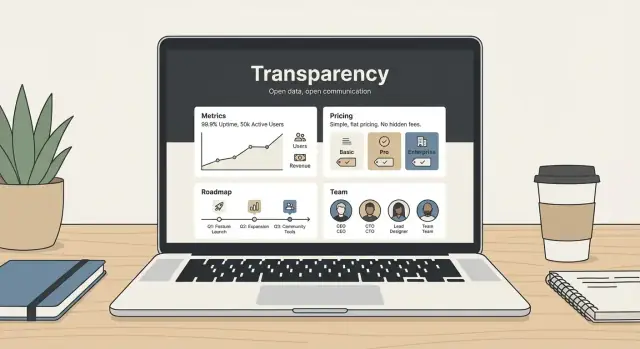
A practical order that reads well for most startups:
-
What this page covers (one-paragraph intro)
-
Story + operating principles (why you exist, how you decide)
-
Team + how you work (who does what, how you build)
-
Pricing + billing expectations (how charges work, edge cases)
-
Metrics (carefully chosen) (what you measure and why)
-
Roadmap + changelog (what’s next, what changed)
-
Privacy + security (plain English) (data handling, key controls)
-
Support + reliability expectations (hours, SLAs if any, status link)
You can reorder based on your business (e.g., put security higher if you sell to regulated teams).
Add quick links for long pages
If the page is longer than a few screens, include a short table of contents near the top with jump links to each section. Keep labels simple (“Pricing”, “Roadmap”, “Security”) so scanning feels effortless.
Make freshness visible (and owned)
Add a “Last updated” line at the top and state a cadence such as “Reviewed monthly” or “Updated within 7 days of major changes.” Assign an internal owner (role or team) so updates don’t stall.
Provide a clear path for questions
End the page with one action: “Questions? Email us at [email protected]” or link to a lightweight form (e.g., /contact). Readers should never wonder where to ask for clarification.
Tell Your Story, Mission, and Operating Principles
A transparency page works best when it explains not just what you believe, but how you actually operate.
Mission vs. principles: keep it specific
Mission is your “why” in one or two sentences: who you serve and what you’re trying to change.
Values are beliefs you want to hold (e.g., “respect,” “speed,” “craft”). Behaviors are the observable actions that prove those values (e.g., “we reply to every support request within 1 business day”). Readers trust behaviors more than slogans.
A short origin story (without oversharing)
Share the simple moment that led to the company: the problem you ran into, why existing options didn’t work, and the first version you shipped. Keep it concrete and customer-focused.
If you want the longer version, link it: see /about.
Your operating principles (with prompts)
Use these prompts to write a few plain-English principles:
- How you make decisions: What matters most when trade-offs appear? (Customer impact, long-term reliability, privacy, simplicity.) Who decides, and how do you gather input?
- How you treat customers: What do you owe users beyond the contract? (Clear communication, no surprise renewals, honest timelines, helpful support.)
- How you handle mistakes: Do you publish incident notes? How do you apologize, fix the root cause, and prevent repeats?
Concrete examples people can hold you to
Add 3–5 commitments such as:
- Response times: “We answer support within 24 hours on weekdays.”
- Support principles: “No canned answers; if we can’t solve it, we’ll say so and suggest alternatives.”
- Refund philosophy: “If you’re unhappy in the first 14 days, we’ll refund—no hoops.” (If applicable.)
Link supporting details where useful (e.g., /careers for how you hire and work).
Introduce the Team and How You Work
People trust people. A transparency page shouldn’t feel like a faceless policy document—it should show who’s responsible for the product and how decisions get made.
Who’s on the team (and why it matters)
Start with a simple overview of leadership and key roles: founders, product lead, engineering lead, customer support lead, security/privacy owner, and any advisors—only if they’ve explicitly agreed to be listed.
Keep it role-focused:
- What each person owns (e.g., “Billing and renewals,” “Incident communication,” “Data requests”)
- How to reach the right function (a shared inbox is often better than personal emails)
Avoid personal details like home locations, personal phone numbers, or anything that invites unwanted contact. The goal is accountability, not exposure.
How you work (so customers know what to expect)
Add a short “working principles” section that explains how collaboration happens day to day:
- Remote, in-office, or hybrid—and what that means for response times
- Communication norms (async-first, weekly planning, customer feedback loops)
- How decisions are made (who decides, when you gather input, how you document changes)
This helps customers understand why some requests move quickly while others require review.
Hiring: set expectations without overexplaining
If you’re hiring (or expect to), share the basics of your process: typical stages, approximate timelines, and what you evaluate (portfolio, problem-solving, communication). Link to /careers for open roles and details.
If you already have background information elsewhere, link it instead of duplicating it (for example, your story and mission on /about).
Make Pricing and Billing Expectations Clear
Launch on Your Domain
Put your transparency page on your own domain for a more trustworthy footprint.
Pricing is where many transparency pages either build trust quickly—or trigger frustration. The goal here isn’t to duplicate your pricing table. It’s to set expectations in plain language so people can self-qualify and avoid surprises.
Explain your plans like you’d explain them to a friend
Use simple plan names and describe who each plan is for. Focus on what’s included at a high level (not every feature).
For example:
- Starter: for individuals trying the product with light usage
- Team: for small teams collaborating and sharing access
- Business: for larger orgs that need controls, reporting, or priority support
If you have usage-based pricing, say so clearly (e.g., “priced by seats,” “priced by usage,” or “priced by both”).
Call out billing terms that often cause surprises
Spell out the basics in one place:
- Whether billing is monthly and/or annual
- Whether you offer a trial (and what happens when it ends)
- How cancellations work (end of billing period vs. immediate)
- Whether taxes (VAT/GST) may apply
If any of these vary by plan or region, say that upfront.
Add-ons, limits, and upgrades
If you have common add-ons (extra seats, additional workspaces, higher usage limits), describe how upgrades happen (instant vs. next billing cycle) and whether downgrades take effect immediately or later.
How you handle price changes
People don’t mind price changes as much as they mind surprises. Share your principles (e.g., “we grandfather existing customers for X months” or “we notify via email and in-app at least Y days before changes”). Only commit to timelines you can consistently meet.
For the full breakdown, keep details on your dedicated pricing page: /pricing.
Share Metrics Carefully (What to Publish and How)
Metrics can build trust fast—but only if they’re understandable, comparable over time, and not harmful to the business or your customers. The goal isn’t to “show everything.” It’s to show a few signals that help people judge reliability, momentum, and fit.
Pick metrics that are safe and hard to misread
Avoid numbers that reveal sensitive strategy (exact revenue, cash runway, customer lists) or that can be easily misinterpreted (vanity totals without context). If a metric could trigger speculation, create churn, or invite competitor copying, it probably doesn’t belong on a public page.
When exact values aren’t appropriate, publish:
- Ranges (e.g., “10–20 hours/week of support coverage”)
- Directional trends (e.g., “churn improved quarter over quarter”)
- Milestones (e.g., “crossed 1,000 weekly active teams”)
Useful examples readers actually care about
A small set of operational metrics often works well:
- Uptime target (e.g., “99.9% monthly target”) and where you track it
- Support response time (first response targets for weekdays/weekends)
- Product usage milestones (weekly active teams, projects created—pick one)
- Churn direction (improving/stable/worsening), not necessarily the exact rate
Add context: what it means and how you measure it
For each metric, include one sentence on why it matters, and one on how it’s measured (time window, data source, and definition). “Response time” should specify whether it’s first response or time to resolution.
Include limitations and measurement changes
Add a short note like: “Metrics may be revised as instrumentation improves.” If you change definitions (e.g., new analytics tool), mark the date and explain what changed so readers don’t assume you’re hiding a dip.
Publish a Roadmap and a Simple Changelog
Add Roadmap and Changelog
Create a simple roadmap and changelog page to match your transparency promises.
A roadmap and changelog turn “we’re building” into something customers can actually follow. They also reduce repetitive support questions (“Is X planned?” “Did you ship Y?”) and set healthier expectations about what’s likely to happen next.
Choose a roadmap format that fits your pace
Keep it lightweight. Three common options:
- Now / Next / Later: simple, friendly, and easy to keep current.
- Public roadmap page: a dedicated page with themes and a few key items.
- Quarterly goals: higher-level outcomes (e.g., “Improve onboarding completion”) instead of feature lists.
If you maintain separate pages, link them clearly from your transparency page (e.g., /roadmap).
Explain what roadmap items mean (and what they don’t)
Roadmap items should be framed as intentions, not promises. Add a short note near the top explaining:
- Items can move as you learn from customers, reliability needs, or technical constraints.
- Dates (if you include them) are best described as “target” or “aiming for,” not guarantees.
- You may remove items that no longer solve the right problem.
This single paragraph prevents disappointment and keeps trust intact when priorities change.
Add a simple changelog customers will actually read
A changelog doesn’t need every tiny tweak. Focus on:
- Major releases and meaningful improvements
- Important fixes that affect user experience
- Deprecations (what’s changing, when, and what customers should do)
Keep entries short, with links to any deeper documentation. If it lives elsewhere, link to /changelog.
Make it easy to request features (without overpromising)
Tell customers exactly how to share feedback—email, an in-app form, or a forum. If you support voting, explain how votes influence prioritization (signal, not a guarantee) and when you review requests.
Explain Data, Privacy, and Security in Plain English
A transparency page should answer the questions people are already asking before they sign up: “What data do you collect?”, “Who can see it?”, and “How long do you keep it?” If users can’t find clear answers quickly, they’ll assume the worst.
Start with a plain-English summary
Open with a short “at a glance” section, then point to the formal policies for full legal wording. For example:
- What we collect: account info (email), product usage events, and billing details (handled by a payment provider)
- What we don’t collect: content you store in the product (if true), or sensitive personal data (if true)
- Why we collect it: to run the service, prevent abuse, and improve features
Then link directly to /privacy and /terms for the complete versions.
Cover the details users care about
Be specific about:
- Retention: how long you keep logs, backups, and deleted account data
- Subprocessors: which vendors help you run the service (hosting, analytics, email) and what they do
- Access controls: who inside your company can access customer data, and under what conditions (support requests, debugging)
Avoid vague promises like “we take security seriously”—describe the practical basics instead.
Share security posture without increasing risk
Explain protections at a high level (encryption in transit, least-privilege access, regular updates), but don’t publish details that could help an attacker (exact firewall rules, internal architecture diagrams, or admin URLs).
Add a clear way to report security issues
Include a simple reporting path, such as [email protected], and what reporters can expect (acknowledgement time, how you handle disclosures). If you have one, link to a short vulnerability disclosure policy page (e.g., /security).
Set Expectations for Support and Reliability
Transparency isn’t only about sharing numbers—it’s about making the day-to-day customer experience predictable. A good transparency page tells people how to get help, how quickly you typically respond, and what “reliable” means for your product.
Support channels (and when to use them)
List your real support paths and what each is best for (only include what you actively monitor): email, in-app chat, help center, community forum, or phone (if offered). If you have account-specific support for paid plans, say so clearly.
Add typical response windows you can consistently meet. For example: “We aim to reply within 1 business day” is better than “within 1 hour” if that isn’t dependable.
Escalation and urgent issues
If you have an escalation path, describe it simply: what counts as urgent, how customers should label it, and when it’s appropriate. Avoid promising a dedicated incident manager unless that’s actually part of your service.
Incident communication and uptime
Explain where users will see service updates and what they can expect during an incident: frequency of updates, what information you share (impact, affected systems, workaround), and when you’ll post a post‑incident summary.
If you publish uptime and incident history, link it directly: see /status.
Refunds and complaints
If your refund policy or complaints handling process is publicly defined, summarize it in a few lines and link to the full policy. Include the key points customers care about: eligibility, time limits, and how to request a review.
Keep It Current: Update Cadence and Ownership
Plan the Structure in Minutes
Use Planning Mode to map sections like pricing, security, and support before building.
A transparency page builds trust only when it stays accurate. The simplest way to keep it credible is to treat it like a living document with clear ownership and a predictable update rhythm.
Assign an owner (and a backup)
Pick one person to own the page end-to-end (often someone in Ops, Product, or Marketing). Their job isn’t to write everything—it’s to make sure updates happen.
A simple workflow that works for small teams:
- Owner: collects inputs, drafts changes, and keeps the update calendar.
- Reviewer: checks accuracy and tone (usually a founder or function lead).
- Publisher: pushes the changes (can be the owner if you’re small) and records the edit in the page’s update log.
If you can, name the owner on the page (or at least in your internal doc) so it doesn’t become “everyone’s job,” which often means nobody’s.
Set an update cadence people can rely on
Choose a schedule you can actually maintain:
- Monthly update: good for early-stage teams with frequent pricing/roadmap changes.
- Quarterly snapshot: good for metrics-heavy pages where numbers should be stable and comparable.
Add a visible “Last updated” line near the top.
Add a small page update log
Include a short “Page update log” with 1–2 lines per change (for example: “2026-03-01 — Updated pricing notice period; clarified data retention”). This is different from your product changelog—it’s a record of edits to the transparency page itself.
Use lightweight versioning
To prevent confusion when numbers shift, publish updates as either:
- Monthly roll-forward: “Updated on the 1st of each month.”
- Quarterly version: “Q3 2026 snapshot,” with a link to the prior quarter.
This helps readers understand what they’re looking at and reduces debates about “why did this change?”
Verify before you publish
Keep a short pre-publish checklist so you don’t ship accidental misinformation:
- Numbers match the source of truth (billing system, analytics, finance sheet)
- Dates are correct (pricing effective date, policy revision date)
- Claims are still true (“24/7 support,” “SOC 2 in progress,” etc.)
- Links work and point to the right internal pages (e.g., /pricing, /security)
Handling sensitive updates
Not everything should be posted immediately or in full detail. When needed, choose one:
- Delay: publish after a fix or after legal review.
- Aggregate: share ranges or percentages instead of exact figures.
- Omit: if publishing creates risk (security, privacy, contractual), say you’re not sharing specifics and why.
Consistency beats perfection: a reliable cadence and clear ownership will do more for trust than occasional big refreshes.
Write, Design, and Publish: A Practical Checklist
This page is easiest to maintain when it’s built for quick scanning and quick updates. Aim for CMS-friendly blocks, consistent headings, and reusable components.
CMS-friendly formatting (so updates don’t hurt)
- Keep sections short (3–6 sentences), with clear H3 subheadings.
- Use a small number of repeatable modules: callouts, tables, and FAQs.
| Component | Best for | Tip |
|---|---|---|
| Table | Pricing notes, uptime targets, data retention | Keep labels in the first column |
| Callout | “Last updated” + ownership + cadence | Put it near the top |
| FAQ | Common questions (billing, security, roadmap) | Write answers in plain language |
Accessibility basics (quick wins)
- Use a logical heading order: H2 → H3 (don’t skip levels).
- Ensure text contrast is readable and font size is comfortable.
- Write descriptive link text (“See /pricing” instead of “click here”).
SEO essentials (without over-optimizing)
- Title tag: “Transparency | {Company Name}”
- Meta description (1–2 sentences): what people will find (pricing expectations, roadmap, security, support).
- Add internal links to supporting pages: /pricing, /security, /privacy, /status, /blog.
- Consider Organization and FAQPage schema (especially if you include an FAQ).
Implement the page quickly (without creating a maintenance burden)
If your bottleneck is shipping the page—not deciding what to say—treat the transparency page like a small product build: draft the sections, publish, and iterate on a cadence.
A practical approach is to generate the initial page structure in a tool like Koder.ai, where you can describe your transparency sections in chat (pricing expectations, support targets, data handling summary, roadmap links) and have a working web page created quickly. Because Koder.ai supports deployment/hosting, custom domains, and snapshots/rollback, you can publish early and update confidently as policies evolve—without turning “website edits” into a multi-week engineering project.
Copy-paste template for your CMS
Intro (2–3 lines): Why you publish this page.
Last updated: ____ • Owner: ____ • Cadence: ____
How we work: (values + decision principles)
Pricing & billing expectations: (summary + link to /pricing)
Roadmap & changelog: (links to /roadmap and /changelog)
Privacy & security: (short summary + link to /security and /privacy)
Support & reliability: (hours, channels, response targets + link to /status)
FAQ: (3–6 questions)
How to ask questions: (support email or /contact)
Publish checklist
Before going live, test on mobile, run a spellcheck, and ask a non-team friend to find answers in under 60 seconds.
If you’d like feedback on clarity or structure, invite readers to send suggestions via your contact form (or a simple email link) and offer an optional update subscription via your changelog or newsletter.
FAQ
What is a transparency page, in plain terms?
A transparency page is a public page (often at /transparency) that explains how your company operates in practical terms—pricing expectations, support/reliability, roadmap approach, and how you handle data.
It’s meant to reduce surprises and speed up trust, not to replace /terms or /privacy.
When should a startup publish a transparency page?
Start when you can commit to a few clear promises and you have someone who can keep the page updated.
If you can’t reliably maintain a public roadmap or metrics, publish your decision principles and update cadence instead (and add the details later).
How do I choose the right audience for the page?
Pick one primary audience and write for them first:
- Customers: pricing, security, reliability, support
- Candidates: how you work, values as behaviors, hiring process
- Investors: execution signals, governance, decision-making
You can include secondary sections, but the primary audience should shape the structure and level of detail.
What should a transparency page definitely include?
Use a short list of “trust questions” and answer them directly (often 3–5):
- "Can I predict what this will cost?" (link to
/pricing) - "What happens during outages and how do I get help?" (link to
/statusif you have it) - "What data do you collect and why?" (link to )
What should never be included on a transparency page?
Avoid anything that creates risk or breaks trust:
- Security-sensitive specifics (internal configs, admin URLs, detailed architecture)
- Personal employee/customer data
- Trade secrets or confidential contract terms
- Overconfident claims you can’t consistently meet (e.g., uptime or response times)
If you can’t share specifics, say so and explain the boundary in one sentence.
Where should it live, and how do people find it?
Use a short, stable URL (commonly /transparency) and link it where people look:
- Footer рядом with
/privacy,/terms, and/security - Optionally in your About menu
Add a simple table of contents with jump links if the page is more than a few screens long.
How should we explain pricing without duplicating the pricing page?
Summarize billing expectations in plain language, then point to the full pricing page.
Common “surprise reducers” to spell out:
- Monthly vs. annual billing
- Trial details and what happens when it ends
- Cancellation timing (end of period vs. immediate)
- Taxes/VAT/GST handling
- Upgrade/downgrade timing
Link to for exact numbers.
Which metrics are safe to share publicly—and how do we avoid misinterpretation?
Only publish metrics that are easy to interpret and safe to share.
Good options:
- Uptime target and where you track it (or link to
/status) - Support first-response targets (and define what “response” means)
- Milestones or directional trends (ranges, quarter-over-quarter improvement)
Add one sentence of context per metric: why it matters and how it’s measured.
How do we publish a roadmap without overpromising?
Use a format you can maintain, such as:
- Now / Next / Later
- Quarterly goals (outcomes, not long feature lists)
Add a short note that roadmap items are intentions, not guarantees, and that priorities can change based on learning, reliability needs, or constraints. Link to /roadmap and /changelog if they exist.
How do we keep the transparency page accurate over time?
Make “freshness” visible and assign ownership.
A simple setup:
- Add “Last updated: YYYY-MM-DD” at the top
- State a review cadence (monthly or quarterly)
- Name an owner by role (e.g., “Operations lead”) and a reviewer
- Keep a tiny page update log (what changed, when)
If something can’t be updated immediately (legal/security reasons), publish a brief placeholder and update after review.