Jul 28, 2025·8 min
Create a Travel Agency Website With Tour Listings (Step‑by‑Step)
Learn how to plan, build, and launch a travel agency website with searchable tour listings, booking inquiries, content, SEO, and mobile-ready design.
Learn how to plan, build, and launch a travel agency website with searchable tour listings, booking inquiries, content, SEO, and mobile-ready design.
Before you touch design or tools, get specific about what your travel agency website must achieve. A site built mainly for booking inquiries will look different from a tour booking website that takes payments online—different pages, buttons, and even how you present availability.
Decide whether your #1 goal is:
This choice drives everything from your homepage headline to how your tour listings are structured.
Write down your tour “catalog” in customer terms. For example:
This helps you plan consistent categories, durations, and price formats—so your itinerary pages don’t feel improvised.
List the destinations you actively cover (by country/city/region) and which languages you’ll support. If you’re targeting multiple markets, your travel website design should make language and currency choices easy to find and hard to miss.
Pick 3–5 numbers you’ll review monthly, such as:
Save 5–10 sites (not just travel brands—also local agencies) and note what you’d improve: clearer filters, better pricing transparency, simpler checkout, or smoother payment integration for tours. This becomes your practical brief for later decisions.
A travel agency website works best when visitors can move from “I’m just browsing” to “I’m ready to book” without thinking too hard. Before you design anything, decide what pages you need and how people will flow between them.
Start with a simple set of pages that supports your main journey:
These pages should be reachable from the main navigation at all times.
Add pages that handle objections and build confidence:
Sketch the path you want most visitors to take:
At each step, keep a single primary action (e.g., “Check availability” or “Request to book”).
Plan categories people actually use: destinations, themes (food, culture, wildlife), difficulty, duration, and possibly price range.
Build a navigation menu that stays consistent across pages—typically: Home, Tours, Destinations, About, Contact—so visitors never feel lost.
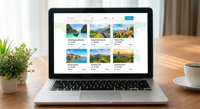
Your tour listing page is the “shop window” of your travel agency website. If visitors can compare options quickly, they’ll click through to details—and eventually book.
Aim for scannable cards that answer the first questions people ask. A good default set includes: tour name, destination, starting price (clearly marked “from”), duration (e.g., 3 days / 2 nights), next available departure (or “Runs weekly”), and 2–4 short highlights (e.g., “Small groups,” “Hotel included,” “Easy hikes”).
Keep the card layout consistent so comparisons are effortless. If you show reviews, show them everywhere (or nowhere) to avoid biasing the list.
Filters should reduce overwhelm, not create it. Start with the essentials:
Make it obvious when filters are active, and add a “Clear all” option. If inventory is limited, consider showing counts (e.g., “Hiking (12)”) so visitors don’t click into dead ends.
Sorting options should reflect how people shop:
If you use “Popularity,” define it internally (bookings, inquiries, or curated picks) and be consistent.
For large lists, pagination is often better for orientation and sharing (people can return to “page 3”). Infinite scroll can work if you keep filters and sorting sticky and provide a “Back to top” jump.
Every tour card needs a single primary action: View details (most common). Add a secondary option like Ask a question only if your booking flow is inquiry-based. Avoid competing buttons that slow decision-making.
A tour listing gets the click; the detail page gets the booking. Your goal is to answer the “Is this right for me?” questions quickly, then make it easy to take the next step.
Keep every tour page structured the same way so visitors can scan and compare:
If you offer variations (private vs. small group, different start points), show them clearly instead of burying them in paragraphs.
Include the information that reduces back-and-forth emails:
Use a focused gallery (8–15 strong images beat 40 random ones). Add video only when it improves understanding—e.g., a short clip of the boat, trail, or accommodation.
Show genuine proof:
Add a clear booking/inquiry section near the top (after the headline and key facts) and again at the bottom after the itinerary.
Use action wording like “Check availability” or “Request a quote,” and keep the form short to start.
The best tour pages don’t “pitch”—they clarify. When visitors can quickly understand what they’re buying, who it’s for, and what happens next, they’re far more likely to inquire or book.
Create a simple template and use it for every tour listing. At minimum, keep these fields consistent:
Consistency makes your tour listings easier to scan and compare—and helps you avoid missing critical details.
Lead with 4–6 highlights that read like quick answers (not poetry). Then add a clear What to expect section describing the flow: meeting point, pace, transportation, group size, and what travelers should bring.
A helpful rule: if someone only reads the highlights and “What to expect,” they should still know whether the tour fits them.
Prioritize authentic images from your tours, guides, and destinations. If you use partner or customer photos, specify photo rights/credits where needed and keep a record of permission.
For multi-day tours, use a repeatable structure like:
This makes itinerary pages easier to read and easier for your team to update.
Include 5–10 FAQs per tour (pickup, dietary needs, accessibility, cancellation, weather). This reduces back-and-forth and builds confidence before someone hits your booking inquiry form.
The best platform is the one you’ll actually keep updated. Tour prices change, dates fill up, and photos get refreshed—so choose a setup that makes edits easy for whoever will maintain the site.
If you need speed and a predictable cost, a website builder (like Squarespace, Wix, or similar) can work well—especially if you’re starting with a small number of tours.
For more control and long-term flexibility, a CMS (commonly WordPress) is often a good middle ground.
A custom build is worth considering only if you have very specific requirements (complex availability rules, multi-currency logic, or deep integration with an internal system) and a budget for ongoing development.
If you want the flexibility of “custom” without adopting a heavy development pipeline, a vibe-coding platform like Koder.ai can be a practical middle option. You can describe your travel agency website (tour listings, tour search and filters, booking inquiry form, and even payment integration for tours) in a chat interface, then iterate quickly as your tours and seasons change.
This is especially useful when you need web app behavior—filters, availability logic, lead routing, and admin-style updates—while still keeping costs predictable. Koder.ai supports source code export, deployment/hosting, custom domains, and snapshots/rollback, with pricing tiers from free to enterprise.
Before you commit, do a “real edit” test:
If any of that requires a developer, updates will slow down—and outdated listings hurt trust.
Make sure you can edit page titles, meta descriptions, headings, and URL slugs per tour and destination page. Also confirm you can add analytics (GA4 or similar), conversion tracking, and cookie settings without hacks.
Tour sites are image-heavy. Choose a platform that automatically compresses images, supports modern formats, and doesn’t create slow mobile pages. Check that tour cards, filters, and inquiry buttons stay fast and easy to tap.
Assign an owner for tour content, pricing/availability, and customer inquiries. A simple update rhythm (weekly checks, seasonal refreshes) prevents old dates and mismatched pricing from sneaking into your listings.
Booking is where a tour website turns interest into revenue—so decide early how “instant” you want the experience to be.
If you run fixed-date group departures with limited seats, instant booking usually makes sense: visitors pick a date, reserve spots, and pay.
If your tours are custom, private, or depend on supplier confirmation, an inquiry-first flow can work better: collect dates, group size, hotel class, and special requests, then confirm manually.
Make the next step obvious (e.g., “Request availability” vs. “Book now”) so customers know what to expect.
Before integrating payments, write down your rules and display them consistently across tour pages and checkout:
If you take partial payments, make the remaining balance and due date visible in the confirmation email and on the booking summary.
Most tours fit one of these models:
Whatever you choose, don’t show “available” unless you can honor it. If availability is manual, say “We’ll confirm within 24 hours.”
At minimum, send an automated email that includes: itinerary summary, meeting point, what to pack, cancellation terms, and your contact details.
If you handle bookings manually, send a “request received” email immediately, then a second email once confirmed.
Add a short cancellation summary near the booking button, and link to the full policy (e.g., /cancellations). Use plain language: deadlines, refund percentages, no-show rules, and how customers request changes.
Good travel website design isn’t about flashy visuals—it’s about helping people feel confident enough to inquire or book. Your tour listings and tour pages should feel consistent, clear, and reassuring on every screen size.
Pick a small, calm color palette (2–3 core colors) and use it consistently for headings, buttons, highlights, and badges (e.g., “Best seller”). Pair it with one readable body font and one heading font. Keep spacing generous so tour cards, prices, and key details don’t feel cramped.
Consistency matters more than novelty: the same button style should always mean the same action (e.g., “Check availability” vs. “Send inquiry”).
Most travelers browse on mobile. Make tour cards tappable, keep filters usable (sticky or in a bottom sheet), and ensure sorting is easy to find.
On forms, use large input fields, clear labels, and the right keyboard types (email, phone, number). Keep the number of required fields minimal.
Show readable prices with what’s included: per person vs. per group, taxes/fees, and any key exclusions. Avoid surprises—hidden fees erode trust fast.
Use one primary call-to-action per screen (“Book now” or “Request availability”), supported by secondary actions like “Ask a question.”
Place trust cues near the price and booking area: clear contact options, response time, cancellation highlights, and social proof (reviews, testimonials, partner badges).
If you have a physical office, include an address. Add links to /contact and /terms in the footer.
Use strong color contrast, descriptive alt text for key images, and keyboard-friendly forms (visible focus states, logical tab order). Accessible design reduces friction for everyone—and keeps travelers moving toward booking.
SEO for a travel agency website is mostly about matching what people search for with the exact page that answers it—then making that page easy for Google (and humans) to understand.
Most bookings start with specific intent: “Lisbon food tour,” “3-day safari from Arusha,” “family-friendly boat trip in Split.” Build pages around combinations of destination + tour type + duration/starting point.
Create a clear hierarchy:
Avoid copying the same template across tours. Your title should quickly answer: Where? What type? Key hook.
Example pattern:
Use short, readable URLs:
On each tour page, link to “related” options that genuinely help the visitor choose (and keep them on-site): similar duration, same destination, alternative style.
Also link from destination guides to your best tours (and back). For example, your guide at /destinations/rome can point to top experiences and seasonal picks.
Add structured data where it fits—especially reviews/ratings, but only if they’re authentic and shown on the page. If you list prices, availability, or operator details, keep them consistent across the page so search engines and travelers see the same story.
Tour listings convert; guides attract. Publish practical content that answers local questions: best time to visit, neighborhoods, day-trip ideas, what to pack, local etiquette. Then naturally place tour suggestions where they’re relevant—helpful, not pushy.
Tour listings bring attention, but lead capture turns that attention into bookings. Your goal is to make it easy for a traveler to raise a hand—without forcing them through a long, fragile checkout flow.
Place a compact form on every tour detail page (and optionally as a sticky button on mobile). Keep fields minimal, but specific enough to respond quickly:
Add hidden context automatically (tour name, page URL), so you don’t rely on the traveler to copy details.
Some audiences prefer chat over forms. Give clear options near the primary call-to-action:
If you use chat, set boundaries (hours, typical reply time). A “We reply within 2 hours” note reduces anxiety and prevents double messages.
Nothing kills conversions like missed inquiries. Send all form submissions and chat notifications to a shared inbox (e.g., sales@) or your CRM if you have one. Use simple labels like “New inquiry: Bali 3-day tour” so your team can triage fast.
Right below the form, tell people what happens next: your response time, whether availability is live, and what details help you confirm (hotel area, pickup point, dietary needs, passport nationality if required).
If you run seasonal offers, add a low-friction newsletter box on your /contact page or after a successful inquiry submission—focused on deals and new tours, not spam.
A tour booking website isn’t just marketing—it’s a place where people share personal details and often money. Clear policies and basic security steps protect your customers, reduce disputes, and increase conversions.
Include Privacy Policy and Terms as dedicated pages, linked in your footer and near any form or checkout step.
If you collect data for marketing (newsletter signups, remarketing), your Privacy Policy should explain what you collect, why, and how users can request deletion. When in doubt, consult a qualified professional.
Don’t hide the rules. Show your refund/cancellation policy:
This prevents chargebacks and “I didn’t know” complaints—especially for deposits, minimum group sizes, and weather-dependent activities.
If you use analytics, ads, or embedded maps, add a consent banner that lets visitors accept or reject non-essential cookies. Keep links to /privacy-policy and /cookie-policy (if you have one) close to the banner.
Small details—real contact info, clear policies, and a secure experience—often matter as much as the tours themselves.
A travel agency website with tour listings can look perfect and still lose bookings if the basics don’t work on real devices. Treat launch day as a controlled release: test what matters, track results, and keep improving.
Check your site on iPhone and Android (at least one small screen), plus desktop. Don’t forget Safari and Chrome—many “it works on my laptop” issues are Safari-only.
Focus on everyday actions:
Run a “real customer” path several times:
Search → tour page → inquiry/booking.
On each step, confirm:
If you support online payments, complete at least one test transaction end-to-end, then refund it.
Before launch, make sure you can answer: “Which tour listings generate the most inquiries?”
At minimum, track:
Keep your setup simple, and name events clearly so non-technical teammates can read reports.
A short checklist prevents last-minute mistakes:
Also decide your rollback plan: if something breaks, will you revert to yesterday’s backup or temporarily disable online booking and route people to the inquiry form?
If your platform supports snapshots (for example, Koder.ai provides snapshots and rollback), make that part of your release process so you can revert quickly without scrambling.
After launch, make updates part of your routine:
If you sell packages with different tiers, consider adding a simple pricing page and linking it from key pages (for example, /pricing) so customers can self-qualify before contacting you.
Choose one primary goal and a clear secondary.
Then set 3–5 monthly metrics (e.g., inquiries, inquiry→booking rate, traffic to top destination pages) so you can improve based on data—not opinions.
A solid baseline funnel is:
Add supporting pages to reduce hesitation:
Start with categories customers actually use, and keep them consistent everywhere:
Avoid creating 20+ filters on day one. Add only what helps decisions, and include a visible “Clear all” so users can reset quickly.
Each card should answer the first comparison questions at a glance:
Use a single primary CTA like View details. Keep the card layout consistent so visitors can compare options without re-learning the page.
Use filters to reduce overwhelm, not increase it:
For large inventories, pagination is often easier to navigate and share than infinite scroll.
Use a consistent template so visitors can scan:
Place the booking/inquiry CTA near the top (after key facts) and again after the itinerary.
Pick based on how your product is delivered:
Whatever you choose, label it clearly:
If it’s manual, set a response promise like “We’ll confirm within 24 hours.”
Make the form short, but “tour-aware”:
Capture context automatically (tour name + page URL) so the traveler doesn’t have to paste details. Route all leads to one shared inbox or CRM, and display expectations right below the form (reply time, what details help you confirm).
Before integrating payments, define and display your rules consistently:
Send confirmation emails that repeat the essentials (itinerary summary, meeting point, cancellation terms, contact info). If you support online payments, do at least one real end-to-end test transaction and then refund it.
At minimum, include dedicated pages and link them in the footer and near forms/checkout:
Security basics that reduce risk and build trust:
Keep these reachable from main navigation so visitors never have to “hunt” for the next step.
Also track key conversions (form submits, bookings, phone/WhatsApp clicks) so you can see which tours actually generate revenue.