Sep 26, 2025·8 min
Create a Web App to Detect Usage Drops & Churn Risk
Learn how to build a web app that detects customer usage drops, flags churn risk signals, and triggers alerts, dashboards, and follow-up workflows.
Learn how to build a web app that detects customer usage drops, flags churn risk signals, and triggers alerts, dashboards, and follow-up workflows.
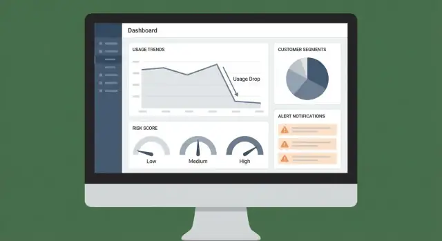
This project is a web app that helps you spot meaningful customer usage drops early—before they turn into churn. Instead of waiting for a renewal conversation to discover a problem, the app surfaces a clear signal (what changed, when, and by how much) and prompts the right team to respond.
Usage declines often show up weeks before a cancellation request. Your app should make those declines visible, explainable, and actionable. The practical aim is simple: reduce churn by catching risk sooner and responding consistently.
Different teams look for different “truths” in the same data. Designing with these users in mind keeps the app from becoming just another dashboard.
At a minimum, the app should produce:
This is the difference between “data available somewhere” and “a workflow people actually follow.”
Define success like a product: with metrics.
If the app improves decisions and accelerates action, it will earn adoption—and pay for itself.
Before you can detect a “usage drop,” you need a precise definition of usage and a consistent unit of measurement. This is less about analytics jargon and more about avoiding false alarms (or missing real churn risk).
Pick one primary usage metric that reflects real value delivered. Good options depend on your product:
Aim for a metric that’s hard to “game” and closely tied to renewal intent. You can track multiple metrics later, but start with one you can explain in a sentence.
Define the entity you’ll score and alert on:
This choice affects everything: aggregation, dashboards, ownership, and routing alerts to the right team.
Set thresholds that match customer behavior:
Also decide your time window (daily vs. weekly) and how much reporting lag you can tolerate (e.g., “alerts by 9am next day” vs. real time). Clear definitions here prevent alert fatigue and make scores trustworthy.
Your app is only as trustworthy as the inputs it watches. Before building dashboards or scoring risk, decide which systems define “usage,” “value,” and “customer context” for your business.
Start with a tight set of data sources you can keep accurate:
If you’re unsure, prioritize product events + billing first; you can add CRM/support once the core monitoring works.
There are three common ingestion methods, and many teams use a mix:
Match cadence to the decisions you’ll automate. If you plan to alert CSMs within an hour of a sudden drop, event ingestion can’t be “once per day.”
Usage drops are detected per customer unit (account/tenant). Define and persist mappings early:
Create a single identity mapping table/service so every integration resolves to the same account.
Write down who owns each dataset, how it’s updated, and who can view it. This avoids blocked launches later when you add sensitive fields (billing details, support notes) or need to explain metrics to stakeholders.
A good data model keeps your app fast, explainable, and easy to extend. You’re not just storing events—you’re storing decisions, evidence, and a trail of what happened.
Start with a few stable tables that everything else references:
Keep IDs consistent across systems (CRM, billing, product) so you can join data without guesswork.
Querying raw events for every dashboard view gets expensive quickly. Instead, pre-compute snapshots such as:
This structure supports both high-level health views and feature-level investigation (“usage dropped—where exactly?”).
Treat risk detection as its own product output. Create a risk_signals table with:
usage_drop_30d, no_admin_activity)This keeps scoring transparent: you can show why the app flagged an account.
Add append-only history tables:
With history, you can answer: “When did risk rise?”, “Which alerts were ignored?”, and “Which playbooks actually reduced churn?”
Your app can’t detect usage drops if the underlying events are inconsistent or incomplete. This section is about making event data dependable enough to power dashboards, alerts, and risk signals.
Start with a short list of behaviors that represent value:
Keep it practical: if an event won’t drive a metric, an alert, or a workflow, don’t track it yet.
Consistency beats creativity. Use a shared schema for every event:
report_exported)Document required properties per event in a lightweight tracking spec your team can review in pull requests.
Client-side tracking is useful, but it can be blocked, dropped, or duplicated. For high-value events (billing changes, successful exports, completed workflows), emit events from your backend after the action is confirmed.
Treat data issues like product bugs. Add checks and alerts for:
A small data quality dashboard plus a daily report to the team will prevent silent failures that undermine churn-risk detection.
A good health score is less about “predicting churn perfectly” and more about helping humans decide what to do next. Start simple, make it explainable, and evolve it as you learn which signals truly correlate with retention.
Begin with a small set of clear rules that anyone on CS, Sales, or Support can understand and debug.
For example: “If weekly active usage drops by 40% vs the prior 4-week average, add risk points.” This approach makes disagreements productive because you can point to the exact rule and threshold.
Once the basic rules work, combine multiple signals with weights. Common inputs include:
Weights should reflect business impact and confidence. A payment failure might carry more weight than a mild dip in usage.
Treat leading indicators (recent change) differently from lagging indicators (slow-moving risk):
This helps your app answer both “What changed this week?” and “Who is structurally at risk?”
Convert the numeric score into bands with plain-language definitions:
Tie each band to a default next step (owner, SLA, and playbook), so the score drives consistent follow-through rather than just a red badge on a dashboard.
Anomaly detection is only useful if it reflects how customers actually use your product. The goal isn’t to flag every wiggle—it’s to catch changes that predict churn risk and deserve a human follow-up.
Use more than one baseline so you don’t overreact:
These baselines help separate “normal for them” from “something changed.”
Treat these differently because the fixes differ:
Your web app should label the pattern, since your playbooks and owners will differ.
False alarms burn trust fast. Add guardrails:
Every risk signal should carry evidence: “why flagged” and “what changed.” Attach:
This turns alerts into decisions, not noise.
A good UI turns messy telemetry into a daily workflow: “Who needs attention, why, and what do we do next?” Keep the first screens opinionated and fast—most teams will live in them.
Your dashboard should answer three questions at a glance:
Make every row clickable to an account view. Prefer familiar table patterns: sortable columns, pinned risk columns, and a clear last-seen timestamp.
Design the account view around a timeline so a CSM can understand context in seconds:
Include an internal deep link pattern like /accounts/{id} so alerts can route people to the exact view.
Filtering is where dashboards become actionable. Provide global filters for plan, segment, industry, CSM owner, region, and lifecycle stage, and persist selections in the URL for shareable views.
For export, allow CSV download from tables (respecting filters), and add “Copy link” sharing for internal handoffs—especially from the at-risk list and alert feed.
Alerts are only useful if they reach the right person at the right time—and don’t train everyone to ignore them. Treat notifications as part of your product, not an afterthought.
Start with a small set of triggers that map to clear actions:
Use simple rules first, then layer in smarter logic (like anomaly detection) once you trust the basics.
Pick one primary channel and one backup channel:
If you’re not sure, start with Slack + in-app tasks. Email can become noisy quickly.
Route alerts based on account ownership and segment:
Deduplicate by grouping repeated alerts into a single thread or ticket (for example, “usage drop persists for 3 days”). Add cool-down windows so you don’t send the same alert every hour.
Every alert should answer: what changed, why it matters, what to do next. Include:
/accounts/{account_id}When alerts lead straight to a clear next action, your team will trust them—and use them.
Detection is only useful if it reliably triggers the next best action. Automating follow-up workflows turns “we saw a drop” into a consistent, trackable response that improves retention over time.
Start by mapping each signal to a simple playbook. Keep playbooks opinionated and lightweight so teams actually use them.
Examples:
Store playbooks as templates: steps, recommended messaging, required fields (e.g., “root cause”), and exit criteria (e.g., “usage back to baseline for 7 days”).
When a signal fires, create a task automatically with:
Add a short context pack to every task: which metric changed, when it started, the last known healthy period, and recent product events. This reduces back-and-forth and speeds up first contact.
Don’t force everyone into a new tab for execution. Push tasks and notes into existing systems, and pull outcomes back into your app.
Common destinations include CRM and support tooling (see /integrations/crm). Keep the workflow bi-directional: if a task is completed in the CRM, reflect it in the health dashboard.
Automation should improve response quality, not just volume. Track:
Review these metrics monthly to refine playbooks, tighten routing rules, and identify which actions actually correlate with usage recovery.
If you want to move from spec to a working internal tool quickly, a vibe-coding platform like Koder.ai can help you prototype the dashboard, account views, and alert workflow via chat—then iterate on the real product behavior with less overhead. Because Koder.ai can generate full-stack apps (React on the web, Go services with PostgreSQL) and supports snapshots/rollback plus source-code export, it’s a practical way to validate your data model, routing rules, and UI flow before you invest in a longer build cycle.
Security and privacy decisions are easiest to get right early—especially when your app is pulling together product events, account context, and alerts about churn risk. The goal is simple: reduce risk while still giving teams enough data to act.
Start by defining what “monitoring” requires. If your usage-drop detection works with counts, trends, and timestamps, you probably don’t need raw message content, full IP addresses, or free-form notes.
A practical approach is to store:
Keeping the dataset narrow reduces compliance burden, limits blast radius, and makes retention policies easier.
Usage-drop dashboards often become a cross-functional tool (CS, support, product, leadership). Not everyone should see the same detail.
Implement role-based access control (RBAC) with clear rules:
Add audit logs for sensitive actions (exporting data, changing alert thresholds, viewing account-level details). Audit logs are also useful for debugging “who changed what” when alerts get noisy.
Treat PII (names, emails, phone numbers) as optional. If you need it for notifications, prefer pulling it on demand from your CRM rather than copying it into your monitoring database.
If you do store PII:
Document what you collect, why you collect it (usage monitoring and customer support), and how long you keep it. Keep language accurate and specific—avoid claims like “fully compliant” unless you’ve completed a formal review.
At a minimum, be ready to support:
If you publish customer-facing docs, link internally to your policies (e.g., /privacy, /security) and keep them aligned with how the system actually works.
Shipping a churn-risk app isn’t just “does it run?” It’s whether teams trust the signals enough to act—and whether the system stays reliable as your product and data evolve.
Before you alert anyone, replay the model or rules over past weeks/months where you already know outcomes (renewed, downgraded, churned). This helps you tune thresholds and avoid noisy alerts.
A simple way to evaluate is a confusion matrix:
From there, focus on what matters operationally: reducing false positives so CSMs don’t ignore alerts, while keeping false negatives low enough that you catch real risk early.
Many “usage drops” are really data issues. Add lightweight monitoring to every pipeline step:
Surface these issues in an internal status view so users can distinguish “customer dropped usage” from “data didn’t arrive.”
Start with internal users (data/ops + a few CSMs) and compare alerts to what they already know. Then expand to a broader group once accuracy and workflow are stable.
During rollout, measure adoption signals: alerts opened, time-to-triage, and whether users click through to the account view.
Give users a one-click way to mark an alert as false positive, known issue, or action taken. Store that feedback and review it weekly to refine rules, update scoring weights, or add exclusions (e.g., seasonal customers, planned downtime).
Over time, this turns the app from a static dashboard into a system that learns from your team’s reality.
Start with one primary value metric that’s hard to game and strongly tied to renewal intent (e.g., key actions completed, API calls, active seats). Keep it explainable in one sentence, then add secondary metrics later for diagnosis (feature-level usage, sessions, time-in-product).
Alerting works best on a single, consistent customer unit—usually account/workspace in B2B. Use subscription if one company has multiple plans, or a sub-cohort (department/team) if adoption varies widely inside a large account. Your choice determines aggregation, ownership routing, and how dashboards are interpreted.
A practical starting point is a clear, rules-based threshold such as week-over-week change (e.g., -40% vs prior 4-week average). Then add guardrails:
Begin with product events + billing/subscriptions because they define value delivery and renewal risk. Add CRM for ownership/segment context and support/incident data to explain dips (ticket spikes, outages). Keep the initial set small enough to maintain data quality reliably.
Use a single primary grouping key like account_id/tenant_id everywhere, and maintain an identity mapping layer/table that links:
If identifiers aren’t consistent, joins break and alerts lose trust quickly.
Pre-compute daily snapshots so dashboards and scoring don’t query raw events constantly. Common tables:
account_daily_metrics (active users, sessions, key actions)account_feature_daily (feature_key, usage_count)This improves performance, reduces cost, and makes “what changed?” analysis much faster.
Create a dedicated risk_signals store with:
This makes every flag auditable and helps teams act because they can see why the account was flagged.
Start with rules-based scoring because it’s debuggable and easier to align across CS/Sales/Product. Combine multiple weighted signals (usage drop, failed payments, seat reduction, ticket spikes), and separate:
Translate numeric scores into bands (Healthy/Watch/At risk) with default actions and SLAs.
Implement routing + deduplication from day one:
Include context (metric, baseline, delta) and a direct link like /accounts/{account_id} so the alert is immediately actionable.
Use data minimization and role-based access control:
Also be prepared for deletion/anonymization requests and keep internal policies aligned (e.g., , ).
/privacy/security