Jun 17, 2025·8 min
How to Build a Web App to Track OKRs Across Teams and Departments
Plan, design, and ship an OKR tracking web app: data model, roles, check-ins, dashboards, integrations, and security for cross-team alignment.
Plan, design, and ship an OKR tracking web app: data model, roles, check-ins, dashboards, integrations, and security for cross-team alignment.
Before you design an OKR tracking app, decide exactly who it serves and what “success” looks like. Otherwise, you’ll build a web app for OKRs that tries to satisfy everyone—and ends up being confusing for most.
An OKR system is used by different people in different ways:
Pick a primary audience for v1 (often team and department leads) and ensure other roles can still complete basic tasks.
For objective and key results software, the must-have jobs are:
Be explicit about minimum support for scale: multiple departments, cross-functional teams, shared objectives, and rollups by team/department. If you can’t support cross-team alignment links from the start, say so—and limit scope to within-team tracking.
Choose metrics you can measure:
Write these into your requirements so every feature decision ties back to outcomes.
Before you design screens or databases, standardize what “an OKR” means in your organization. If teams interpret terms differently, your OKR tracking app will turn into a reporting tool that nobody trusts.
Start by writing clear definitions that will appear in your product copy, help text, and onboarding.
Objective: a qualitative, outcome-oriented goal (what we want to achieve).
Key Result: a measurable result that proves progress toward the objective (how we know we achieved it).
Initiative (optional): the work or projects intended to influence key results (what we do). Decide early whether initiatives are in scope for your web app for OKRs.
If you include initiatives, be explicit that they don’t “roll up” achievement the way key results do. Many teams confuse activity with outcomes; your definitions should prevent that.
Your OKR dashboard will only be as credible as its scoring rules. Pick one primary scoring method and apply it everywhere:
Then define rollups (how scores combine):
Write these rules down as product requirements for your objective and key results software so they’re enforced consistently in analytics and reporting.
Define your time cadence: quarterly, monthly, or custom cycles. Your OKR check-in workflow depends on this.
Document:
These decisions affect filters, permissions, and historical comparisons in the OKR analytics views.
Naming sounds minor, but it’s the difference between “team alignment” and a wall of vague titles.
Establish conventions like:
Make these conventions visible in the UI (placeholders, examples, validation hints) so OKRs stay readable across teams and departments.
Information architecture (IA) is where an OKR tracking app either feels obvious—or immediately confusing. Your goal is to make it easy for someone to answer three questions in seconds: “What are my OKRs?”, “How is my team doing?”, and “Are we on track as a company?”
Start with a small set of core screens and make them reachable in one click from the main navigation:
Keep secondary actions (export, duplicate, archive) inside menus on the relevant screen, not in global navigation.
Most users think in these three lenses. Make them explicit in the UI—either as top-level tabs or as a persistent switcher:
Make the default landing view “My OKRs” to reduce cognitive load.
Add a global search that works across Objectives, Key Results, and people. Pair it with simple filters that match how OKRs are managed: cycle, owner, status, department, and tags.
For non-technical users, keep flows short: clear labels (“Create Objective”, “Add Key Result”), strong defaults (current cycle), and minimal required fields. A user should be able to create an OKR and post a check-in in under a minute.
A scalable OKR tracking app starts with a clear, consistent data model. If the structure is messy, alignment breaks, reporting becomes slow, and permissions get complicated.
Most teams can cover 80% of needs with a small set of core records:
To make the app trustworthy and collaborative, store the history around OKRs:
OKRs get complicated when many teams align work. Model these relationships explicitly:
For each key result, store:
Keep the latest “current value” on the key result for quick dashboards, and store each check-in as the source of truth for timelines and rollups.
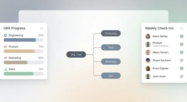
A good OKR tracking app isn’t just a list of objectives—it’s a reflection of how your company actually works. If your org chart in the product is too rigid (or too loose), alignment breaks down and people lose trust in what they’re seeing.
Start by supporting the basics: departments and teams. Then plan for real-world complexity:
This structure drives everything else: who can see which OKRs, how rollups work, and how people find the right place to check in.
Keep role-based access control simple enough for admins to manage, but specific enough to prevent chaos.
A practical baseline:
Avoid “everyone can edit everything.” It creates accidental changes and endless “who touched this?” conversations.
Be explicit about a few high-impact actions:
A common pattern is: admins create cycles, department editors publish within their area, and locking/archiving is limited to admins (or a small ops group).
Visibility needs to be flexible, not one-size-fits-all:
Make visibility obvious in the UI (badge + sharing summary), and ensure it’s enforced in search, dashboards, and exports—not just on the OKR page.
A clear lifecycle keeps your OKR tracking app consistent across teams. Without it, people will create goals in different formats, update them at random times, and argue about what “done” means. Define a small set of workflow states and make every screen (creation, editing, check-ins, reports) respect them.
A practical default lifecycle looks like:
Draft → Review → Published → In progress → Closed
Each state should answer three questions:
For example, keep Draft private by default, then make Published visible in rollups and the OKR dashboard so leadership views aren’t polluted by unfinished work.
Most teams need lightweight gates before OKRs become “real.” Add configurable review steps such as:
In the app, reviews should be explicit actions (Approve / Request changes) with a comment box, not informal Slack messages. Also decide what happens after feedback: typically Review → Draft (with notes) until resubmitted.
At the end of a quarter, users will want to reuse work without losing history. Support three distinct actions:
Make these actions visible in the cycle close flow, and ensure rollups don’t double-count clones.
Targets will change. Your app should record who changed what, when, and why—especially for key result baselines and target values. Keep an audit trail that captures field-level diffs (old value → new value), plus optional notes.
This audit history builds trust: teams can discuss progress without arguing over whether the goalposts moved.
A great OKR tracking app lives or dies on how easy it is to write a good Objective, define measurable Key Results, and connect them to what other teams are doing. The UX should feel more like guided writing than “filling out a database.”
Start with a clean, two-part form: Objective (a clear outcome) and Key Results (measurable signals). Keep labels plain-language and add short, inline prompts like “Describe the change you want to see” or “Use a number + deadline.”
Use real-time validation that teaches without blocking—e.g., warn if a Key Result has no metric (“Increase what, by how much?”). Provide a one-click toggle for common KR types (number, %, $), and show examples next to the field, not hidden in a help page.
Offer templates by department (Sales, Product, HR) and by theme (Growth, Reliability, Customer Satisfaction). Let users start from a template, then edit everything. In objective and key results software, templates reduce inconsistent phrasing and speed up adoption.
Make “last quarter’s OKRs” searchable so people can reuse patterns, not just copy text.
Alignment shouldn’t be a separate step. While creating an OKR, let users:
This keeps team alignment front-and-center and improves rollups later in the OKR dashboard.
Treat edits as normal. Add autosave, and capture meaningful history with lightweight “version notes” (e.g., “Adjusted target after pricing change”). Show a clear change log so teams can trust updates during the OKR check-in workflow without arguing over what changed.
A tracking app only works if teams actually use it. The goal of check-ins is to capture reality—quickly—so progress, risks, and decisions stay visible without turning into a weekly paperwork ritual.
Design a single, predictable flow that works for every Key Result:
Keep the form short, allow saving drafts, and pre-fill last week’s context so users aren’t starting from zero.
Add comments directly on Objectives, Key Results, and individual check-ins. Support @mentions to pull the right people in without meetings, and include a simple “decision log” pattern: a comment can be marked as a decision, with date and owner, so teams can answer “why did we change direction?” later.
Let users attach links to evidence—docs, tickets, dashboards—without requiring integrations. A URL field plus optional label (“Jira ticket”, “Salesforce report”, “Spreadsheet”) is enough. If possible, auto-fetch titles for nicer readability, but don’t block saving if metadata fails.
Busy teams check in between calls. Optimize for phones: large tap targets, minimal typing, and one-screen submission. A quick-action entry point (e.g., “Check in now”) and reminders that deep-link to the exact KR reduce drop-off and keep updates consistent.
Dashboards are where your OKR tracking app becomes useful day-to-day. The goal is to help people answer two questions fast: “Are we on track?” and “What should I look at next?” To do that, build dashboards by level—company, department, team, and individual—while keeping the same mental model across all of them.
Each level should show a consistent set of widgets: overall status distribution, top at-risk objectives, upcoming review dates, and check-in health. The difference is the scope filter and the default “owner” context.
A company dashboard might start with org-wide rollups; a team dashboard should highlight only the objectives the team owns plus any parent objectives they contribute to.
Rollups should be transparent, not “magic.” Let users drill down from an Objective to its Key Results, and then into the latest updates, comments, and evidence. A good pattern is:
Include a breadcrumb trail so users always know where they are, especially when they arrive from a shared link.
Add dedicated views (not just filters) for:
These views should support “assign follow-up” actions so managers can move from insight to next step.
Quarterly reviews shouldn’t require copying screenshots into slides. Provide one-click exports:
If you support scheduled exports, send them via email or store them under /reports for easy access during review meetings.
Integrations can make or break adoption. If your OKR tracking app forces teams to double-enter status updates, it will be ignored. Plan integrations early, but ship them in a sensible order so you don’t stall the core product.
Start with the tools most likely to reduce manual work and increase visibility:
A practical rule: integrate the system that’s already the “source of truth” for your users’ daily workflow before adding nice-to-have analytics connectors.
Most rollouts start with existing OKRs in spreadsheets or slides. Support a CSV import with:
Make imports idempotent when possible, so re-uploading a corrected file doesn’t create duplicates.
Be explicit about whether your APIs are read-only (reporting, embedding OKRs elsewhere) or write-enabled (create/update OKRs, post check-ins).
If you expect near-real-time sync, add webhooks for key events like “KR updated,” “check-in submitted,” or “objective archived,” so external tools can react without polling.
Include an admin page where authorized users can connect, test, and manage integrations: token status, scopes, webhook health, last sync time, and error logs. Keep the UX simple—one screen that answers: “Is it connected, and is it working?”
If you want to prototype your OKR tracking app quickly (especially the OKR dashboard, check-in workflow, and permissions model), a vibe-coding platform like Koder.ai can help you get to a working internal version faster—while still producing real, exportable source code. That can be useful for validating IA, roles, and reporting with stakeholders before you invest heavily in bespoke engineering.
Notifications are the difference between an OKR tracking app that looks good in demos and one teams actually use. The goal isn’t “more pings”—it’s timely nudges that keep check-ins and reviews from slipping, without training people to ignore the system.
Start with a few clear, high-signal reminders:
Keep rules configurable at the workspace or org level, but ship with sensible defaults (for example: a single reminder 24 hours after a missed check-in, and another 48 hours later if still untouched).
Different teams live in different tools, so offer per-user notification channels:
Also add quiet hours and time zones. A reminder at 9am local time feels helpful; the same reminder at 2am gets muted forever.
Automations should remove repetitive work while staying transparent:
Make automations opt-in where they may surprise users, and always show “why you got this” inside the notification. That trust is what keeps adoption high.
Security and privacy decisions are hard to “bolt on” later—especially when your OKR tracking app starts holding sensitive performance context, strategy notes, and leadership comments. Treat these as product requirements, not just engineering tasks.
Use encryption in transit (HTTPS/TLS everywhere) and encryption at rest for databases and file storage. Protect sessions with short-lived tokens, secure cookies, and clear logout behavior (including “log out of all devices”). Add rate limits to login and API endpoints to reduce brute force attempts, and keep an audit log of key events: sign-ins, permission changes, OKR edits, exports, and integrations.
A simple but powerful rule: any action that changes OKRs or access should be attributable to a user, time, and source.
If your product supports multiple companies, plan tenant isolation early. At minimum:
For higher assurance, consider separate databases per tenant—more work, but simpler containment.
Define what happens when cycles end. Keep a retention policy for cycles, check-ins, and comments (e.g., retain 2–3 years), and support deletion for user accounts and personal data where required. Make exports and admin deletion actions auditable. If you anonymize past comments when a user is deleted, document the behavior clearly.
Set up environments (dev/staging/prod) with controlled access and configuration management. Automate backups and regularly test restores. Add monitoring for uptime, error rates, and slow queries, plus alerts that reach a human. Finally, write a lightweight incident response runbook: how to revoke tokens, rotate keys, communicate impact, and ship fixes safely.
Start by choosing a primary audience for v1 (often team and department leads) and define the core jobs to be done:
Then write measurable success metrics (adoption, check-in rate, reporting time saved, KR quality) so feature decisions stay outcome-driven.
A safe default is team and department leads because they:
Still ensure executives can scan dashboards and contributors can update KRs quickly, but optimize early UX for the people who run the workflow.
Minimum viable “across teams and departments” usually means:
If you can’t support cross-team alignment links yet, explicitly scope v1 to within-team tracking to avoid misleading reporting.
Standardize the terms in product copy and onboarding:
If you include initiatives, clearly prevent them from “rolling up” achievement like KRs, or teams will mistake activity for progress.
Pick one primary scoring method and enforce it everywhere:
Define rollups in writing (average vs weighted, whether weights must sum to 100%, how milestone KRs map to numeric progress, and whether manual overrides are allowed). Consistency is what makes dashboards credible.
Start with a small set of workflow states and make them consistent across screens:
For each state, define:
This prevents “half-baked” OKRs from polluting leadership views and makes governance predictable.
A practical minimum set is:
Keep the latest KR current value on the KR record for fast dashboards, and store check-ins as the timeline source of truth.
Use simple role-based access control and avoid “everyone can edit everything.” A baseline:
Also decide governance actions: who creates cycles, publishes OKRs, locks edits, and archives cycles—then enforce those rules consistently in UI and API.
Design for a predictable weekly flow that can be completed quickly:
Reduce friction with pre-filled last context, draft saving, and mobile-friendly screens. Adoption usually correlates with how fast a user can complete a check-in.
Dashboards should answer: “Are we on track?” and “What should I look at next?” Build by level:
Make rollups transparent with drill-down:
Include dedicated risk views (at-risk, overdue check-ins) and provide exports for reviews:
If you offer scheduled exports, store them under /reports for easy retrieval.