Jul 03, 2025·8 min
Create a Web App to Track Support Load and Staffing Needs
Learn how to plan and build a web app that tracks support load, key metrics, and staffing needs with forecasts, alerts, and reports your team can act on.
Learn how to plan and build a web app that tracks support load, key metrics, and staffing needs with forecasts, alerts, and reports your team can act on.
This web app exists to answer one practical question: “Do we have enough support capacity for the demand coming in?” When the answer is “not sure,” you get bottlenecks, stressed agents, and inconsistent service levels.
“Support load” isn’t a single number. It’s the combination of work arriving, work waiting, and effort required to resolve it. For most teams, that includes:
The app should let you decide what counts as load, then calculate it consistently—so planning moves from opinions to shared numbers.
A good first version should help you:
You’re not trying to predict the future perfectly. You’re trying to reduce surprises and make tradeoffs explicit.
This app is mainly for support leads, support ops, and managers. Typical daily questions include:
Start with a small set of metrics and a basic staffing estimate. Once people trust the numbers, refine with better segmentation (queue, region, tier), more accurate handle times, and improved forecasting over time.
Before you choose charts or build integrations, define what the app is for—and what it is not. Clear requirements keep the first version small, useful, and easy to adopt.
Start with 2–4 goals that map directly to everyday support planning. Good early goals are specific and measurable, for example:
If a goal can’t be acted on within a week or two, it’s probably too broad for v1.
List who will open the app and what they’re trying to do. Keep stories short and concrete:
This list becomes your build checklist: if a screen or metric doesn’t support a story, it’s optional.
Requirements should describe decisions, not just data. For staffing and load tracking, the app should support decisions like:
If you can’t name the decision, you can’t evaluate whether the feature helps.
Agree on a few outcomes and how you’ll measure them:
Write these into the project doc (and revisit after launch) so the app is judged by usefulness—not by how many charts it has.
A staffing and workload app is only as useful as the data it can reliably pull in. The goal for an early version isn’t “all the data,” it’s enough consistent data to explain load, measure capacity, and spot risk.
Start by listing the systems that represent work, time, and available people:
You don’t need perfect detail from every channel on day one. If phone or chat data is messy, start with tickets and add the rest once the pipeline is stable.
A practical approach is hybrid: API for the help desk (high-volume, time-sensitive) and CSV for schedules/headcount until you’re ready to integrate.
Choose cadence based on the decisions you’re supporting:
To make metrics actionable, store these dimensions across sources:
Channel (ticket/chat/phone), team, priority, timezone, language, and customer tier.
Even if some fields are missing initially, design the schema to accommodate them so you don’t have to rebuild later.
The fastest way to derail a support tracking app is to track everything. Start with a small set of metrics that explain (1) how much work is arriving, (2) how much is waiting, and (3) how fast you respond and resolve.
Focus on four metrics that most teams can trust early on:
These four numbers already answer: “Are we keeping up?” and “Where are delays showing up?”
Productivity metrics are useful, but only if everyone agrees on the definition.
Two common options:
Be cautious with comparisons between agents; routing rules, complexity, and shift times can skew results.
If you track SLAs, keep it simple:
Add a single in-app glossary page (for example, /glossary) that defines every metric, its formula, and edge cases (merged tickets, reopened tickets, internal notes). Consistent definitions prevent arguments later—and make dashboards credible.
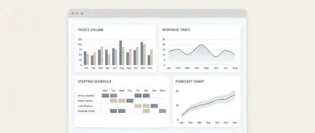
A good support dashboard answers a handful of repeat questions in seconds: “Is volume changing?”, “Are we keeping up?”, “Where is the risk?”, and “How many people do we need next week?” Design the UI around those questions, not around every metric you can calculate.
1) Overview dashboard (command center)
This is the default landing view for daily check-ins. It should show today/this week at a glance: incoming tickets, resolved tickets, current backlog, and whether demand is outrunning capacity.
2) Team drill-down (diagnose where work is piling up)
Let a lead click into a single team (or queue) to see what’s driving load: channel mix, priority mix, and the biggest contributors to backlog growth.
3) Staffing planner (turn metrics into a staffing number)
This view translates demand into required capacity: forecasted volume, expected handle time assumptions, available agent hours, and a simple “gap/surplus” result.
Keep each chart tied to one decision:
Supporting metrics can sit as small number cards nearby (e.g., “% within SLA”, “median first response”), but avoid turning every card into a chart.
Default filters should cover most workflows:
Make filters sticky across screens so users don’t re-select them repeatedly.
Use plain labels (“Open tickets”, “Resolved”) and consistent units. Add status colors for thresholds (green/on track, amber/watch, red/at risk). Use sparklines in metric cards to show direction without adding clutter. Where possible, show “what changed” (e.g., “Backlog +38 since Monday”) so the next action is obvious.
This is the “calculator” at the center of your app: how many support requests are likely to arrive (demand), how much work your team can realistically handle (capacity), and where the gaps are.
Start simple and make it explainable. For an early version, a moving average is often good enough:
If you don’t have enough history, fall back to “same hour yesterday” or “same day last week,” and label the forecast as low confidence.
Capacity is not “headcount × 8 hours.” It’s staffed time adjusted for how much work an agent completes per hour.
A practical formula:
Capacity (tickets/hour) = Scheduled agents × Productive hours/agent × Productivity rate
Where:
Shrinkage is the time people are paid but not available: breaks, PTO, training, team meetings, 1:1s. Treat these as editable percentages (or fixed minutes per shift) so operations can tune them without a code change.
Turn demand vs. capacity into clear guidance:
This keeps the model useful even before you add more advanced forecasting.
Early forecasts don’t need advanced machine learning to be useful. The goal is to produce a “good enough” estimate that helps leads plan shifts and spot upcoming strain—while staying easy to explain and maintain.
A strong baseline is a rolling average of incoming tickets (or chats) over the last N days. It smooths random noise and gives a quick read on trend.
If volume is volatile, try two lines side-by-side:
Support work is usually patterned: Mondays differ from Fridays, mornings differ from evenings. Without getting complicated, calculate averages by:
Then forecast next week by applying the “typical Monday” profile, “typical Tuesday” profile, etc. This alone often outperforms a plain rolling average.
Real life creates outliers: product launches, billing changes, outages, holidays. Don’t let those permanently distort your baseline.
Add manual event markers (date range + label + notes). Use them to:
Every week, compare forecast vs. actual and log an error metric. Keep it simple:
Trend the error over time so you can see whether the model is improving or drifting.
Never show “Required staff: 12” without context. Display the inputs and method next to the number:
Transparency builds trust—and makes it easier to correct bad assumptions quickly.
A support staffing app only works if people trust the numbers and know what they’re allowed to change. Start with a small set of roles, clear edit rights, and an approval flow for anything that affects staffing decisions.
Admin
Admins configure the system: connect data sources, map ticket fields, manage teams, and set global defaults (e.g., business hours, time zones). They can also manage user accounts and permissions.
Manager
Managers see aggregated performance and planning views: ticket volume trends, backlog risk, capacity vs. demand, and upcoming schedule coverage. They can propose or approve changes to staffing assumptions and targets.
Agent
Agents focus on execution: personal queue metrics, team-level workload, and schedule/shift details relevant to them. Keep agent access limited to avoid turning the tool into a performance leaderboard.
Allow edits that represent planning inputs, not raw ticket history. Examples:
Avoid editing imported facts like ticket counts or timestamps. If something is wrong, fix it at the source or via mapping rules, not by hand.
Every change that affects forecasts or coverage should create an audit entry:
A simple workflow works well: Manager drafts → Admin approves (or Manager approves for smaller teams).
Protect two categories:
Default to least privilege: agents can’t see other agents’ individual metrics; managers see team aggregates; only admins can access customer-level drilldowns when necessary. Add “masked views” so planning can happen without exposing personal or customer data.
A good first version doesn’t need a complicated stack. It needs predictable data, fast dashboards, and a structure that won’t fight you when you add new support tools later.
Start with four building blocks:
This setup makes it easier to reason about failures (“ingest is broken” vs. “dashboards are slow”) and keeps deployments straightforward.
For early help desk analytics, relational tables work well even for time-series metrics. A common approach:
tickets_raw (one row per ticket or status event)metrics_hourly (one row per hour per queue/channel)metrics_daily (daily rollups for quick reporting)Add indexes on time, queue, and channel. When data grows, you can partition by month or move aggregates to a dedicated time-series store—without rewriting the whole app.
Design your pipeline as explicit stages:
Treat each external system as a connector module. Keep tool-specific quirks inside that connector, and expose a stable internal format to the rest of the app. That way, adding a second inbox, chat tool, or phone system later doesn’t leak complexity into your support operations web app.
If you want a reference structure, link your “Connectors” and “Data Model” pages from /docs so non-engineers can understand what’s included and what isn’t.
If your goal is to get a working v1 in front of support leads quickly, a vibe-coding platform like Koder.ai can help you prototype the core screens (overview, drill-down, staffing planner), the API, and a PostgreSQL-backed schema from a guided chat—then iterate on the requirements with stakeholders.
Because Koder.ai supports source code export, snapshots, and rollback, it can be useful for fast experimentation (e.g., trying different staffing formulas or SLA definitions) without locking you into a one-off prototype.
Dashboards are great for exploration, but support teams run on routines. Alerts and lightweight automation make the app useful even when nobody is actively staring at charts.
Set thresholds that translate directly into “what should we do next,” not just “something changed.” Start with a small set and refine later:
Each alert should include what triggered it, how bad it is, and a link to the exact view that explains it (e.g., /alerts, /dashboard?queue=billing&range=7d).
Send alerts where the team already works. Keep messages short and consistent:
/queues/billing?range=24hSlack works well for real-time operational pings; email is better for “FYI” alerts and stakeholders.
Generate a weekly report automatically (sent Monday morning):
Link the summary to the underlying views so people can verify quickly: /reports/weekly.
Not everyone will log in. Allow exporting:
Exports should mirror what’s on screen (filters, date range, queue), so stakeholders trust the numbers.
A support operations app succeeds when it changes decisions—so your rollout should prove it can be trusted, understood, and used.
Focus your testing on correctness and clarity:
If you’re writing automated tests, prioritize the transformations and calculations (your support workload tracking logic) over pixel-perfect UI tests.
Before launch, snapshot a baseline from the last 4–8 weeks:
After the app is used for decisions (like adjusting schedules or routing), compare the same metrics. This is how you validate whether your staffing needs forecast and support capacity planning assumptions are improving outcomes.
Start with one support team or one queue. Run the pilot for 2–4 weeks and collect feedback on:
Iterate quickly: update labels, add a missing segment, or tweak defaults. Small UX fixes often unlock adoption.
You don’t need invasive analytics. Track just enough to know if the tool is being used:
If adoption is low, ask why: is the data untrusted, the dashboard too busy, or the workflow misaligned?
Create a simple “v2 backlog” based on pilot learnings:
Keep the list visible and prioritized so continuous improvement becomes routine—not a one-time launch task.
Start by tracking three things consistently:
If those inputs are stable, you can answer “are we keeping up?” and produce staffing gap estimates without overbuilding.
Define load as a combination of:
Pick definitions you can measure reliably, then document them in a glossary so the whole team debates decisions—not numbers.
Keep v1 goals actionable within 1–2 weeks. Good examples:
If a goal can’t change an operational decision quickly, it’s likely too broad for the first release.
You can run v1 with:
Add chat/phone later if those pipelines are messy. It’s better to be consistent for one channel than inconsistent across five.
A practical hybrid is common:
If you do CSV, make templates strict and versioned so columns and meanings don’t drift over time.
Start with four core metrics most teams can trust:
These tell you whether demand is rising, where work is stuck, and whether service levels are at risk—without turning the dashboard into a metric dump.
Use a simple, explainable model:
Then output something operational like “Need +2 agents from 2–6pm” with a confidence note and the exact inputs used.
Yes. Early versions often do best with:
Always show the method and inputs next to the result so teams can debug assumptions quickly.
Design around repeat questions with three screens:
Keep filters sticky (date, team/queue, channel, priority) and use clear units and labels so the dashboard is scannable in seconds.
Start with least privilege and clear edit boundaries:
Make planning inputs editable (shrinkage, schedules, overrides), but don’t allow edits to imported facts like ticket timestamps. Log changes with an audit trail and approvals for anything that affects forecasts or coverage.