Jun 21, 2025·8 min
How to Create a Website That Powers a B2B Buying Guide
Learn how to plan, design, and launch a website for a B2B buying guide with the right structure, SEO, trust signals, and lead capture for sales teams.
Learn how to plan, design, and launch a website for a B2B buying guide with the right structure, SEO, trust signals, and lead capture for sales teams.
Before you design pages or write copy, define what a “buying guide website” means in your context. Some companies launch a standalone microsite with its own navigation and URL structure. Others build a dedicated section inside the main site (for example, under /resources/buying-guides). Both can work—the right choice depends on ownership, publishing speed, analytics, and how closely the guide ties to your product pages.
A standalone site can feel neutral and educational, which may help early-stage buyers. A section of your main site is usually easier to maintain, benefits from your existing domain authority, and keeps conversion paths (like /pricing or /demo) close.
Ask one question: do you want the guide to function as a content hub that introduces your company later, or as a sales-adjacent resource that naturally routes people to product information?
Buying guides often try to do everything—teach, capture leads, and close deals. Choose the primary job for the site:
Your primary goal shapes everything from page layout to call-to-action wording. If you’re supporting sales calls, you might prioritize printable comparison checklists. If you’re reducing support, you might emphasize “what to expect after purchase” content.
Start with one category (e.g., “ERP selection”) rather than multiple categories and sub-guides. A smaller, complete guide beats a broad, half-finished library. You can expand later once you learn what resonates.
Pick a few outcomes tied to the goal:
/pricing, /demo, or key comparison pages)With goal, scope, and metrics locked, you’ll make faster decisions in every step that follows.
A B2B buying guide works when it mirrors how real committees decide—not how your org chart looks. Start by naming the people who influence the purchase and what “success” means to each of them.
Most guides can be mapped to a small set of recurring roles:
Organize your site content around buying stages, then list the questions and objections each role brings:
Put evergreen, search-friendly answers on the site: definitions, buying checklists, comparison pages, integration notes, and security basics.
Reserve deal-specific or version-sensitive material for a PDF or sales deck: custom pricing scenarios, tailored ROI, implementation plans for a specific account, and negotiated terms.
Your guide should make evaluation easier by explicitly covering core criteria like budget, compliance, integrations, and time to value—not as marketing claims, but as clear explanations of how buyers can assess each item.
A buying guide works when readers can tell where they are, what’s next, and how to compare options without getting lost. Before you write more pages, decide on a simple structure you can keep consistent as the guide grows.
Start with a small set of organizing labels you’ll use everywhere—navigation, breadcrumbs, and internal links.
A practical taxonomy for a B2B buying guide site usually includes:
Keep it simple: aim for one primary home for each page (category/subcategory), and treat use cases, industries, and roles as filters or cross-links—not separate silos that create duplicates.
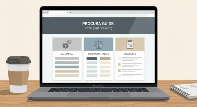
Most successful guides rely on a repeatable set of page templates:
This mix supports different reading styles: skimmers start on hubs; evaluators jump into comparisons.
Use a top navigation entry for the guide (e.g., “Buying Guide”) so it’s always reachable.
Inside the guide section, add a side navigation that reflects the taxonomy (categories → subcategories → key topics). Keep it stable; changing it frequently breaks the reader’s mental map.
Also include breadcrumbs (e.g., Buying Guide → Category → Topic) to make backtracking effortless.
First-time readers shouldn’t have to guess where to begin. Add a simple Start here page that:
If you already have a resources area, make this page easy to find from /blog or /resources so the guide feels like a destination, not a random set of articles.
A buying guide works when it removes uncertainty for a specific decision. Your content plan should start with the questions buyers actually ask internally: “What options exist?”, “How do we compare them?”, “What could go wrong?”, and “What will this cost us over time?”
Avoid launching a hub that feels unfinished. A lean but complete starting set usually includes:
If you can’t cover a crucial topic yet, be explicit: note what’s missing and when it will be added, rather than implying the guide is comprehensive.
Consistency builds confidence and makes the guide easy to scan. For each topic page, use the same structure:
Supporting pages make the main guide more actionable:
Assign an owner per topic, add a visible last reviewed date, and schedule reviews (e.g., quarterly for pricing, biannually for criteria pages). Define update triggers: new regulations, product changes, competitor shifts, or repeated questions from sales/support. This prevents your guide from becoming stale—and losing trust.
A B2B buying guide succeeds when it’s easy to scan, easy to compare, and easy to revisit. Your layout should help a busy reader answer one question per visit—without forcing them to read everything.
Write in short sections with clear, descriptive headings (the kind that still make sense when skimmed). Use callout boxes to separate “key takeaways,” “watch-outs,” and “who this is for,” so readers can pull meaning in seconds.
A simple pattern works well:
Comparison pages for B2B are where layout really pays off. A table is helpful only if it’s readable and tells the reader how to interpret it.
For example, add a short note above the table:
Use this grid to shortlist 2–3 options. Start with the “Must-have” column, then use “Best for” to confirm fit.
Then structure the table around buying criteria people actually debate:
Include a table of contents near the top, plus “jump to” links for long sections. If the page is lengthy, a subtle progress indicator (or “X min read”) helps readers commit and return later.
Ensure readable contrast, comfortable font sizing, and clear focus states for keyboard navigation. Tables should be navigable with a keyboard and readable on mobile (consider stacked rows). If you use icons or diagrams, include alt text and avoid using color alone to communicate meaning.
A buying guide is only useful if readers believe it. The goal isn’t to sound “best-in-class”; it’s to make your claims checkable and your point of view clear.
Treat each guide page like a mini-publication.
Include an author line, a last-updated date, and (where relevant) a short “How we evaluated” note. If you reference stats, standards, or market definitions, link to primary sources (or clearly name them if you can’t link). This helps readers understand what’s fact, what’s opinion, and how current the information is.
A simple pattern:
Buyers trust vendors who can say “no.” Add a short section like “Best for” and “Not ideal for” on comparison pages and product-related explainers.
Examples that build credibility:
This also reduces bad leads and shortens sales cycles because expectations are set early.
Trust signals work when they’re specific and permitted.
If you share case studies, make them concrete: industry, starting problem, what changed, and measurable outcomes—without implying everyone will get the same result.
Don’t force every reader into “Book a demo.” Add distinct routes:
/contact/sales)/support)/partners)When contact options match intent, your guide feels helpful—not pushy.
SEO for a B2B buying guide isn’t about chasing high-volume keywords—it’s about showing up when someone is actively evaluating options and needs help deciding.
Start with a simple cluster approach:
Build a small set of clusters tied to your core categories, then publish supporting pages that answer the next logical question. This creates a B2B content hub that can rank for buyer journey content without forcing every page to sell.
Consistent URLs make it easier for search engines (and people) to understand your site.
A common convention for a B2B buying guide website:
/guides/vendor-management-platform/compare/tool-a-vs-tool-b/alternatives/tool-a/product/tool-aThen set a linking rule: guides link to relevant comparisons and alternatives; comparisons link back to the guide and forward to the appropriate product pages. Keep anchors descriptive (“see our vendor management selection checklist”) rather than generic (“click here”).
For each page, write:
FAQ schema can help when you have a true FAQ section. Only mark up statements you can support, and avoid adding schema for claims, awards, or guarantees you can’t substantiate. This keeps your SEO for buying guides credible and sustainable.
A buying guide works best when readers can take a next step that matches where they are in the decision process. The goal isn’t to gate everything—it’s to offer helpful actions that feel natural as someone moves from exploring to comparing to shortlisting.
Use a few consistent CTA patterns so readers don’t have to hunt:
Early-stage readers often want to learn, not be sold to. Give them an easy way to stay connected:
A good rule: the earlier the page in the journey, the less you should ask for.
Keep forms proportional to the action:
Don’t leave people wondering what happens next.
/pricing, /blog/vendor-comparisons).A buying guide isn’t a single page—it’s a small publishing system. The CMS and templates you pick determine whether your team can add new vendor comparisons, update pricing assumptions, and expand the glossary without breaking design consistency.
Decide where the guide will live and stick to it. A clean, predictable URL structure helps both readers and editors.
For example:
/resources/buying-guides/ as the index/resources/buying-guides/<category>/ for guide hubs/resources/buying-guides/<category>/<page-slug>/ for individual pagesOnce you pick a convention, use it everywhere: navigation, internal links, breadcrumbs, and your CMS collections.
Most teams move faster when the guide is built from a few reusable content types rather than fully custom pages. Aim to create templates for:
The key is separating content from layout. In your CMS, define structured fields you’ll reuse (intro, key takeaways, “best for,” pricing notes, assumptions, sources, last reviewed date). Then let the template render those fields in a consistent format.
If you’re deciding between a traditional CMS and a headless CMS, the practical question is: Who publishes? If marketing needs to ship updates weekly, prioritize a workflow they can run without developer support.
If you need to prototype this system quickly, a vibe-coding platform like Koder.ai can help you generate consistent page templates and a guide-ready information architecture from a chat-based spec—then export source code (commonly React on the web, with Go + PostgreSQL on the backend) so your team can own and extend it.
Buying guides often touch on claims, competitors, pricing, and regulated language. Build a lightweight workflow upfront:
Draft → subject matter review → legal/compliance check (if needed) → final edit → publish.
Make “last reviewed” part of the publishing checklist so older pages don’t quietly become outdated.
Guide readers click around. Fast navigation keeps them engaged and makes the guide feel trustworthy.
Prioritize:
A scalable CMS setup isn’t glamorous, but it’s what turns a one-time project into a content engine.
A B2B buying guide isn’t a “publish and forget” asset. The best guides get better each month because they’re treated like a product: measured, reviewed with stakeholders, and iterated based on evidence.
Start with content performance metrics that tell you whether readers are actually using the guide—not just landing on it.
Track:
Pageviews alone won’t tell you what’s working. Add event tracking for interactions that show buying intent and engagement, such as:
If you’re using GA4, pair it with a tag manager so marketing can adjust tracking without engineering support.
Create a simple monthly dashboard that both teams can understand at a glance. Keep it focused on a few questions:
Use the data to guide specific improvements: add missing comparisons, clarify confusing sections (often revealed by low scroll depth or high exits), and refine CTAs to better match the reader’s stage. Over time, your guide becomes more helpful—and more effective—without needing a full redesign.
A B2B buying guide site can look “done” while still hiding issues that reduce trust and conversions. Before you announce anything, run a tight launch pass focused on clarity, usability, and discoverability.
Start with a full sweep of the buying guide section, not just the homepage.
Test mobile layouts, forms, and navigation on real devices. Pay special attention to:
If possible, have someone unfamiliar with the site try to find one answer (“Which option fits companies our size?”) and watch where they get stuck.
Prepare internal links that help readers take the next step without feeling pushed. Common destinations:
/pricing for buyers ready to evaluate cost/contact for specific questions or demos/blog/content-hub-strategyCreate a launch checklist that includes:
In week one, monitor form submissions, top entry pages, and the most-exited pages. Make small fixes quickly (broken links, unclear headings, missing FAQs), then schedule a monthly refresh to keep the guide current and credible.
It depends on neutrality, speed, and how close you want conversions to be.
/resources/buying-guides/): easier to maintain, benefits from existing domain authority, and keeps /pricing and /demo nearby.Pick the option that best matches who owns updates and how tightly the guide should connect to product pages.
Choose one primary job, then design everything around it.
Common primary goals:
Once you pick one, align CTAs, page templates, and success metrics to that goal so the guide doesn’t feel confused or overly salesy.
Start with a scope you can finish, not a library you can’t.
A practical approach:
A smaller, complete guide builds trust faster than a broad, incomplete hub.
Write for the buying committee, not a single persona.
Most B2B guides map well to 2–4 roles:
For each role, list questions by stage (problem → options → shortlist → purchase) and build pages to answer them directly.
Use a simple taxonomy that keeps content findable and prevents duplication.
A common structure:
Then enforce consistency with stable side navigation and breadcrumbs so readers always know where they are.
Use a small set of repeatable page templates so readers know what to expect.
Core templates that work well:
Keep a consistent topic-page outline (summary → who it’s for → criteria → pitfalls → next steps) to improve scanning and trust.
Make pages easy to scan, compare, and revisit.
Practical UX elements:
Design for busy readers who want one answer per visit.
Add verifiable context, not hype.
High-trust elements:
Trust increases when you make claims checkable and admit fit boundaries.
Focus on evaluation intent and make linking rules predictable.
Key steps:
Offer next steps that match the reader’s stage and keep friction proportional.
Good patterns:
/guides/<category>/compare/<a>-vs-<b>/alternatives/<tool>This helps search engines and readers understand relationships between pages.
/pricing, related comparisons) and deliver assets immediately via emailThis converts without gating the entire guide.