Apr 17, 2025·8 min
How to Create a Website for Career Coaching or Resume Services
Learn how to create a website for a career coach or resume service: pages to include, copy tips, pricing, booking, SEO basics, and launch checklist.
Clarify Your Niche, Offers, and Website Goal
Before you write a single line of website copy for coaches, get specific about who you serve and what you want visitors to do. A clear niche makes your career coaching website feel “made for me,” which improves inquiries and bookings.
Define exactly who you help
Start with one primary audience. Examples: graduating students, career changers returning after a gap, executives targeting VP roles, or candidates in a specific industry (tech, healthcare, finance). The tighter your focus, the easier it is to write headlines, choose testimonials for coaching, and build a portfolio of resumes that matches your ideal client.
Also decide your service area: local (with city/state mentioned) or remote worldwide. If you work across regions, state your time zone and typical availability to reduce back-and-forth.
Choose 1–3 core offers (not a menu)
A resume writing website converts better when the offers are simple. Pick your core services and name them plainly:
- Resume + cover letter
- LinkedIn profile rewrite
- Interview prep or career coaching packages
If you do more, keep them as add-ons later. Your goal is to help someone quickly self-identify: “This is the right resume service landing page for me.”
Set one primary goal for the site
Each page should support a single main action. Choose one:
- Book a discovery call (common for a website for career coach)
- Buy a package
- Request a quote
This decision affects everything else—your buttons, page layout, and online booking for coaches.
Write down what makes you different
List 3–5 differentiators you can prove: your process, turnaround time, specialties (ATS-friendly resumes, federal resumes, executive storytelling), and how you work (async, live calls, revisions). These become the “why you” points that later support your service pricing page and help with career coach SEO.
Plan the Site Structure and Visitor Path
A career coaching website works best when visitors can answer three questions quickly: What do you do? Is it for me? What do I do next? Your site structure should make those answers obvious in one or two clicks.
Start with a simple, proven page set
For most coaches and resume writers, this structure is enough:
- Home: the overview and fastest path to booking
- Services: what you offer, who it’s for, what’s included
- About: credibility, approach, and fit
- Results (or “Testimonials”): proof and outcomes
- Resources/Blog: helpful content to build trust and support career coach SEO
- Contact/Booking: the action page (online booking for coaches, forms, calendar)
Optional pages can help, but only add them if they reduce friction:
- FAQs (great for objections like timelines, revisions, and confidentiality)
- Pricing (if you want a dedicated service pricing page)
- Case Studies (if you can share examples ethically)
- Policies (refund, reschedule, privacy)
Map the visitor journey from first visit to booking
Think in terms of a path, not a menu. On every core page, include one primary call to action (CTA): “Book a consult” or “Get resume feedback.” Support it with one secondary CTA, such as “See services” or “Read results.”
A simple journey often looks like this:
- Home reassures and points to the right service
- Services explains options clearly and links to pricing/booking
- Results reduces risk with proof
- Booking captures the lead and confirms next steps
Plan internal links (3–5 is enough to start)
Internal links help visitors move forward without thinking, and they also help your resume writing website get indexed.
Examples you can implement immediately:
- Home → /services
- /services → /booking (or /contact)
- /services → /pricing (if you have it)
- /about → /results
- /blog (or /resources) → /booking
Keep navigation labels plain
Use words clients already use. “Services,” “Pricing,” “Book,” and “Results” beat clever labels every time. Save your unique language for headlines and page copy—not the navigation bar.
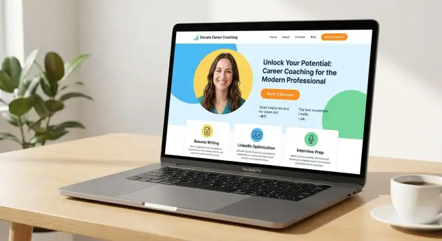
Create a Home Page That Converts
Your home page has one job: help the right person quickly understand what you do, trust you, and take the next step. For career coaching and resume services, clarity beats cleverness every time.
Start with an outcome-focused headline
Lead with the result your client wants, not your credentials. A strong headline states the transformation in plain language.
Examples:
- “Land more interviews with a resume that shows your value.”
- “Career coaching for professionals ready for a better role.”
- “Get clear, confident, and hired—without second-guessing your next move.”
Follow the headline with a short intro that names who you help and the pain point you solve. Think: role, level, or situation.
For example: “I help mid-career professionals who feel stuck reposition their experience, tighten their resume, and interview with confidence.”
Put one clear CTA above the fold
Above the fold (the part visible before scrolling), include one primary call-to-action button. Pick the action that matches your main offer:
- Book a Call (best for coaching)
- Get a Resume Review (best for resume services)
Keep the button label specific, and link it to your booking or contact flow (for example, /book or /contact). Avoid competing buttons that split attention.
Add quick proof you can verify
Right under your CTA, add “proof in a glance” elements that reduce doubt. Keep it honest and only include what you can back up.
Good options:
- 1–2 short testimonials (with permission)
- A simple results snapshot (e.g., “Clients have landed roles at…”) only if true
- Relevant certifications or memberships (only if current)
Include a simple “How it works” mini-section
People feel safer when they know what happens next. Add a small 3–4 step walkthrough.
Example flow:
- Choose your service (resume, LinkedIn, coaching)
- Submit details (current resume + goals)
- Meet or review (call or written feedback)
- Revise and finalize (updates + next steps)
When these pieces are in place, your home page becomes a clear starting point—not a biography—guiding visitors toward booking with confidence.
Build Service Pages People Understand
A service page should answer one question: “Is this for me, and what happens next?” When visitors can quickly understand your offer, they’re more likely to book—without emailing back and forth.
Split services into clear pages (or sections)
Avoid one long “Services” page that mixes everything together. Create separate pages (or distinct sections) for each core offer, such as:
- Resume Writing
- LinkedIn Profile Optimization
- Interview Coaching
This helps visitors self-select and keeps your calls to action specific (e.g., a resume client shouldn’t have to scroll past interview prep to take the next step).
Say who it’s for—and what they get
Early on the page, name the audience and situation: entry-level, career changers, executives, returning to work, tech roles, etc. Then list concrete deliverables and the format.
Example: “You’ll receive a tailored resume (Word + PDF), an ATS-friendly version, and a 20-minute handoff call.” Clear outputs reduce uncertainty.
Explain your process and timeline
People want to know what working with you feels like. Outline the steps in plain language: intake form, kickoff call, first draft, revisions, coaching sessions, final files. Include typical timelines (“first draft in 3 business days”) and what you need from them.
Add one primary CTA per page
Use a single, obvious next step above the fold and again near the end:
- Buy (for fixed packages)
- Book (for sessions)
- Request a quote (for custom or complex needs)
Link to /booking or /contact, depending on the action.
Reduce hesitation with a mini-FAQ
Include common questions directly on the page: number of revisions, confidentiality, turnaround time, how calls are done, refunds/rescheduling, and what happens if they’re not sure which service fits.
Set Up Pricing and Packages Clearly
Pricing isn’t just a number—it’s a clarity tool. When visitors understand what they can buy and what happens next, they’re more likely to book (and less likely to send “how much is it?” emails).
Pick a model that fits how you work
Start with the structure that matches your delivery:
- Packages (best for resume writing and defined outcomes)
- Tiers (good when you offer “good / better / best” options)
- Hourly coaching (useful for ongoing support or interview practice)
- Custom quotes (keep this for complex cases; still show a “starting at” range)
If pricing is a frequent question, link your main call-to-action buttons to /pricing (for example: “See pricing” or “Choose a package”).
Spell out what’s included (in plain language)
Each offer should list the details people care about:
- Number of coaching sessions (and session length)
- Resume/LinkedIn revisions included
- Response times (e.g., 2 business days)
- Support window (e.g., 14 or 30 days of follow-up)
- What’s not included (to prevent surprises)
Use a simple comparison table
A quick table helps visitors self-select without reading paragraphs:
| Package | Best for | Includes | Turnaround |
|---|---|---|---|
| Essentials | Quick refresh | 1 call + 1 revision | 5–7 days |
| Standard | Job search push | 2 calls + 2 revisions | 3–5 days |
| Premium | Career change | 3 calls + 3 revisions + LinkedIn | 2–3 days |
Keep it high-level. Too many rows can create decision fatigue.
Explain payment and what happens after purchase
Be explicit about whether you take full payment upfront or a deposit with the balance later. Then outline the next steps: confirmation email, intake form, scheduling link, and when they’ll receive the first draft or coaching plan. A short “After you purchase…” section reduces anxiety and refunds.
Add Booking and Contact Options
Add a client intake flow
Go beyond a brochure site with intake forms and a simple client portal when you are ready.
People visit a career coaching or resume writing website when they want momentum. Make it easy to take the next step without emailing back and forth.
Offer a low-friction first step
A simple entry option reduces hesitation—especially for new visitors. Consider either a free 15-minute consult (good for fit and quick triage) or a paid resume review (good if you want to filter for serious buyers).
Keep the offer specific: what they’ll get, how long it takes, and what happens next.
Use an online scheduler (and prep checklist)
Add an online scheduler so prospects can pick a time instantly. On the booking page, tell them what to prepare before the call, such as:
- Current resume (or LinkedIn URL)
- A target role and job posting
- Any deadlines (interview date, layoff timeline, graduation)
Also set clear expectations: session length, the meeting tool (Zoom/Google Meet/phone), and your cancellation window—only if you have one.
Create a dedicated booking page with one primary action
Give booking its own page (for example, /book) and keep it focused. One primary action—“Book now”—beats multiple competing buttons. If you offer more than one option, show a short comparison, then guide visitors to the best default.
Add contact options for people not ready to book
Some visitors have questions about fit, confidentiality, or employer sponsorship. Offer a simple contact form plus a visible email address. Keep the form short (name, email, message, and an optional “What role are you targeting?”).
If you can’t respond quickly, set expectations with a brief note like “Replies within 1–2 business days.”
Strengthen Trust with About, Credentials, and Proof
People hire a career coach or resume writer with personal, high-stakes information. Your website has to answer a quiet question quickly: “Is this person safe, credible, and a good fit for me?”
Write an About story that’s about the client
Instead of a full biography, lead with what changes for clients after working with you: clearer career direction, stronger interviews, resumes that reflect measurable impact, or more confidence in salary conversations.
Then add just enough background to make those outcomes believable—your “why,” your approach, and the types of roles or industries you’ve worked with. Keep it skimmable and specific.
Credentials: accurate, current, and easy to verify
List certifications, training, and relevant experience in plain language. Include dates when helpful and link to the certifying body when possible (or a PDF). Avoid padding your credibility—outdated badges or vague claims (“certified expert”) reduce trust.
If you have a process that’s evidence-based (e.g., ATS-aware formatting, accomplishment-driven writing, structured coaching frameworks), name it and explain it briefly.
Show your working style and best-fit clients
Describe how you work: direct vs. supportive, structured vs. flexible, data-driven vs. narrative-focused. Also say who you’re best for (and who you’re not). This reduces awkward discovery calls and attracts clients who will be happiest with your style.
Make it feel consistent and real
Use a professional headshot and keep your tone consistent across pages—your About, services, and contact should sound like the same person. Consistency signals care.
Add a simple trust section
Include a short privacy note: what documents you request, how you store/share them, and how long you keep them. Keep it honest and practical—no overpromises. A few lines near your About or /contact page can remove anxiety and increase inquiries.
Use Testimonials, Samples, and Case Studies Ethically
Get more credits as you share
Create content or refer others and earn credits to keep building on Koder.ai.
Social proof can be the difference between “interesting” and “I’m ready to book.” But in career coaching and resume services, proof has to respect privacy, avoid exaggeration, and stay clear about what’s typical.
Collect testimonials with clear permission
Only publish testimonials when you have explicit consent to use them on your website (and clarify where: homepage, service pages, /booking, etc.). Keep them specific so they’re useful to future clients:
- The client’s role or target role (e.g., “Product Manager pivoting to fintech”)
- The goal (resume rewrite, interview prep, career strategy)
- The outcome (more callbacks, clearer positioning, confidence in interviews)
If a client prefers anonymity, say so honestly (e.g., “Client in healthcare operations”). Never imply a name, company, or title they didn’t approve.
Share samples without exposing personal data
For resume/LinkedIn samples, anonymize thoroughly: remove names, emails, phone numbers, addresses, employer names, school IDs, and any unique project details that could identify someone. Keep the example truthful—don’t present a “sample” as a real client result if it’s a mock-up.
Use “before/after” carefully
Before/after can be persuasive when it focuses on improvements you can control: structure, clarity, keywords, scannability, and achievement framing. Avoid fake numbers or guaranteed outcomes. Instead of “3x interviews,” show what changed:
- Cleaner summary and target role alignment
- Stronger action verbs and measurable impact wording (only if verified)
- ATS-friendly formatting and relevant keyword coverage
Add mini case studies: situation → approach → result
A short case-study block (5–8 lines) helps visitors understand your process.
Situation: stalled job search after a layoff.
Approach: clarified target roles, rebuilt resume narrative, updated LinkedIn, practiced interview stories.
Result: “More consistent recruiter responses and stronger interviews within 4 weeks.”
Place proof near decision points
Don’t hide testimonials on a “Testimonials” page only. Add proof where people decide: on service pages, near package descriptions, and right above your booking/contact CTA (for example, on /services and /booking).
Cover the SEO Basics for Career Coaching and Resume Services
SEO doesn’t have to be complicated. If your site clearly explains what you do, who you help, and where you work (even if you’re remote), you can start showing up for searches that signal high intent.
Match what people are actually searching for
Think in terms of “I need help now” queries, such as “resume writer for [city]” or “career coach for [industry]”. Build pages that directly reflect those needs—either separate service pages or dedicated sections within your main service pages.
Write your page titles and headings to match your offers and locations. For example:
- Page title: “Resume Writing Services in Austin | [Brand Name]”
- H1: “Resume Writing for Austin Job Seekers”
If you serve multiple locations, avoid making dozens of near-duplicate pages. Focus on a few core areas you truly support and add clear location cues in your copy.
Add FAQs that reduce hesitation
A short FAQ section can rank for long-tail searches and improve conversions. Use plain language and answer real questions like:
- “How many revisions are included?”
- “Do you write federal resumes?”
- “What’s the difference between coaching and resume writing?”
Place these on relevant pages like /services and /pricing.
Keep pages fast and image-friendly
If you include headshots, icons, or resume samples, optimize them:
- Use descriptive filenames (e.g.,
executive-resume-sample.pdforcareer-coach-headshot-jamie-lee.jpg) - Add clear alt text (“Career coach Jamie Lee on a video call”)
- Compress images so pages load quickly on mobile
Plan blog topics that support your services
Pick 6–10 blog posts that answer common questions and naturally link back to /services and /pricing. Examples: “How to tailor your resume for ATS,” “How to negotiate salary after a job offer,” or “What to expect from career coaching in your first session.”
Design for Clarity, Mobile, and Accessibility
Good design on a career coaching website isn’t about fancy effects—it’s about helping someone quickly understand what you do, trust you, and take the next step.
Start with a clean, readable foundation
Pick a simple template with plenty of white space and predictable navigation. Use one or two readable fonts (a sans-serif for body text is usually easiest), and keep font sizes comfortable—especially on mobile. Buttons should have strong contrast against the background, with clear labels like “Book a Free Call” or “Get Resume Feedback.”
Keep branding consistent (without overdesigning)
Choose 1–2 brand colors plus neutrals, then apply them consistently across the site. A limited set of components makes everything feel cohesive: one primary button style, one secondary button style, a consistent “card” style for services, and one testimonial layout.
To avoid your site drifting over time, create a mini style guide you can copy into a doc:
- Primary/secondary colors (hex codes)
- Fonts and heading sizes
- Button styles and CTA wording rules
- Spacing rules (e.g., “sections always have 48px padding”)
Mobile-first: design for thumbs and short attention
Most visitors will find you on a phone. Make the page easy to scan with short sections, clear headings, and generous spacing. Consider a sticky CTA (like “Book” or “Contact”) that stays visible while scrolling.
Also ensure tap targets are large enough: buttons and links should be easy to tap without zooming, and forms should be short with mobile-friendly fields.
Accessibility essentials you can implement today
Accessibility helps everyone—busy professionals, people using screen readers, and anyone on a small screen.
- Use headings in order (H2, then H3) so pages are easy to navigate
- Add alt text to meaningful images (and skip it for purely decorative ones)
- Maintain strong color contrast for text and buttons
- Avoid tiny text; aim for readable sizes and comfortable line spacing
- Don’t rely on color alone to communicate meaning (e.g., errors should include text)
Add Lead Generation: Email Signup and Helpful Resources
Prototype your site at no cost
Use the free tier to draft your pages, then upgrade only if you need more.
A great career coaching website doesn’t just explain what you do—it gives visitors a low-pressure way to stay connected until they’re ready to book. That’s where a simple email signup and a well-organized resources area can do the heavy lifting.
Create lead magnets that fit your offer
Your free resource should feel like a “small win” your ideal client can use immediately, and it should naturally connect to your paid service.
A few lead magnet ideas that match career coaching and resume services:
- A resume checklist (formatting, impact bullets, ATS basics)
- A LinkedIn headline guide with examples for common roles
- A job-search weekly plan (especially useful for coaching clients)
Keep it specific. “Free career tips” is vague; “10 resume bullets that show impact (with templates)” signals value and attracts the right audience.
Add an email signup with a clear benefit (and minimal fields)
Place a signup form where it’s easy to notice: the home page, service pages, and your resources area. The copy should say exactly what they get and when.
Good signup microcopy examples:
- “Get the Resume Checklist (PDF) + 3 practical email tips over the next week.”
- “Receive LinkedIn headline examples for your industry—no spam, unsubscribe anytime.”
Use minimal fields—usually first name + email is enough. Every extra field lowers signups. If you need segmentation (e.g., “coaching” vs “resume writing”), use a single dropdown.
Build a resources page that organizes posts, templates, and FAQs
A dedicated resources hub makes your site feel more helpful and easier to navigate. Instead of a long blog feed, organize content by visitor intent:
- Resumes (checklists, bullet formula, common mistakes)
- LinkedIn (headline, About section, profile keywords)
- Interviews (prep guide, common questions)
- FAQs (timelines, revisions, what you need from clients)
Then add internal links that guide people forward. If a post explains resume bullet writing, link to your resume service landing page and your booking page.
Set boundaries so free help doesn’t drain your time
Resources should build trust, not create endless unpaid reviews. Be clear about what you won’t do for free:
- “I’m not able to provide resume feedback by email. If you’d like a professional review, book a Resume Audit.”
That single line protects your calendar and gently moves visitors toward paid options.
Use internal links to connect resources to booking
Every helpful page should have a next step. Add a short callout at the bottom:
- “Want hands-on help? Explore /services or book a consult at /book.”
This is how your resources turn into clients—without feeling pushy.
Launch Checklist, Analytics, and Ongoing Updates
A career coaching or resume writing website is never really “done”—but it should be launch-ready. The goal is to go live with confidence, track what matters, and create a simple rhythm for keeping the site accurate and effective.
A practical pre-launch checklist (15–30 minutes)
Before you announce your site, do one clean pass as if you’re a first-time visitor:
- Check every link (menu, buttons, footer, social icons). Broken links are a trust killer.
- Test every form (contact, booking request, email signup). Confirm you receive submissions and that the confirmation message makes sense.
- Confirm mobile readability: headlines not cut off, buttons easy to tap, text not tiny, no horizontal scrolling.
- Speed sanity check: pages should load quickly on mobile data. If not, compress large images and remove heavy widgets.
- Spelling + clarity sweep: pay special attention to service names, job titles, and pricing.
- Booking flow rehearsal (if you offer online booking): pick a time, submit, ensure the confirmation email and calendar event arrive.
Add the essential “legitimacy” pages
At minimum, include a clear /contact page. Depending on where you operate and what tools you use, add:
- /privacy-policy (especially if you collect emails, use analytics, or embed scheduling tools)
- /terms (helpful if you sell packages, collect deposits, or have cancellation rules)
Link these in the footer so they’re always easy to find.
Build faster (optional): generate the site and flows with Koder.ai
If you want to ship a polished site without a long development cycle, you can use Koder.ai to vibe-code a career coaching website from a simple chat. You can describe your niche, offers, and CTAs, then generate pages like /services, /pricing, and /book with a consistent design system.
Because Koder.ai can produce full-stack apps (React on the front end, Go + PostgreSQL on the back end), it’s also useful if you later want more than a brochure site—like a client intake portal, paid package checkout, or a lightweight CRM-style dashboard. You can export the source code, deploy with hosting, and use snapshots/rollback to safely iterate as your offers evolve.
Set up privacy-aware analytics (track what actually matters)
You don’t need complicated dashboards. You do need a way to answer: Which pages bring inquiries and bookings?
Track these core events:
- Page views for key pages (Home, Services, Pricing, Booking)
- Form submissions (contact form, email signup)
- Bookings or “booking completed” (if your scheduling tool supports it)
If you use Google Analytics, consider enabling consent controls and avoiding unnecessary user-level tracking. If you prefer simpler options, choose privacy-focused analytics that still show referrers and top pages.
Ongoing updates: a light monthly routine
A neglected site loses trust over time. Keep it simple:
- Monthly (30 minutes): check for broken links, confirm forms still work, review analytics for top pages and drop-offs.
- Quarterly: refresh testimonials (with permission), update your bio, and review pricing and package descriptions.
- When you publish content: link it from relevant service pages so it supports conversions (not just traffic).
If you want a low-effort starting point, set a calendar reminder to review your /pricing and /booking pages once a month—those pages usually influence revenue the most.
FAQ
What should I decide before writing copy for a career coaching or resume website?
Start by defining one primary audience (e.g., graduating students, executives, career changers) and whether you serve clients locally or remotely.
Then choose a single primary goal (most commonly book a discovery call). Your niche + goal will drive your headlines, offers, CTAs, and page structure.
What pages does a career coaching or resume writing website need?
A simple, proven setup is:
- Home (clear overview + CTA)
- Services (what you offer, who it’s for, what’s included)
- About (credibility + approach)
- Results/Testimonials (proof)
- Resources/Blog (trust + SEO)
- Contact/Booking (take action)
Add Pricing, FAQs, or Policies only if they reduce buyer friction.
How many services should I list on my site?
Keep it to 1–3 core offers so visitors can self-identify quickly.
Good “core” options include:
- Resume + cover letter
- LinkedIn profile rewrite
- Interview prep / coaching package
If you do more, list them later as add-ons to avoid turning your Services page into a confusing menu.
What should my home page include to get more bookings?
Aim to answer three questions immediately: What do you do? Is it for me? What do I do next?
Use an outcome-focused headline, a short “who you help” sentence, and one primary CTA above the fold (e.g., “Book a Call” or “Get a Resume Review”). Add a small proof block and a simple “How it works” section to reduce hesitation.
How do I write service pages people actually understand?
Make each service easy to understand with:
- Who it’s for (role/level/situation)
- Deliverables (exact outputs like Word + PDF, sessions, revisions)
- Process + timeline (intake → draft → revisions → final)
- One primary CTA (Buy, Book, or Request a quote)
Consider separate pages (or clearly separated sections) for each core offer so the CTA stays relevant.
How do I present pricing without scaring people away?
Choose a model that matches how you deliver:
- Packages (defined deliverables)
- Tiers (good/better/best)
- Hourly coaching (ongoing support)
- Custom quotes (show a starting range)
Then spell out what’s included (sessions, revisions, response times, support window) and add a short “After you purchase…” section so people know exactly what happens next.
What’s the best way to set up booking and contact on my site?
Use one focused booking page (e.g., /book) with an online scheduler and clear expectations:
- Session length and meeting tool (Zoom/Meet/phone)
- What to prepare (resume/LinkedIn, target role, deadlines)
- Cancellation/reschedule window (if you have one)
Also offer a low-friction first step (free consult or paid audit) and a simple contact form for people not ready to book.
How can I use testimonials and resume samples ethically?
Use proof where people decide (service pages, pricing blocks, and near CTAs), not only on a Testimonials page.
For testimonials, get explicit permission and keep them specific (goal + outcome). For samples, anonymize thoroughly (names, employers, contact details, unique identifiers) and avoid implying guarantees or typical outcomes you can’t support.
What are the simplest SEO steps for a career coach or resume writer website?
Start with high-intent phrases people actually search for (e.g., “resume writer in [city]” or “career coach for [industry]”).
Then:
- Match page titles/H1s to your offers and locations
- Add a mini-FAQ on /services or /pricing for long-tail searches
- Keep pages fast (compress images, avoid heavy widgets)
- Publish a handful of helpful posts and link them back to /services and /book
What should I check before launching my career coaching or resume website?
Run a quick pre-launch pass:
- Click every link and button
- Test forms (contact, email signup, booking)
- Check mobile readability and load speed
- Confirm booking confirmations and emails work
Add essentials like /contact and footer links to /privacy-policy (and /terms if you sell packages). Track basics: page views for key pages and conversions like form submissions and bookings.