Mar 13, 2025·8 min
How to Create a Website for a Crypto or Web3 Education Platform
Step-by-step guide to plan, design, and launch a crypto or Web3 education website: content structure, trust, compliance basics, payments, and growth.
Step-by-step guide to plan, design, and launch a crypto or Web3 education website: content structure, trust, compliance basics, payments, and growth.
Before you sketch pages or record lessons, decide what “Web3 education” means on your site. Web3 is a broad label, and trying to teach everything makes your platform feel generic.
Pick a clear center of gravity for your brand, such as:
Write a one-sentence promise that a visitor can understand in five seconds, for example: “Practical DeFi courses for beginners who want to use protocols safely.”
Select a single “default learner” so your curriculum, tone, and examples stay consistent:
You can support other segments later, but start with one.
Decide what “winning” looks like in the first 90 days:
Crypto learners are cautious, and they should be. Build credibility into your site basics:
A clear structure helps visitors feel oriented—especially when they’re new to crypto. Before you design anything, map the pages you need and decide how a learner moves from “curious” to “confident.”
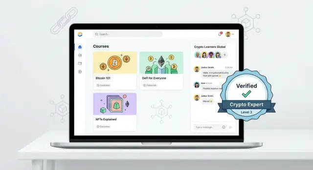
Start with a small set of pages most people expect:
These pages reduce friction because users don’t have to “learn your site” before they can learn blockchain.
Instead of a flat catalog, build Beginner → Intermediate → Advanced learning paths so people always know what to do next. Each path should explain:
Example: Beginner: Wallet-ready → Intermediate: DeFi basics → Advanced: On-chain analysis.
Offer two ways to browse:
Write a one-page sitemap and test menu labels with non-technical friends. Prefer “Wallet Safety” over “Self-custody Fundamentals,” and “Learning Paths” over “Tracks.” If they hesitate, rename it.
A strong Web3 education site feels coherent from the first lesson to the final project. Start by defining the learning outcomes for each course (what a learner can do afterward), then choose formats that match those outcomes—not the other way around.
Use a mix of content types so learners can watch, practice, and self-check:
Decide how learners earn credit and what it means:
Make criteria visible on the course page so expectations are clear before purchase.
A consistent structure reduces drop-off. Use the same pattern across lessons:
Add a searchable glossary for terms learners repeatedly hit: seed phrase, gas, smart contract, slippage, cold wallet. Link glossary entries directly from lessons so learners never feel stuck on vocabulary.
Trust is your conversion engine. People won’t enroll—or they’ll refund—if they suspect hype, hidden incentives, or outdated information.
Add a short, plain-language disclaimer near any content that discusses tokens, trading, yields, or wallets. Make it visible on lesson pages, downloadable PDFs, and webinar registration screens.
Example wording:
This course is for educational purposes only and is not financial, legal, or tax advice. Crypto is high-risk. Always do your own research.
Keep it consistent across the site, and link to a fuller version in /terms.
Web3 changes quickly, so say how you stay current. A simple “Update policy” block builds confidence:
Also show “Last updated” dates on course pages and key lessons so learners can judge freshness.
Create instructor bios that focus on verifiable experience: previous roles, published work, open-source contributions, conference talks, and real projects. Avoid performance claims (e.g., “beat the market”) and don’t imply guaranteed outcomes.
If you use guest experts, disclose any affiliations that could be perceived as promotion.
Put links in your footer and checkout flow to:
Clear policies reduce support tickets, protect your brand, and make learners feel safe committing to a membership or course.
A crypto education platform shouldn’t treat safety as a “bonus lesson.” Your interface can teach good habits every time someone signs up, starts a course, or clicks a link.
Add a short, skimmable safety onboarding flow that appears for new users and is always accessible later. Keep it practical:
Many learners can “learn blockchain online” without connecting a wallet at all. Default to simulations, read-only explorers, screenshots, and testnet examples.
If your lesson genuinely needs a wallet connection (e.g., signing a message or interacting with a testnet dApp), make it an explicit choice with a clear alternative: “Continue without connecting.” This builds trust and reduces drop-offs.
If you prompt a wallet connection, translate technical prompts into simple explanations right next to the button:
Create a dedicated /safety-center page with checklists, scam examples, and “what to do if…” guides. Link it from:
This turns your UX into a built-in safety coach—without scaring learners away.
A crypto/Web3 education site should feel calm, clear, and predictable. Learners are often juggling new concepts (wallets, networks, fees), so your design should remove friction—not add it. A simple visual system also makes it easier to publish courses quickly without every page feeling custom.
Prioritize readability over “crypto aesthetics.” Use a legible body font size (16–18px), generous line spacing, and a restrained color palette. Strong contrast is non-negotiable: your calls to action (Enroll, Start lesson, Join membership) should be obvious, and long lesson pages should be easy on the eyes.
A practical rule: if your lesson text doesn’t read well on a phone in bright light, it’s not ready.
Reusable blocks speed up publishing and keep the platform consistent. Create a small component library and use it across course catalogs, landing pages, and dashboards:
When these blocks look the same on every page, users learn the interface once and stop second-guessing what to click.
Many learners will watch videos on their phones. Make key actions reachable with one hand: resume lesson, speed controls, downloads, and “next lesson.” Keep navigation minimal, avoid tiny tap targets, and ensure pages load quickly on mobile connections.
Accessibility is good UX and good business: it helps more people complete your courses.
These basics make your web3 education website easier to trust, easier to use, and easier to scale.
Your tech stack should match what you’re teaching and how fast you need to ship. For a crypto/Web3 education platform, the “best” option is usually the one that supports clear learning progress, protects users’ data, and won’t break during a live cohort.
An LMS is the quickest path if your priority is launching courses and iterating content. You typically get hosting, user accounts, progress tracking, quizzes, certificates, and basic email automation out of the box.
Choose this if you want fewer moving parts and predictable maintenance.
A custom setup (for example, a CMS for marketing pages plus a dedicated course tool) gives you more control over design, SEO, and content strategy—useful if you plan to scale into a media brand.
It’s also easier to create custom learning paths, advanced filtering, and content hubs that rank well in search.
If you want custom without a long build cycle, a vibe-coding platform like Koder.ai can help you prototype and ship a React-based front end with a Go + PostgreSQL back end through a chat-driven workflow—useful when you need “custom features” (paths, quizzes, certificates, dashboards) but still want to move fast.
Keep your “v1” requirements tight:
Plan for stability early:
(If you build on Koder.ai, snapshots and rollback can simplify day-to-day ops when you’re iterating quickly, and you can export source code later if you outgrow the initial setup.)
Document nice-to-haves so they don’t delay launch—advanced dashboards, cohort analytics, referrals, community gamification, and on-chain credentials can wait until you’ve validated demand.
Pricing is part of your curriculum: it sets expectations, signals depth, and shapes how learners commit. Before you design plans, decide what you’re really selling—content access, outcomes, support, or community.
A few models work especially well for a crypto course platform:
Keep tiers limited (2–4). For each tier, list inclusions in plain language:
Link each plan to the next step in a learning path so learners understand what to buy now vs later.
Offer card payments by default, and add PayPal if your audience expects it. Only accept crypto if you can support it well—clear instructions, network selection, confirmation times, and a documented refund policy (often harder with crypto). If you do, add a short “Paying with crypto” help page like /help/payments.
Add a small FAQ right on the checkout page: refunds, access length, device support, and “what happens after I pay.” Consider a simple guarantee for first-time buyers. Send clean receipts/invoices automatically, and include a “Need help?” link to /support so payment questions don’t become churn.
Your content can be excellent—and still not convert—if visitors can’t quickly answer: “Is this for me, and what happens next?” High-converting pages remove doubt, set expectations, and make the next step obvious.
Treat your home page as a guided decision screen, not a brochure. Lead with a clear value proposition (what you teach, who it’s for, and the outcome), then offer 2–4 paths so people can self-select.
For example: Beginner: Learn blockchain online, DeFi fundamentals, Security-first wallet setup, Developer track.
Add social proof where it matters: learner stats, testimonials, logos (if permitted), and short “as seen in/featured on” notes. Place a strong primary CTA above the fold (e.g., Start the free mini-lesson, Browse courses, Join membership) and repeat it after key sections.
A course page should read like a promise with boundaries. Include:
Also add a short “Who this is NOT for” block. It reduces refunds and increases trust.
Offer a free mini-course or a one-page checklist (e.g., “Wallet Safety Basics”) in exchange for email. Keep the form simple (email only) and set expectations: what they’ll receive and how often you’ll email.
Don’t leave visitors at dead ends. Link to the next logical step using relative URLs:
This creates a smooth learning-and-purchase journey without extra friction.
SEO for a crypto education site isn’t about chasing hype keywords—it’s about matching the exact questions beginners type when they’re confused or nervous. If your content answers those questions clearly, you’ll attract motivated learners and set the right expectations for your courses.
Start with high-intent “how/what” searches and safety basics. These often convert well because the reader wants a trustworthy guide.
Examples to build around:
Create one focused page per topic, then connect it to the most relevant lesson or course page.
Treat your blog and resource pages as the front door to your curriculum. For each learning path, plan supporting articles that remove friction before a learner enrolls.
For instance, if you have a beginner wallet module, schedule articles like “hot wallet vs cold wallet” and “how to store a seed phrase safely,” then link each article to the next logical step (e.g., a preview lesson or /courses/wallet-safety).
Use clear titles, a single H1, descriptive H2/H3 headings, and a meta description that promises a practical outcome. Add internal links that help readers progress:
Add an FAQ section to key pages, build a glossary hub (e.g., /glossary), and use short definitions and step-by-step explanations. This makes content easier to scan, improves internal linking, and increases the chance your pages show up for question-based searches.
A crypto/Web3 education site feels alive when learners can ask questions, compare notes, and get timely help—without turning your community into a spam magnet. The goal is simple: reduce drop-off and increase confidence.
Start with one primary channel and set expectations early.
Whatever you choose, publish clear rules (no shilling, no “DM me for signals,” no impersonation) and pin them everywhere.
Don’t assume learners know what to do next. Add:
Link to this from your header or dashboard (e.g., /start).
Set up a lightweight support model that you can keep:
Assign at least one moderator who understands common crypto scams and can remove risky posts quickly.
Offer simple recurring touchpoints:
Record sessions and add them to a members-only archive so live events also improve your course library.
A crypto/Web3 education site is never “done.” Chains upgrade, narratives shift, and best practices for safety evolve. Treat launch as the start of a measurement-and-improvement cycle, not a finish line.
Pick a small set of metrics tied to learning outcomes and revenue. Typical goals include:
Track these as funnel steps in one place (your analytics tool + payment system). Add simple event tracking for key actions like “Start lesson,” “Finish quiz,” and “Join community.”
Do one final sweep with real devices, not just your laptop:
If you have multiple course landing pages, check that each one has a clear primary CTA and a working payment path.
Don’t wait for angry emails. Add lightweight collection points:
Set a monthly cadence: review analytics, read tagged feedback, and ship small improvements. Prioritize:
Continuous improvement is how your platform stays credible—and how completion rates (and renewals) rise over time.
Start by narrowing your scope to one clear promise (e.g., “Practical DeFi courses for beginners who want to use protocols safely”). Pick one primary audience segment (beginners, creators, developers, or teams) so your tone, examples, and learning path stay consistent.
A simple way to validate the focus is to define your first 90-day success metric (email signups, course sales, community activity, or certifications completed) and build the site around that.
Ship a familiar set of pages first:
This reduces friction because learners don’t have to “learn your site” before they can learn Web3.
Learning paths answer the learner’s real question: “What should I do next?” Structure paths as Beginner → Intermediate → Advanced, and for each path clearly state:
Then offer two browse modes: by topic (DeFi, NFTs, security) and by outcome (“Set up a wallet safely,” “Avoid scams”).
Use formats that match the outcome:
Standardize lessons with a repeatable template (intro, key terms, steps, recap, resources) so learners always know what to expect.
Decide “proof of learning” before you publish:
Put the criteria on the course page so expectations are clear before purchase.
Add trust signals where users make decisions:
Also show “Last updated” dates on course pages and key lessons to prove freshness.
Make disclaimers visible near any discussion of tokens, trading, yields, or wallets, and keep the wording consistent across lessons, PDFs, and webinars. Link to a fuller version in /terms.
Also explain your update process (sources, review schedule, and what triggers updates) so learners know you’re not teaching outdated or risky practices.
Default to learning without wallet connection whenever possible (screenshots, simulations, read-only explorers, testnets). If connecting is truly required, make it optional with a clear alternative (“Continue without connecting”).
When you do connect, explain in plain language whether the action is connect, sign, or approve, what it enables, and how to revoke access (link to /safety-center).
Create a dedicated /safety-center with practical checklists and “what to do if…” guides (phishing, seed phrase exposure, suspicious approvals). Link it from course pages, onboarding emails, and any page that mentions wallets or payments.
Include a beginner safety onboarding flow that covers seed phrase rules, common scams, token approvals, and phishing basics.
For speed, use an all-in-one LMS if you want hosting, accounts, progress tracking, quizzes, and certificates with minimal maintenance. Go custom (CMS + course tool) if SEO, design control, and advanced learning paths are core to your strategy.
At minimum, v1 should include accounts, progress tracking, assessments, certificates, and automated email (welcome, reminders, receipts). Document “Phase 2” features so they don’t delay launch.