May 26, 2025·8 min
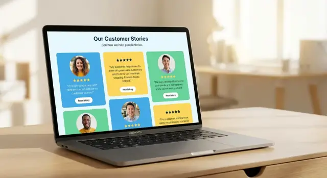
Create a Website for Customer Stories & Testimonials That Convert
Learn how to plan, collect, write, and publish customer stories and testimonials on a dedicated website that builds trust and drives sign-ups.
Learn how to plan, collect, write, and publish customer stories and testimonials on a dedicated website that builds trust and drives sign-ups.
Before you design a customer stories website, get clear on what it’s supposed to accomplish. Testimonials can do several jobs at once, but your site will convert better when you choose a primary goal and build around it.
Common goals include:
Pick one as the “main” outcome, then treat the others as supporting benefits. This decision will shape everything: page structure, CTAs, the amount of detail you include, and even how you tag stories.
A customer stories page will be read by different people at different stages of the buying process. Identify your primary audience:
Write down the top 5 questions they need answered and make sure your stories explicitly address them. If those questions stay unanswered, visitors will treat your stories as “nice marketing,” not decision support.
Choose 1–3 success metrics that match your goal, such as:
Set a baseline (current performance) so you can see improvement after launch. Without a baseline, you can’t tell whether your new testimonial page design actually helped.
Match formats to intent: short quotes for quick reassurance, full case studies for proof and detail, video testimonials for emotion and authenticity, and a logo wall for instant credibility.
Before building, list the core pages you want—for example: a main /customers hub, individual story pages, an industry or use-case filter page, and a submission page for new testimonials.
Your site structure should make it effortless for a buyer to find “someone like me,” understand what changed, and then take the next step. Start by choosing between two proven options based on how many stories you have today.
Option 1: A hub page + many story pages (best for growing libraries). The hub helps visitors filter quickly, while each story page can rank for specific searches and carry a focused narrative.
Option 2: A single long page (best if you have ~5–15 strong testimonials). It’s easy to maintain and works well when your product is simple or your audience is narrow.
If you expect your library to grow, choose Option 1 early. It prevents a painful migration later and makes internal linking, SEO, and filtering much easier.
Keep it simple and buyer-friendly:
If you want a clean start, link your Stories hub from the main nav and feature 3–6 stories on the homepage.
Avoid internal jargon like “Success” or “Customer Wins” if your audience doesn’t use those terms. Prefer labels like Customer Stories, Case Studies, Testimonials, By Industry, and Results.
Use one primary CTA across story-related pages (for example, Book a demo or Start trial) and repeat it consistently: top of page, after key results, and at the end.
Consistency matters because story pages are often read non-linearly. If visitors skim straight to “Results,” they should still see a clear next step.
A simple path that works:
Homepage → Customer Stories hub → Story page (problem → solution → results) → CTA → /contact or /pricing
If a visitor can’t reach a relevant story in two clicks, your structure is probably too complicated.
A testimonial page succeeds when it feels effortless to scan and easy to believe. Your design should reduce “work” for the reader: show who said it, what changed, and what to do next—without distractions.
Make the quotes the hero. Use generous spacing, short line lengths, and clear hierarchy (headline → quote → context). Large quote text can work well, but pair it with strong headings that summarize the outcome (e.g., “Cut onboarding time by 30%”). Treat this page like a reading experience, not a collage.
Standardize every testimonial so visitors can quickly compare.
Each card should include:
Consistency builds trust because it signals you didn’t rewrite every story differently. It also makes it easier to scale later.
Filters can increase conversions by helping people find “someone like me.” Keep them limited and meaningful: industry, company size, problem, or product area. Avoid too many options, and don’t hide the best stories behind multiple clicks.
A good rule: if a filter won’t change a buying decision, remove it.
Don’t overload the page with unrelated CTAs. Keep each page focused on proof, then offer a single next step such as “See the case study,” “Book a demo,” or “Talk to sales.” If you add supporting elements (ratings, review counts, security badges), keep them visually quiet so they support the stories rather than compete with them.
Most visitors will skim on a phone. Ensure quote blocks don’t become walls of text, logos don’t shrink into illegibility, and video embeds load cleanly. Use readable font sizes, tappable filters, and keep key context (name, role, outcome) visible without extra taps.
Collecting great testimonials is mostly about preparation and respect for your customer’s time. If you make participation easy and the outcome clear, you’ll get specific stories instead of vague compliments.
Start with your happiest customers—but don’t stop there. Aim for variety so your future customer stories website reflects the range of people you serve:
Keep a simple tracker with name, product/use case, results, and status (asked / agreed / drafted / approved).
Your outreach message should answer: what will be public, where it will appear, and how much time it takes. Be explicit about permissions (name, title, company, headshot, logo) and whether you’ll attribute quotes.
If you use incentives, keep them appropriate and transparent (e.g., a donation to a charity or a gift card where permitted).
Give customers options:
The best method is the one they’ll actually complete.
Avoid “Do you like it?” Instead ask for specifics:
Send a final draft for confirmation, with a clear “reply with edits or approval” CTA. Limit review to facts, attribution, and sensitive details—then publish quickly while momentum is high.
A customer story should read like a helpful mini-lesson, not a brochure. The easiest way to keep it grounded is to build it around what actually changed for the customer—and how.
A clean structure keeps you from over-explaining and helps readers find themselves in the story:
This arc also makes your story skimmable, which matters on busy testimonial pages.
Vague wins (“saved a lot of time”) don’t build trust. Look for measurable specifics the customer can confirm:
If the customer can’t verify a number, don’t invent one. Instead, use concrete descriptions: “Our weekly report went from a half-day project to something we finish before lunch.”
A strong story answers: “Would this work for a team like mine?” Include a few anchors near the top:
Context prevents the story from sounding too perfect—and helps the right prospects lean in.
Preserve the customer’s phrasing and perspective. Edit for clarity, remove filler, and fix grammar, but don’t swap in marketing language they never used. A good test: if you read it aloud, does it sound like a person talking to a peer?
Pull-quotes help readers get the “so what” in seconds. Make it short, specific, and outcome-focused.
Example: “We cut onboarding from two weeks to three days—and new hires stopped asking the same setup questions.”
The “best” testimonial format depends on where it will live on your site and how much effort you can reliably invest. A single strong quote can lift a conversion page, while a full case study can shorten the sales cycle for higher-consideration buyers.
The goal is to choose a mix you can maintain long-term—fresh, credible, and easy to browse.
Quote testimonials are ideal when you need quick proof near a decision point—pricing pages, product pages, signup flows, and in-page CTAs. They work best when they’re specific.
A useful quote includes:
If you only publish one format to start, start here: quotes are quick to collect, quick to publish, and easy to reuse across /pricing, /features, and key landing pages.
Case studies are the right choice when buyers need to justify a purchase internally, compare options, or understand implementation details. They’re especially effective for complex deals, higher price points, and longer sales cycles.
Keep them skimmable: a clear “problem → approach → results” flow, a short summary at the top, and a section that addresses common objections (timeline, migration effort, team involvement). Think of a case study as a decision aid, not a press release.
Video builds credibility quickly because people can see and hear the customer. The trade-off is production and coordination.
To make video practical:
Even a lightly produced recording can work if the story is authentic and the audio is clear.
Before/after snapshots show transformation without asking readers to commit to a long story. They can be a small visual, a checklist, or a “then vs. now” table.
This format works well on product and feature pages: it answers “What will change for me?” in seconds.
A neglected stories section hurts trust. Pick formats based on your team size and workflow: quotes are easiest to keep fresh, case studies require more coordination, and video needs ongoing operational support.
A smart mix is often: frequent quotes, occasional case studies, and selective video for your most persuasive customers or flagship use cases.
Consistency is what makes a customer stories website feel credible—and what makes it easy to publish the next story without starting from scratch.
Start with standard fields that can appear in a header area across all customer stories:
These fields make stories scannable and help readers quickly answer: “Is this someone like me?” They also support better internal filtering and future SEO improvements.
A good story reads like a clear before-and-after—not a product brochure. Build your content model around a repeatable narrative:
If your CMS supports it, treat Results as structured fields (e.g., metric label + value + timeframe) so you can reuse them in cards, sidebars, and “highlights” sections.
Tagging turns a collection of pages into a browsable library. Use a small, controlled set of tags you’ll actually maintain:
Avoid free-text tags that create duplicates (“E-commerce” vs “ecommerce”). Pick a single naming style and stick to it.
Turn repeated sections into components you can drop into any story:
When these components are standardized, you can also reuse them on /customers, product pages, and pricing pages without rewriting everything.
A template isn’t just layout—it’s an editorial system. If a draft is missing a Challenge, an Implementation detail, or a dated result, it’s not ready to ship. That rule alone keeps your library consistent, faster to publish, and easier to trust.
A testimonial hub is useful, but customer stories convert best when they appear exactly where people hesitate. The goal is to reduce “Will this work for me?” friction at key moments—without turning every page into a wall of quotes.
Make social proof impossible to miss. Add a dedicated homepage block (often right after your value proposition or product overview) with a few high-signal snippets and a direct link to your full story library.
Example structure:
/customersPeople scan features and pricing looking for risk. Add relevant stories next to the claims that need support:
/pricing, include a small “Trusted by” strip plus one or two pricing-adjacent stories (e.g., “Upgraded from Starter after 2 weeks”).Don’t make readers restart their search. On each story page, add links to related stories:
A simple “More stories like this” section keeps people browsing and increases the chances they’ll find a match.
Every story page should offer a next step, but it shouldn’t overpower the narrative. Match CTAs to intent:
/pricing/demo/contactPlace one CTA near the top (subtle) and one at the end (clear), and keep the story itself front and center.
Customer stories can rank well because they answer high-intent questions like “Does this work for companies like mine?” The key is to publish pages that match what people actually search for—and make them easy for search engines to understand.
Create dedicated story pages that combine industry + problem/solution + outcome. For example: “HVAC scheduling software: how Acme Services cut no-shows by 22%.” This is more discoverable than a generic “Customer Success Story.”
If you have multiple stories, consider light organization pages (e.g., “Stories by industry” or “Stories by use case”) that link out to each story.
Write a clear, specific title and meta description for each story page. Mention the customer type, the solution, and a measurable result when possible.
Use descriptive URLs and headings:
/customers/acme-hvac-scheduling-no-showsIf you embed video testimonials, add captions or a transcript on the page (not only in the player). For images (logos, screenshots, before/after charts), add accurate alt text that describes what’s shown.
Avoid keyword stuffing like repeating “testimonial page design” unnaturally. Instead, focus on clarity: who the customer is, what changed, and the proof behind it.
If you want more structure, pair this section with reusable story templates from /blog/create-reusable-templates-and-content-fields.
Great testimonials build trust—until a customer feels exposed, misquoted, or surprised by what you published. A clear legal and privacy workflow protects both sides and makes your customer stories website easier to scale.
Before you publish names, logos, headshots, job titles, or direct quotes, get written approval. This can be as simple as an email confirmation or a lightweight release form that states exactly what you’ll use and where it will appear (e.g., a testimonial page, homepage, ads, sales decks).
When in doubt, treat “publicly available on LinkedIn” as not the same as permission to republish.
Customer stories are most compelling when specific—but specificity can accidentally reveal confidential information. Be cautious with:
A practical rule: if a detail would be uncomfortable in a competitor’s hands, confirm it’s safe to share (or remove it).
Not every great result can be shared under a full name and logo. Build flexible options into your case study website process:
This keeps your social proof website growing even when customers have strict policies.
Make approvals predictable to reduce delays and revisions:
If multiple stakeholders are involved (legal, PR, leadership), set a clear deadline and one “single approver” to avoid endless loops.
Create a simple process to update or remove a testimonial on request—especially if the customer changes roles, rebrands, or ends the relationship.
If incentives were provided (gift cards, discounts, event perks), add a short disclosure where appropriate. This keeps your publish case studies program transparent and avoids awkward surprises later.
A customer stories library isn’t “set and forget.” Treat it like a product: define what success looks like, measure it consistently, then make small changes that compound.
Pick a short list of metrics you’ll review every month:
If you can, segment by traffic source (organic, paid, email) and device. Video-heavy pages often behave differently on mobile.
Tie your stories to real outcomes—then measure lift. Common “key actions” include:
In analytics, set up these actions as goals/conversions and compare performance for visitors who viewed at least one story vs. those who didn’t. If story viewers convert at a higher rate, you’ve proven the library is doing its job.
Big redesigns make results hard to interpret. Instead, test one change at a time:
Run tests long enough to avoid weekday/weekend noise, and keep the “winner” only if it improves the primary conversion—not just clicks.
Ask sales and support which stories actually help close deals. Add quick internal notes (e.g., “best for healthcare CTOs,” “handles security objections”) so teams can find the right proof fast.
Outdated tools, old screenshots, or results from years ago can reduce trust. Update metrics, add a current quote, or archive stories that no longer reflect your product or customer base.
A testimonial library works best when it’s treated like a product—not a one-time campaign. The goal is to keep stories fresh, easy to find, and easy to publish, even as volume grows.
Create a simple editorial calendar with a realistic cadence (for example: 1 customer story per month, 2 short testimonials per week). Assign clear ownership: who sources candidates, who interviews, who writes, who approves, and who publishes.
If you’re short on time, ship “small” consistently: a strong quote + photo + outcome can be more valuable than a long case study that never gets finished.
Don’t rely on memory or ad-hoc Slack messages. Keep a lightweight pipeline that anyone in Support or Customer Success can contribute to:
This turns everyday wins—resolved tickets, renewals, positive NPS comments—into publishable assets.
As your library grows, inconsistency becomes the enemy of trust. Create a small style guide that covers:
Consistent structure also makes it easier to reuse content across pages without rewriting.
Every published story should generate snippets you can drop into other channels: email nurtures, sales decks, one-pagers, social posts, and onboarding. Store these snippets alongside the main story so Sales and Marketing can grab them quickly.
As the library expands, add categories (industry, use case, product), search, and filters so visitors can find “someone like me.” Also invest in faster publishing—templates, reusable content blocks, and a checklist—so new stories don’t get stuck in production.
A lot of teams get stuck between “we know what pages we need” and “we don’t have time to build it.” If you’re trying to launch (or rebuild) a case study website quickly, a structured template plus a repeatable publishing workflow is the real unlock.
One practical approach is to use a build system that can generate the core pages (hub, filters, individual story templates, and CTA placements) from a consistent content model. For example, Koder.ai can help teams vibe-code a customer stories website from a simple chat brief—then iterate on components like story cards, tag filters, and reusable templates without rebuilding everything by hand. This is especially useful if you want a React-based front end, a Go/PostgreSQL backend for structured “Results” fields, and the option to export source code or host with custom domains.
The key is the same either way: keep the structure consistent, ship the first version quickly, and then improve based on real reading and conversion data—not opinions.
Start by choosing one primary outcome and designing everything around it:
You can support the other goals, but one “main job” keeps the site from becoming unfocused.
Pick the group you most want to persuade, then list the top questions they need answered:
Use those questions as an editorial checklist: each story should answer at least 2–3 of them clearly.
Choose 1–3 metrics that match your main goal, then set a baseline before launch. Common choices:
Review monthly and compare conversion rates for visitors who viewed at least one story vs. those who didn’t.
Use your current volume to decide:
A simple test: if visitors can’t reach a relevant story in two clicks, your structure is likely too complex.
Start with pages that help buyers browse, trust, and act:
Use labels your buyers already recognize and search for:
Avoid internal terms like “Customer Wins” or “Success” if they aren’t common in your market—clarity beats creativity in navigation.
Standardize one primary CTA across story-related pages (for example, Book a demo or Start trial) and repeat it in predictable spots:
Keep secondary CTAs minimal so the proof stays the focus and the next step feels obvious.
Make testimonials easy to compare and easy to believe. A strong “card” includes:
Consistency matters: when every entry shows the same types of details, it feels less cherry-picked.
Offer low-friction options and use outcome-focused prompts.
Ways to contribute:
Prompts that work:
Get explicit written permission and keep a simple, repeatable workflow.
Minimum best practices:
Store approvals alongside the final asset so you can scale publishing and handle update/removal requests cleanly.
Then feature 3–6 of your strongest stories on the homepage and link to the hub from the main nav.
End with a lightweight approval step: “Reply with edits or approval,” and publish while momentum is high.