Jun 29, 2025·8 min
Create an E-Commerce Product Showcase Website: Step by Step
Learn how to plan, design, and launch an e-commerce product showcase website—structure, visuals, product pages, SEO, checkout, and tracking.
Clarify Your Store Goal and Audience
Before you pick a website builder or start designing product pages, get clear on what this site is supposed to do for you. A product showcase website can mean anything from “a catalog that drives inquiries” to a fully functional online store that takes payments and ships orders.
Define your main goal
Choose one primary outcome so every decision supports it:
- Showcase-only: you highlight products and collect inquiries (contact form, email, phone calls, quote requests).
- Full online sales: you aim for add-to-cart and completed purchases.
If you try to optimize for everything at once, you’ll end up with a confusing experience.
Choose a niche and your ideal customer
Write a simple description of who you’re selling to. Be specific: “busy parents buying eco-friendly lunch gear” is more useful than “everyone.” Note what matters most to them (price, durability, style, giftability, delivery speed), because that will shape your categories, wording, and visuals later.
Map your product range
List what you’ll actually sell in the first version:
- Categories (e.g., “Candles,” “Room Sprays,” “Gift Sets”)
- Variants (sizes, colors, scents)
- Pricing approach (good/better/best, bundles, subscriptions)
This prevents building a site structure that falls apart when you add variations.
Decide what success looks like
Pick 2–3 measurable targets for the first 30–60 days: number of inquiries, add-to-cart rate, purchases, or average order value. Clear metrics make it easier to improve later.
Collect examples you like
Save 5–10 stores with layouts, tone, and photography you admire. Note why they work (simple navigation, clean product grids, confident copy). This becomes your reference when making design and content decisions.
Choose the Right Platform and Tech Stack
Your platform decision affects everything else: how fast you can launch, how easy it is to update product pages, and what you’ll pay over time. Start by choosing the level of control you actually need.
Hosted website builders (fastest to launch)
Tools like Shopify, Squarespace, and Wix handle hosting, security updates, and many checkout basics for you. They’re a strong fit if you want a polished product showcase quickly, prefer drag-and-drop editing, and don’t want to manage technical maintenance.
The tradeoff is flexibility: advanced custom features and very specific design changes can be harder (or require paid apps).
CMS + e-commerce plugin (more control)
A CMS like WordPress with WooCommerce can be cost-effective and flexible, especially if you want full control over content and SEO structure. You’ll typically need separate hosting and a bit more setup time, and maintenance becomes your responsibility (updates, backups, security).
Custom build (maximum flexibility)
A custom store (often using frameworks plus a headless commerce backend) makes sense when you have unique product page requirements, complex region rules, or performance needs at scale. It’s the most expensive route and usually needs ongoing developer support.
If you want the flexibility of a custom build without starting from scratch, a vibe-coding approach can help you get to a working first version faster. For example, Koder.ai lets you describe your store in a chat interface and generate a production-style app (commonly React on the front end with a Go + PostgreSQL backend), with features like planning mode, snapshots and rollback, and source code export—useful if you want a custom foundation while keeping iteration quick.
Confirm your must-have features
Before committing, list the essentials: inventory tracking, product variants (size/color), shipping rules, tax handling, discount codes, and easy product page editing.
Check integrations you’ll rely on
Make sure your platform connects cleanly to:
- Payments (Stripe/PayPal and local methods)
- Email marketing (welcome flows, abandoned cart)
- Analytics (GA4, Meta pixel) and product feeds
Plan for growth
Even if you start small, confirm you can add products easily, support multiple languages, and sell to multiple regions later—without rebuilding from scratch.
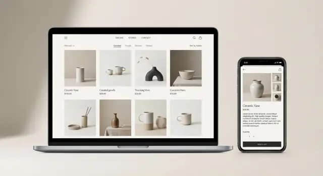
Plan Site Structure and Key Pages
Before you pick colors or write product descriptions, decide what pages your store needs and how people will move between them. A clear structure reduces confusion, makes products easier to find, and sets you up for better conversions later.
Map the core pages (your “shopping path”)
Most product showcase stores rely on a few essential page types:
- Home: highlights best sellers, new arrivals, and key categories.
- Category (Collection) pages: group products in a way shoppers expect.
- Product pages: the decision page—details, photos, price, and “Add to cart.”
- Cart: a quick review and an easy path to checkout.
- Checkout: minimal distractions, maximum clarity.
- About and Contact: proof you’re real and reachable.
If you sell only a handful of items, you can simplify (for example, a single “Shop” page instead of multiple categories). If you sell many items, structure matters even more.
Create a category structure customers understand
Build categories around how customers shop—not how you organize inventory internally. Common approaches include:
- Use cases (Work, Travel, Gym)
- Product types (Shoes, Bags, Accessories)
- Attributes (Men/Women, Materials, Sizes)
Keep category names plain and predictable. If someone can’t guess what’s inside a category from the label, rename it.
Decide navigation: menu, filters, search, breadcrumbs
Aim for “I can find it in two or three clicks.” Plan:
- A top menu with your main categories
- On-category filters (size, color, price, availability)
- Search if your catalog is more than a small set of products
- Breadcrumbs on product pages so shoppers can jump back to the right category
Add supporting pages that prevent hesitation
Include pages that answer questions before they become objections:
- FAQs
- Shipping & Returns
- Size guide (or fit guide)
Sketch simple wireframes for each page type
You don’t need design software—just boxes on paper. For each page type, sketch the key blocks (headline, category grid, product gallery, specs, reviews, shipping notes). This makes the build faster and helps you spot missing information early.
Design a Clear, Trustworthy Look
A product showcase site should feel calm, consistent, and predictable. When the design is clear, visitors spend less time figuring out the interface and more time evaluating your products.
Start with a clean, flexible theme
Choose a theme/template that’s built for selling: it should support product grids, categories, and filtering (by size, color, price, etc.) without looking crowded. Aim for layouts with generous whitespace and simple navigation—your products should be the loudest thing on the page.
Lock in brand basics (and stick to them)
Define a small set of brand rules before you design more pages:
- Logo usage (full logo vs. icon, where it appears)
- A limited color palette (one primary, one accent, neutrals)
- Typography (1–2 fonts max) and consistent text sizes
- Button styles (primary vs. secondary) used the same way everywhere
Consistency is what makes a store feel “real.” If every page looks slightly different, people hesitate.
Build visual hierarchy with spacing
Use spacing to guide attention: big product images first, then price, then key options (size/color), then the “Add to cart” button. Keep each section visually distinct with padding and clear headings, so users can scan without getting lost.
Design for trust, not decoration
Make trust elements visible (not buried): a clear header with contact info, a footer with shipping/returns links, and a dedicated area for reviews on product pages. Small details—like showing accepted payment methods near checkout—reduce doubt.
Don’t forget accessibility
Use readable color contrast, descriptive alt text for product images, and ensure the site works with a keyboard (tabbing through menus, filters, and forms). Accessibility improves usability for everyone and helps prevent friction at the moment of purchase.
Prepare Product Photos and Visual Assets
Your visuals do most of the selling work in a product showcase. Before you shoot anything, set simple photo standards so every item looks like it belongs in the same store.
Create photo standards (so your catalog feels consistent)
Decide and document:
- Background: pure white, light gray, or a real setting—pick one default.
- Angles: a repeatable “set” (front, 45°, side, back, top/bottom if needed).
- Lighting: soft, even light; avoid harsh shadows and mixed color temperatures.
- Size & crop: same aspect ratio (often 1:1 or 4:5) and similar product scale in frame.
This consistency makes category pages and product grids look clean, which helps shoppers compare items faster.
Shoot the essentials for each product
At minimum, capture:
- Hero image: the clearest, most “clickable” view for listings.
- Multiple angles: reduce uncertainty about shape and details.
- Close-ups: texture, materials, stitching, ports, labels—anything people ask about.
- In-use shots: show scale and context (on a person, in a room, next to common objects).
If a product’s value is hard to understand from stills (fit, movement, sparkle, mechanism), add a short video (5–15 seconds) or a 360 view—but only when it truly clarifies the decision.
Optimize assets for speed without sacrificing clarity
Large images slow down pages and hurt conversions. Export web-ready versions:
- Compress images and keep dimensions appropriate for your layout.
- Use modern formats like WebP (and AVIF where supported), with sensible fallbacks.
- Name files descriptively (e.g., “linen-shirt-blue-front.webp”) and add helpful alt text.
When every product follows the same visual rules, your product pages feel more trustworthy—and easier to shop.
Write Product Copy That Helps People Decide
Go from showcase to store
Start with a showcase and expand into a full store when your structure is proven.
Good product copy doesn’t “sell” with hype—it answers the questions a shopper is already asking, in the order they’re asking them. Your goal is to reduce hesitation: What is it? Is it right for me? What do I get? What will it cost? What happens if something goes wrong?
Start with a title people actually use
Write product titles that match how people search and speak. Keep them specific and scannable: include the product type plus the key differentiator (material, size, model, or use case). Avoid internal SKUs or clever names that don’t explain anything.
Example: “Stainless Steel Insulated Water Bottle (750ml)” is clearer than “HydraPro X7.”
Use a simple, decision-friendly structure
A reliable structure keeps the page readable and helps shoppers find what they need fast:
- Benefits (1–3 lines): the outcome for the customer (comfort, time saved, cleaner look, less mess).
- Key features: what makes it work (not a long list—only what matters).
- Specs: measurable details (dimensions, capacity, materials, weight, compatibility).
- What’s included: what arrives in the box (and what doesn’t).
Write like a helpful store associate. Prefer concrete claims over vague ones (“fits 13–14 inch laptops” beats “fits most laptops”).
Explain options clearly
If you offer sizes, colors, materials, or compatibility, spell it out with plain language and zero guessing. If one option changes fit, use, or care, say so. If something is only compatible with certain models, list them.
Pricing, discounts, and availability
Show the full price clearly. If there’s a discount, explain it simply (what’s reduced, for how long if relevant). Add straightforward availability messaging like “In stock,” “Pre-order (ships on Feb 10),” or “Backordered (2–3 weeks).” Avoid urgency unless it’s true.
Add trust details (only if true)
Include warranty terms, care instructions, and any relevant certifications—but only when accurate and verifiable. If a material needs special handling, say it upfront. These details reduce returns and increase confidence.
Build High-Converting Product Pages
A good product page doesn’t just look nice—it answers questions quickly and makes the next step obvious. Your goal is to remove hesitation: show what the product is, what it costs, how it fits the buyer’s needs, and what happens after they click.
Make options and availability crystal clear
If your product has variants (size, color, material), use a clean selector that’s hard to miss and easy to change.
- Show which options are in stock vs. unavailable (and disable unavailable choices)
- Update the price, images, and delivery estimate when a variant changes
- If stock is low, say so in a calm, helpful way (e.g., “Only 3 left”)
Use strong, specific calls to action
Place your primary CTA near the price and variants, and keep it consistent.
“Add to cart” is usually best. “Buy now” can work for fast purchases. If your products require customization, B2B approval, or large orders, consider “Request a quote” alongside a secondary “Contact us” link (e.g., /contact).
Help people find the right product faster
Even the best product pages won’t convert if shoppers can’t compare options. Add site-wide product search plus category filters and sorting:
- Filters: size, color, category, use case, price range
- Sorting: price, popularity, newest
Increase order value with relevant cross-sells
Use “Related items,” bundles, or “Frequently bought together” sections—only when they truly match the product. Keep it tight (3–6 items) and prioritize compatibility over volume.
Add reviews thoughtfully (and moderate)
Reviews reduce uncertainty, but only if they’re trustworthy. Verify purchases when possible, display an overall rating plus a few recent reviews, and moderate submissions to remove spam and abusive content—without hiding genuine criticism. A short “How we handle reviews” note builds credibility.
Set Up Checkout, Payments, Shipping, and Tax
Prototype your catalog layout
Generate your categories and product pages, then adjust layout and copy in minutes.
Checkout is where “browsing” turns into revenue—so aim for clarity, speed, and reassurance. Most store platforms guide you through the basics, but the details (payments, shipping rules, and taxes) determine how smooth the buying experience feels.
Payments: offer what customers already use
Start with the payment methods people expect in your region. At minimum, enable a major card option and a popular wallet method (for example, Apple Pay/Google Pay where available). If your audience frequently uses bank transfer, local wallets, or cash-on-delivery, include them—just be explicit about processing time and any extra steps.
Also verify:
- Your store currency and payout currency match your business setup
- Test payments in “sandbox/test mode” before going live
- Your statement descriptor (what appears on card bills) is recognizable
Shipping: set rules customers can understand
Shipping is less about math and more about expectations. Configure shipping rules with simple choices and plain language:
- Zones (where you ship)
- Rates (free, flat, or calculated)
- Delivery times (be realistic)
- Tracking (who provides it and how customers receive updates)
If you offer free shipping, say what qualifies (minimum order value, specific products, or certain locations). If shipping is calculated at checkout, warn shoppers early so it doesn’t feel like a surprise.
Taxes: configure once, review often
Configure taxes correctly for where you operate (and where you’re required to collect). Many platforms can auto-calculate, but you still need to confirm your business address, nexus/registration settings, and whether product prices include or exclude tax. When in doubt, get advice from an accountant—tax mistakes scale quickly.
Reduce friction and increase confidence
Keep checkout moving:
- Offer guest checkout (account creation can be optional)
- Use minimal fields and smart defaults (auto-fill address where possible)
- Show clear, specific error messages (not just “invalid”)
Add reassurance right where doubts appear:
- A visible link to returns/exchanges
- A short secure-payment note near the payment step
- Support contact (email/chat) in the checkout footer
Finally, place a few test orders end-to-end to confirm confirmations, tracking emails, and tax/shipping totals are correct.
Add Trust Signals and Store Policies
People don’t just buy products—they buy confidence. Clear policies and visible business details reduce hesitation at the exact moment someone is deciding whether to check out.
Publish the policy pages (and make them easy to find)
Create dedicated pages for the essentials: Shipping, Returns/Refunds, Privacy, and Terms (if needed for your business). Link them in the footer and from checkout, where questions about delivery time, costs, and refunds are most common.
Keep the language plain and specific:
- Shipping: processing time, carriers, estimated delivery windows, tracking, international rules
- Returns: eligibility, time window, condition requirements, who pays return shipping, how refunds are issued
- Privacy: what data you collect, why, how it’s stored, and how customers can request deletion
Show you’re a real business
Add business details anywhere customers might look for reassurance: footer, /contact, and order emails. Include support email, support hours, and an address if it applies (or at least your business name and location/region). If you have social profiles, link them from the footer.
Cover security basics (quietly, but clearly)
Ensure your store runs on SSL (HTTPS)—not just on checkout, but site-wide. Use strong admin passwords, enable 2FA if available, and assign staff roles so not everyone has full access.
If you allow accounts or have forms (contact, newsletter), add spam protection (CAPTCHA or built-in anti-bot tools) to prevent fake signups and support spam.
Prepare customer emails that build trust
Set up clear, branded emails for: order confirmation, shipping update with tracking, and refund/return updates. Repeat key info (items, totals, shipping address, support contact) so customers never feel lost.
Optimize for SEO and Discoverability
SEO for an e-commerce website starts with making it easy for search engines (and people) to understand what you sell and how your store is organized. You don’t need to “hack” anything—just be clear, consistent, and helpful.
Set the basics: URLs, titles, headings
Use readable URLs that match real categories and products (e.g., /candles/soy-vanilla-jar instead of /p?id=123). Keep them stable so links don’t break.
For each page, write a specific page title and meta description that matches what the shopper expects to find. Use one clear H1 per page (usually the product or category name), then H2s for sections like “Details,” “Sizing,” or “Shipping.”
Write unique category copy (avoid duplicates)
Category pages can rank well, but only if they offer something beyond a grid of products. Add a short intro that explains:
- Who the products are for
- Key differences (materials, sizes, price range)
- How to choose
Avoid pasting manufacturer text across multiple pages. Duplicate copy makes it harder for search engines to decide which page deserves to rank.
Add structured data where possible
If your website builder or platform supports it, enable structured data (schema) for products and reviews. This helps search engines understand important details like price, availability, and ratings, and can improve how your listings appear.
Strengthen internal linking
Internal links guide visitors and spread relevance across your store navigation. Link:
- Categories → subcategories → product pages
- “Related products” and “Pairs well with” sections
- Blog articles → relevant category/product pages (and back)
Plan content that attracts new shoppers
Create helpful content that matches real questions, then link to products naturally. Good starting points include buying guides, comparisons, care instructions, and gift idea roundups. Publish these in your store’s blog at /blog and reuse the same themes in category copy and FAQs.
Ensure Mobile Experience and Fast Performance
Get rewarded for referrals
Earn credits by sharing Koder.ai or referring teammates and clients to try it.
A product showcase site can look beautiful and still lose sales if it feels slow or awkward on a phone. Mobile shoppers are often comparing options quickly, so your pages need to load fast, read easily, and make it effortless to take the next step.
Improve performance (without sacrificing design)
Start with the biggest performance win: images. Product photography is usually the heaviest part of an e-commerce website.
- Export images at the right dimensions (don’t upload 5000px files if your gallery displays at 1200px).
- Use modern formats when possible (WebP/AVIF) and compress JPEG/PNG sensibly.
- Limit autoplay video and heavy animations on product pages.
Next, keep your tech stack lean. Every extra app/plugin, tracking script, and font can add seconds.
- Remove apps you aren’t using and replace “nice-to-have” widgets with built-in features.
- Reduce custom fonts (one family with a couple weights is usually enough).
- Turn on caching/CDN options your platform provides (often a simple setting in your website builder or hosting).
Make it mobile-first
Design for thumbs and small screens first, then scale up.
Make sure key actions are easy to tap and never cramped:
- Large, clear buttons (“Add to cart”, “Buy now”) with comfortable spacing
- Readable text (avoid tiny font sizes and low-contrast colors)
- Sticky add-to-cart or quick “Buy” sections for long product pages (if your theme supports it)
Also check navigation: your menu, filters, and search should be usable with one hand. If your store navigation requires too many taps, shoppers will bounce.
Test critical flows before launch
Performance isn’t only speed—it’s whether the buying path works every time.
Test these end-to-end on mobile and desktop:
- Search → product page → add-to-cart
- Checkout → payment → confirmation page
- Confirmation emails (order confirmation, shipping updates)
Compatibility and monitoring
Preview on iOS/Android and at least two browsers (Chrome + Safari is a solid baseline). Fix layout issues like overlapping buttons, broken galleries, or sticky elements that block content.
If your platform supports it, enable uptime monitoring and basic error tracking so you’re alerted quickly when checkout errors or outages happen.
Launch, Track Results, and Keep Improving
Launching your product showcase site isn’t the finish line—it’s the start of learning what real shoppers do. A smooth launch plus a simple measurement plan will help you improve conversion without guessing.
Install analytics that answer “what’s working?”
Set up analytics before you announce your store. At minimum, you want visibility into traffic sources (search, social, email), product views, add-to-cart actions, and purchases. If you’re using GA4 (or similar), enable e-commerce reporting so you can see performance by product and category, not just pageviews.
Track key events (and define success)
Beyond purchases, track intent signals so you can fix drop-offs early. Useful events/goals include newsletter signup, “checkout start,” payment step reached, and completed order. These help you spot whether the issue is product pages, cart friction, or checkout confusion.
Run a practical launch checklist
Before you go live, do a quick sweep:
- Check for broken links and missing images (especially on top product pages)
- Confirm redirects if you changed URLs during build
- Verify stock settings (sold-out behavior, backorders, low-stock alerts)
- Test tax and shipping rules with a few sample addresses
- Place a real test order end-to-end and confirm emails/receipts
If you’re iterating quickly (especially on a custom build), consider using tooling that supports safe changes—like snapshots and rollback—so you can ship improvements without fear. Platforms such as Koder.ai include that style of workflow, which is helpful when you’re refining product pages, navigation, and checkout steps based on early data.
Have a simple post-launch plan
In the first two weeks, focus on momentum: add an email capture offer, run a small promotion on a best-seller, and set up basic retargeting for visitors who viewed products but didn’t buy.
Review weekly and iterate
Schedule a 30-minute weekly review. Prioritize pages with high views but low sales: tighten product copy, improve images, adjust pricing clarity, and test the call-to-action. Small, consistent changes compound quickly.