Mar 29, 2025·8 min
How to Create a Website for an Educational Bootcamp Challenge
Learn how to plan, design, and launch a website for an educational challenge or bootcamp, from landing page and signup to content delivery and analytics.
Learn how to plan, design, and launch a website for an educational challenge or bootcamp, from landing page and signup to content delivery and analytics.
Before you write a single line of copy for your bootcamp website, get specific about what you’re actually selling (or giving away). Clarity prevents a common problem: building a beautiful course landing page that attracts the wrong people—or confuses the right ones.
Start with one primary conversion goal. Pick the one that matters most right now:
This choice affects everything: your hero headline, calls-to-action, and even which pages you need.
Write down the format in plain language so a newcomer can understand it instantly:
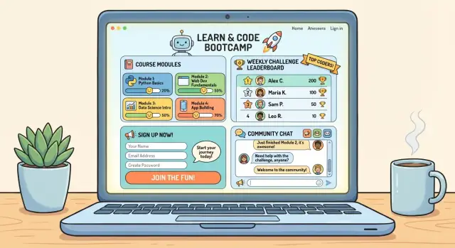
If you plan features like a challenge leaderboard or a learning community, decide whether they’re core to the experience or simply a bonus. Your website should reflect that priority.
Avoid vague outcomes like “learn the fundamentals.” Instead, define 2–4 measurable results:
These outcomes become the backbone of your curriculum page design later.
Capture your reality upfront: launch date, budget, who owns what (content, design, support), and tools you already use (email platform, payment processor, community). Constraints aren’t limitations—they’re guardrails that keep you shipping.
If you want to move faster without assembling a full dev pipeline, you can prototype (or even launch) parts of the experience using a vibe-coding platform like Koder.ai—for example, spinning up a React-based landing page, a simple learner dashboard, or a lightweight leaderboard with a Go + PostgreSQL backend. The key is still the same: build only what supports your primary conversion goal.
A bootcamp website converts when it sounds like it was written for one specific person—then scales that clarity to everyone else. Before you touch your course landing page layout, get precise about who you’re helping and what outcome they’re buying.
Keep personas practical and action-oriented. For example:
For each persona, write:
List the top problems they want solved—and the phrases they actually use in DMs, surveys, and calls. Turn those into your headlines and page sections:
This language should show up in your bootcamp website hero section, FAQ, and curriculum page design so visitors instantly feel understood.
Clarity reduces refunds and churn. State prerequisites plainly (“Basic HTML is required” or “No experience needed”), and add a short “Not a fit if…” block. It builds trust and filters out misaligned applicants for your online cohort signup.
Before you chase new testimonials, collect what’s available: student work samples, screenshots of results, brief quotes, or before/after stories. Even a small set of credible proof inputs can improve conversion on your educational challenge website.
Before you write copy or pick a template, decide what pages you actually need. A small, focused site is easier to maintain and often converts better because visitors aren’t forced to hunt for the next step.
At minimum, plan for these pages:
Most visitors should move through a straightforward flow:
Make that path visible in your navigation and buttons. Everything else should support it.
Add extra pages only when they reduce risk or increase trust, for example:
If you’re unsure, start with the essentials and link to policies from the footer. You can expand later without rebuilding the whole bootcamp website.
A bootcamp website doesn’t need lots of pages to convert—your landing page just needs to answer the main questions quickly: What will I achieve, by when, and what do I do next? Aim for clarity over cleverness.
Write your hero headline as Outcome + time frame. This helps the right people self-select and reduces “curious clicks” that don’t convert.
Examples:
Right under the headline, add a short subheadline that defines who it’s for and what format it is (live cohort, async lessons, daily prompts, etc.). Then place a clear primary CTA button (e.g., Apply, Join the next cohort, Get on the waitlist).
People should understand the flow in 10 seconds. A clean 3–5 step block often outperforms long explanations:
Keep it concrete. If you have a challenge leaderboard or learning community, name it here so it feels tangible (for example, “Track progress on the leaderboard” or “Get support in the community”).
Trust elements should reduce doubt, not distract:
Repeat the same primary CTA at the top, mid-page, and bottom—especially after key sections like curriculum highlights or testimonials. Keep the button label consistent so the user never wonders what happens next.
Hidden details cause hesitation and drop-offs. Include:
If you need multiple options, present them as a simple choice (e.g., Standard vs. Plus) and link to a fuller /pricing page—while still showing the main numbers on the landing page.
A clear curriculum page reduces anxiety and increases signups because learners can quickly answer: “What will I do, and can I keep up?” Aim for a scan-friendly layout that works on mobile—short blocks, consistent labels, and a predictable rhythm.
Use a simple timeline format: Week 1, Week 2… (or Day 1–14). For each step, include three elements: topic, assignment, and checkpoint. Checkpoints can be a mini-quiz, a submission, or a live session milestone.
Also include the estimated time commitment next to each week/day (for example, “3–5 hours”). If effort varies, be honest—people prefer clarity over surprises.
Spell out what learners will produce:
If you review work, say how (peer feedback, mentor comments, rubric-based scoring) and when (within 48 hours, weekly, etc.).
Add a sample lesson, a short preview video, or a “Day 1 walkthrough” so learners can see the teaching style and difficulty level. This is especially helpful for first-time cohort students.
Include a small callout like “New to this topic?” with prerequisites, setup steps, and an optional prep track (e.g., “Start here: 60-minute fundamentals”). If you have a dedicated page, link it as /start-here so beginners know exactly what to do first.
Your signup system is where interest turns into committed participants. The goal is simple: make the next step obvious, low-friction, and aligned with how selective your bootcamp challenge needs to be.
Choose one primary path and make it consistent across your site:
If you offer multiple options (for example, “Apply” and “Buy now”), label them clearly and explain who each path is for.
Every extra field lowers completion rates. Start with the minimum—name and email—then add only what you actively use to make decisions or personalize onboarding.
For applications, keep it focused: a few short questions beat a long questionnaire. If you need more detail later, collect it after acceptance.
Don’t stop at “Thanks!” Use the thank-you page to prevent drop-off:
If you run live sessions, add calendar links (Google/Apple/Outlook) so participants lock dates in immediately.
When spots fill up, switch the main CTA to Join the waitlist instead of forcing people to hunt for options. Tell them what happens next: how you’ll notify them, whether you add seats, and whether waitlisters get early access or a deadline when invited.
If you want, route waitlist signups to a separate page like /waitlist so messaging stays clean and specific.
Pricing is where interest turns into commitment—or hesitation. Your goal isn’t to “sell harder,” it’s to remove uncertainty: what it costs, what they get, and what happens if life gets in the way.
Choose one option and make it obvious at a glance:
If you offer discounts (early bird, student pricing, team pricing), keep them time-bound and easy to understand—no complicated math.
A pricing section should read like a checklist of outcomes and access. Include specifics such as:
Avoid vague promises like “guaranteed results.” State only what you can reliably deliver—support, structure, and clear expectations.
Put your key terms in plain language near the purchase button, then link to the full version.
Cover:
A good rule: if a learner can ask “what if I can’t attend?”, your page should answer it.
If you have a dedicated pricing page, link to it (for example: /pricing) and summarize the essentials on the bootcamp page.
Keep a short pricing FAQ directly under the checkout area, like:
This small block often removes the final friction that stops someone from enrolling.
A bootcamp challenge succeeds when learners always know three things: what to do today, where to find it, and how to get help. Your website should make that path obvious—even for someone joining late or checking in on mobile.
Keep the content location consistent. You can host lessons as:
If you use external tools, link to them from one central place so learners don’t hunt through email threads.
Create a “home base” page that’s available right after signup. It should include:
This page becomes the tab learners keep open all week.
If you don’t want to custom-build everything at once, a platform like Koder.ai can help you generate a dashboard workflow quickly, then iterate with features like planning mode, deployments/hosting, and snapshots + rollback as you learn what learners actually use.
For daily challenges, define a repeatable structure: Task → Submission → Feedback/points. Submissions can be a form, a file upload, or a link to work (e.g., a doc or screenshot). If you add a leaderboard, keep rules simple and fair: what earns points, what counts as “on time,” and how ties are handled.
If you use Slack/Discord/forum, place the join link, channel map, and basic etiquette rules on the dashboard. Include what’s encouraged (sharing work, asking questions) and what isn’t (spam, selling, harsh critique).
Spell out how help works: office hours schedule, expected email response time, and who moderates the community. A small “How to get help” box on the dashboard prevents frustration and drop-off.
A bootcamp site should feel effortless: people scan quickly, decide quickly, and often do it on a phone. Your design job is to remove friction so the program details and the “Apply” or “Join” action are always obvious.
Start by designing the page on a narrow screen, then scale up. Keep primary buttons large, high-contrast, and consistently placed (top hero, mid-page, and near the bottom). Forms should be short, with big tap targets, clear error messages, and autofill-friendly fields. If you have a long application, consider splitting it into steps so it’s manageable on mobile.
Readable typography and spacing matter more than decorative flourishes. Use a comfortable font size, strong color contrast, and clear headings to break up content. Avoid vague links like “Click here”—use descriptive link text such as “Download the syllabus” or “See the schedule.” If you use icons, pair them with text so meaning isn’t lost.
Give each page a clear title and use headings in a logical order (one H1, then H2s, etc.). Prefer descriptive URLs like /bootcamp/java-weekly-challenge instead of /page1. These small choices improve search visibility and make links easier to share.
Set social preview text and sharing images for your program page so it displays clearly in chats and on social platforms (title, short description, and a branded image). This increases trust and click-throughs when alumni and partners share your link.
Pick a simple set of brand colors, one or two icon styles, and consistent section spacing. Repeating patterns (headline, short paragraph, proof, CTA) makes your page easier to skim—and makes your bootcamp feel organized before it even starts.
You don’t need a complicated setup to learn what’s working. A small set of clear metrics will tell you whether your bootcamp website is attracting the right people—and where they drop off.
Start by tracking a handful of actions tied directly to enrollment. Set up analytics events for:
Name events consistently (for example: cta_click_apply, form_submit_waitlist) so reports stay readable.
Whenever you share your course landing page via ads, partners, affiliates, or email newsletters, add UTM parameters. This helps you answer questions like: “Do partner referrals convert better than Instagram ads?”
Keep a simple convention, such as:
utm_source = platform or partner nameutm_medium = ad, email, referralutm_campaign = bootcamp-spring-2026If you link internally from emails to pages like /pricing or /apply, UTMs can still be useful—just be consistent.
Traffic alone is a vanity number. Instead, monitor the path:
landing → signup/application → onboarding started → completion
This shows whether your issue is messaging (low signups), friction (form drop-offs), or delivery (low completion). If you have a challenge leaderboard or community space, track “first meaningful action” too (e.g., first check-in submitted).
During enrollment, set a weekly review cadence. A basic dashboard can include:
Use it to make small, targeted changes—like rewriting a CTA, shortening a form, or clarifying the schedule.
Avoid grabbing extra personal data “just in case.” Track behavior at a high level, keep retention settings reasonable, and be clear about what you measure. Your goal is better decisions, not maximum surveillance.
Automation isn’t about sounding robotic—it’s about making sure every learner gets the right info at the right time, even when you’re busy teaching.
Create a small set of plain-language emails you can reuse each cohort:
Always link to the pages learners will actually use: /dashboard, /schedule, /community, and /support. Fewer links, clearer action.
At minimum, automate three paths:
If you have payments, add a receipt email and a “payment failed” recovery sequence that points to /pricing or the billing page.
Prepare reusable templates for:
Send one pre-launch checklist email 3–5 days before start. Then send a final “doors closing” email 24 hours before enrollment ends, linking to the /apply or /signup page and restating the deadline plainly.
A bootcamp website can look “done” and still fail on launch day because one small step breaks (a payment error, a missing confirmation email, a bad mobile layout). Treat launch like an event: rehearse it, then run it.
Run a complete test flow across devices and browsers:
Pick a mix of “ideal students” and a few newcomers. Ask them to:
Collect feedback with a short survey (5 questions max): What confused you? What nearly stopped you? What’s missing? What convinced you?
Prioritize issues that block conversion: unclear pricing, broken emails, long forms, or missing policies. Once fixed, freeze changes 24–48 hours before launch day to avoid last-minute bugs.
If you’re building custom flows (checkout, dashboards, or a challenge leaderboard), make sure you can roll back safely. Tools that support snapshots and rollback—like Koder.ai—can reduce launch risk when you’re iterating quickly.
Create a simple timeline with channels, content, and owners (who posts what, where, and when). Include a “day-of” checklist and a backup contact method.
Review metrics daily for the first week: landing-page conversion rate, form drop-offs, checkout completion, and email open/click rates. Make small, focused edits to headlines and CTAs—then re-check results.
Pick one primary conversion goal and build everything around it:
If you try to optimize for all three at once, your headlines and CTAs will compete and conversions usually drop.
Use plain language that answers three questions immediately:
If you include community or a leaderboard, say whether it’s core to the experience or a bonus.
Replace vague outcomes with 2–4 measurable deliverables, like:
A good outcome is something learners can build, write, present, or ship by a specific day.
A small site usually converts better and is easier to maintain. Start with:
Use an Outcome + time frame headline, then add who it’s for and the format.
Examples:
Put one clear CTA under it (Apply/Join/Waitlist) and keep that CTA consistent throughout the page.
Aim for a scan-friendly flow that answers “What happens next?” in seconds:
Keep it concrete, and mention where learners will do the work (dashboard, community, submission form).
Use a timeline layout (week-by-week or day-by-day). For each step include:
Add estimated time per week/day, and clearly state how feedback works (who gives it, format, turnaround).
Choose one primary registration path and stick to it:
Keep forms short (collect only what you’ll use) and use a thank-you page to set expectations and point to the next step (e.g., /dashboard or /schedule).
Place key details near the decision point (and link to full policies from the footer):
If a learner can ask “What if I can’t attend?”, your page should answer it before they buy.
Track the few actions that map to enrollment and completion:
Use UTMs for every campaign and review metrics weekly so you can make small fixes (shorter forms, clearer dates, better CTAs) based on data.
Add optional pages (case studies, detailed policies) only if they reduce risk or boost trust.