Sep 29, 2025·8 min
How to Create an Artist Website That Monetizes Your Work
Learn how to create an artist website that sells originals, prints, and digital downloads, books commissions, and grows your audience with email and memberships.
Learn how to create an artist website that sells originals, prints, and digital downloads, books commissions, and grows your audience with email and memberships.
Before you pick a template or upload a single image, decide what the website is for. “Monetize” can mean a lot of things, and your choices here will shape everything from your homepage copy to your navigation.
Start by selecting a main goal for the next 90 days:
You can do multiple revenue streams, but give one priority so the site doesn’t feel like a menu of unrelated options.
Choose the group you most want to attract:
If you try to speak to everyone, your website will feel vague. A single audience makes the design and messaging easier—and typically increases conversions.
Write down the three actions you want visitors to take, in order. Common examples:
Pick one measurable target for your first 90 days—something you can actually track, like 5 sales, 15 commission inquiries, or 100 email signups. A clear metric keeps you focused on what’s working, not what’s merely “pretty.”
Your first choice isn’t “which template looks best,” it’s what kind of home you want online—and how much control you want over it.
A hosted profile page (on marketplaces, social platforms, or portfolio networks) is quick to set up, but you’re building on rented space—URLs can change, features can disappear, and your audience is one algorithm update away.
A custom domain (like yourname.com) makes you easier to remember, improves credibility when someone Googles you, and lets you move platforms later without losing your identity. Even if you start small, buy the domain early and point it to wherever your site lives.
Pick based on your main monetization path:
If you do all of these, start with the one that makes you money most reliably today, then expand.
A site you can’t update becomes a static brochure. Choose a system where you can add new work, products, and posts in minutes—on your own—without calling a developer.
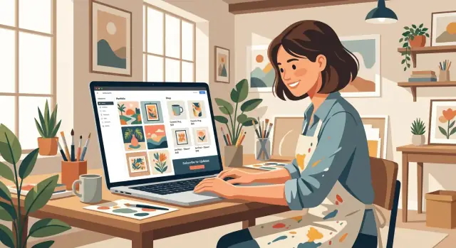
If you want more flexibility than a template—but don’t want to assemble a custom stack from scratch—vibe-coding platforms like Koder.ai can be a practical middle ground. You describe what you need (portfolio pages, a shop, commission request forms, email capture, members-only content), and the platform helps generate a working web app you can iterate on through chat.
Koder.ai also supports source code export, deployment/hosting, custom domains, and snapshots/rollback—useful if you want to experiment with new layouts or checkout flows without risking a broken site.
Make sure your option supports:
Expect $10–$20/year for a domain, then:
Start at the level you’ll actually maintain, then upgrade when sales justify it.
Before you touch templates or colors, plan the “map” of your artist website. A clean structure makes it easier for visitors to find your work, trust you, and buy—without getting lost or needing to understand art jargon.
Pick a domain name that matches your artist name or studio name as closely as possible. Ideally it’s short, spellable out loud, and consistent with your social handles.
If your exact name is taken, add a simple modifier (like “studio,” “art,” or your medium) rather than extra dashes or odd spellings. Your domain becomes your permanent home base for your portfolio, shop, and email newsletter.
For most artists, a five-page foundation is enough:
Keep these labels plain and familiar. “Portfolio” beats “Gallery,” and “Shop” beats “Collect,” unless your audience already uses that language.
If you offer services, create dedicated pages instead of burying details in your About page. Consider:
These pages reduce back-and-forth and attract better-fit inquiries.
Your menu should answer three questions fast: What do you make? Can I buy it? How do I reach you? Keep top navigation to 5–7 items, and use a footer for the rest (shipping, returns, FAQs, privacy).
Even if you don’t publish them today, leave room for pages like Collections/Series, Press, or Testimonials. A little planning now saves a full redesign later.
Your portfolio isn’t a scrapbook—it’s a guided viewing experience that helps the right people quickly understand what you make, what it costs, and what to do next.
Start with a clean, gallery-forward template that gives your images room to breathe and keeps text readable. Avoid layouts with busy backgrounds, tiny captions, or multiple competing sidebars. If visitors have to “hunt” for the art, they’ll bounce.
Consistency makes your work look more premium. Pick one or two fonts (a clear body font plus an optional accent font) and a limited color palette that fits your style.
Keep type sizes comfortable—especially for descriptions, dimensions, shipping notes, and pricing details. Your art should be the loudest element on the page, not the design.
Test your site on a phone before you finalize anything. Make sure:
Accessibility is good design. Add descriptive alt text to key images (especially in your creator portfolio and shop), maintain strong color contrast, and use readable font sizes. If you use image-only buttons, add labels so people know what they do.
Each page should have a primary call-to-action: buy a piece, request a commission, join your list, or view a collection. A focused page converts better than a page that tries to do everything at once.
A shop turns “Nice work” into “I want to buy it.” The key is to decide what you’re actually selling, then make the buying experience feel obvious and low-stress.
Start with a small set of offers you can fulfill consistently. Many artists do best with one primary product type and one “entry-level” option.
For example:
If you offer everything at once, visitors can get overwhelmed. You can always expand once orders and fulfillment feel stable.
Every product page should remove doubt. Include:
For digital downloads, be explicit about access:
Organize your shop so a new visitor can find what they want in seconds. Common collections include:
Don’t over-categorize. Two to six collections is usually plenty.
Limited editions can work well, but only when it’s true. If it’s a “limited” print, state the edition size and whether it will ever be reprinted. If it’s not limited, don’t imply urgency—trust is worth more than a quick conversion.
Short, clear policies reduce support emails and increase buyer confidence. Create dedicated pages for:
Link to these pages from product pages and the checkout area, so buyers don’t have to hunt for them.
A commissions page should do two jobs at once: inspire people with your work, and make it easy for the right clients to request the right thing. When your offer is clear, you spend less time messaging back and forth and more time creating.
Lead with 6–12 examples that match what you want to be hired for (not everything you’ve ever made). Label them by type—portrait, full-body, cover art, pet illustration—and add a simple price range for each.
Include a timeline that’s easy to understand, such as “Sketch: 2–3 days, Final: 1–2 weeks,” and note what affects delivery (complexity, queue size, print shipping). A small “Current status: Open/Waitlist/Closed” badge saves you a lot of awkward inquiries.
Spell out what you will and won’t do: subjects, style limits, and how many revisions are included. Also clarify usage rights in plain language—personal use vs. commercial use, whether the client can print it, and whether you can share it in your portfolio.
If you price artwork differently for commercial use, say so directly and link to a short policy page like /commissions/terms.
Packages help clients self-select:
Then offer add-ons with clear rules: rush fee (and what “rush” means), extra characters, complex background, and a commercial license. If an add-on changes your timeline, say it.
Your form should collect exactly what you need to price accurately:
End with what happens next: “You’ll get a quote within 2 business days. If accepted, I’ll send an invoice and start after the deposit.” Clear steps build confidence and reduce follow-up emails.
Memberships are one of the cleanest ways to stabilize your income: instead of relying on sporadic shop launches or commission waves, you build a predictable monthly base. The key is to keep it simple and sustainable—your members want consistency more than constant surprises.
Pick a membership angle that fits your natural workflow. Good options include behind-the-scenes studio updates, early access to new work, mini tutorials, process videos, or members-only drops. If you already create content while you work, a membership can turn that “already happening” material into recurring revenue.
Strong tiers differ by value, not by “more posts.” For example:
This keeps each tier easy to explain on your pricing page and helps people choose based on what they actually want.
Decide on a fulfillment rhythm you can maintain even when you’re traveling, shipping orders, or in a creative slump. Monthly is often the sweet spot for artists. If you do weekly, make it lightweight (e.g., a short studio note every Friday).
A practical rule: promise less than you can do on your best month, so you don’t burn out on your worst month.
If you offer community perks—comments, DMs, Discord, live calls—set expectations early. Define your response time (e.g., “I reply to member questions on Tuesdays”) and the format (one group Q&A vs. unlimited 1:1). Clear boundaries protect your schedule and prevent the membership from turning into a second full-time job.
If your setup truly allows it, say “Cancel anytime.” It lowers purchase anxiety and builds trust. You can still retain members by making the experience genuinely useful: predictable benefits, a clear archive, and occasional member-only perks like early shop access.
If you’re deciding where to place this, a simple “Membership” item in your main navigation plus a short pitch on your homepage usually works well.
Social platforms are great for discovery, but they can change rules overnight. An email list is different: it’s a direct line to people who asked to hear from you—perfect for launches, limited drops, commissions, and workshops.
Make the “why” for subscribing obvious and aligned with your art. Good options include a set of phone wallpapers from a recent series, a printable mini‑zine, a small digital download, or a one-time discount code for your shop.
Keep it simple: one promise, one delivery. If you offer a discount, be clear about exclusions (originals vs. prints, bundles, etc.) so it doesn’t create support emails.
A single footer form isn’t enough. Place email signups where people already like what they see:
If you can, add a lightweight pop-up only for exit intent or after scrolling—keep it easy to close.
A short automated sequence does the heavy lifting:
This turns casual subscribers into confident buyers—without constant posting.
At signup (or in your first email), let people self-select: buyers/collectors, fans, students. Then send fewer, more targeted emails—like drop announcements to buyers, behind-the-scenes to fans, and tutorials to students.
If you’re working on your pricing strategy, link readers to related posts such as /blog/how-to-price-your-art.
People buy art from people they trust. Your website can earn that trust quickly—without long sales copy—by answering the quiet questions visitors have: “Who are you?”, “Can I rely on you?”, and “What happens after I pay?”
Your About page isn’t a résumé—it’s context. Share your story in a way that supports the work: what you make, what themes you return to, what materials or tools you use, and who your work is for.
Include a clear “what I offer” section (commissions, originals, prints, licensing, workshops), and link to the next step, like /commissions or /shop.
Social proof works best when it’s grounded in reality. Use real quotes from customers or collaborators (first name + role is often enough), and only show client logos with explicit permission.
If you have testimonials, keep them short and concrete:
If you do brand work, murals, workshops, or speaking, create a simple media kit/press page. Include a few selected images, a short bio, past features, and how to inquire. This saves back-and-forth and makes you look organized.
A good contact page prevents frustration on both sides. Mention your time zone, typical response time (e.g., “within 2 business days”), and what info you need for common requests. If you take commissions, link to your form so inquiries start with the details you actually need.
A compact FAQ can remove purchase anxiety and cut repetitive emails. Focus on the questions that block checkout:
These pages don’t just “look professional”—they make buying feel safe.
SEO for an artist website is mostly about clarity: helping real people (and search engines) understand what you make, what it’s called, and how to buy it.
Give every artwork, series, or product its own page with a descriptive page title and headings. “Untitled #3” might be your studio label, but online you can pair it with meaning: “Untitled #3 — Abstract Acrylic Painting in Blue and Ochre.” That simple change helps searches like “blue abstract acrylic painting” match your page.
Add image alt text that describes the piece and medium (and optionally the subject). Think: “Linocut print of wildflowers, black ink on cream paper.” This improves accessibility and can support image search.
Also, keep your images fast: export to modern formats (WebP/JPEG), and don’t upload a 10MB file if a 250KB version looks identical on-screen.
Create collection pages targeting search intent, not just your internal categories. Examples:
A strong collection page includes a short intro, 6–20 pieces, and a clear next step (buy, inquire, join your list).
Set up a blog (or “Updates”) page for launches, behind-the-scenes process posts, exhibitions, and restocks. These posts give you more entry points from search, and they provide shareable links for your newsletter.
Keep URLs clean and consistent, and avoid duplicate pages for the same work. If you move pieces around, update links instead of creating multiple versions. A tidy structure like /prints/botanical/fern-linocut is easier to trust (and to share).
If you want a quick checklist, add one to your launch routine alongside /blog/launch-checklist.
Launching your site isn’t a one-time finish line—it’s the start of a simple feedback loop. The goal is to learn what people actually do on your site (not what you hope they do), then make one or two improvements each month.
Set up an analytics tool and make sure it can answer three questions:
Also track “micro-conversions” like clicking your commission button or adding a product to cart—these often reveal where people hesitate.
Before you announce anything, do a quick pass on:
Create one homepage banner that states what you sell and where to start (e.g., “New print drop” or “Commissions open”). Then schedule:
If you offer multiple packages (commissions, licensing, lessons), link directly to /pricing so visitors can self-select without messaging you first.
UTMs let you label links so analytics shows which channel performed.
https://yoursite.com/shop?utm_source=instagram&utm_medium=social&utm_campaign=print_drop
Once a month, review top pages and your biggest drop-off step (e.g., cart → checkout). Make one change, then measure again—swap button text, simplify options, add a size guide, or move testimonials closer to the buy decision.
If you’re iterating quickly, tools that support safe changes (like snapshots and rollback in Koder.ai) can make optimization less stressful—especially when you’re tweaking high-stakes pages like checkout or commission forms.
Most artist websites don’t fail because the work isn’t good—they fail because the buying process feels uncertain. The fixes below are simple, but they compound fast.
If your prices look like guesses, visitors hesitate or negotiate. Use a clear method and stick to it:
Then explain it briefly on your pricing or FAQ page: “Prices reflect materials, time, and edition size.” That one line reduces awkward back-and-forth.
Hidden shipping costs are a top reason people abandon carts. Show shipping fees early (on product pages and at checkout) and include realistic delivery estimates.
Be specific: “Ships in 3–5 business days. Delivery: 2–7 business days depending on location.” If you ship internationally, say whether duties/taxes may apply.
Every extra step loses sales. Reduce friction by:
If you offer commissions, include a clear “starting at” price, what’s included, revision limits, and timeline. A small “What happens next” section builds confidence.
Limited-time promos can work, but only when they’re rare and easy to understand. If you discount, explain exactly what’s included (sizes, files, licensing, shipping) so buyers aren’t guessing.
Sales follow attention. Create a repeatable content schedule you can maintain: one short post per week (new piece, behind-the-scenes, customer photo, process clip) plus one email. Consistency beats intensity.
If you want a simple structure, link your content to one goal each month (prints, commissions, or downloads) and point everything back to your shop or inquiry page.
Start by choosing one primary monetization goal for the next 90 days (portfolio, shop, commissions, memberships, or a simple all-in-one). Then define:
This keeps your homepage copy, navigation, and calls-to-action focused.
Not at first. Multiple revenue streams are fine, but prioritize one so the site doesn’t feel like unrelated options.
A practical approach:
A custom domain (like yourname.com) is a long-term asset: it’s easier to remember, improves credibility, and lets you change platforms later without losing your identity.
Even if you start on a hosted page, you can buy the domain early and point it to wherever your site lives.
Match the platform to what you sell most:
Also choose something you can update quickly—an unmaintained site turns into a dead brochure.
For most artists, a simple five-page foundation works:
Use plain labels and keep the menu to 5–7 items. Your navigation should answer quickly:
Put secondary items in the footer (shipping, returns, download terms, privacy, FAQs). This helps non-artists buy without getting lost.
A strong portfolio is a guided viewing experience:
Each page should have and one clear next step.
Make product pages remove doubt fast:
For digital downloads, clearly explain when the link arrives, download limits, and what happens if the buyer loses the file.
Treat your commissions page like a filter and a sales page:
Track what people do, then improve one thing monthly.
Set up analytics so you can see:
Use UTM links for launches (e.g., ?utm_source=instagram&utm_medium=social&utm_campaign=print_drop) and monitor drop-offs like cart → checkout to spot friction.
Add income-specific pages (like /commissions, /licensing, /workshops) when you’re actively selling those offers.
/commissions/termsEnd with “what happens next” (response time, deposit/invoice, when work starts).