Mar 11, 2025·8 min
How to Create a High-Converting B2B Tool Website (Examples)
Step-by-step guide to planning, designing, and launching a B2B tool website, with industry examples, must-have pages, and copy tips.
Step-by-step guide to planning, designing, and launching a B2B tool website, with industry examples, must-have pages, and copy tips.
Before you touch copy, design, or SEO, decide what the website is for. High-converting B2B SaaS websites usually optimize around one primary action—and everything else supports it.
Choose the main conversion you want most visitors to take:
If you try to optimize for all of these equally, you’ll end up with unclear CTAs and mixed messaging. You can still offer secondary options, but make one the default path.
B2B purchases rarely involve one person. Your website should clearly prioritize a primary reader while still addressing common stakeholders:
A simple test: if your homepage headline only makes sense to end users, procurement and executives will bounce. If it only speaks to executives, users won’t believe it’ll work in practice.
Conversion rate matters, but it’s not the only signal that the site is doing its job. Pick a short list you’ll track consistently, such as:
A practical v1 website should prioritize clarity and a working conversion path. Save “nice-to-haves” for later iterations—like a full resource library, deep comparison pages, or every possible industry vertical—once you’ve validated your core message.
If you’re trying to ship v1 quickly, consider building the first version in a system that makes iteration easy. For example, Koder.ai can help teams generate and revise core pages (home, pricing, contact, security) through a chat workflow, then export source code and deploy—useful when speed matters more than perfection.
If you have an existing software product website, capture a few numbers before changing anything: current conversion rates, top landing pages, and where visitors drop off. Baselines make it possible to prove improvement (or spot problems fast) after launch.
A B2B tool website converts faster when it speaks to a specific buyer in a specific context. If you try to appeal to “any business,” your messaging gets vague, and visitors can’t quickly tell if your product fits their reality.
Start with the industries where you already have traction (customers, pipeline, or domain expertise). Choose one primary vertical and one secondary option you can credibly support. This keeps your SaaS messaging tight while leaving room to expand later.
A simple decision rule: pick the industry where you can show the clearest outcome (time saved, risk reduced, revenue gained) with the least explanation.
Your ICP should fit in a few lines and guide your copy choices across the B2B SaaS website:
Document the top objections and decide where you’ll answer each one on your software product website:
Create separate industry pages if the workflows, terminology, and proof differ. If only the examples change, keep one core B2B landing page and swap in industry-specific use cases and testimonials.
Positioning is the “meaning” people assign to your product in the first few seconds. A clear value proposition makes it easy for a busy buyer to self-qualify: “Is this for me, and will it help?”
Write a single, plain-English sentence that combines: who it’s for + what it does + the outcome.
Example template:
“For [role/team] in [industry/context], [product] helps you [do the job] so you can [business result].”
Keep it free of jargon. If a non-technical VP can’t repeat it back, it’s not ready.
Choose three benefits that map to business goals. Good benefits sound like results:
If you’re tempted to write “customizable dashboards,” ask: “So what?” Turn it into the outcome: “Spot issues early without weekly reporting.”
Even early-stage teams can demonstrate credibility. List the proof you can honestly display today:
Order matters. Use this simple hierarchy:
Add one sentence that sets expectations against alternatives:
“Unlike tools that require heavy setup and ongoing admin, we [your distinctive approach] so teams get value in [timeframe].”
A high-converting B2B SaaS website is less about having “more pages” and more about having the right pages in the right order. Your structure should help a buyer answer three questions quickly: Is this for me? Will it work in my environment? What do I do next?
Your homepage should act like a smart signpost, not a feature dump. Lead with who it’s for (role + company type), the measurable outcomes you enable, and proof that reduces doubt (logos, short results, recognizable integrations). Then make the primary CTA unmissable (for example: “Book a demo” or “Start a trial”) and repeat it after key sections.
Instead of listing every module, group capabilities by the “jobs” buyers hire you to do. For example: “Automate approvals,” “Reduce reporting time,” or “Prevent compliance drift.” This maps to how non-technical stakeholders evaluate tools: outcomes and workflows.
If you sell across verticals, create dedicated pages that speak directly to industry pain points and constraints. Each page should include tailored use cases, terminology your audience uses, and proof that feels relevant (a short case example, common integrations, or regulatory notes).
Pricing pages should clarify packaging, what’s included, and the decision path. Add FAQs that address typical objections (seat counts, implementation time, security, support). End with a clear next step: “Choose plan,” “Contact sales,” or “Request a quote.”
B2B buyers often need reassurance beyond the product. Keep a clean Company/About page, an easy Contact page, and dedicated security/trust content when applicable (security overview, compliance, data handling, uptime, and vendor paperwork readiness).
A B2B tool website should guide visitors through a simple sequence: understand the problem, see your approach, gain confidence, then take the next step. Your CTAs (calls to action) are the signposts. If they change on every page, buyers hesitate.
Choose a single “main action” that matches your sales motion—most commonly “Request a demo” or “Talk to sales.” Use that same primary CTA on the homepage, product pages, solutions pages, and pricing. Consistency reduces decision fatigue and helps first-time visitors learn what to do next.
Not everyone is ready to speak to sales. Offer a smaller commitment next to the primary CTA, such as “See use cases,” “Watch a 2‑minute demo,” or “Explore integrations.” This keeps people moving forward instead of bouncing.
For first-time visitors, less is more. Limit top navigation items to the essentials (for example: Product, Solutions, Pricing, Resources, Company). If you list everything, you invite people to wander before they understand your value.
On high-intent pages (homepage, solutions, pricing), a sticky header with your primary CTA keeps the next step available without forcing users to scroll back up.
Whichever you choose, keep the experience consistent across the site.
Most B2B tool websites are read by people who influence the purchase but won’t use the product day-to-day: operations leaders, finance, security, or a department head. Your copy should help them quickly answer three questions: “What does it do?”, “Why should I care?”, and “What happens if we try it?”
Use a simple formula: outcome + for whom. This keeps you out of vague buzzwords.
Examples:
If you can’t name the audience, you’ll end up writing for nobody.
Non-technical buyers skim. Make the page easy to “get” in 20 seconds:
A good test: if someone only reads the headings, do they still understand the story?
Features are necessary, but outcomes are what create motivation. A simple rewrite pattern:
Add a quick example to make it real: “Sync customers and invoices to NetSuite nightly.”
Small lines of text near CTAs can remove uncertainty and increase conversions:
This is where you answer “what happens next?” before the visitor has to wonder.
If your space requires terms (e.g., “SOC 2,” “RBAC,” “ETL,” “GL”), add a short glossary block. Define each in one sentence, in plain language, and tie it to why it matters: “SOC 2: an external audit that shows we handle customer data responsibly.”
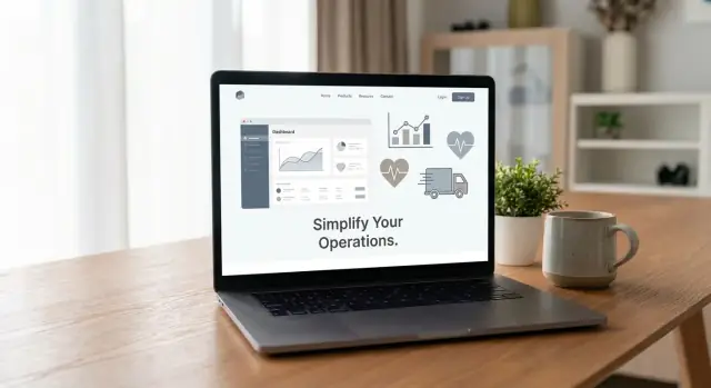
Buyers don’t just want to be told your product is “easy” or “fast”—they want to see it. The right visuals reduce uncertainty, make your messaging feel concrete, and help non-technical stakeholders explain the tool internally.
Use screenshots to explain a workflow step-by-step. Each image should answer one question: “What happens here, and why does it matter?” Add short labels or callouts that tell the viewer what to notice (for example: “Auto-detected fields,” “Approval status,” or “Export to ERP”).
A simple rule: one screenshot per claim. If you claim “set up in minutes,” show the setup screen with the key fields visible.
Instead of a long product tour, add a few short, real clips that show your key flows:
Keep clips tight and readable. Focus the cursor movement, avoid tiny text, and don’t speed-run menus. The goal is clarity, not flash.
If integrations are part of your value, show them visually with recognizable logos near the relevant feature. This reassures buyers that your tool fits their stack and reduces “Will it work with what we use?” anxiety. If you have many integrations, group them (CRM, data warehouse, ticketing, payments) so the list feels curated rather than overwhelming.
Visual polish signals maturity. Keep spacing, typography, and color contrast consistent across screenshots and demo frames. When visuals look mismatched, buyers assume the product experience is inconsistent too.
Every visual should support a statement you’ve made: a workflow, a result, a constraint handled well, or a real UI state. If an image doesn’t add understanding, remove it.
Most B2B buyers aren’t just evaluating features—they’re assessing risk. If your site doesn’t answer “Will this be safe and painless to adopt?”, sales cycles stretch and deals stall.
Replace generic claims with plain-language specifics about how you handle data and access.
If security questions are a common blocker, create a dedicated /security page that centralizes these answers so prospects don’t have to ask for them repeatedly.
Even mid-market teams look for “grown-up” capabilities. Call out what you support today (and what’s available on request) in a simple checklist:
Help buyers bring you into their process without a long email thread. Offer lightweight, downloadable assets:
Logos alone are easy to ignore. Pair proof elements with specifics:
Trust is built when your site answers hard questions early—clearly, calmly, and with evidence.
A pricing page should answer the questions buyers ask before they’re willing to book a call: “What will this cost?”, “What do I get?”, and “How do we buy?” If it’s vague, you’ll spend your sales time repeating basics instead of qualifying real opportunities.
Aim for 2–4 plans and label each with a clear “best for” description (for example: “Best for small teams” or “Best for companies with multiple departments”). This helps non-technical buyers self-select without reading every feature line.
Don’t rely on generic “Pro includes everything in Basic.” Spell out the variables buyers care about, such as:
If something is an add-on, say so plainly. Hidden limits are a common reason deals stall.
Some buyers need procurement-friendly terms, security reviews, or custom rollout support. Give them a clear path: “Contact sales,” “Talk to us,” or “Request a quote.” Include what they’ll get from that conversation (e.g., volume pricing, annual invoicing, security documentation).
A short FAQ reduces repetitive emails. Cover billing frequency, cancellations, upgrades/downgrades, trials, annual discounts, invoices, taxes, and typical contract terms.
Finally, make pricing easy to find: include it in your top navigation and repeat a pricing call-to-action in key product pages.
Your core value proposition can stay consistent, but the proof and language should shift by industry. Buyers don’t just want to know what your tool does—they want to know it fits their constraints, workflows, and risk profile.
Show dashboards, but anchor them to decisions and ROI. Instead of “custom reporting,” say “answer pipeline questions in 2 clicks” or “reduce weekly reporting time by 6 hours.” Pair visuals with a short narrative: what teams measure, what they changed, and what improved.
Messaging should lead with security and governance. Emphasize audit trails, permissioning, and approvals workflows: who can initiate actions, who can review, and how changes are logged. Buyers will look for clarity on access controls and evidence they can pass audits without manual effort.
Healthcare buyers want plain-English reassurance about privacy requirements and how data is segmented. Explain role-based access with examples (clinician vs. billing vs. admin) and describe how sensitive information stays protected while still being usable day to day.
Highlight real-time visibility and the ability to manage exceptions. Messaging that resonates:
Also call out integrations (TMS, WMS, EDI, APIs) and how quickly they can be set up.
Manufacturing messaging should focus on reliability and operational consistency. Lead with uptime, standardized workflows across sites, and traceability (who did what, when, and why). If you support compliance or recalls, explain how records can be pulled quickly without hunting across systems.
A simple rule: keep the homepage broad, then create vertical-specific sections or pages that swap in industry vocabulary, proof, and “day-in-the-life” scenarios.
SEO and performance aren’t “marketing extras” for a B2B SaaS website—they directly affect how many qualified buyers find you and how many stick around long enough to convert.
Start with the fundamentals that help search engines understand your software product website.
Performance is a trust signal. If the site feels slow or hard to use, buyers assume the product will be too.
You don’t need a huge blog to start. Create 3–6 initial posts that match buyer questions and pain points, such as:
Each post should point readers toward the next step: a demo request, a contact form, or the pricing page.
Set up simple conversion tracking for key CTAs and form submissions (demo requests, contact, newsletter, trial). You’ll quickly see which pages attract buyers—and which ones need clearer messaging or faster load times.
Launching a B2B SaaS website isn’t a finish line—it’s the first real test of your SaaS messaging, website structure, and conversion rate optimization assumptions. Treat the launch as a controlled release: verify the basics, measure what happens, then improve quickly.
Before you announce anything, confirm the essentials are complete:
Run your most important journeys end-to-end, like a buyer would:
Ask sales and support to review the site against real objections they hear: “Do you integrate with X?”, “How long to implement?”, “Is this compliant?”, “What does pricing include?” Capture gaps and turn them into improvements on your software product website.
Set a monthly cadence to A/B test one high-impact change at a time—headline, CTA copy, form length, or how you present pricing page best practices.
Maintain a proof backlog: new customer quotes, updated metrics, fresh B2B case studies, and clearer before/after outcomes. Proof compounds—and it’s often what pushes a hesitant buyer to request a demo.
If your team wants to move faster without rebuilding everything each cycle, tools like Koder.ai can shorten the iteration loop: draft page variants in a chat interface, keep snapshots for rollback, and ship updates quickly—while still retaining the option to export source code when you need full control.
Start by choosing one primary conversion (demo request, free trial, book-a-call, or lead capture). Make that action the default CTA across the site, and treat everything else as secondary paths that support it.
Pick one primary reader (usually the buyer/champion) and ensure each key stakeholder can quickly find their answers:
Track a small set of metrics tied to intent and funnel health, such as:
Use these consistently before and after changes so you can prove impact.
Keep v1 focused on clarity + a working conversion path. Prioritize:
Save “nice-to-haves” (big resource libraries, deep comparison pages, many vertical pages) for later once your core message is validated.
Avoid “any industry” positioning. Choose 1 primary vertical (and optionally 1 secondary) where you can show the clearest outcome with the least explanation.
A practical rule: pick the industry where you already have traction (customers, pipeline, or deep domain knowledge).
Use a short, reusable ICP that fits in a few lines:
Then use it as a filter for every headline, example, and proof point you add.
Make a list of top objections and assign each one a “home” page or section:
This prevents prospects from having to email you for basic answers.
Create separate industry pages when workflows, terminology, and proof differ.
If only the examples change, keep a strong core page and swap in:
Write one plain-English sentence combining who it’s for + what it does + the outcome:
“For [role/team] in [industry/context], [product] helps you [do the job] so you can [business result].”
Then support it with 2–3 outcome bullets and a clear CTA. If a non-technical VP can’t repeat it, simplify it.
Use a consistent conversion path:
Add microcopy near forms (response time, no credit card, next steps) to reduce friction.