Create a Website for Product Launch Announcements: Guide
Learn how to create a website for product launch announcements: structure, copy, email signup, countdowns, SEO, analytics, and promotion checklist.
Set the Goal and Call to Action
Before you write a headline or pick a template, decide what “success” means for your launch announcement page. A launch page can’t do everything at once—when it tries, visitors hesitate and leave.
Define the single primary goal
Pick one main outcome and optimize the entire page around it:
- Awareness: explain what’s launching and why it matters, with a low-friction next step.
- Signups / waitlist: collect emails (and maybe one extra field) so you can notify people first.
- Sales: drive to checkout or “Buy now” if the product is ready.
- Press interest: route journalists to a press kit and a clear contact.
If you have secondary goals (e.g., “Follow us” or “Request a demo”), keep them visually smaller so they don’t compete.
Choose one primary CTA (and make it obvious)
Your CTA should match your goal and your launch readiness:
- Pre-launch: “Join the waitlist”, “Get launch updates”
- Beta: “Request access”, “Apply for beta”
- Launch day: “Buy now”, “Start free trial”
- Press: “Download press kit”, “Contact PR”
Keep the CTA consistent across the page: same wording in the hero, mid-page, and at the bottom. If you’re running ads or email campaigns, reuse the exact CTA phrase so people feel they landed in the right place.
Decide your timeline and milestones
Write down the dates (even if they’re internal) so the page can stay accurate:
- Announcement date
- Early access/beta window
- Public launch date
- Any pricing change deadline
If dates are uncertain, avoid exact promises. Use language like “Launching this spring” and offer the waitlist CTA as the commitment.
Identify who the page is for
A launch page for customers should lead with benefits and outcomes. A page for partners should clarify integration value and contact paths. A page for press should prioritize facts, assets, and a direct email.
If you truly have multiple audiences, consider separate pages (e.g., /launch for customers and /press for media) so each can have one clear goal and CTA.
Choose the Right Launch Website Format
The best launch site format is the one you can ship quickly, update easily, and measure clearly. Match the format to your launch stage (teasing vs selling) and your audience (early adopters vs broad market).
One-page landing page vs. multi-page site
A one-page landing page is usually the fastest, most effective option for early launches. It keeps the message focused, reduces navigation distractions, and makes analytics simpler (one URL, one funnel). If you’re validating demand, collecting waitlist signups, or announcing a date, this is often enough.
A small multi-page site makes sense when people need more context before they commit—especially for higher-priced products or B2B. Consider multi-page if you must explain multiple use cases, support different audiences, or need separate pages for SEO topics (e.g., “Product for teams” vs “Product for creators”).
A practical middle ground: a single landing page plus a few supporting pages such as /pricing, /faq, or /press.
Must-have blocks (keep it lean)
Whether you choose one page or several, most launch sites need the same core building blocks:
- Hero section: what it is, who it’s for, and the primary action (join waitlist, request access, buy).
- Benefits: the outcomes people get, written in plain language.
- Social proof / credibility: quotes, logos, numbers, or founder background.
- FAQ: handle objections (availability, platforms, pricing, security, refunds).
- Signup: email capture, request access form, or “notify me” flow.
If you include only one “extra,” make it the FAQ—it quietly increases conversions.
Do you need localization, pricing, or docs at launch?
Ask these questions:
- Localization: Are you marketing in multiple countries on day one? If yes, plan separate URLs (e.g., /en, /es) and translate only the pages that drive signups or sales.
- Pricing: If you’re ready to sell, show pricing (or at least “starting at…”). If you’re still testing, it’s fine to say “pricing coming soon” and focus on value + waitlist.
- Docs/help: Only required at launch if users can onboard immediately. Otherwise, a short “How it works” section is enough.
Plan how the site evolves (pre-launch → launch → post-launch)
Design the site like a switchable flow. Pre-launch, your primary goal is interest (waitlist). On launch day, the same page should flip the main CTA to “Get started” or “Buy now.” After launch, update key sections with real screenshots, customer quotes, and links to onboarding.
If you want, create a simple “page roadmap” now: what must be live this week, what can wait until after launch, and what you’ll add once users arrive.
Ship fast without locking yourself into a rebuild
If speed is the constraint (it often is), consider tools that let you iterate quickly and still keep a real product-grade stack behind the scenes. For example, Koder.ai is a vibe-coding platform where you can build and refine a launch-ready web experience from a simple chat—then export source code, deploy, host, and switch messaging (pre-launch → launch) without starting over. That’s especially useful when your page needs fast QA, tracking events, and frequent copy updates under deadline pressure.
Craft the Homepage Hero That Explains It Fast
Your homepage hero is the fastest way to answer a visitor’s silent questions: What is this? Is it for me? What should I do next? If they can’t get those answers in a few seconds, they’ll bounce—even if the product is great.
Write a clear headline: what it is + who it helps
Keep the headline concrete and specific. A good formula is:
[Product category] for [target audience]
Examples:
- “A budgeting app for freelancers who hate spreadsheets”
- “Security alerts for small IT teams”
- “Team scheduling for busy café owners”
Avoid headlines that sound like slogans (“Work better. Faster.”). Those belong in supporting copy, not the main line.
Add a short subheadline with the main promise and timeframe
Your subheadline should add the key benefit and set expectations about when it delivers value. Timeframes create clarity and credibility.
Try:
- “Set up in 10 minutes, get your first report today.”
- “Launch-ready templates in under an hour.”
- “See savings in your first week with automated categorization.”
If you’re pre-launch, make the timeframe about availability rather than results:
- “Join the waitlist—early access opens in January.”
Select one hero visual (and make it do real work)
Pick a single visual that explains the product without requiring extra reading:
- A crisp product screenshot (best for software)
- A mockup showing the product in context (best for mobile apps)
- A short silent demo loop (best when the “aha” is movement)
Keep it focused. One strong visual is more effective than a carousel. If you use a demo video, make it optional (don’t force autoplay with sound) and ensure the first frame still explains what the product is.
Place the CTA above the fold (and match it to launch stage)
Your call to action should be visible without scrolling and aligned with your goal:
- Pre-launch: “Join the waitlist” or “Get early access”
- Limited beta: “Request access” (with a short qualifier like “for teams of 5+” if needed)
- Launch day: “Buy now” / “Start free trial”
Use one primary CTA. If you add a secondary option, make it clearly secondary (e.g., “See pricing” linking to /pricing). Also, label what happens next: “Join the waitlist (no spam)” or “Start free trial (no card required).”
Quick hero checklist
Before you move on, check that a first-time visitor can answer these in under 5 seconds:
- What is it?
- Who is it for?
- What’s the main outcome?
- What should I do next?
If any answer requires scrolling, rewriting the hero will usually lift signups more than adding new sections below.
Structure the Message: Benefits, Not Features
People don’t buy “features.” They buy outcomes: saved time, less stress, more sales, fewer mistakes. Your launch announcement page should translate what you built into what it does for them—in plain language.
Turn features into benefits (a quick rewrite method)
Start with a feature, then add “so you can…” or “which means…” and finish with a real-world result.
- Feature: “AI-powered routing” → Benefit: “Send each request to the right person automatically, so customers get answers faster.”
- Feature: “Real-time sync” → Benefit: “Everything stays up to date, so you don’t chase the latest version.”
If the benefit still sounds abstract (“improve productivity”), make it specific (“save 2–3 hours a week on status updates”).
Use 3–5 key benefits (make them skimmable)
Pick the few benefits that matter most to your ideal user. More than five usually turns into a blur.
A simple format works best:
- Short heading (3–6 words)
- One supporting sentence explaining the outcome
- Optional: a small proof detail (e.g., “Works with Stripe and HubSpot”)—only if it reinforces the benefit
Example benefit headings:
- Launch faster — Publish updates and announcements without bottlenecks.
- Stay consistent — Keep messaging aligned across email, web, and social.
- Know what’s working — See which channels drive signups.
Add a “How it works” section in 3 steps
A launch page should reduce uncertainty. A three-step explanation gives visitors a mental model without overwhelming them.
Keep each step short and concrete:
- Connect (what they set up in minutes)
- Customize (what they can change to fit their needs)
- Go live (what success looks like right away)
Avoid technical detail unless your audience expects it. The goal is confidence, not documentation.
Use a comparison table only if it’s accurate and simple
A small comparison can help when people are deciding between options (plans, versions, or “new vs. old”). If you include one, keep it honest and easy to scan:
- Limit to 3–6 rows (the differences that truly matter)
- Use clear labels (“Starter”, “Pro”) and plain wording
- Don’t use vague claims (“best,” “ultimate”). Be specific (“Up to 3 projects”)
If you can’t summarize the differences without footnotes, skip the table and focus on the primary benefits instead.
Build an Email Signup or Waitlist That Converts
Your launch site has one job before release: capture interest you can reach later. A strong waitlist turns “looks interesting” into a direct line to people who are likely to try (and buy) when you go live.
Decide what to collect (and why)
The more fields you ask for, the fewer people will sign up—so start lean.
If you’re launching a consumer product, email-only is usually best. You can always learn more later through onboarding questions.
If you’re launching B2B, email + role/company can be worth the extra friction because it helps you:
- personalize follow-ups (e.g., “for founders” vs “for marketing teams”)
- prioritize qualified leads for early access
- understand demand by company type or size
A practical default: Email + one optional field (role or company). Keep anything else for a later step.
Offer a clear reason to sign up
People don’t hand over their email for “updates.” They sign up for a benefit.
Make the incentive specific and visible near the form:
- Early access: “Get access 48 hours before public launch.”
- First dibs / limited spots: “We’re onboarding 200 teams in the first wave.”
- Discount or credit: “Join the waitlist for 20% off your first month.”
- Launch pack: templates, checklists, or bonus content they’ll receive by email
Tie the offer to your product value, not a random giveaway. If your incentive attracts the wrong crowd, your list will look big but won’t convert.
Set expectations (so people trust the form)
Add one short line under the signup button that answers the questions people silently ask:
- How often will you email me? (“1–2 emails per month until launch.”)
- What will I get? (“Progress updates, early access details, and launch-day link.”)
- Will you spam me? (“No spam. Unsubscribe anytime.”)
This small copy reduces hesitation and improves conversion without changing your design.
Connect your email tool and test the full flow
A form that “collects emails” but doesn’t send confirmations—or tags subscribers correctly—creates chaos when launch day hits.
Before you publish, verify:
- the form sends the address to your email platform
- subscribers land in the right list/segment (e.g., waitlist vs newsletter)
- the confirmation email (if using double opt-in) actually arrives and looks right on mobile
- the thank-you page or success message is clear (and ideally offers a next step)
If you can, use the thank-you moment to deepen intent: “Reply with what you’re hoping to achieve,” or “Tell us your role so we can send the right use cases.” Keep it optional to avoid lowering signups.
A clean waitlist setup now saves you from scrambling later—and gives you an audience you can reliably activate on launch day.
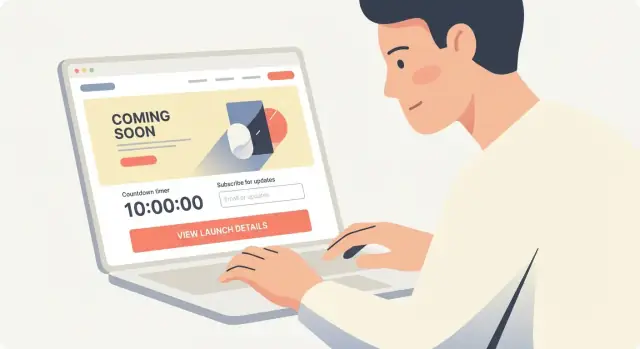
Add Timing Elements: Countdown, Calendar, and Launch-Day Switch
Timing cues turn “interesting” into “I should come back.” Use them only when they’re true—and make the moment of launch feel clear and effortless for visitors.
Use a countdown only when the date is firm
A countdown timer page works because it reduces uncertainty. But if you’re not 100% confident in the date and time, a countdown can backfire fast—people will notice, and trust is hard to regain.
If your timeline is still flexible, swap the countdown for a softer message like “Launching in early March” plus an email signup. Save the real timer for when the launch window is locked.
When you do use a countdown:
- Include the timezone (or detect it and show “Your time”) so people don’t miss it.
- Place it near the primary call to action (e.g., “Join the waitlist” or “Get notified”).
- Avoid overpromising with microcopy like “Available everywhere at launch” unless that’s true.
Explain what happens at launch
Visitors don’t just want a date—they want the plan. A small “What happens at launch?” block removes friction and prevents support questions.
Cover the essentials in plain language:
- Availability: Is it a public release, invite-only, or a limited beta?
- Pricing: Will there be launch pricing, a discount, or a free tier?
- Regions: Where will it be available on day one?
- Access details: Will you email a link, open checkout, or publish on /pricing?
This is also a good place to clarify any “first day” limits (stock, seats, onboarding slots) without sounding pushy.
Add an “Add to calendar” link
Make it easy for people to remember the announcement time. A simple “Add to calendar” link reduces drop-off, especially for launches tied to a livestream, webinar, or timed checkout opening.
Offer at least one option (Google Calendar is often enough), and label it clearly:
- “Add to Google Calendar”
- “Download .ics” (works with Apple Calendar/Outlook)
Keep the event description short and include the URL of your launch announcement page so the calendar entry becomes a direct reminder.
Prepare a launch-day switch you can activate fast
Launch day is busy—your website should not require a redesign at the last minute. Set up a simple “switch” you can flip:
- A top banner announcing “We’re live” with a link to the product release landing page
- A modal for existing waitlist visitors (“Your access is ready—start here”)
- A homepage hero swap from “Join the waitlist” to “Start now”
Make sure the post-launch state is written and approved before launch day. That way, when the countdown hits zero, the site instantly matches reality—no awkward “pre-launch” messaging lingering for hours.
Increase Trust with Social Proof and Credibility Signals
A launch announcement page often asks visitors to do something before they can “see the full product” (join a waitlist, request access, book a demo). That’s a trust hurdle. Social proof and basic credibility signals reduce hesitation and make your call to action feel safer.
Use real voices (and get permission)
If you have early users, beta testers, or advisors, add short testimonials or quotes—specific is better than glowing.
Instead of “Amazing product,” look for statements like: “Cut our onboarding time from 2 days to 3 hours.” Always confirm you have permission to publish the quote and the person’s name/title. If someone prefers privacy, you can use “Operations Manager, mid-size logistics company,” but understand that named quotes convert better.
Add numbers only when you can verify them
Credible metrics can work well on a product release landing page, but vague claims can backfire.
Examples of verifiable numbers:
- “1,842 teams on the waitlist” (if your system can confirm it)
- “99.9% uptime over the last 90 days” (if you have monitoring)
- “Backed by $X in funding” (if publicly announced)
Avoid padded stats like “10x faster” unless you define the comparison and can support it.
Logos: approval matters
Logos from customers, partners, accelerators, or publications can be powerful—only include them if you have explicit approval or the relationship is public. If approvals are still in progress, you can use text alternatives (“Trusted by teams at…”) and switch to logos later.
Trust basics visitors look for
These small elements can lift conversion rates because they answer “Who is behind this?” and “Is it safe?”
- A clear contact option (email, form, or /contact)
- A link to your privacy policy (/privacy) near the signup
- If you collect emails, a one-line note about how you’ll use them (e.g., “We’ll only email product updates. Unsubscribe anytime.”)
- Security notes if relevant (SSO, encryption, compliance), but keep them factual and brief
When in doubt, prioritize authenticity over volume: one strong testimonial and clear identity cues beat a wall of generic praise.
Create a Press Kit and Announcement Resources
A press kit makes it easy for journalists, partners, creators, and even your own team to tell the same accurate story—without emailing back and forth. Add it as a dedicated section on your launch announcement page, or publish a separate /press page linked from your footer.
Build a simple “Press” section
Start with a short product summary (2–4 sentences) written for someone who has never heard of you. Focus on what the product does and who it’s for, then add a one-line differentiator. Keep it copy‑paste friendly so it can drop into an article quickly.
Provide downloadable assets (the right way)
Create a small set of files that cover 90% of media needs:
- Product screenshots (PNG, high resolution)
- Logos (SVG + PNG, light/dark versions)
- Founder headshot (PNG/JPG, high resolution)
Host assets in a single downloadable bundle (ZIP) and also offer individual file links for convenience. Name files clearly (e.g., AcmeApp-Logo-Dark.svg) and include brief usage notes like “Do not stretch” or “Use dark logo on light backgrounds.”
Include a one-page factsheet
A factsheet prevents mistakes and saves time. Include:
- Launch date and timezone
- Pricing (with the simplest plan breakdown)
- Availability (countries, platforms, requirements)
- Company name, location, and founding year
- Contact details for media
If you have an embargo, state it plainly at the top.
Add a media contact and boilerplate
Provide a dedicated media contact email (e.g., [email protected]) and a short boilerplate paragraph about your company. Keep the boilerplate consistent across announcements and your /about page, and update it when major milestones change.
If you’re also preparing announcement copy, link to a “Press release” page and any launch resources from the same hub (e.g., /press).
Cover SEO Basics for Launch Announcement Pages
A launch announcement page often needs to do two jobs at once: convert visitors and be discoverable when people search for your product name (and alternatives). A few focused SEO steps will get you most of the way there—without turning the page into keyword soup.
Pick one primary keyword and place it intentionally
Choose a single primary keyword that matches the page’s purpose (for example, “product launch website” or “launch announcement page”). Then use it in three high-impact places:
- Page title (HTML title tag): the clickable headline in search results
- H1: the main on-page headline (your hero heading or a close variation)
- URL: short, readable, and keyword-aligned (e.g.,
/launchor/product-launch)
Keep secondary keywords (like “product release landing page” or “pre-launch email signup”) for supporting copy, FAQs, or subheadings—don’t force them into every paragraph.
Write a meta title + description that match the offer
Search snippets should reflect what the page actually provides (waitlist, early access, launch date, etc.). Good metadata increases click-through and filters out mismatched traffic.
Example:
- Meta title: Product Launch Website for [Product Name] — Join the Waitlist
- Meta description: Be first to try [Product Name]. Get launch updates, early access, and the release date. Join the email list in 30 seconds.
If your page has a clear next step, mention it (“Join the waitlist,” “Get notified,” “Request access”).
Optimize images and page speed (especially on mobile)
Launch pages often use large hero visuals. Keep them fast:
- Compress images and use modern formats (WebP/AVIF when possible)
- Add alt text that describes the image plainly (helpful for accessibility and image search)
- Avoid auto-playing heavy video in the hero
A faster page generally ranks better and converts better.
Add simple schema where it fits
Structured data helps search engines understand your page. For most launch announcement pages, consider:
- Organization schema (brand details)
- Product schema (name, description, offers when available)
- FAQ schema (if you include a short FAQ section)
Keep it accurate and consistent with what users see on the page—no “availability” claims until they’re true.
Track Performance and Plan Post-Launch Updates
Launch pages aren’t “set and forget.” If you don’t measure what visitors do, you’ll end up guessing which channels and messages actually drove signups and sales.
Install analytics (and track the actions that matter)
Start with a simple analytics setup (GA4, Plausible, or similar) and define the few key events you need on a launch announcement page:
- CTA clicks (e.g., “Join the waitlist,” “Get notified,” “Buy now”)
- Successful email signups (not just form views)
- Key scroll points (to learn if people reach pricing/FAQ)
If you’re using a form tool, make sure the “success” event triggers only after a confirmed submission. Otherwise, you’ll overcount conversions and make bad decisions.
Use UTM tags so every campaign is attributable
Any link you share should carry UTM parameters so you can compare channels without guesswork—email vs. social vs. ads vs. partner mentions.
Create a consistent naming convention (lowercase, no spaces) and stick to it:
?utm_source=newsletter&utm_medium=email&utm_campaign=launch_week&utm_content=cta_button
Keep a small internal doc with approved values so “twitter” and “x” don’t become two separate sources.
Run a pre-launch QA checklist
Before you drive traffic, do a fast quality pass:
- Mobile review (layout, readability, tap targets)
- Broken links and missing meta titles/descriptions
- Form behavior (validation, confirmation message, email delivery)
- Page speed and image sizes
- Legal/footer links (privacy, terms) if you collect emails
Plan post-launch updates (so the page stays useful)
After launch day, visitors still arrive from old shares and search. Have a plan for updates:
- Add a short changelog section for new releases
- Publish new FAQs based on real support questions
- Update pricing and feature details the same day they change
- Create a redirect strategy (e.g., move /launch to /pricing or /product, or switch the hero CTA from “Join waitlist” to “Start free trial”)
Treat the launch page like a living asset, not a one-time poster.
FAQ
What should the single main goal of a product launch announcement page be?
Choose one primary outcome and optimize everything around it:
- Awareness: explain what’s launching + a low-friction next step
- Signups/waitlist: capture emails (and maybe one extra field)
- Sales: drive to checkout or trial
- Press: route to a press kit and contact
Keep secondary actions visually smaller so they don’t compete with your main CTA.
How do I choose the right call to action (CTA) for my launch page?
Pick one primary CTA that matches your stage and repeat it consistently (hero, mid-page, bottom).
Examples:
- Pre-launch: “Join the waitlist”
- Beta: “Request access”
- Launch day: “Buy now” / “Start free trial”
- Press: “Download press kit”
Use the same exact CTA wording across ads/emails and the page to reduce drop-off.
When should I use a countdown timer on a launch announcement page?
Use a countdown only when the date/time is firm. If timing might change, use softer language (“Launching this spring”) and focus on the waitlist.
If you do add a countdown:
- Show the timezone (or “Your time”)
- Place it near the primary CTA
- Avoid promises you can’t guarantee (regions, availability, stock)
Should my launch website be one page or multi-page?
Go with a one-page landing page when you need speed, focus, and a simple funnel (common for early launches and waitlists).
Choose a small multi-page site if visitors need more context before committing—especially for B2B, higher price points, or multiple audiences/use cases.
A practical middle ground: one landing page plus a few supporting pages like /pricing, /faq, or /press.
What sections are essential on a product launch website?
Keep it lean with blocks that support your main goal:
- Hero: what it is, who it’s for, primary action
- Benefits: outcomes in plain language
- Social proof: quotes, logos, credible numbers
- FAQ: objections (pricing, platforms, security, refunds)
- Signup/CTA section: form or purchase flow
If you add only one extra section, make it the FAQ—it often lifts conversions.
How do I write a homepage hero that explains my product quickly?
Use a concrete, specific headline that answers “What is this?” and “Who is it for?”
A reliable formula is:
- [Product category] for [target audience]
Add a short subheadline that states the main promise and a believable timeframe (or availability if pre-launch). Avoid slogan-only headlines that don’t explain anything.
How do I turn features into benefits on a launch announcement page?
Rewrite features into outcomes using “so you can…” or “which means…”
Example:
- Feature: “Real-time sync”
- Benefit: “Everything stays up to date, so you don’t chase the latest version.”
Limit yourself to 3–5 key benefits, each with a short heading and one supporting sentence. If a benefit sounds vague (“boost productivity”), make it measurable (“save 2–3 hours/week”).
What information should I collect in a waitlist or email signup form?
Start lean—every extra field lowers conversion.
Good defaults:
- Consumer: email only
- B2B: email + one optional field (role or company)
Increase signups by adding a clear incentive near the form (early access, limited spots, discount) and a trust line under the button (frequency, “no spam,” unsubscribe).
What social proof and credibility signals matter most for a launch page?
Use trust signals that reduce the “Is this real/safe?” hesitation:
- Specific testimonials (with permission)
- Verifiable numbers (only if you can confirm them)
- Logos only with approval or a public relationship
- Clear contact option and a /privacy link near the form
- Brief, factual security notes if relevant
Prioritize authenticity: one strong quote beats a wall of generic praise.
What SEO steps should I prioritize for a launch announcement page?
Cover basics that help both discovery and conversion:
- Put one primary keyword in the title tag, H1, and URL (e.g., /launch)
- Write metadata that matches the offer (waitlist, early access, launch date)
- Compress images and avoid heavy autoplay video for mobile speed
- Add accurate schema where it fits (Organization, Product, FAQ)
Keep it honest—don’t claim availability or offers until they’re true.