Aug 12, 2025·8 min
How to Create a Website for a Founder-Led Media Brand
A practical step-by-step guide to plan, write, and launch a website for a founder-led media brand—structure, pages, SEO, email growth, and credibility.
A practical step-by-step guide to plan, write, and launch a website for a founder-led media brand—structure, pages, SEO, email growth, and credibility.
A founder-led media brand is more than “a creator with a site.” It’s the mix of content + trust + distribution: you publish regularly, people come back because they trust your point of view, and you have reliable ways to reach them again (email, subscriptions, followers, partners).
That’s why your website shouldn’t start with colors, fonts, or a clever hero headline. It should start with a decision: what job is the site responsible for doing?
Most founder-led sites need to do one (or two) primary jobs:
When the job is clear, design choices get simpler: every page either supports that job or it doesn’t earn a spot in the navigation.
Your site should connect the channels where your brand already lives, so visitors can choose how to follow you:
A good rule: don’t add icons for platforms you’re not maintaining. Dead links quietly reduce trust.
Define what “working” means in measurable terms. Examples:
Once you have those, it’s easier to decide what deserves prime real estate on your homepage—and what can live one click deeper (like a /media-kit or /work-with-me page).
A founder-led media brand grows because people recognize your angle, not because you cover a topic. Your website should make that angle obvious within seconds: what you believe, who you serve, and what readers can expect next.
Keep it simple and specific:
I help [who] get [outcome] by [your POV / method].
Examples:
This statement becomes the backbone for your homepage hero, your about page opening, and your newsletter signup copy.
Content pillars aren’t categories for your convenience—they’re promises to your audience. Pick 3–5 pillars you can realistically publish on for the next 6–12 months.
For each pillar, define:
If a topic doesn’t fit a pillar, it doesn’t go on the site (or it goes in a personal notes space, not your public feed).
Sound like a founder, not a brochure. Write down a few non-negotiables:
Even before you have a big audience, you can build trust. Gather a lightweight folder of:
You’ll reuse these across your about page, media kit page, and newsletter landing pages—without rewriting every time.
A founder-led media brand website isn’t “for everyone.” It’s a set of clear paths for specific people who arrive with a specific intent. If you get that intent right, everything else—pages, copy, and conversion—gets easier.
Most creator and personal brand websites serve a mix of:
You don’t need a separate site for each—just make sure each group can self-identify within seconds.
For each audience, write down the top 3–5 questions they’re silently asking.
Examples:
Then list likely objections (too expensive, unclear niche, inconsistent publishing) and decide what page element resolves them: a short positioning statement, a sample of recent work, a simple process section, or a /media-kit.
Pick one “next step” per audience and repeat it consistently: Subscribe (newsletter website), Book a call, Partner/Sponsor, Press inquiries. Secondary links are fine, but avoid competing buttons.
Assume most people meet you on mobile. Use readable font sizes, strong contrast, descriptive link text, and buttons large enough to tap. Add clear headings so your site works for everyone—and so your best work is easy to find.
Your site’s pages and navigation are your “map.” If the map is unclear, people won’t subscribe, read, or reach out—even if the content is great.
Most founder-led media brand sites work best with a lean backbone:
If you already have these, you can expand later without breaking anything.
Optional pages can be helpful, but only if they reduce confusion:
Aim for 5–7 top-level links, in the same order on every page. Put your primary CTA in the header—for most creator brands that’s Subscribe—and let everything else support that goal.
If you want a secondary action (like “Contact”), keep it quieter (footer or a simple text link).
If you need a simple default: Home, Start Here, Content, About, Subscribe—with Subscribe styled as the main button.
A founder-led media brand site works best when every page has a job. Before you write a single line, decide what success looks like for each page: subscribe, book a call, download a resource, or simply understand what you stand for.
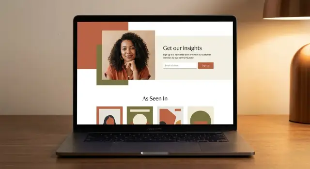
Your home page isn’t a biography. It’s a promise.
Include:
If you have multiple offers, keep them secondary and below the fold so the first scroll stays focused.
Your About page should answer: “Why you, and why now?” Share the story in a way that supports the reader.
Cover:
End with a simple next step (e.g., /subscribe or /start-here).
This page is a shortcut for new readers. Curate your top 5–10 pieces and arrange them by problem or desired result (not by date).
For each item, add one sentence on who it’s for and what they’ll get. If you offer a newsletter, place an opt-in mid-page and at the end.
Brands and podcasts want quick clarity. Your media kit page should be skimmable and specific.
Include an audience snapshot (who they are + key numbers), your partnership formats (sponsor slots, workshops, interviews), a few examples, and a single inquiry CTA (link to /contact or a short form).
Tip: keep a “last updated” date so it feels current.
Founder-led media brands win on trust. Your website copy should feel like a conversation with you—not a generic “brand voice” that could belong to anyone.
Headlines should state the value in plain language. If a first-time visitor can’t explain what you do in five seconds, your copy is working against you.
Examples of clear headline patterns:
For most pages, this structure keeps you focused and makes the reader’s decision easy:
Promise → proof → examples → CTA
Create a short bio (50–80 words) for headers, sidebars, and your /media-kit. Then write a longer version for your About page.
Short bio template:
“Hi, I’m [Name]. I write [what] for [who] who want [outcome]. Previously, I [credible proof]. Get the next issue every [cadence].”
Keep these in a doc so you can paste them across pages consistently:
When in doubt, read your draft out loud. If you wouldn’t say it on a podcast, rewrite it.
A founder-led media brand grows through repeatable discovery: people find one strong piece, understand what you stand for, and know exactly where to go next. Your content hub makes that journey feel obvious.
Decide what you publish most often and design around it. For many creator brands, that’s a mix of:
Choose 1–2 primary types to feature prominently, then treat everything else as supporting. This keeps your homepage and archive pages clean, and it trains visitors to expect a consistent format.
Your categories (or “topics”) should map to your content pillars—not to trendy themes or one-off experiments. Limit categories to a small set (usually 3–6) so people can self-select quickly.
Use tags sparingly for helpful secondary grouping (tools, industries, frameworks). If you find yourself adding a new tag every week, you’re building clutter, not navigation.
Most visitors won’t start at your latest post—they’ll start at whatever got shared. Add curated collections like “Start Here,” “Most Popular,” or “Best for Founders” to give them a confident next click.
A simple approach:
Discovery should lead somewhere. Plan internal links inside every piece to your key destinations—especially /subscribe and /start-here.
If you have a large library, add search. It’s not a nice-to-have once your archive hits “I know I wrote this… where is it?” territory.
Your email list is the one channel you can count on to reach people directly—no algorithm, no guessing. Treat your website as the place where casual readers become subscribers.
Choose a single main offer and make it a newsletter promise, not a random freebie. The best promises sound like: “A 5‑minute weekly brief on X,” “Behind-the-scenes lessons from building Y,” or “One actionable idea every Tuesday.”
Keep it specific enough that people can say yes quickly, and broad enough that you won’t outgrow it in a month.
Most visitors won’t scroll to your footer. Put signup opportunities in a few natural moments:
Use consistent copy across blocks so readers don’t have to re-interpret what they’re getting.
After signup, send people to a dedicated thank-you page with next steps: share the newsletter, follow your primary social channel, and read 2–3 “best of” posts. This is also a great place to link to your privacy statement (/privacy).
Right next to the signup, state the basics: frequency, main topics, and a short privacy note (“No spam. Unsubscribe anytime.”). Clear expectations build trust—and trust builds a list.
Monetization works best when it feels like a natural extension of what you already publish—not a detour. Your site should make it easy for the right people to buy or inquire, while letting everyone else keep reading, listening, or subscribing.
Pick the simplest “default” action you want a motivated visitor to take. For many founder-led media brands, that’s either hiring you (services/advising) or buying a product.
If you sell services, create a clear Work with me page at /work-with-me. Keep it scannable:
If you have products, map a simple funnel and stick to it: /pricing (or /shop) → checkout. Don’t hide the buying path behind blog posts. Make it visible in the top navigation or a persistent button.
Social proof should reduce risk, not inflate promises. Use:
Avoid stacking ten testimonials. Two strong, credible examples beat a wall of praise.
Vague “Contact” pages convert poorly. Tell people exactly how to reach you, based on intent:
If you offer multiple things, route them with simple buttons: “Advising,” “Sponsorship,” “Speaking,” “Other.” The goal is momentum—no confusion, no extra clicks.
SEO for a founder-led media brand website isn’t about chasing tricks—it’s about making sure the right people can find the right page, then take the next step.
Pick one primary keyword per page and make sure it matches what the visitor expects to accomplish on that page.
For example:
If a page tries to rank for five different intents, it usually ranks for none.
For your key pages, set the basics so search engines (and humans) can scan and trust your site:
Use simple structure consistently:
Create a small set of evergreen posts that answer recurring questions in your niche (the stuff people Google every month). Tie each post to a clear next step—usually your newsletter signup. Over time, this becomes the compounding engine behind your creator website strategy, not just a pile of posts.
Your tech stack should serve one goal: publish consistently with minimal friction. If updating the site feels like “a project,” it won’t happen.
No-code builder (Webflow, Squarespace, Wix) is ideal if you want fast setup, built-in hosting, and visual editing.
CMS (WordPress, Ghost) works well if your site is content-heavy and you want strong publishing features, categories, and plugins.
Lightweight static site (Astro, Eleventy, Hugo + a headless CMS) is great if you have a developer (or are one) and want speed and stability with fewer moving parts.
If you’re unsure, choose the option that makes publishing and updating your homepage the easiest.
If you want a faster “build and iterate” loop without assembling a traditional dev pipeline, platforms like Koder.ai can help. It’s a vibe-coding platform where you can describe the site you want in chat, then generate a working web app (commonly React on the front end, with Go + PostgreSQL available for backend needs), export the source code, and deploy/host with support for custom domains. For founder-led sites, that can be a practical way to ship quickly, then refine structure and copy as you learn what converts.
Keep your requirements simple and measurable:
Buy a domain you can say out loud and type easily. Then set up:
Also create a dedicated inbox like [email protected] so brand outreach doesn’t live in personal DMs.
Before you share your site anywhere, do a quick QA pass:
Once this is done, you’re ready to publish—and you can iterate without rebuilding everything later.
A founder-led media brand site isn’t “set and forget.” It’s a living front door to your ideas, and small improvements compound. The goal is simple: learn what’s working, change one thing at a time, and keep the experience current for new readers.
Start by mapping your site to a basic path: traffic → subscribe → reply → conversion.
If a step is weak, you don’t need a redesign—you usually need a tighter message and clearer calls to action.
Pageviews alone won’t guide decisions. Set up events for actions that represent intent:
Keep it lightweight: the point is direction, not perfect attribution.
Once a month, review what happened and ship a small update:
Create a simple checklist:
Freshness isn’t about posting constantly—it’s about staying accurate, easy to navigate, and aligned with what you sell and believe.
Start by choosing the primary job:
Then make every page and nav link earn its spot by supporting that job.
Pick one primary CTA per audience and repeat it consistently.
/subscribe)/work-with-me)Avoid competing buttons above the fold; one clear next step wins.
Use a simple one-liner:
“I help [who] get [outcome] by [your POV/method].”
Put versions of it in your homepage hero, the first paragraph of /about, and your signup copy on /subscribe so visitors understand your angle in seconds.
Choose 3–5 pillars you can publish on for the next 6–12 months. For each pillar, define:
If a topic doesn’t fit a pillar, it shouldn’t become a main category on your site.
Start lean with:
Add optional pages only when they remove confusion (e.g., , , , ). Keep top navigation to about .
Make it skimmable and specific:
/contact or a short form)Add a “last updated” date so it feels current.
Treat your site as the subscriber engine:
/subscribe/start-hereSet expectations near the form to reduce unsubscribes.
Design around the formats you publish most often.
Use internal links in every piece to point to and .
Focus on basics you can finish quickly:
/about, /subscribe, /media-kit)Measure the funnel, not just traffic:
Run a simple monthly loop:
Small changes compound faster than redesigns.
/media-kit/contact)/start-here/work-with-me/media-kit/faq/subscribe/start-hereDon’t chase multiple intents on one page; clarity ranks better.