Nov 03, 2025·8 min
How to Create a Website for an Industry Benchmark Report
Learn how to plan, write, and design a website for an industry benchmark report: structure, data visuals, SEO, CTAs, and launch checklist.
Learn how to plan, write, and design a website for an industry benchmark report: structure, data visuals, SEO, CTAs, and launch checklist.
A benchmark report site can’t be everything to everyone. Before you write a single paragraph or design a benchmark report landing page, decide what the website must achieve—and what it can safely ignore.
Start by choosing the main reason this industry benchmark report website exists. Common goals include:
Choose one primary goal and one secondary goal. This makes tradeoffs easy (for example: a heavily gated report may lift leads but reduce reach).
“Executives” is too broad. Pick a primary audience and write down the comparisons they care about:
This clarity will shape the report website structure: navigation labels, filters for interactive data charts, and which takeaways deserve the top of the page.
Match metrics to the goal:
Set targets before launch so “success” isn’t a vague feeling.
For most teams, aim for ~3,000 words total across the site (not counting tables or chart labels). Lock a timeline with clear milestones: data freeze date, draft deadline, design/build, review, and launch—plus a planned update window so the report doesn’t go stale.
A benchmark report website isn’t just a container for charts—it’s a guided experience. Before you design pages, decide what story you’re telling and what you want readers to remember after 60 seconds.
Write down the exact questions a reader is trying to solve. Keep them concrete and scannable, such as:
These questions become the backbone of your section order and your chart selection.
Most visitors won’t read every detail. Choose 5–10 insights that are both true at a glance and useful without context. Each should pass two tests:
Make these insights consistent with the rest of the report so the summary doesn’t feel like marketing copy.
Clarify the split early so the page feels fair:
If something is gated, preview it with a clear “what you’ll get” note.
Use a simple narrative flow:
This structure keeps the report readable for non-technical visitors while still rewarding detail-oriented readers.
A benchmark report is only as useful as the trust it earns. Your website should make it easy for readers to understand where the data came from, who it represents, and how you calculated every headline number—without forcing them to dig through footnotes.
Start with a plain-language overview of the inputs you used, such as survey responses, product/usage analytics, public datasets, or partner-contributed data. If you combine sources, say so, and explain why (e.g., surveys for intent + usage data for behavior).
A simple “Data sources” block works well:
Readers need context to know whether the benchmark applies to them. Specify:
If you used filtering rules (e.g., removing inactive accounts, minimum activity thresholds), describe them in one or two sentences and link to a deeper methodology page if needed.
Benchmarks can shift dramatically based on definitions. For each core metric, include a short definition and calculation notes:
A strong methodology section also states boundaries. Call out known limitations—sample bias, incomplete coverage in certain regions, changes in tracking, or differences across industries. Be explicit about what the benchmark does not prove (for example: causation, future performance, or universal applicability).
This transparency reduces skepticism and helps readers use your benchmark responsibly.
Your benchmark report will get shared, skimmed, and referenced—often by people who didn’t start on your homepage. The site format and structure should make it easy to understand the headline insights fast, then dive deeper without getting lost.
You have three practical options:
If your data is extensive, subpages usually win because they reduce page weight, improve readability, and let readers jump directly to the section they care about.
Keep URLs short and easy to cite in presentations. A common pattern is:
Avoid query-string-heavy URLs for core pages; they’re harder to share and can complicate SEO.
Benchmark readers rarely consume content top-to-bottom. Give them fast orientation:
Keep section titles “question-like” and specific (“What changed since last year?” beats “Trends”).
A short post can help you promote the report and capture search demand for a single insight. Publish a teaser on /blog/ (e.g., “3 surprising findings from the 2026 benchmark”), then link prominently to the full report at /reports/industry-benchmark-2026. Keep the teaser focused—enough to be valuable, not enough to replace the main page.
Your landing section has one job: help the right reader understand what the benchmark is, why it matters, and what to do next—within seconds.
Write a headline that names the benchmark and the time period. This reduces bounce rates because visitors instantly confirm they’re in the right place.
Example:
“2025 B2B SaaS Support Benchmarks (Q1–Q3 Data)”
If you also serve multiple segments, add a short subheading that clarifies scope (region, company size, or industry).
Most visitors won’t read the full report immediately. Give them a short executive summary with 3–6 bullets that highlight the most “talkable” outcomes (directional findings, not full charts).
Good executive summary bullets:
Keep these bullets concrete and free of jargon—save definitions and caveats for your methodology section.
Add two small blocks directly under the summary:
This helps readers self-qualify and makes the page feel intentionally written, not generic.
Choose a single “main action” and make it impossible to miss:
Use a benefit-led label (e.g., “Get the PDF + data tables”) and keep supporting links secondary (for example, “Jump to charts” linking to /#benchmarks).
If you want to ship the landing page quickly (and iterate based on real analytics), a vibe-coding workflow can help: platforms like Koder.ai let teams build a React-based report page and supporting subpages from a chat prompt, then export the source code for review and long-term ownership.
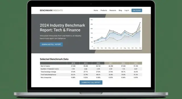
Your benchmark data is the “proof” in the report—so the visuals need to do more than look nice. They should help a reader quickly answer: Where do I sit compared to peers, and what should I do next?
Consistency beats variety. Reuse the same chart types for the same kinds of comparisons (e.g., bar charts for rankings, line charts for trends, stacked bars for breakdowns). Keep axis ranges and units consistent whenever possible, and don’t rename the same metric across sections.
A simple rule: if someone learns how to read one chart on your page, they should be able to read the rest without rethinking the legend every time.
Don’t settle for “Figure 3: Average time to value.” Use a plain-language caption that states the insight:
“Teams with a dedicated onboarding owner reach time-to-value 35% faster than teams without one.”
This helps non-technical readers understand why the chart matters, even if they only skim.
Charts aren’t equally usable for everyone, and they can be hard to interpret on mobile. Provide:
These additions also make your content easier to quote and share.
Interactive charts can be powerful, but only if they’re easy to use. Limit controls to a few high-value filters such as:
Default to the most common view, show the currently applied filters clearly, and avoid “choose 12 dimensions” experiences. Interactivity should help readers find their peer group in two clicks, not turn the page into a dashboard.
Your findings are where the report earns attention—and where many benchmark sites lose people by sounding like an academic paper. Aim for clarity first: short sentences, familiar words, and one idea per paragraph.
Treat each major insight as its own on-page section (often an H2 on the full report page) anchored by a single key chart. Readers should be able to scan the page and understand the story without interpreting statistics from scratch.
A simple structure that works well:
Finding title (plain-English statement)
1–2 sentences summarizing what changed / how groups compare
Key chart (one message)
Why it matters (2 bullets)
What to do next (2 bullets)
Notes (definitions, sample size, date range, methodology link)
Non-technical readers don’t want “p-values” or “regression coefficients.” They want answers like: Is this normal? Are we behind? What should we do?
Use brief callouts for genuinely surprising stats, but keep the tone neutral. For example: “One in three teams reported a decrease despite higher budgets.” Avoid exaggeration like “game-changing” or “shocking.”
Ground insights in recognizable scenarios:
If you reference a real company, confirm you have permission—or keep it anonymous and focus on the pattern, not the brand.
Your benchmark report should be easy to consume and easy to act on. The best CTA strategy usually gives readers two clear paths: (1) read now, (2) download for later.
Different people share research in different ways. Offer more than one format and make the content promise unambiguous.
On each button, label what’s included (for example: “32-page PDF + methodology appendix” or “15-slide summary deck”). If the slides are a summary, say so—don’t let people assume they’re getting the full report.
If you gate everything, you’ll lose the audience that wants to skim before committing. Add an ungated option prominently:
You can still gate “bonus” assets (PDF, slides, dataset) while keeping the on-page version accessible for visitors coming from search or social.
If you use a form, make it low-friction: name + work email is often enough. Next to the submit button, add one plain sentence explaining how you’ll use the email (e.g., “We’ll email the download link and occasional report updates—unsubscribe anytime.”). This reduces hesitation and improves conversion quality.
Not everyone wants a download. Place lightweight secondary CTAs after key sections (intro, major findings, conclusion):
Keep the primary action consistent (read or download), and use secondary CTAs as helpful next steps—not competing buttons.
SEO for an industry benchmark report website is mostly about clarity: making it obvious to both humans and search engines what the report covers, who it’s for, and why it’s credible. Get the fundamentals right and you’ll earn long-term traffic that keeps your benchmark report landing page converting.
Start with a clean hierarchy that reflects how people search. Your H1 should be close to the page’s primary intent (for example, “2025 B2B SaaS Support Benchmarks”), then use H2/H3s that map to topics like methodology, key findings, and segment breakdowns.
Write a descriptive meta title and meta description that include your main keyword naturally and set expectations.
If you publish supporting pages (methodology, data definitions, industry slices), keep titles distinct so you don’t cannibalize your own rankings.
Add a short FAQ section near the bottom of your benchmark report landing page. Use questions you actually hear from prospects and readers, such as “How was the data collected?” or “Is the benchmark data free to access?” This helps you capture long-tail searches and also reduces friction for people deciding whether to trust your numbers.
If you include an FAQ section, add FAQPage schema. For the main page, Article (or Report if your CMS supports it well) is a reasonable default. Keep schema aligned with visible content—don’t mark up questions you don’t answer on-page.
Benchmark pages often rely on charts. Make them searchable and accessible:
Done well, your report SEO strategy will bring the right visitors: people actively comparing vendors, validating budgets, or building internal cases—and that’s exactly who a website for a research report should attract.
A benchmark report is only as persuasive as the trust behind it. Your website should make it easy for readers to answer three questions quickly: Who produced this? Where did the numbers come from? What happens when something changes?
Add a clear “About the research” block near the top of the report and on a dedicated page like /about.
Include:
If you used partners (panels, survey vendors, associations), name them and describe their role so readers can separate data collection from analysis.
Where you reference external stats or definitions, use citations/footnotes and link to the original source when possible.1 This reduces skepticism and helps journalists validate your claims.
Practical tips:
You can keep footnotes at the end of each page section or on a single /sources page.
Benchmark data ages quickly. Add a visible “Last updated” line and a public changelog at /changelog.
Example entries:
Provide contact details for:
A named contact and response expectation (“We reply within 2 business days”) can be a quiet but powerful credibility signal.
Example: “Definition of SMB” sourced from a government statistics office report (link to original). ↩
A benchmark report site only works if people can actually read it, on any device, with any input method. Before launch, run a quick checklist for accessibility, speed, and legal compliance—these are easier to fix now than after the report is shared widely.
Start with readable basics: ensure text meets contrast guidelines (especially small labels on charts), use a clear typographic hierarchy, and keep link text descriptive (avoid “click here”).
Make the entire page usable with a keyboard. You should be able to tab through navigation, chart filters, accordions, and the download/gate form without getting trapped. Add visible focus styles so users can see where they are.
For non-text content, provide meaningful alt text for icons and illustrative images. For charts, don’t rely on color alone—use labels, patterns, or direct data markers. If the chart is complex, add a short written summary beneath it (“Key takeaway: median CAC increased 12% YoY”).
Benchmark pages often fail Core Web Vitals because of heavy charts and large visuals. Compress images (WebP/AVIF where possible) and avoid uploading oversized hero graphics.
Lazy-load interactive charts and any below-the-fold embeds so the top of the report appears quickly. If you use a charting library, only ship the components you need and defer non-critical scripts.
Assume most visitors will open the report on their phone. Use responsive charts that reflow, increase tap targets for filters, and avoid tiny legends. When necessary, provide a simplified “mobile view” (for example, fewer series, stacked labels, or a toggle to switch to a table).
If you collect emails for a gated report download, ensure your privacy notice covers what you collect, why, retention, and how to opt out. Match cookie banners/notices to your existing site setup (same categories and consent behavior) so visitors don’t see inconsistent prompts across pages.
A final pass with Lighthouse (performance + accessibility) and a quick legal review of forms and notices can prevent costly fixes after launch.
Analytics and launch shouldn’t be an afterthought for a benchmark report site. The best reports keep improving after release—based on what real readers do (and where they drop off), not guesses.
Start by defining a small set of events that map to business outcomes and reader intent.
Set up analytics events for:
If you’re using a form, also track form start, form submit, and form error events. That’s often where conversion problems hide.
For every campaign, partner, or newsletter, use consistent UTM links so you can compare performance apples-to-apples. Create a simple naming convention (source, medium, campaign) and share it with anyone promoting the report.
Example: partner traffic vs. paid social can behave very differently—UTMs let you spot which audience reads deeply versus which bounces.
Before pushing live, run a checklist:
In week 1–2, review engagement and exit points. If readers stop before the key findings, try shortening the intro, adding a “jump to insights” link, or moving one high-value chart higher. If CTA clicks are high but downloads are low, focus on the form experience and confirmation steps first.
If you’re iterating quickly (new sections, updated charts, A/B-tested CTAs), tools that support snapshots and rollback can reduce risk. For example, Koder.ai supports fast iteration with deployment/hosting and the ability to revert changes, which is useful when your report site needs frequent updates after launch.
Pick one primary goal (awareness, leads, credibility, or partner value) and one secondary goal. Then choose page elements that support that goal:
Write the goal at the top of the brief so decisions (like gating) are consistent.
Define the audience by the comparisons they need:
Use those comparisons to name sections and filters (e.g., “By company size” beats “Segments”).
Choose metrics that match your goal and set targets before launch:
Track a small set of events consistently so you can compare updates over time.
A practical default is ~3,000 words total across the site (excluding tables/chart labels). Build a timeline around fixed milestones:
This prevents endless “one more chart” scope creep.
Use a simple narrative flow:
Also pick 5–10 headline insights that are true at a glance and each maps to one supporting chart.
Make it easy to trust the numbers without forcing readers into footnotes:
If needed, link to a deeper page like /reports/your-report/methodology.
Use a split that feels fair:
Always preview gated content with a clear “what you’ll get” note, and keep an ungated “Read the full report on this page” option when possible.
Pick the format based on report size:
Keep URLs short and predictable, e.g.:
Keep charts readable and repeatable:
Aim for “find my peer group in two clicks,” not a full dashboard.
Use SEO elements that match what’s on the page:
Also add an honest “Last updated” line and a public changelog like /changelog to build credibility and keep shares evergreen.