Jun 23, 2025·8 min
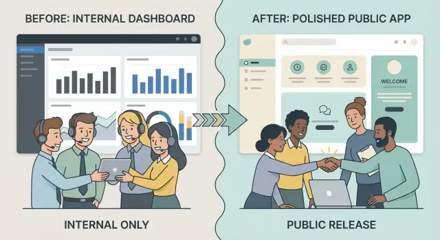
How to Create a Public Website for an Internal Tool
A practical guide to turn an internal tool into a public-facing website: structure, security, onboarding, docs, pricing, launch steps, and ongoing maintenance.
A practical guide to turn an internal tool into a public-facing website: structure, security, onboarding, docs, pricing, launch steps, and ongoing maintenance.
Turning an internal tool into a public website isn’t just “putting it on the internet.” The first step is deciding what you’re actually releasing, who it’s for, and what “good” looks like once outsiders can use it.
Be specific about why the tool is going public. Are you trying to reduce manual work for your team, create a new revenue stream, support partners, or make customers more self-sufficient? Each goal drives different decisions about onboarding, support, pricing, and how polished the experience must be.
Write success as measurable outcomes, such as:
“External users” is too vague. Identify who you’re building for—customers, partners, vendors, or the general public—and what they’re trying to accomplish.
A partner managing multiple client accounts needs different flows than a single end-customer who logs in once a week. Treat these as distinct journeys, not minor variations.
Internal tools rely on tribal knowledge. Public products must be clear, forgiving, and predictable. Expect to rethink:
Decide whether you need a marketing website (to explain and persuade), an app shell (to sign up and use the tool), or both. This choice affects scope immediately—and prevents you from building a full product experience when you only needed a credible front door.
If speed is the constraint, it can help to prototype the marketing pages and the authenticated app shell in parallel. Teams increasingly do this with vibe-coding platforms like Koder.ai, where you can describe the flows in chat (including onboarding, roles, and pricing pages), generate a React front end with a Go/PostgreSQL backend, and still export source code later if you need a traditional engineering handoff.
Before you design a marketing site or onboarding flow, get clear on what you’re actually shipping. Internal tools often “work” because everyone already knows the shortcuts, the context, and who to ask when something breaks. A public release removes that safety net.
List the tool’s current features and supporting pieces:
Write down every assumption the product makes about its users and environment, such as:
For each feature, decide:
This is also where you spot “internal convenience” features that shouldn’t become public promises.
Collect the most common questions internal users ask—password resets, permission issues, unclear error messages, missing data, confusing terminology. These are early signals of where public users will get stuck, and they directly inform your onboarding, documentation, and in-app guidance.
Internal tools often assume people already know the vocabulary, where everything lives, and what “good usage” looks like. A public site has to teach that context quickly, without overwhelming new visitors.
Keep the first version tight: Home, Features, Pricing (even if it’s “Request access” for now), Docs, and Contact. These pages answer the basics: what it is, who it’s for, how it works, what it costs, and where to get help.
Sketch the main path you want most users to take:
Visitor → signup → onboarding → first success → ongoing use → renewal/upgrade.
Each step needs a clear “next action.” For example, your Home page should drive to “Start free” or “Request a demo,” while Docs should drive to “Create your first project” (not a long reference index).
A simple rule: keep evaluation content public (use cases, feature overview, sample screenshots, security summary, pricing), and put execution content behind login (real data, workspace settings, billing portal).
If you publish docs, consider making “Getting Started” public and gating advanced admin configuration.
Limit top navigation to 5–7 items. Use one label per concept (“Docs,” not “Help Center / Guides / Reference” all at once). Put secondary items in the footer, and keep the same navigation across marketing pages so people don’t feel lost.
Internal tools often work because someone on the team can “show you where to click.” Public users won’t have that. Your goal is to make the product understandable, recoverable (when something goes wrong), and confidently usable without waiting for a human.
Replace internal jargon, team nicknames, and shorthand with labels that describe outcomes. A button like “Run ETL” becomes “Import data,” and a filter like “Region = NA” becomes “Region: North America.”
Add short help text where decisions are unfamiliar (“Choose a workspace to keep projects separate”). Use consistent terminology across navigation, headings, and actions so users don’t wonder if “Project,” “Job,” and “Run” are different things.
Design consistent empty states, errors, and loading messages. Empty states should answer: What is this area for? Why is it empty? What should I do next?
Error messages should be specific and actionable (“File type not supported. Upload .CSV or .XLSX.”), and loading states should set expectations (“Importing… usually takes 1–2 minutes”).
Add guided setup using checklists, lightweight tooltips, and “next step” prompts after key actions. The first successful outcome should be fast and obvious.
Check contrast, keyboard navigation, focus states, and readable typography. If people can’t navigate or read the UI, they can’t self-serve—no matter how good the features are.
Turning an internal tool into a public product usually fails first at “who can get in” and “what can they do.” Start by designing authentication and access control as product features, not just infrastructure.
Keep the default path simple (email + password), then add options based on your audience:
Be explicit about the entry point: “Create a workspace” vs “Join a workspace,” and make it obvious what happens after an invite is accepted.
Decide whether users belong to:
Multi-tenant adds a “current organization” switcher, org-level billing, and clearer data boundaries.
Define roles in plain language, then map them to actions:
Avoid “custom roles” early; it’s better to ship 3 clear roles than 12 confusing ones.
Include a minimal account area: profile (name, avatar), password reset, email preferences/notifications, active sessions/devices, and a safe way to change email. These reduce support tickets immediately.
Moving from “behind the firewall” to the open internet changes the risk profile overnight. The goal isn’t perfection—it’s making the most likely failures unlikely, and making the impact small if something does go wrong.
Start by listing your highest-impact scenarios and how they could happen:
For each, write down: what data or action is at stake, who could exploit it, and the simplest control that reduces risk (permissions, input limits, extra verification, safer defaults).
Public signups and APIs need guardrails from day one:
Keep logs useful for investigations, but avoid logging sensitive content (tokens, full payloads, secrets).
Write down what you store and why:
If you don’t need a piece of data, don’t collect it—less stored data reduces both risk and compliance overhead.
Even a small product should have a few public-facing signals:
Good documentation isn’t a “nice to have” once you go public—it’s the difference between a product that scales and one that gets buried in support requests. Aim for clarity over completeness: help people succeed quickly, then let them go deeper if they need to.
Write a short Quick Start that gets new users to a first result in minutes. Keep it focused on one common goal (for example: “Create your first workspace and invite a teammate”). Include:
Organize your docs so users don’t have to guess where information lives:
Reduce tickets by linking help from the screen the user is on. Examples:
Add a persistent footer (and/or help menu) with clear destinations such as /docs and /contact, plus a short line on typical response times and what information to include in a request.
If your internal tool is becoming a public product, pricing isn’t just a number—it’s a promise about who it’s for and what “success” looks like for a customer.
Start by deciding whether pricing is:
Public pricing reduces friction and support questions. Request-based can work when deals vary widely or onboarding is hands-on.
Good packaging aligns with what costs you money and what customers understand. Common limit types include users/seats, projects/workspaces, usage (events, runs, API calls), and storage.
Avoid arbitrary limits. If your main cost driver is compute, don’t gate by “number of projects” unless it maps to compute in a predictable way.
Customers should never discover limits by breaking something. Spell out:
Your /pricing page should have a single, clear call to action per plan (Start, Upgrade, Contact). Inside the product, include an Upgrade entry in billing settings, show current usage vs. limits, and confirm what changes immediately (access, invoices, proration) before the customer commits.
If you’re building on a platform with multiple tiers already (for example, Koder.ai offers free/pro/business/enterprise tiers), use that structure as a forcing function: decide which capabilities belong in each tier (SSO, custom domains, audit logs, higher limits) and reflect those choices consistently in-app and on the pricing page.
Internal tools usually “make sense” because everyone shares context: the same org chart, the same acronyms, the same pain points. A public website has to replace that missing context fast—without reading like a spec.
You don’t need a full rebrand to look credible. Create a lightweight kit you can apply across the marketing site and the app:
This keeps pages consistent, reduces design debates, and makes future additions feel like part of the same product.
Internal descriptions often sound like: “Manage queue states and apply routing rules.” Public copy should answer: “What does this help me accomplish?”
A useful structure is:
Replace insider language with the customer’s words. If you must keep a term (like “workflow” or “policy”), define it in plain English once.
Trust content is powerful, but only if it’s real. If you have genuine testimonials with permission, include a couple with name, role, and company.
If you don’t, use honest placeholders such as “Case study coming soon” and focus on verifiable signals:
Even a small product needs a few foundational pages so visitors can answer basic questions quickly:
Keep these pages readable and consistent with your tone. Clarity beats cleverness when someone is deciding whether to trust you.
If your tool worked internally, it probably spread through word-of-mouth and shared context. Once it’s public, you lose that “someone will show them” effect. Analytics and feedback help you see where new users get stuck and what actually drives adoption.
Set up event tracking for the small set of behaviors that indicate progress:
Keep names consistent and simple so reports stay readable. Also track drop-offs in key funnels (landing → signup → activation) so you can focus on the biggest leaks.
Analytics tells you what happened; feedback helps explain why. Add at least one low-friction channel:
Make sure every message captures enough context (page/screen, account ID, optional screenshot) without forcing users to write an essay.
Choose a few metrics you can act on, such as activation rate, time-to-first-value, weekly active teams, and support volume per active user. Then set a cadence—weekly early on, then biweekly or monthly—to review trends, decide one or two experiments, and follow up.
Collect only what you need to improve the product, and document it plainly. Avoid capturing sensitive content by default (like full text fields) and be intentional about user identifiers. If you’re tracking events, define what’s included, how long it’s retained, and who can access it—then keep that documentation up to date.
Internal tools often feel “fast enough” because usage is predictable and the team knows the workarounds. Once the site is public, expectations change: pages must load quickly, errors must be rare, and growth should not require emergency rewrites.
Start with the parts every new user hits: the marketing pages, sign-up, login, and the first screen after onboarding.
Add basic observability early. Error monitoring should capture stack traces, user context (without sensitive data), and release versions. Pair it with uptime checks and clear alerting rules so you know when sign-in, core flows, or key endpoints start failing.
Plan for spikes: use queueing and background jobs for slow tasks like exports, imports, email sending, and report generation. In the database, add indexes for frequent filters and lookups, and watch for “N+1” queries that get worse as data grows.
Create a rollback plan: versioned deployments, feature flags for risky changes, and a simple runbook for reverting. A safe release process (staging checks, canary rollouts, and post-release monitoring) turns launches into routine operations instead of high-stress events.
If you use a platform that supports snapshots and rollback (for example, Koder.ai), bake that into your release habit: snapshot before a risky change, validate the critical flows, and roll back quickly if onboarding or login breaks.
A public launch isn’t just “turn it on.” You’re moving from a controlled internal setup to a system that must protect real customer data, survive mistakes, and keep working during change.
Start by classifying what you already have:
If you migrate accounts, communicate what will stay the same (login email, data history) and what will change (new terms, new permissions, possible billing requirements). If you don’t migrate, provide an export path so teams don’t feel trapped.
Set up clear boundaries:
Avoid copying production data into dev or staging. If you need realistic datasets, anonymize them and remove sensitive fields.
Public sites often require cleaner URLs, marketing pages, and a new domain. Map old paths to new ones and implement 301 redirects to prevent broken bookmarks, internal docs, and browser-saved links. Also plan for:
Write a short internal migration note: new login flow, who gets admin rights, where to file support requests, and which features are now restricted. This reduces confusion the day you go live.
A public launch is less about a single moment and more about removing unknowns. Before you tell anyone, make sure a first-time visitor can understand the product, sign up, and get help without waiting on your team.
Confirm the basics are complete and easy to find:
Add visible routes for Support and Sales (or “Talk to us”). Next to each, state response times in plain language (for example: “Support replies within 1 business day”). This reduces frustration and prevents your inbox from turning into an untracked backlog.
Keep it lightweight and coordinated:
If you want an extra distribution lever, consider a small “share and earn” incentive. For example, Koder.ai runs an earn credits program for content and a referral flow via referral links—mechanisms like these can help early products drive adoption without needing a full sales motion on day one.
Create a small “What’s new” section with dated entries. It builds trust, answers “is this actively maintained?”, and gives you a steady stream of announcement material without inventing new marketing every time.
A public product isn’t “done” after launch. The difference between a tool people try once and a tool they rely on is what happens every week after release: support, fixes, and steady improvements.
Create a recurring cadence so work doesn’t pile up:
Keep the routine visible internally (a shared board or checklist) so anyone can see what’s being handled and what’s waiting.
Build support around repeatable answers: a clear intake form, a small set of categories (billing, login, data, feature request), and templated replies. Track “top issues” weekly so you fix the root causes, not just the tickets.
Treat feedback as data. Combine qualitative notes (support tickets, short interviews) with metrics (activation rate, retention, time-to-value). Review monthly and decide what to ship, what to pause, and what to remove.
A public changelog or updates page can build trust by showing momentum and transparency.
Make it easy for users to continue exploring with clear next steps: /blog, /docs, /pricing, /contact.
Start by defining measurable outcomes (activation in 30/90 days, time-to-value, retention, support tickets per active user). Then choose a specific audience and their jobs-to-do. Those two decisions determine what you ship first, how much polish you need, and whether you’re building a marketing site, an app shell, or both.
Create a concrete inventory:
Then tag each feature as must keep, must fix, or remove so you don’t accidentally ship internal convenience features as public promises.
Look for assumptions that only work inside the company:
Anything in this list becomes a public-product requirement: clearer UX, real permissions, automation, and documented processes.
Keep v1 simple and predictable. A common starter set is Home, Features, Pricing (or “Request access”), Docs, and Contact.
Limit top navigation to 5–7 items, use one label per concept (for example, “Docs”), and decide early what stays public (evaluation content) vs. what requires login (execution content and real data).
Translate the UI into plain language and make states predictable:
This reduces “I need someone to show me” dependency and lowers support load.
Treat access control as a product feature:
Also include account basics like password reset, session/device list, and a safe email-change flow to prevent avoidable tickets.
Begin with a simple threat model focused on your most likely, highest-impact risks:
Then implement day-one guardrails: least-privilege defaults, rate limits, audit logs, and careful logging that avoids secrets and sensitive payloads.
Write docs that optimize for fast success:
Make help easy to find with persistent links like /docs and /contact, and set expectations on response times.
Track a small set of events tied to progress:
Pair analytics with a low-friction feedback loop (in-app prompt after milestones, /contact form, triageable feature requests). Collect only what you need and avoid capturing sensitive content by default.
Plan for real-world change:
Before announcing, confirm the basics: core pages, legal pages, monitoring, backups, and clear support paths (with stated response times).