Sep 30, 2025·8 min
How to Create a Website for a Learning Product Landing Page
Learn how to create a website for a learning-focused product landing page: structure, copy, visuals, SEO, lead capture, and testing to improve sign-ups.
Learn how to create a website for a learning-focused product landing page: structure, copy, visuals, SEO, lead capture, and testing to improve sign-ups.
A learning product landing page works best when it has a single job: move the right learner toward a specific action. Before you write copy or pick a template, define what you’re offering, who it’s for, and what “success” means.
Start by naming the format and the next step you want visitors to take. “Join the cohort,” “start a free trial,” and “buy now” are different commitments—and your page should reflect that.
Decide on one primary action and treat everything else as secondary. If the main goal is purchase, don’t make newsletter signup equally prominent.
Be specific about who should say “this is for me.” Consider:
This clarity prevents vague messaging like “for anyone who wants to learn,” which usually converts poorly.
Describe the transformation in plain language: what will learners be able to do after they finish?
Good outcomes are measurable and practical:
Avoid promises that only describe content (“12 modules”) without the result.
Choose a few numbers that tell you whether the page is working. Common options include conversion rate (visitors who enroll), email signups (if you’re pre-launch or building a waitlist), and demo bookings (for higher-priced or B2B learning products).
Write these goals down now—you’ll use them later to decide what to test and what to keep.
Your page structure should follow the way a potential learner makes a decision: “Is this for me?” → “Can I trust it?” → “What exactly do I get?” → “Is it worth the price?” → “What if I have doubts?” → “Okay, where do I enroll?” When your page mirrors that sequence, visitors don’t have to hunt for answers.
Keep the site small and purposeful. For many learning products, a lightweight sitemap is enough:
A single-page layout works well when the offer is straightforward and the main objections can be handled in one scroll. A multi-page setup can be better when you have multiple audiences, several plans, compliance requirements, or deeper credibility to explain (team, methodology, outcomes, case studies).
A practical rule: if people need lots of reassurance before buying, give key topics their own focused pages—while still keeping the landing page as the primary path to enrollment.
Build your flow from awareness → proof → details → price → reassurance → call to action.
Navigation should support that flow, not compete with it. Use a minimal top navigation (or none), repeat the primary CTA at natural decision points, and avoid distracting links that send visitors off-track. If you include extra pages, make sure each one has a clear way back to the main enrollment action.
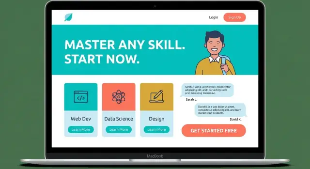
Your hero section has one job: help a visitor understand what they’ll get and what to do next—within a few seconds. Clarity beats cleverness here. A strong hero makes the rest of the page easier to read because people already know they’re in the right place.
Write a single sentence that describes the transformation or result, not the format or feature list.
If your learning product serves multiple audiences, pick the primary one for the headline. Trying to include everyone usually makes the message vague.
Use the subheadline to answer two questions: “Is this for me?” and “What am I signing up for?” Keep it concrete.
Example pattern:
“Built for new managers who want to lead 1:1s confidently. Includes short lessons, guided practice, and templates you can use immediately.”
This is also where you can set expectations (time commitment, level, prerequisites) without burying it deeper on the page.
Pick a single primary call to action that matches your funnel:
Place it above the fold, use a button label that describes the action, and keep surrounding text minimal so the choice feels easy.
A second option can help, but only if it supports the same decision.
Good secondary CTAs: “Watch preview” or “View curriculum.”
Avoid adding multiple competing actions (newsletter, social, blog) in the hero. If the hero is clear and focused, visitors will keep scrolling with confidence.
People don’t buy a “course.” They buy a change: less stress, more confidence, a clearer path, and measurable results. This section should make that change obvious in under a minute of skimming.
Use a short, scannable block (think 4–6 lines, each with a clear heading) that mirrors what your audience is already feeling. For example:
Keep each problem specific and concrete. Avoid vague labels like “level up your skills.”
A feature is what you built; a benefit is what the learner gets on Tuesday afternoon.
Spell out what “done” looks like with details:
If someone can’t explain what they get in one sentence after reading this section, tighten it.
A landing page for a learning product should make the content feel tangible. People don’t just buy “knowledge”—they buy a clear path from where they are now to what they can do next. Your curriculum section is where you remove ambiguity and help visitors picture themselves progressing.
Present modules in a logical sequence, with a one-sentence outcome for each step. Instead of listing topics (“Module 3: Marketing”), describe progress (“Module 3: Write a simple campaign plan you can reuse”). Keep module names short and scannable, and make the progression obvious: fundamentals → practice → application → final project.
If the course is flexible, say so—but still offer a recommended track so learners know where to start.
Add one or two “sample lessons” with real titles and a short summary, or include a downloadable syllabus. If you use a preview video, keep it focused: what learners will build, how the course works, and what a typical lesson looks like.
Avoid teaser content that doesn’t teach anything; a small, useful excerpt builds confidence.
People want to know what they’ll do, not just what they’ll watch. Briefly explain the methods you use, such as:
Spell out the commitment in plain terms: hours per week, suggested pace, and total duration. Then tie it to a result: what learners will build by the end (a portfolio piece, a plan, a working prototype, a certification-ready skill). The goal is for visitors to think, “I can fit this into my schedule—and I’ll have something to show for it.”
People rarely buy a learning product on copy alone. They want proof that real learners finished the course, applied it, and got measurable results. Your job is to make that proof easy to scan and hard to doubt.
Aim for testimonials that include context and a before/after outcome. A quote like “Loved it!” is pleasant but doesn’t reduce risk.
Good testimonials usually answer three things: who the learner was, what they struggled with, and what changed after the course.
Add a name, role, and (when appropriate) company or location. If you use initials for privacy, say why.
Show what “success” looks like with concrete examples: a project screenshot, a short writing sample, a portfolio piece, or a summarized before/after. Keep it permission-based and clear about what was provided by the learner versus edited for privacy.
A simple case study format works well:
List experience that connects directly to the promise of the course: relevant roles, years teaching, results you’ve helped learners achieve, and your teaching style (feedback-heavy, project-based, cohort-driven). Skip unrelated awards.
Use a few credibility signals—media mentions, community size, completion rates, partnerships—but only if you can back them up. Being specific (“12,400 learners since 2021”) builds more confidence than vague claims.
Pricing is where many visitors pause—not because they dislike your offer, but because they’re trying to reduce uncertainty. Your job is to make the decision feel clear, fair, and low-friction.
If you can, offer one clear plan. A single price works well for focused courses, cohorts, or workshops because it avoids “Which one is right for me?” fatigue.
If you need tiers, keep it to 2–3 options with plain names (for example: Essentials, Plus, Premium). Avoid confusing add-ons at checkout; they create second thoughts.
Under each plan, list the items that change someone’s outcome—not marketing fluff. Examples that reduce uncertainty:
Write inclusions in the same order across tiers so the differences are easy to compare.
If you offer a trial, guarantee, or refund, state the terms in one or two sentences near the price—before the visitor has to hunt for it.
Be precise and only promise what you can honor (for example: “7-day refund if you complete fewer than 20% of the material” or “Refunds available up to the day before the cohort starts”). Clear terms feel safer than vague “risk-free” claims.
A comparison table is useful when tiers are genuinely different. Keep it readable on mobile:
End the section with a single, direct call to action under each plan (for example: “Enroll now” or “Start the cohort”) so visitors don’t have to scroll to act.
Even strong landing pages lose signups when people feel uncertain. This section’s job is to reduce “mental checkout” moments by answering the questions buyers hesitate to ask.
Keep FAQs short, specific, and written in the same tone as the page. Focus on decision blockers, not trivia. Common themes:
If you offer multiple formats (videos, templates, live sessions), answer how each is delivered and how learners use it.
A clear fit statement builds confidence for the right people and reduces refunds for the wrong ones.
Who this is for should mention a goal, starting point, and motivation. Who this is not for should set boundaries kindly (for example: “Not ideal if you want a fully advanced certification track” or “Not a good match if you can’t commit at least 2 hours weekly”).
Make the first steps feel easy:
People enroll faster when they can picture the next 10 minutes.
Include lightweight help paths: a simple form, support email, or chat—plus a note on typical response time. Place it near the FAQ so learners can get clarity without leaving the page or feeling “sold to.”
A learning product landing page should feel calm, readable, and easy to scan. If visitors have to work to understand what they’re seeing, they’ll postpone the decision—and postponement usually means leaving.
Most visitors will arrive on a phone, so prioritize a single-column layout for the core sections (hero, outcomes, curriculum, pricing, FAQ). This keeps the reading flow predictable and prevents side-by-side elements from shrinking into tiny, hard-to-read blocks.
Keep your primary call-to-action visible without being pushy: a clear button in the hero, repeated after key sections, and (optionally) a simple sticky CTA bar on mobile.
Choose typography that looks good at small sizes and holds up on different screens. Aim for generous line spacing and short line lengths so paragraphs don’t feel like walls of text.
Accessibility basics that also improve conversions:
Instead of abstract illustrations, use real screenshots of lessons, the course platform, worksheets, or a short clip showing what learners will actually experience. Place visuals next to the exact promise they support (e.g., a module overview beside the curriculum summary).
Speed is part of design. Optimize images, use modern formats, and keep animations subtle. Heavy motion effects can make the page feel slower and can also reduce readability.
A simple rule: every visual element should either clarify the offer, reduce doubt, or guide the next step. If it does none of those, remove it.
SEO for a learning product landing page is about attracting the right intent—people already looking to learn this topic—without turning your page into a long article. The goal is simple: match search queries, stay clear, and keep the primary call-to-action obvious.
Start with fundamentals that don’t affect readability:
Prioritize phrases that signal readiness to learn, not casual browsing:
Use these naturally in the hero, one short benefits block, and the curriculum section. Avoid stuffing keywords into every paragraph; clarity converts better.
Structured data can help search engines understand your offer, but it must reflect real content:
If you include any supporting navigation, keep it minimal and non-distracting (for example, one “Pricing” destination or one educational article). The landing page should still feel like a single path: problem → solution → proof → price → enroll.
A learning product landing page is never “done.” People’s objections shift, traffic sources change, and small wording tweaks can meaningfully affect enrollments. The goal is simple: measure what matters, run focused experiments, and keep a steady weekly cadence.
Start with a few core signals instead of tracking everything:
If you can, segment these by device (mobile vs. desktop). A pricing section that works on desktop can feel cramped on mobile.
Set up clear conversion events: “email signup,” “start checkout,” “purchase,” and any micro-step like “download syllabus.” Then create a simple dashboard you can check in 10 minutes each week.
A practical weekly view:
Pick one hypothesis, one change, and run it long enough to avoid random noise.
Test ideas that often move the needle:
Numbers show what happened; feedback explains why:
Fold the top objections back into your copy—especially near the pricing and enrollment sections.
Once you have a clear landing page structure, the next bottleneck is often execution: creating the page, updating sections quickly, and shipping experiments without turning every copy change into a dev project.
If you want to move faster, a vibe-coding platform like Koder.ai can help you build and iterate on a learning product landing page through a chat interface—while still producing a real web app you can deploy, host, and evolve. This is especially useful when you’re running weekly conversion optimization: you can spin up variations, keep snapshots for rollback, and ship improvements without slowing down the testing cadence.
Keep the principle the same regardless of tooling: your page wins when it stays focused on one primary action, answers objections in the order people think, and makes the next step feel simple.
Start by choosing one primary action (e.g., “Enroll,” “Start free trial,” or “Join waitlist”). Write the page around that single commitment:
Define your target learner with role/situation, skill level, and constraints.
Examples of constraints worth stating directly on the page:
The more specific the “this is for me” moment, the higher the conversion tends to be.
A strong learning outcome describes a measurable transformation, not just what’s inside.
Good outcomes usually include:
If someone can’t repeat the promise in one sentence after skimming, the outcome is too vague.
Use a decision-flow structure that matches how people buy:
Choose single-page when the offer is straightforward and most objections can be answered in one scroll.
Choose multi-page when you have:
A practical rule: if buyers need lots of reassurance, give key topics focused pages—but keep the landing page as the main path to enrollment.
Aim for clarity in under a few seconds:
Avoid adding competing actions in the hero (newsletter, blog, multiple buttons).
Translate features into Tuesday-afternoon benefits.
Examples:
Write benefits in the learner’s language, tied to real problems they recognize.
Make the curriculum feel like a path, not a topic dump:
Use proof that reduces risk and is easy to verify:
Avoid vague praise like “Loved it!” unless it’s paired with a concrete outcome.
Make pricing feel clear, fair, and low-friction:
End with a direct CTA under each plan so people can act immediately.
This reduces “scroll hunting” and keeps momentum toward the CTA.
The goal is for visitors to picture themselves progressing successfully.