Dec 02, 2025·8 min
How to Build a Legal Information Website: Step-by-Step Guide
Learn how to plan, design, and launch a legal information resource website: structure, sourcing, disclaimers, search, accessibility, SEO, and maintenance.
Learn how to plan, design, and launch a legal information resource website: structure, sourcing, disclaimers, search, accessibility, SEO, and maintenance.
A legal information website works when it’s clear who it serves, what questions it answers, and where it stops. Before you write a single page, make a few foundational decisions that will guide every later choice—from navigation to editorial standards.
Start by picking your primary reader:
Write down the top 10–20 questions they ask in plain language. Those questions become your first content roadmap and your baseline for tone (simple explanations vs. deeper references).
Scope has three dimensions:
Be specific on every page about what the content covers (and what it doesn’t), especially when rules vary widely.
Choose a small set of metrics that match your purpose:
Define targets for the first 90 days so you can judge progress without guessing.
Put boundaries in writing early:
Link to a clear explanation in your /terms (and mirror key points in page-level notices) so users understand the site’s role: education and orientation, not representation.
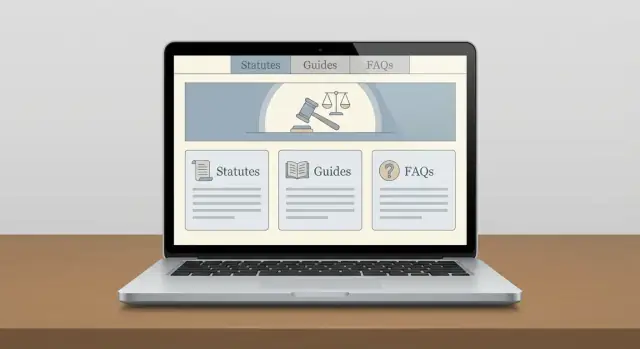
People should be able to quickly narrow down what issue they have and where it applies. Your information architecture (site structure) and taxonomy (the labels you use) should make that path obvious and consistent.
Build top-level categories around common life problems rather than legal theory. Typical starting points include family, employment, housing, immigration, consumer/debt, criminal, and small claims/courts. Keep the first level short (often 6–10 items) so navigation stays scannable.
If your audience is more specific (e.g., small business owners), create categories that match their tasks (e.g., “Hiring,” “Contracts,” “Taxes”) while still mapping back to legal areas internally.
Jurisdiction is not a “nice to have” for legal content. Decide early how you’ll represent it:
Use the same jurisdiction choices across navigation, on-page filters, and search facets so users don’t have to re-learn your system.
A clear URL structure helps both users and search engines understand context. Pick a pattern and stick to it.
Example:
/family/child-support/ (general)/us/ca/family/child-support/ (jurisdiction-specific)Avoid mixing multiple patterns for the same concept (like sometimes putting jurisdiction at the end).
Different questions need different formats. Plan a small set of content types such as guides/articles, step-by-step checklists, glossary terms, and downloadable forms (with clear context and limits). Each type should have a consistent layout and metadata (topic, jurisdiction, last reviewed date).
Tags get messy fast (“tenant rights” vs. “renters’ rights”). Draft an approved tag list, set simple rules (singular/plural, capitalization), and regularly merge duplicates. This keeps browsing and search filters useful as your library grows.
A legal information website is only as trustworthy as its inputs and editing rules. Before you publish, decide what counts as “authoritative,” how you cite it, and how you correct it when the law changes.
Start with primary and official sources wherever possible:
Use secondary sources (treatises, blogs, summaries) as context—not as proof—and make that distinction clear in your writing.
Create a simple, consistent citation style that non-lawyers can still follow.
At minimum, each page should:
If you quote or paraphrase, link directly to the relevant section or paragraph when you can.
Some pages age quickly (filing deadlines, fee amounts, form versions, procedural rules). Assign each content type a review cadence (e.g., monthly for deadlines, quarterly for agency guidance, annually for evergreen explainers) and track it in your content workflow.
Legal sources can conflict or be interpreted differently. Document an editorial policy for:
When uncertain, say so plainly and point readers to the underlying materials.
If you include editorial notes (plain-English explanations, “why this matters,” or examples), define who can write them and who approves them. Even a lightweight approval step—legal reviewer for accuracy, editor for clarity—prevents small mistakes from becoming site-wide misinformation.
A legal information website needs plain-language guardrails. Your goal is to help people learn—without implying you’re giving tailored legal advice or creating a professional relationship.
Use a short disclaimer near the top or bottom of pages that provide legal explanations:
Keep it readable (one short paragraph is often enough), and link to your full terms for details.
In your /terms, spell out the boundaries:
If you publish templates (letters, checklists), add a note that they may not be valid in every jurisdiction and may require customization.
Trust improves when readers can see how current the page is.
Include:
If a topic varies widely by location (family law, landlord–tenant, employment), place the jurisdiction note near the top so readers don’t miss it.
If you accept corrections, encourage helpful feedback while discouraging sensitive disclosures:
“Spotted an issue? Contact us with a link to the page and what seems incorrect. Please don’t include confidential facts or details about an active legal matter.”
Route those messages to a workflow that supports review and updates.
At minimum, link prominently (footer is fine) to:
These pages align expectations, reduce risk, and make your site feel credible—without overpromising certainty.
Good templates keep legal information consistent, scannable, and less intimidating—especially for readers who don’t know legal terminology.
Create a handful of repeatable structures and use them everywhere:
Each template should have a clear purpose so writers aren’t reinventing the page every time.
Write in short paragraphs, with clear headings that match what people search for (“How to…”, “What to do if…”, “How long does…”). Put the main answer early, then add detail. Define necessary legal terms once, and link to the glossary term page.
For guide pages, add two quick orientation blocks at the top:
Legal topics often hinge on choices and deadlines. Use step-by-step checklists and “If/then” decision points to reduce confusion, such as:
Keep steps action-focused and concrete (documents to gather, where to file, what to ask).
Examples help, but they must be unmistakably illustrative. Create a rule: whenever you show a sample timeline, letter, or scenario, label it as Example and add a short note like “This is a simplified example; your situation may differ.” Avoid implying guaranteed outcomes.
Once these templates are defined, store them in your editorial docs so every new page starts from a proven structure.
Good legal information is only useful if people can locate it quickly—and feel confident they’re in the right place. Because users often arrive stressed (a deadline, a notice, a letter from court), navigation should reduce decision-making and prevent dead ends.
Start with a topic structure that matches how people think (e.g., “Housing,” “Family,” “Money & Debt”), then narrow by jurisdiction and situation. For complex hierarchies, breadcrumb navigation is essential:
Home → Housing → Evictions → Notice periods
Breadcrumbs reassure users, make backtracking easy, and help them understand where an article fits within the wider site.
On-site search should be prominent and forgiving (typos, synonyms, plain-language queries). Add filters that map to how legal answers vary:
If your content includes forms, agencies, or court procedures, consider “content type” filters (Guide, Checklist, Form, FAQ).
Legal reading is rarely one-and-done. Add related content modules at the end and, where relevant, mid-article:
This keeps users moving and makes your site feel coherent rather than a pile of pages.
Create a glossary page and add inline definitions for legal terms (tooltips or short callouts). This helps non-lawyers stay oriented without opening five tabs. If you have a “Definitions” section, link it consistently (e.g., /glossary).
For long guides and checklists, provide a clean printable view (and printer-friendly formatting). People often need to bring a checklist to court, share it with family, or save it for later—printing should be a first-class option, not a broken browser feature.
Accessibility isn’t just a compliance checkbox—it directly affects whether people can find, read, and act on legal information under stress. Aim for an experience that works for screen readers, keyboards, mobile devices, and users who need larger text or higher contrast.
Use sufficient color contrast for body text and links, and don’t rely on color alone to signal meaning (for example, errors should include text and an icon). Make sure every interactive element is reachable by keyboard, with visible focus states so users can see where they are on the page.
Legal pages get long. Use a clear heading hierarchy (H1 → H2 → H3) so assistive technologies can skim. Keep paragraphs short and use descriptive link text—avoid “click here” and instead say what the link does (e.g., “Download the eviction notice checklist”).
For screen reader support, ensure form fields have labels, page regions are logical (header, main content, footer), and any icons or buttons have accessible names. If you include images such as charts, provide meaningful alt text; if the image is decorative, mark it as such.
If you collect information (newsletter signups, contact requests, intake-style questionnaires), keep fields minimal and plain-language. Provide specific, helpful error messages (“Enter a 5-digit ZIP code”) and avoid legal jargon in prompts.
Check pages on mobile, with text zoomed to 200%, and with keyboard-only navigation. Quick sanity checks with a screen reader (NVDA/VoiceOver) often reveal missing labels and confusing structure early—before those issues become expensive to fix.
People visit a legal information website when they’re worried, stressed, or dealing with personal details. That makes privacy and security part of your credibility—not just a technical checkbox.
Start by minimizing what you collect. If the site is informational, you often don’t need names, case details, or documents at all.
If you offer a “contact us” form, keep it simple (name/email/message) and avoid prompting for sensitive information (health status, immigration details, criminal history). If users might share sensitive details anyway, add a short note near the form: what you can and can’t help with, and what not to send.
All pages should load over HTTPS, especially any form pages. Add spam protection (rate limits, CAPTCHA, or honey-pot fields) and make consent language clear:
Legal publishers often underestimate what their tools collect by default. Document what you log (IP addresses, user agents, form submissions, email delivery logs) and keep retention short.
If you use analytics, offer privacy-friendly settings: disable unnecessary tracking features, avoid session recording, and don’t collect precise location. Your privacy policy should match your tooling—no copy/paste promises that aren’t true.
Create a straightforward cookie/analytics notice aligned with how your site actually behaves. If you don’t use marketing cookies, say so. If you do, give users a real choice and honor it.
Even small sites need a basic plan:
This doesn’t need to be long—but writing it down now saves time when it matters.
Picking the right tech stack is less about shiny features and more about supporting predictable publishing, reliable uptime, and content you can trust. For a legal information website, your CMS should make it easy to store structured facts—not just write pages.
Start with the basics: hosting, SSL, automated backups, and a staging environment (a private copy of the site for testing changes). Staging matters because legal content updates often involve many small edits, and you want a safe place to review formatting, links, and citations before anything goes live.
Look for a CMS that can model content with fields such as jurisdiction, court/agency, effective dates, last reviewed date, citations, and related topics. This structure helps you:
A traditional CMS can work if it supports custom fields and editorial workflows. A headless CMS can be a good fit if you plan multiple front ends (web, newsletter, app), but it adds development complexity.
If you want to move faster than a classic build cycle, a vibe-coding platform like Koder.ai can help you prototype and ship a content-driven legal resource with a chat-based workflow—then export the source code if you later migrate to a different stack. It’s especially useful for quickly standing up structured page templates (guides, FAQs, glossary entries), search/filter UI, and an editorial staging environment without reinventing everything from scratch.
Fast mobile loading is a trust signal. Implement caching at the CDN/host level and lightweight page templates. Even if your content is text-heavy, performance can degrade from large PDFs, unoptimized icons, and third-party scripts.
Set clear permissions: writers draft, legal reviewers approve, and only a small group can publish. Your CMS should support version history and easy comparisons between edits.
If you’re evaluating platforms, prioritize “safe publishing” features (approval steps, audit logs, and rollback). For example, Koder.ai includes snapshots and rollback to help you revert changes quickly if a release introduces a broken link, a formatting issue, or an incorrect jurisdiction label.
Document a simple deploy process: how changes move from staging to production, who approves releases, and how to roll back quickly if something breaks (for example, restoring a previous version or reverting a deployment). This keeps updates calm and controlled—even under time pressure.
SEO can help people find accurate legal information, but it shouldn’t push you into making claims your site can’t support. The goal is simple: match real user questions with clear, well-sourced answers, and be explicit about jurisdiction and limits.
Do keyword research around how people actually ask for help—especially question-style queries such as “how to…,” “what are my rights…,” and “deadline to…”. These tend to map cleanly to helpful guides and FAQs.
Also watch for “intent modifiers” that signal urgency or scope, like “notice,” “statute of limitations,” “small claims,” or “appeal.” If you can’t answer a query without heavy caveats, consider reframing it (e.g., “How the deadline is calculated” rather than “You have 30 days”).
Create SEO fundamentals on every guide:
Add schema where it fits—commonly FAQ or Article—without stuffing markup onto every page. Mark up only content that is visible and genuinely answers common questions.
Avoid thin pages. If you have multiple near-duplicates (e.g., “eviction notice,” “notice to quit,” “termination notice”), consolidate into one stronger guide with a sectioned structure.
Optimize for local/jurisdiction intent with clear location signals in titles, intros, and headings (e.g., “California” vs. “United States”). If a topic varies widely, add a jurisdiction selector or a clear “Applies to” note—and never imply attorney-client advice.
Legal information ages quickly. A clear maintenance process keeps your site credible, reduces user confusion, and helps you spot risky pages before they drift out of date.
Not every page needs the same attention. Create a simple review calendar based on how often the underlying law or procedure changes:
Maintain a lightweight “topic register” that assigns each content area an owner and a next-review date.
Even if you’re not a law firm, you should document who touches content and when. A practical workflow is:
draft → review → publish
If you have access to a qualified reviewer, make it draft → legal review (if applicable) → publish. The key is consistency: every page follows the same steps, and no “quick fixes” bypass review.
For sensitive updates (deadlines, eligibility rules, penalties), keep an internal edit history: what changed, why, and who approved it. On-page, add a visible “Last reviewed” date. When changes are substantial, include a short “What changed” note so returning users can trust the update.
Users will find outdated details faster than your team. Add a simple “Report an issue” link (for example, to /contact) and route submissions to your backlog. Treat reports as triage items: confirm the claim, update content, and record the fix.
Launching a legal information website isn’t just publishing pages—it’s confirming that users can safely find, trust, and act on what you provide. A short, structured pre-launch review reduces errors that can harm credibility (or create risk) on day one.
Start with a sweep focused on accuracy and user safety:
Pick 3–5 common scenarios and run them end-to-end. For example:
Have at least one person who didn’t build the site test these flows and note confusion points.
Set up analytics goals that reflect usefulness, such as:
Consider a soft launch to a limited audience (newsletter, partner orgs) and invite feedback with a simple form. If your content will change often, publish a public /updates page or change log so returning visitors can see what’s new and what’s been corrected.
Start by choosing one primary audience (general public, students, or professionals) and listing the top 10–20 questions they ask in plain language. Use that list to define your first content roadmap, reading level, and how much citation depth you need.
Make it explicit across three dimensions:
Add an “Applies to” note and scope statement on every page so readers don’t assume it’s universal.
Pick a few metrics that match your purpose and can be measured consistently, such as:
Set 90-day targets so you can evaluate progress without guessing.
Write boundaries down early and repeat them in visible places:
Link the short disclaimer to a fuller explanation in /terms, and avoid wording that implies representation or individualized guidance.
Use problem-based categories people recognize (e.g., Housing, Family, Employment) rather than doctrine-based labels. Keep top-level navigation to about 6–10 items, then narrow with subtopics and “Next steps” pathways so users don’t hit dead ends.
Decide one hierarchy and stick to it everywhere (navigation, filters, search facets), for example:
Use one naming convention (“New York” vs “NY”) and one label for non-local content (e.g., “Federal” or “General information”) so users don’t have to re-learn your system.
Choose one predictable pattern and apply it universally, such as:
/family/child-support/ (general)/us/ca/family/child-support/ (jurisdiction-specific)Avoid mixing patterns (like placing jurisdictions at the end sometimes), and keep URLs readable so users can infer context from the path.
Prefer primary and official sources:
Use secondary sources only for context, and cite/link to the underlying authority whenever possible.
At minimum, each page should include:
For fast-changing pages (deadlines, fees, forms), assign a review cadence and track next-review dates in your workflow.
Keep it short, visible, and consistent:
Link to /terms for details, and ensure contact forms discourage sensitive disclosures (e.g., “Please don’t include confidential facts or details about an active legal matter.”).