Mar 11, 2025·8 min
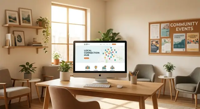
How to Create a Website for a Local Industry Resource Center
Learn how to plan, build, and launch a website for a local industry resource center, with clear steps for content, design, SEO, and ongoing updates.
Learn how to plan, build, and launch a website for a local industry resource center, with clear steps for content, design, SEO, and ongoing updates.
Before you pick a platform or write pages, get clear on what your local industry resource center website is for. A “resource center” can mean anything from a simple guide library to a community directory, events calendar, and training sign-ups. If you don’t define the mission of the site, it will quietly turn into a pile of PDFs and outdated announcements.
Write 3–5 concrete goals that describe real outcomes. Examples:
Keep goals action-oriented (“help people do X”), not feature-oriented (“have a directory”).
Most local resource hubs have a few repeat audiences:
For each audience, note their top 2–3 tasks. Those tasks will later become your navigation priorities.
Pick a small set of measurable signals tied to your goals:
Document your baseline (even if it’s “unknown”) so improvements are visible after launch.
Gather 5–10 similar sites you like. For each, write one thing to replicate (clear navigation, strong search, simple intake form) and one thing to avoid (buried resources, stale news, jargon-heavy writing). This becomes your shared reference point when decisions get subjective.
Before you pick a template or write a single page, get clear on what you do and how you sound. A local industry resource center succeeds when visitors instantly understand: “This is for people like me, and it will help me today.”
Your homepage headline should explain who you serve, what you provide, and the local angle—without buzzwords.
A simple fill‑in format:
“We help [local audience] [do the outcome] by providing [key resources], [directory/training], and [support], all focused on [your area].”
Example:
“We help small manufacturers in Metro County grow and hire by providing practical guides, a vetted supplier directory, and a calendar of local trainings.”
If you can’t say it in one sentence, your site navigation will likely be confusing too.
Most sites fail by asking people to do too many things at once. Choose three primary actions and make them obvious on the homepage (buttons, featured panels, and repeated calls to action).
Common “top three” actions for a resource center:
Everything else (newsletters, donations, volunteering, membership) can still exist—just don’t let it compete with your main goals.
Set a tone you can maintain across pages and authors:
Create a short “voice note” for contributors: 5–10 words that describe how you write (for example: clear, welcoming, no jargon, action‑oriented).
You don’t need a full rebrand, but you do need consistency:
These basics make your site feel trustworthy, even before visitors read a word.
A local industry resource center website works best when visitors can answer one question quickly: “Where do I click next?” Before you write pages or pick a theme, sketch a sitemap and a navigation menu that match how people actually use your site.
Keep your main menu small so it fits on mobile without turning into a maze. Most resource centers can cover everything with 6–8 top-level items and a few clear subpages.
A practical starter sitemap:
If you need one more, consider Get Involved (volunteer, sponsorship, membership) rather than adding multiple “misc” pages.
For each menu item, write a one-line promise that matches a real visitor goal. Example:
This prevents pages from becoming catch-alls and makes it easier to decide what doesn’t belong on a page.
If you’ll publish lots of resources or directory listings, plan a site-wide search early. Also add quick entry points—like “Browse by topic” or “Find help near me”—near the top of /resources and /directory so visitors aren’t forced to scroll and guess.
Finally, test your navigation labels with a few non-staff people. If they misinterpret “Initiatives” or “Programs,” rename it to what they expect.
A local industry resource center wins trust when people can quickly find the right document and understand whether it’s still current. That starts with a clear resource library plan and a simple content model (the consistent fields you capture for every item).
List the kinds of materials you intend to host or link to, then keep the set small and obvious. Common types include:
Resource types help visitors filter quickly, and they help your team maintain a steady publishing rhythm.
Categories should reflect how your community thinks (broad buckets), while tags capture specifics (narrow terms). For example, categories like “Workforce,” “Permits,” and “Safety” pair well with tags like “OSHA,” “apprenticeship,” “city ordinance,” or neighborhood names.
Tip: pull wording from real inputs—front-desk questions, email requests, and common search queries—rather than internal jargon.
Every resource should display the same essentials so people can decide in seconds whether to click. A strong default card includes:
Content stays useful only if someone owns it. Set a simple rule like: each category has a named owner, and every item gets reviewed every 6–12 months (or sooner for regulations and grants). Track a “next review date” in your CMS so outdated items are easy to spot and refresh.
A local directory is often the most-used part of a resource center website. Done well, it becomes the “who can help me?” tool for businesses, residents, and partners. Done poorly, it becomes a stale list no one trusts—so plan it like a product, not a page.
Start by choosing the types of listings you’ll support, such as members, suppliers, service providers, facilities, training partners, or “where to buy” locations. Keep the first version focused; it’s easier to expand categories later than to clean up a messy database.
At minimum, define the required fields you need for every listing so search and filtering work reliably:
Optional fields can add real value when they’re standardized: email, contact person, certifications, languages, accessibility notes, and a “last verified” date.
Filters should match real questions visitors ask. Common high-signal filters include:
Avoid creating dozens of rarely used tags. If you’re unsure, launch with fewer filters and review search terms and clicks after a month.
Every listing should have a visible “Suggest an update” action that’s fast to use. Keep the form short (what’s wrong + what’s the correct info) and allow screenshots or links.
Route suggestions to a shared inbox or CMS moderation queue, and display a “last updated” date on listings to build trust. Consider a simple policy: verify critical changes (address, phone, ownership) before publishing, and aim for a response within 3–5 business days.
An events calendar turns your resource center into a place people return to. It also gives partners a clear way to plug into your work—without email back-and-forth.
Start with a small set of event categories so visitors can scan quickly. Common options for a local industry resource center include workshops, meetups, job fairs, and webinars. Use consistent labels and colors (but don’t rely on color alone—add text tags too) so the calendar stays readable.
If you host training, consider separating Training from Networking or Hiring events. People often arrive with one intent, and clear categories reduce drop-off.
Make every event page answer the basic questions immediately:
Add a short “What you’ll learn” section for trainings. For job fairs or meetups, list what attendees should bring and what to expect.
Place the primary action high on the page: Register, RSVP, or Join webinar. If registration is handled elsewhere (Eventbrite, Google Form, your CRM), link out and keep the copy simple.
Also offer “Add to calendar” options. The most universal is an ICS download, which works with Apple Calendar, Outlook, and many others. If your platform supports it, include Google Calendar and Outlook buttons too.
Don’t delete old events. Create an archive so past workshops, webinars, and job fairs continue to build trust and search visibility. Archive pages can include slides, recordings, handouts, and a short recap—then point visitors to the next relevant upcoming event.
If you have recurring trainings, link from archived sessions to the next scheduled date (or a “Join the waitlist” form at /contact).
Picking your platform is less about “what’s trendy” and more about who will update the site every week. A local industry resource center usually needs fast publishing, reliable forms, and strong search visibility—without requiring a developer for every change.
Hosted website builders (Squarespace, Wix, Webflow hosting) are easiest to launch and maintain. They’re great if your pages are mostly informational and your team wants simple editing. Limits can show up when you need advanced directory filtering, custom member experiences, or complex integrations.
WordPress is a flexible middle ground: lots of themes and plugins, strong SEO control, and many agencies can support it. It requires more care (updates, security, plugin choices) but can scale well for resource libraries, directories, and events.
Headless CMS (Contentful, Strapi, Sanity) shines when you need custom experiences across web + other channels. It usually costs more up front because you’ll need a developer to build and maintain the front end.
If you want a more custom directory, workflows, and forms—without going through a long traditional development cycle—Koder.ai can be a practical option. It’s a vibe-coding platform where you describe the resource hub you need in chat (pages, searchable library, directory filters, event registration flows), and it generates a real application (commonly React on the front end, Go + PostgreSQL on the back end). You can deploy and host, connect a custom domain, take snapshots for rollback, and export the source code if you want to hand it off to a developer later.
Look for:
Set clear permissions: Editor (creates updates), Reviewer (checks accuracy and tone), Admin (publishes, manages settings). Even a simple “draft → review → publish” process prevents outdated listings and inconsistent messaging.
Plan costs for hosting, domain, templates/themes, key plugins (forms, security, SEO, backups), and ongoing maintenance (updates, fixes, small improvements). A realistic maintenance line item protects the site after launch—especially for directories and calendars that need frequent updates.
Most people will meet your local industry resource center on their phone—often while they’re on a job site, commuting, or trying to solve a problem quickly. A simple, mobile-first design makes the site feel helpful instead of hard work.
Use clear headings, short paragraphs, and generous spacing so visitors can skim. Aim for one primary idea per screen. If you have long explanations, break them into small sections with descriptive subheadings.
A good rule: if a page needs heavy zooming or side-to-side scrolling, it’s not ready.
Your homepage should answer “What can I do here?” within seconds. Give the main actions prominent buttons near the top:
Keep calls to action consistent in wording and style across the site so people learn what to tap.
Small choices make a big difference:
Whenever possible, use authentic photos from local events, training sessions, facilities, or member organizations. Real images build trust fast. Keep them optimized so pages load quickly on cellular connections.
Accessibility is part of usability: it helps people with disabilities, but it also makes the site clearer for everyone—busy staff, older devices, bright sunlight, or a shaky mobile connection.
You don’t need to memorize standards to make meaningful improvements. Build from a short checklist and apply it consistently across every page type (home, directory listing, event page, resource article).
Links should make sense out of context. Screen readers often list links on a page—if each one says “click here,” that list becomes useless.
Use descriptive link text (avoid “click here”), such as:
Also make buttons specific: “Submit application” beats “Submit.”
Local resource centers often rely on PDFs—forms, guides, compliance checklists. PDFs can be accessible, but many aren’t.
Provide accessible PDFs or HTML alternatives for key documents. If you must publish a PDF, ensure it has selectable text, correct reading order, headings, and form fields with labels. For high-use items (applications, “how to” guides), consider an HTML page plus a printable PDF.
Even well-built sites need a human backstop.
Add a clear contact method for accessibility support, such as an email address and phone number on /contact, and a short note like: “Need this information in a different format? Contact us and we’ll help.”
Small improvements, applied consistently, prevent frustration—and help your directory, events, and resources reach more of the community.
Local SEO is how people nearby find your resource center when they search for help, training, partners, or specific services. It’s much easier to build it in from the beginning than to bolt it on later.
Start by listing the exact places you serve (city, county, region, neighborhoods) and the words people actually use for your industry. Then align each major page with a clear purpose (directory, events, training, support, membership).
Create location pages where they truly help visitors—especially if your programs differ by area. If you serve a broad region, use service-area language on key pages (e.g., “Serving contractors across Clark County and the surrounding region”) without inventing separate pages that would feel repetitive.
Write titles and headings that reflect local intent and what the page provides. Aim for plain-English clarity over keyword stuffing.
Examples:
Keep one main topic per page, and use subheadings to organize content people scan.
NAP means Name, Address, Phone. Decide the official format once and use it consistently:
Consistency reduces confusion for visitors and improves trust signals for search engines.
If your platform supports it, include Organization (or LocalBusiness) schema with your:
Many CMS plugins can handle this without code. If you’re unsure, add it as a launch checklist item and confirm it’s present on your homepage and contact page.
When you plan new content (news, guides, member resources), include the location context when it’s relevant: local regulations, nearby training sites, and region-specific programs. This keeps pages genuinely useful—so local SEO follows naturally.
A local industry resource center website should get better over time. Analytics tells you what’s working, while feedback tells you what’s missing. Together, they help you prioritize updates without guessing.
Install GA4 (or a privacy-focused alternative) and decide which interactions count as success. For a resource hub, the most useful events are often straightforward:
If you’re using GA4, set these up as key events (conversions) so they show up clearly in reports. Keep naming consistent (e.g., directory_filter_used, resource_outbound_click) so month-to-month comparisons are easy.
People will find broken links, outdated hours, and missing resources before you do. Make it painless for them to tell you.
A lightweight approach:
Place it near the bottom of directory pages, resource articles, and event listings. Route submissions to an inbox that’s monitored, and add an auto-response that sets expectations (e.g., “We review submissions weekly”).
When you share links in newsletters, social posts, or partner emails, add UTM parameters so you can see what drives traffic and sign-ups. Create a simple naming rule, such as:
utm_source=newsletter / utm_medium=email / utm_campaign=monthly_updateutm_source=partner_name / utm_medium=referral / utm_campaign=resource_centerKeep reporting short and repeatable. A one-page monthly template can include:
This rhythm turns analytics into decisions: what to update, what to promote, and what to retire.
A local industry resource center site should feel “finished” on launch day—but it also needs a plan for staying accurate. Treat launch as the start of an ongoing publishing and upkeep routine.
Before you announce the site, confirm the basics work end-to-end:
Consistency beats volume. Pick a cadence your team can sustain:
Keep a simple backlog: topic, owner, due date, and which page(s) it supports.
Assign an owner and a backup person for routine checks:
Start with the partners who already serve your audience:
After launch, review analytics and feedback monthly so promotion aligns with what people actually use.
Start with 3–5 outcome-based goals (e.g., “help businesses find permits faster,” “increase training sign-ups”). Then define your primary audiences and their top tasks, and choose a few trackable success metrics like form submissions, event registrations, and directory listing clicks. This prevents the site from becoming an unmaintained document dump.
A simple pattern is:
Keep labels plain and test them with non-staff users to avoid confusing menu terms.
Use a one-sentence format like:
“We help [local audience] [achieve outcome] by providing [key resources/services], focused on [place].”
If you can’t say it clearly in one sentence, visitors won’t know where to click—and your navigation will likely become cluttered.
Choose three primary actions and make them obvious on the homepage (buttons and repeated calls to action). Common examples:
Everything else can exist, but it shouldn’t compete visually with the top three.
A practical “resource card” includes:
Standardizing these fields makes the library easier to search, trust, and maintain over time.
At minimum, require consistent fields for every listing:
Add a visible “Suggest an update” flow and show a last updated/verified date to build trust.
Start with fewer, high-signal filters based on real visitor questions:
Launch simple, then review analytics (search terms, filter usage) and refine instead of guessing upfront.
Each event page should answer immediately:
Also offer an (“Add to calendar”) and keep past events in an archive with slides/recordings when available.
Pick based on who will maintain the site weekly:
Non-negotiables include easy editing, forms with spam protection, SEO controls, backups, and user roles.
Track actions tied to your goals, such as:
Add a simple “Report an issue / Suggest a resource” form on key pages, and use a one-page monthly report to turn data into specific updates.