Dec 09, 2025·8 min
Create a Website for Online Courses: From Plan to Launch
Learn how to plan, build, and launch an online course website with the right structure, content hosting, payments, SEO, and student support.
Learn how to plan, build, and launch an online course website with the right structure, content hosting, payments, SEO, and student support.
Before you choose a platform or design a single page, get clear on why the site exists and who it serves. This step prevents a common trap: building an impressive online course website that attracts the wrong learners—or doesn’t support your business goals.
Write a simple learner profile: who they are, what they already know, and what’s blocking them. A beginner-friendly course site feels very different from one aimed at working professionals seeking a credential.
Ask:
Each course should have a clear “after” state. Aim for outcomes you can demonstrate, not vague promises.
Example: instead of “Understand SEO,” use “Create a keyword list and optimize three pages for search.” These outcomes later become your landing page bullets, lesson structure, and even testimonials.
Pick 2–4 metrics you’ll actually track. Common ones include enrollments, checkout conversion rate, completion rate, refund rate, and revenue. If the course supports a service business, leads booked and email sign-ups may matter more than completion.
Make two lists: must-have and nice-to-have. Must-haves typically include reliable video hosting for courses, a smooth course checkout and payments flow, and progress tracking (basic LMS website setup). Nice-to-haves might be community, certificates, or advanced quizzes.
This clarity makes every next decision faster—from course website design to whether you sell courses online via one-time payment or membership.
Before you touch any website settings, decide how students will experience your course. Your format affects scheduling, content production, community needs, and what your site must support.
Self-paced works best for skills people want on-demand. Students can start anytime, and your website should emphasize clear navigation and progress tracking.
Cohort-based is great for accountability and live feedback. You’ll need a calendar, session links, and a defined start/end date.
Blended combines self-paced lessons with periodic live workshops or office hours—often the best of both worlds if you can commit to recurring sessions.
Start with 3–6 outcomes (what students can do by the end), then build a simple hierarchy:
A useful rule: one lesson should answer one question. If it answers three, split it.
Your access model impacts pricing and support:
Mix formats to support different learners: short video demos, readable text summaries, downloads (templates, checklists), and occasional live sessions. Create a repeatable lesson pattern (e.g., video → steps → resource → assignment) so students always know what to expect.
Choosing your platform is less about “best software” and more about the trade-offs you can live with: speed vs. flexibility, simplicity vs. control, and monthly fees vs. long-term ownership.
All-in-one platforms bundle your website, course delivery, payments, and basic email automation.
They’re great if you want to launch quickly with minimal setup. You typically get built-in features like student accounts, progress tracking, certificates, coupons, and a hosted course library.
Watch for limits around branding and ownership: can you use a custom domain, fully control the checkout, export your student list, or move your course content easily if you switch later?
A website builder (for example, a general CMS or site builder) paired with best-in-class tools can give you more control over design, SEO, and content marketing.
This approach works well when your site is more than a “course store”—for instance, if you also publish a blog, offer services, or need stronger landing pages. The downside is more moving parts: you’ll connect video hosting, email, checkout, and sometimes membership tools.
Operationally, confirm you can manage admin roles, approve instructors, and update lessons without breaking pages.
A hybrid setup keeps your main website on a builder (for branding and marketing) while delivering courses through an LMS subdirectory or subdomain.
It’s often a strong path for growth: multiple courses, bundles, cohorts, team licenses, and multi-instructor workflows—without rebuilding your entire website. If you’re unsure, this option preserves flexibility while still giving learners a focused classroom experience.
For a deeper checkout discussion, see /blog/course-checkout-and-payments.
If your requirements go beyond typical LMS limits—custom onboarding flows, unusual pricing logic, a highly branded classroom, or deeper integrations—you may prefer to build your own online learning platform.
A vibe-coding platform like Koder.ai can be a practical middle ground: you describe the product in chat, iterate in planning mode, and generate a React web app with a Go backend and PostgreSQL. You can also use snapshots and rollback while testing changes, export source code for ownership, and deploy/host with custom domains—useful if you want more control than an off-the-shelf builder but don’t want a slow, legacy development pipeline.
A clear site structure helps visitors understand what you teach, trust you, and find the right course quickly. Before you design anything, map the pages you need and how they connect.
Most students arrive with a simple question: Is this course for me, and is it worth the price? Your navigation should mirror that decision.
Keep the top menu short and predictable:
If you have only one flagship course, you can replace Courses with a single Course link that goes to the course detail page.
Plan these pages first:
Create a small “footer cluster” of trust pages: FAQ, Refund Policy (if you offer one), Terms, and Privacy. Link them in the footer across the entire site so they’re always easy to find.
Draft a one-page sitemap and use it as your source of truth for both desktop and mobile menus. Consistency matters: labels and page order should match across devices so students don’t feel lost when switching from phone to laptop.
Good design isn’t about looking “fancy”—it’s about helping visitors quickly answer three questions: Is this for me? Can I trust it? What do I do next? When your course site feels clear and predictable, people spend less energy navigating and more energy deciding to enroll.
Pick a small set of brand choices and use them everywhere: 1–2 primary colors, 1 accent color, and 1–2 fonts. Keep spacing consistent (the same padding and margin patterns across pages) so the site feels cohesive.
Use imagery sparingly and with purpose—show your teaching style, real course materials, and outcomes. If you use icons or illustrations, stick to one style so pages don’t feel stitched together.
Your hero section should say who the course is for and what they’ll be able to do after it. Aim for clarity over cleverness.
On course cards, lead with outcomes and constraints people care about:
Use clear heading structure (H2/H3), readable contrast, and descriptive link text (“View syllabus” instead of “Click here”). Add alt text for meaningful images, and ensure forms, menus, and modals work with keyboard navigation.
Most visitors will check your site on a phone. Use single-column layouts, large tap targets, and short sections.
To keep pages fast: compress images, limit heavy animations, and avoid loading multiple video previews at once. Speed and clarity are trust signals—especially on course pages and checkout.
Before you build pages and funnels, make sure your lessons are actually producible at a consistent quality. Students forgive simple visuals; they rarely forgive muddy audio, missing downloads, or “where do I find this?” confusion.
You typically have three options for video and files:
Pick one “default” path early. Mixing hosting methods per lesson can create inconsistent load times and more support requests.
Create a small checklist that you can reuse for every module:
Module-02_Lesson-03_Intro-to-X.mp4 so uploading and updates are painless.This is less about perfection and more about reducing friction when you update the course later.
Downloads should support learning, not just pad the course. Common, high-value assets include PDFs, worksheets, code files, checklists, project briefs, and answer keys.
Keep file names student-friendly (e.g., Worksheet-Goal-Setting.pdf) and mirror your lesson titles so students can find the right asset quickly.
Captions and transcripts improve accessibility, comprehension, and search inside your course. They also help students who learn on mute or in noisy environments.
End each lesson with a consistent mini-summary, such as:
That simple structure makes your content feel guided and reduces drop-off between lessons.
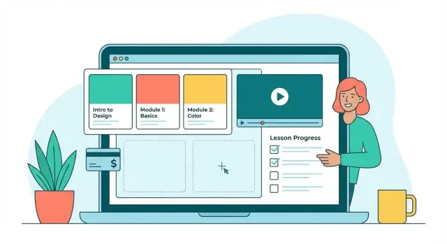
Your LMS settings determine whether your course feels smooth and self-serve—or confusing and support-heavy. Before you add extras, lock down three basics: who can access what, how learners move through lessons, and how you’ll manage updates.
Start with the simplest path from checkout to learning:
A good rule: a student should always know what they own and where to start.
Progress indicators reduce drop-off because students can “see” momentum.
Enable:
If your platform supports it, show a compact “Next lesson” button everywhere to keep learners moving.
Structure prevents overwhelm and protects your course flow:
Define who does what so the course stays current:
These details are often the difference between a course that scales and one that constantly needs manual fixes.
Pricing and checkout are where interest turns into revenue—so aim for clarity over cleverness. Your goal is to make it obvious what students get, what it costs, and how quickly they can start learning.
Start with the simplest model that fits your offer:
If you offer multiple tiers, list them clearly on /pricing and link to it from your sales pages.
A high-converting checkout is usually a boring one:
What you need depends on your region and where your customers live. At minimum, define:
If you’re unsure, set a default workflow and confirm requirements with an accountant before scaling ads.
Even good checkouts fail sometimes. Prevent churn and confusion by setting up:
Small details here can save hours of support and protect your revenue.
Your course pages should do two jobs at once: explain the offer clearly and remove friction so the right students feel confident enrolling. The goal isn’t hype—it’s clarity.
Create one “master” course sales page layout you can reuse. For each course, include:
If you need inspiration, build a single internal “page checklist” in your docs and link your team to it from your /courses page.
Not everyone is ready to buy today. Offer a low-effort next step:
Keep the form simple (usually just email) and make the benefit obvious.
Even a basic set of automated emails can improve conversions:
Prioritize proof that feels real: named quotes (with permission), short case studies, before/after examples, or portfolio outcomes. Avoid generic praise—specific wins build trust faster.
SEO is a steady way to attract the right learners—people already searching for help with the exact problem your course solves. Pair it with educational content marketing and your site can earn traffic long after launch.
Instead of chasing broad terms like “online course,” focus on phrases tied to outcomes and pain points:
Map these to the right page type: blog posts for questions, and course pages for purchase-intent terms (e.g., “Excel budgeting course”).
Every important page should clearly communicate what it’s about—both to people and search engines:
Also add “next step” links inside posts, such as “Ready to go deeper? See the full curriculum on /courses.”
Create a small set of cornerstone guides that match your course promise, then publish supporting articles that answer narrower questions. Each guide should naturally link to the relevant course landing page and to your FAQs (e.g., /pricing or /refund-policy).
If your platform allows it, enable:
Consistency beats volume. Start with 1 strong post per week or every two weeks, refresh top-performing posts quarterly, and update course pages whenever you change pricing, outcomes, or curriculum.
Launching your online course website isn’t the finish line—it’s the start of a feedback loop. A few clear metrics will tell you where learners get excited, where they hesitate, and what to improve first.
Start with basic website and checkout tracking so you can see your funnel end-to-end. Even simple analytics can answer: “Where do people drop off?” and “Which page actually drives enrollments?”
Track:
Revenue is important, but learning progress predicts retention, refunds, reviews, and referrals. If your platform supports it, review:
When you find a drop-off lesson, don’t immediately add more content. First, check whether the lesson needs a clearer intro, a shorter video, better examples, or a quick recap.
Make one change at a time and measure for a set period (for example, 1–2 weeks). Good starter tests include:
Use light-touch feedback so it’s easy to respond:
Treat patterns as priorities: if five people ask the same question, your course (or site) is silently asking it too.
A course website isn’t finished when you hit “publish.” Students judge the experience by how quickly they can get started, how easy it is to get help, and whether the platform stays reliable over time.
Create a single “Start Here” flow that appears immediately after purchase and inside the student dashboard. Include:
A short welcome email sequence (Day 0, Day 2, Day 7) can reinforce these steps and reduce refunds.
Pick channels you can consistently maintain:
Set expectations upfront: list response times (e.g., “within 24–48 hours on business days”), office hours, and community guidelines (respectful behavior, no spam, no sharing paid materials).
Before opening traffic, run a tight QA pass:
If you’re building a custom platform, snapshots/rollback (for example, in Koder.ai) can make these pre-launch changes safer: you can test quickly, then revert instantly if something breaks.
Plan recurring upkeep: update lessons quarterly, apply security patches, and do a light SEO refresh every 2–3 months (update titles, add FAQs, improve internal links). Treat analytics and support logs as your roadmap—what students ask most is what your site should explain next.
Start by defining your learners, the problem you solve, and 3–6 measurable outcomes. Then choose a delivery format (self-paced, cohort, blended), pick a platform approach (all-in-one, builder + integrations, or hybrid), and map a minimum set of core pages: Home, Courses, Course detail, About, Blog/Resources, Contact, plus Terms/Privacy/Refund.
Launch only after you’ve test-purchased your own course and verified emails, access, and mobile usability.
Choose self-paced if your promise is “learn on-demand” and you want evergreen sales with simple support.
Choose cohort-based if your promise relies on accountability, deadlines, and live feedback (you’ll need calendars, session links, and a defined start/end).
Choose blended if you can commit to recurring live sessions but still want scalable self-serve lessons.
Treat outcomes as the “after” state students can demonstrate. Use action-based language and make them specific.
These outcomes should directly shape your sales page bullets, module plan, and what testimonials will later mention.
Use one clear hierarchy:
A practical rule: if a lesson answers three questions, split it. Consistency matters—use the same lesson pattern (e.g., video → steps → resource → assignment) so students always know what to do next.
Start with a must-have list that supports a smooth path from payment to learning:
Add nice-to-haves only when they serve the outcomes (community, certificates, advanced quizzes) and you can support them long-term.
Pick the approach that fits your trade-offs:
If you expect to grow beyond one course, hybrid often reduces future rebuild risk.
Keep navigation aligned with the “decision path” (Is this for me? Is it worth it?). Minimum pages:
In the footer, always include trust pages: , , , . Link them site-wide so they’re easy to find at checkout time.
Aim for clarity and low friction:
Add confirmation emails with access instructions and a support link. If you sell subscriptions, enable retry logic for failed payments to reduce churn.
Pick one “default” hosting path to avoid inconsistent load times and support issues:
Set reusable production standards (5–12 minute lessons, consistent audio, consistent slide template, and predictable file naming) so updates don’t become a mess later.
Track both business and learning signals:
When you spot a drop-off lesson, fix clarity first (shorter video, better examples, clearer intro/recap) before adding more content. Run small tests (headline, layout, pricing display) one at a time for 1–2 weeks.