May 05, 2025·8 min
How to Create a Website for an Online Workshop Series
Step-by-step guide to plan, build, and launch a website for an online workshop series—registration, schedules, emails, payments, and promotion.
Clarify Your Workshop Series Before You Build
Before you touch a website builder, get clear on what you’re actually selling. A workshop series site is easier to write, design, and promote when the series has a sharp promise and a simple structure.
Define who it’s for—and the outcome
Start with a specific audience, not “anyone interested in…”. Write one sentence that names the attendee and the transformation.
Example: “For new managers who want to run confident 1:1s and improve team performance in 4 weeks.”
This outcome becomes the backbone of your homepage headline, session descriptions, and FAQs.
Clarify the format and structure
Decide how people will experience the series so your site can set expectations clearly:
- Live, on-demand, or hybrid: Live needs clear time zones and calendar reminders; on-demand needs access rules and replay dates.
- Single track vs. multiple tracks: One track is simpler to explain; multiple tracks require an easy way to compare sessions and choose.
Also confirm the practical details: session length, total number of sessions, Q&A time, and whether homework or templates are included.
Decide how you’ll measure success
Pick 2–3 success metrics so you know what to optimize on the website:
- Registrations (total sign-ups)
- Attendance rate (who actually shows up)
- Revenue (ticket sales)
- Email signups (waitlist or free resource downloads)
Your metrics will shape what you highlight: urgency, social proof, or lead capture.
List the must-have website actions
Write down the few actions your site must support from day one: Register, Join the waitlist, Contact, and Share. If an action isn’t on this list, consider postponing it until after launch.
Collect your core assets
Gather everything you’ll need to avoid stalling mid-build: series title, one-paragraph description, speaker bios and headshots, dates/times (with time zone), logos (yours and partners), and a small set of visuals that match your topic. With these in hand, the rest of the website becomes assembly, not guesswork.
Plan Your Pages and User Flow
A workshop website works best when it answers questions in the same order people ask them: “What is this?”, “Is it for me?”, “When is it?”, “What do I get?”, and “How do I join?” Planning your pages and the path between them saves you from last-minute rewrites and broken links.
Start with a simple site structure
For most workshop series, keep the navigation tight:
- Home (the main workshop series landing page)
- Workshops (list of sessions)
- Speakers
- Pricing
- FAQ
- Contact
If you’re short on time, you can combine Speakers and FAQ into the Home page, but keep Workshops and Pricing easy to find.
Decide: one site + session pages, or one long page?
A good default is one site for the whole series, plus individual session pages when:
- sessions have different audiences or outcomes
- you want to rank for specific topics (helpful for workshop site SEO)
- you’re running ads to a single session
If every session is tightly connected, a single “Series” page with an event schedule page section can be enough.
Map the user journey (first visit → confirmation)
Sketch the ideal flow:
- Visitor lands on your Home page
- Skims outcomes + social proof
- Checks schedule and speakers
- Clicks “Register” → workshop registration page
- Pays / confirms
- Receives confirmation email with next steps
At each step, make the next click obvious and reduce choices.
Outline content for each page
Before you design, draft the essentials:
- Headline (clear promise)
- Who it’s for (and who it’s not)
- Proof (testimonials, past attendee count, logos)
- Logistics (date/time, timezone, format, replay policy)
- Call to action (consistent button label)
Pre-launch readiness checklist
Before you publish, confirm:
- final copy is in place (no “TK” notes)
- images load fast and have alt text
- registration links work end-to-end
- confirmation email is correct (date, timezone, access link)
- FAQ covers refunds, replays, accessibility, and support contact
- every “Register” button goes to the right pricing/package
Pick the Right Platform and Tools
Your platform choice decides how quickly you can launch, how smooth registration feels, and how much maintenance you’ll do every time you add a new session.
Option 1: Website builder (fastest)
Tools like Squarespace, Wix, or Webflow are great when you want a polished workshop series landing page without managing plugins or hosting. You’ll usually get modern templates, mobile editing, and easy page building.
Good fit if you need: a marketing-focused online workshop website, simple pages, and quick updates.
Option 2: CMS (most flexible)
WordPress or similar CMS options work well if you expect to grow, publish lots of content, or need unusual features. The trade-off is setup time and ongoing maintenance (updates, plugins, occasional troubleshooting).
Good fit if you need: full control, advanced SEO, complex event schedule page layouts, or custom member/replay access.
Option 3: Hosted event platform (simplest registration)
Platforms like Eventbrite, Hopin, or Zoom Events can handle ticketing and confirmations out of the box. The downside: branding is more limited, and your “website” may feel like a profile page.
Good fit if your priority is to sell workshop tickets with minimal setup.
Option 4: Vibe-coding platform (fast custom site + app logic)
If you want something more tailored than a template—without committing to a full traditional dev cycle—a vibe-coding platform like Koder.ai can be a practical middle ground. You describe the pages, registration flow, and attendee hub in chat, and the platform generates a working web app (React + Go + PostgreSQL under the hood), with options for hosting, custom domains, and source code export.
Good fit if you need: a custom workshop registration page, an attendee hub with gated content, integrations, and a workflow you may iterate on often (with snapshots/rollback to keep changes safe).
Essentials to check before you commit
Make sure you can:
- Use a custom domain and on-brand templates
- Edit for mobile (most attendees register on phones)
- Add analytics (GA4 and/or a pixel) for tracking sign-ups
- Create a solid workshop registration page with forms + payments
- Send automated emails (confirmation, reminders, replay links) or integrate tools like Stripe + Mailchimp/ConvertKit
If multiple people manage speakers and sessions, confirm team access, roles, and approvals.
Finally, estimate ongoing effort: adding dates, updating speaker bios, publishing replay access, and handling support. The “best” platform is the one you’ll actually keep current.
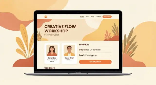
Design a Workshop Homepage That Converts
A workshop homepage has one job: help the right people quickly understand the value and take the next step. Keep it focused, scannable, and action-oriented.
Start with a clear hero section
At the top, answer four questions without making people scroll:
- Who it’s for (e.g., “For beginner podcasters who want consistent audio quality”)
- What they’ll learn (2–3 concrete outcomes)
- Next date + time zone clarity (include “Your time zone” wording or a converter link)
- One primary CTA: Register or Join the waitlist
Support the CTA with a short line that reduces hesitation, such as “Limited seats” or “Replay included.”
Add a simple “How it works” block
People register more confidently when the process feels predictable. Include:
- Series schedule (number of sessions, session length, cadence)
- Time zones (state the default zone and how you’ll handle conversions)
- Platform (Zoom, Meet, etc.) and any requirements
Keep this section visual and compact—think 3–5 steps, not paragraphs.
Use trust builders where they matter
Place credibility near your CTA and pricing teasers:
- Instructor background (1–2 lines + a link to a full bio)
- Testimonials or outcomes (even 2–3 short quotes help if you have them)
- Partner logos or “featured in” mentions (only if true)
If you don’t have testimonials yet, swap in proof like “500+ attendees taught” or a short clip from a past session.
Keep navigation minimal and the CTA visible
Avoid sending visitors on a tour of your site. Limit the top nav to essentials (Schedule, Speakers, FAQ) and keep a sticky CTA (“Register” / “Join waitlist”). If you need extra details, link them from the FAQ or a short “Learn more” anchor.
Make sharing effortless
Add social share images (Open Graph), a short, memorable URL, and a tiny “Invite a friend” line near the CTA. You can also include a quick share link to /register so people can forward it instantly.
Build Session Pages, Schedule, and Speaker Profiles
Once your homepage convinces someone to join, your session pages do the “decision support.” They answer: Is this session right for me, and can I attend live?
Start with a series overview (the “map”)
Create a single overview page that explains the series theme, difficulty levels, and the recommended path (for example: “Start with Session 1 if you’re new,” “Sessions 3–4 are best for advanced attendees”). This helps people buy with confidence—especially when they’re considering a full pass.
If your series has multiple tracks, make them scannable with short labels (Beginner / Intermediate / Advanced) and consistent naming.
Build a consistent template for every session page
Each session should follow the same structure so visitors don’t have to “re-learn” your site.
Include:
- Topic + one-sentence outcome (what they’ll be able to do afterward)
- Learning goals (2–5 clear bullets)
- Agenda (high level, with timestamps if helpful)
- Duration and format (live, hands-on, lecture + Q&A)
- Prerequisites (required tools, recommended experience, pre-reading)
Add a clear call-to-action near the top and again after the details: “Register” or “Get the Series Pass.”
Make scheduling effortless (especially across time zones)
Show date/time in at least two time zones (commonly local + UTC), or add a time-zone converter link (for example: “Convert to my time zone”). If you offer replays, say so right next to the time.
Use visible status labels on every card and session page:
- Open
- Sold out
- Waitlist
- Replay available
Speaker profiles that build trust
Add instructor/speaker bios with headshots and (optional) social links. Keep bios specific: credibility, what they teach in this session, and a quick “why it matters.” If you have multiple speakers, link each name to a profile section so visitors can learn more without leaving the page.
Set Up Pricing, Packages, and What Attendees Get
Launch a custom registration flow
Create a tailored registration and confirmation experience without a traditional dev cycle.
Pricing is easiest to say “yes” to when it’s simple, comparable, and clearly tied to outcomes. Before you design the page, decide what you’re selling—then make the options obvious.
Choose a clear offer structure
Pick one primary model and only add extras if they truly help:
- Single ticket (best when each session stands alone)
- Bundle / series pass (best when the sessions build on each other)
- Subscription / membership (best for ongoing monthly workshops)
- Free registration (best for lead generation, with an upsell later)
Spell out what’s included (without guessing)
Under each option, list exactly what attendees get, using plain language:
- Live access (date/time + time zone)
- Replay access (how long it stays available)
- Materials (slides, worksheets, templates)
- Q&A / hot seats (how it works, any limits)
- Certificate (only if you actually provide one)
If something is not included (for example, 1:1 feedback), say so briefly to prevent confusion.
Use pricing blocks that compare and guide
Create 2–3 pricing cards side by side with a short label like “Most popular” on the option you want most people to choose. Keep differences scannable: access length, bonuses, and support.
Your calls to action should match the offer:
- “Reserve my spot” (single session)
- “Get the series pass” (bundle)
Handle payment questions upfront
Add a small FAQ right below pricing:
- Refunds (link to /refund-policy only if you have a defined policy)
- Invoices/receipts (who to contact, expected timing)
- Taxes/VAT (a simple note like “Taxes may apply at checkout”)
The goal: fewer hesitations at checkout and fewer support emails later.
Create Registration and Confirmation That Feel Smooth
Registration is where interested visitors turn into attendees. If it feels slow or confusing, people will postpone—or abandon. Aim for a flow that takes less than a minute, works on mobile, and answers the “what happens next?” question immediately.
Keep the form short (and the friction low)
Ask only what you’ll actually use. For most workshop series, that’s:
- Name
- Ticket type
- Company (optional)
Everything else can be collected later (or not at all). If you need special info (accessibility needs, dietary restrictions for hybrid events), make it optional and clearly labeled.
Make the confirmation page do real work
Don’t stop at “Thanks for registering.” Your thank-you page should reduce support requests and increase attendance by providing:
- A clear “You’re in” message with the series dates and time zone
- Add-to-calendar links (Google, Apple, Outlook)
- The next action: “Check your inbox for joining instructions” or “Create your attendee login”
- A simple link back to the schedule (for example, /schedule)
Automate emails people actually need
Set up a small sequence:
- Immediate confirmation email (receipt + what to expect)
- Reminder(s) (e.g., 24 hours and 1 hour before)
- “How to join” instructions (link, password if needed, troubleshooting tips)
Keep subject lines direct, and include the session time zone in every reminder.
If you take payments, test end-to-end
Run a full purchase on both mobile and desktop: choose a ticket, pay, receive the email, and verify the thank-you page. Check that refund and contact details are easy to find.
Plan an attendee help path
Put support in obvious places: a contact form, a support email, or clearly stated live chat hours. Add a short “Need help?” section on the registration and confirmation pages so attendees don’t have to hunt.
Deliver Access, Links, Materials, and Replays
Plan first, build second
Use Planning Mode to outline pages, content blocks, and data before you generate.
A great workshop site doesn’t stop at checkout. Attendees should know exactly where to go, what to click, and what to do next—without digging through old emails.
Choose a delivery setup that fits your format
You have three common options:
- A meeting link per session (simple): each session page shows its own Zoom/Meet link.
- A portal-style “Attendee Hub” page (cleanest): one page contains the schedule plus all session links and downloads.
- Email-only delivery (lightweight): session links and materials are sent before each workshop.
If your series has multiple sessions, a hub page usually reduces support questions because attendees always have one reliable place to check.
Protect access when you need to
If sessions are paid or limited, make access intentional:
- Password-protected hub page for small groups.
- Unique links (in confirmation emails) if you want simpler gating.
- Account login if you plan to run many cohorts and want a long-term member area.
Match the security to the risk. Overcomplicating access can increase no-shows.
Build a single “Attendee Hub” that answers everything
On your hub page, include:
- Session list with dates, times, and Join buttons
- Calendar downloads (ICS) and time zone notes
- Slides, worksheets, and resource links
- How to get help (email + response window)
- FAQs: refunds, replays, certificates, tech checklist
You can link to it from your confirmation page and emails (for example, “Save this page” and “Bookmark it”).
Don’t skip accessibility basics
Even a simple setup can be more welcoming:
- Provide guidance on captions (auto-captions enablement, or how to request support)
- Use readable font sizes and strong contrast on buttons and links
- Avoid “click here” links—use descriptive labels like “Join Session 2”
Plan replays carefully
Only promise replays if you can support them. Decide ahead of time:
- Where replays are hosted
- When they’re posted (e.g., within 48 hours)
- Expiry dates (7/30/90 days) and what happens after
Clear expectations reduce refunds and last-minute emails.
Grow Your Email List and Automate Follow-Ups
Your workshop site shouldn’t only collect registrations—it should keep building a list you can invite to the next session. A simple email system can turn “maybe later” visitors into paid attendees over time.
Add a signup that feels worth it
Place a short email signup on your homepage and landing pages (top, mid, and footer). Keep the copy specific: “Get new dates + early-bird pricing” works better than “Subscribe.” If you have a /schedule page, add a small form there too so people browsing dates can opt in without committing.
Offer a small lead magnet (and connect it to the workshop)
Create a quick download that matches your topic: a checklist, a template, or a 5–10 minute preview lesson. Deliver it automatically after signup, and include a single call-to-action to view the next workshop date or the full series page.
Segment your list from day one
Even basic segmentation improves results. Tag subscribers by intent and activity:
- Interested (signed up for updates)
- Registered (paid or free ticket)
- Attended (showed up live)
- Replay viewers (clicked replay link)
This lets you send different follow-ups—replay reminders to viewers, next-level offers to attendees, and a gentle invite to those who haven’t registered yet.
Add a waitlist for sold-out sessions
If a session hits capacity, don’t show a dead end. Offer a waitlist form and automate notifications when a seat opens or a new date is added. This keeps demand warm and reduces support emails.
Write a simple nurture sequence
Keep it short and focused: value email → invitation → last call. One helpful tip builds trust, one clear invitation drives action, and a deadline-based reminder captures procrastinators.
SEO and Analytics for Workshop Websites
A workshop site doesn’t need complex SEO to perform well—just clear intent, clean structure, and a way to measure what’s working. Focus on helping people (and search engines) understand exactly what your series is, who it’s for, and how to register.
Keep it simple: one primary keyword per page
Assign one main phrase to each core page so you don’t compete with yourself. For example:
- Series homepage: online workshop website (or your series name)
- Topic landing page: workshop series landing page + the topic (“Prompt Engineering Workshop Series”)
- Instructor page: instructor name + “workshop”
Use the primary keyword in the H1, first paragraph, and naturally in a couple of headings. Avoid repeating every keyword everywhere—clarity beats volume.
Write titles and meta descriptions that sell the click
Your page title is often what people see in search results. Make it specific:
- Title: “Live Online Workshop Series: [Topic] (Dates + Level)”
- Meta description: Mention outcome, audience, and a concrete detail (start date, number of sessions, replays).
Do this for your main pages: series home, schedule, pricing, and registration page.
Add an FAQ that matches real questions
A strong FAQ helps rankings and reduces support emails. Include questions people actually ask, such as:
- “What time zone are sessions in?”
- “Is this beginner-friendly?”
- “What tools do I need?”
- “Will I get replays and slides?”
If you already answer these via email, those are your best FAQ candidates.
Speed and image basics (especially on mobile)
Large images slow signups. Compress files, use modern formats when possible, and add descriptive alt text (e.g., “Instructor Jane Doe teaching the UX research workshop”). Fast pages help both SEO and conversions.
Set up analytics events you can act on
Don’t track everything—track what changes decisions:
- Completed registrations (thank-you page view or purchase event)
- Email signups (form submission)
- Button clicks (Register, View schedule, Pricing)
Review weekly: which page drives the most registrations, where people drop off, and which traffic sources bring buyers—not just visitors.
Promote the Series and Keep Registrations Coming
Keep full control with export
Export source code when you want to own and extend your app outside the platform.
Your website is the hub, but registrations usually happen after multiple “touches.” Build a simple promotion system you can run every week, not a one-time blast.
Build a promo plan (and repeat it)
Use a mix of channels so you’re not dependent on any single algorithm:
- Email: announce the series, then send weekly reminders and “last chance” notes before each session.
- Social: reuse the same core message in different formats (short post, carousel, story, pinned post).
- Partners: newsletters, community posts, co-hosts, sponsors.
- Communities: relevant Slack/Discord groups, LinkedIn groups, forums (follow rules; lead with value).
- Paid ads (optional): only after you’ve confirmed your landing page converts and your tracking works.
If you offer multiple packages, make the call-to-action match the intent: “Join Session 1” vs. “Get the full series.” Point both to the right spot (often your /pricing page).
Add social proof as it arrives
Social proof is most powerful when it’s fresh. As registrations and sessions start, update the workshop series landing page with:
- short attendee quotes (name + role if allowed)
- screenshots of feedback or chat highlights (get permission)
- partner logos or “featured in” mentions
Keep it skimmable: one proof block near the top, a larger set lower on the page.
Use a session-based content calendar
Tie your content to each session topic so every post feels specific:
- 2–3 short tips per session topic
- 1 teaser clip or quote from the instructor
- a “what you’ll be able to do” post 48 hours before
Each piece should link back to the same page (your workshop series landing page) so you don’t split attention.
Make promotion easy for partners
Create a small partner kit: copy snippets, images, and tracking links (UTM-coded). Put it on a simple page and share it after a quick intro email. If someone wants to co-market but needs help, invite them to /contact for a fast approval loop.
Launch Checklist and Ongoing Improvements
Launching your online workshop website is less about hitting “publish” and more about proving the whole experience works end to end. A simple pre-launch checklist prevents most support emails and last-minute panic.
Do an end-to-end test (like a real attendee)
Run a full test from the first click to the moment you “enter” the workshop. Use a private browser window and, if possible, a second device.
- Registration → confirmation page → confirmation email
- Reminder email(s) → join link → successful access
- Payment flow (if paid) → receipt/invoice → correct access level
If you have multiple ticket types, test each one. It’s common for one package to accidentally point to the wrong confirmation message or calendar invite.
Proofread the details people screenshot
Attendees rarely read everything—so they rely on key details being obvious and consistent across your homepage, registration page, and emails.
Focus on:
- Dates and time zones (use one standard format everywhere)
- Pricing (including what’s included and any taxes/fees)
- Button labels (make them specific: “Register for Session 2” beats “Submit”)
Mobile, accessibility, and speed checks
Most people discover a workshop series on their phone, even if they attend on desktop.
Quick checks:
- Mobile layout: no overlapping sections, readable font sizes, tappable buttons
- Accessibility basics: clear headings, good contrast, descriptive link text
- Page speed: compress large images and remove unnecessary embed widgets
Make updates safe and predictable
Workshop series sites change—new sessions, speaker swaps, updated links. Decide who can publish updates and how quickly.
A lightweight process helps: edit → preview → publish, plus a visible “Last updated” note on the schedule page when changes are significant.
(If you’re iterating quickly, tools with snapshot/rollback—like Koder.ai—can reduce the risk of breaking registration flows when you ship last-minute updates.)
Post-event workflow (so the series keeps selling)
Plan what happens right after each session:
- Send a feedback survey (keep it short)
- Email replay access and materials
- Invite attendees to the next session or next offer
If you want, turn this checklist into a repeatable internal doc and link it from your team workspace next to your /blog or announcements page.
FAQ
What should I clarify before I start building my workshop series website?
Start by writing one sentence that names:
- the specific audience
- the transformation (measurable outcome)
- the timeframe
Use that sentence as your homepage headline, your session intros, and the first draft of your FAQ. If you can’t state the outcome clearly, the website will feel vague no matter how well it’s designed.
What pages does a workshop series website need?
A simple, effective default navigation is:
- Home
- Workshops (schedule/session list)
- Speakers
- Pricing
- FAQ
- Contact
If you’re short on time, combine Speakers + FAQ into the Home page, but keep Workshops and Pricing easy to find from the top navigation and multiple CTAs.
Should I build one long landing page or separate pages for each session?
Use one long page when your sessions are tightly connected and sold as a single series.
Add individual session pages when:
- sessions target different audiences or outcomes
- you want SEO traffic for specific topics
- you’re running ads to one session
A common approach is a series homepage plus session pages that share one consistent template.
What’s the ideal user flow from first visit to registration?
Make the “happy path” obvious:
- Home page (promise + who it’s for)
- Schedule/workshops overview (dates, format, speakers)
- Pricing (clear options)
- Registration → payment/confirmation
- Confirmation email with next steps
At each step, reduce choices and repeat one primary CTA (Register / Join the waitlist).
What should my workshop homepage include to improve conversions?
Include four things above the fold:
- Who it’s for
- 2–3 concrete outcomes
- Next date + time zone clarity
- One primary CTA
Then add a short “How it works” block (3–5 steps) and put trust builders (testimonials, attendee count, instructor credibility) near the CTA and pricing section.
How do I handle time zones and scheduling on the site?
Set expectations clearly:
- state the default time zone (and keep the format consistent everywhere)
- show at least two time zones (often local + UTC) or provide a “Convert to my time zone” link
- place replay info right next to the time (“Replay included” / “No replay”)
This reduces support requests and prevents no-shows caused by confusion.
What information should every session page contain?
A reliable session page template includes:
- topic + one-sentence outcome
- 2–5 learning goals
- a high-level agenda (timestamps if helpful)
- duration and format (hands-on, lecture + Q&A)
- prerequisites and required tools
Add a CTA near the top and again after the details (Register / Get the series pass).
How should I structure pricing and packages for a workshop series?
Keep pricing simple with 2–3 clearly comparable options, such as:
- single ticket
- series pass (bundle)
- subscription/membership (if ongoing)
Under each option, list what’s included (live access, replay length, materials, Q&A, certificate if applicable) and note what’s not included when it commonly causes confusion (e.g., 1:1 feedback).
How can I make registration and confirmation feel smooth (and reduce drop-offs)?
Optimize for speed and clarity:
- ask only for what you’ll use (usually name, email, ticket type)
- make the thank-you page useful: dates/time zone, add-to-calendar links, next steps, link back to /schedule
- automate essential emails: confirmation, reminders, and “how to join” instructions
Always run an end-to-end test on both mobile and desktop before launch.
What SEO and analytics should I set up for a workshop website?
Track only what you’ll act on:
- completed registrations (thank-you page view or purchase event)
- email signups
- key button clicks (Register, View schedule, Pricing)
For SEO, assign one primary keyword per page, write specific titles/meta descriptions, and make pages fast on mobile (compressed images, clean layout). Review performance weekly to find drop-offs and traffic sources that convert.