Sep 12, 2025·8 min
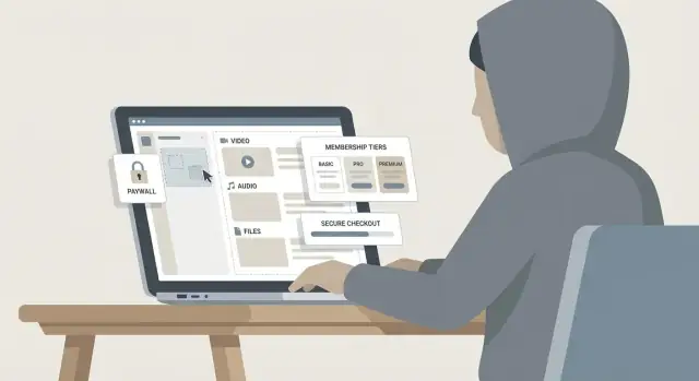
Create a Website for a Creator’s Paid Content Library
Learn how to plan, build, and launch a creator website with a paid content library—memberships, payments, content organization, and a smooth member experience.
Clarify Your Offer and the Business Model
Before you think about platforms or paywalls, get specific about what you’re selling and why someone should pay for it. A paid content library works best when the value is obvious in one sentence: what members get, how often, and the transformation or outcome they can expect.
Define what “content” means for your library
Start by choosing your core formats (and keep the first version focused). Your library can include:
- Video (tutorials, behind-the-scenes, workshops)
- Audio (private podcast, guided sessions)
- Newsletters (member-only essays, breakdowns)
- Downloads (templates, presets, swipe files)
- Courses (structured learning paths)
- Livestream replays (Q&A, critiques, coaching)
A useful rule: pick one “anchor” format (the main reason to join) and one “support” format (improves retention).
Choose a business model that matches your audience
You have a few proven options:
- Subscription: recurring monthly/annual access to everything (best for ongoing updates).
- One-time purchase: sell a single product or mini-library (great for clear, finite outcomes).
- Tiered membership: different access levels (good when you have both casual fans and power users).
- Bundles: package content around a theme (ideal for seasonal promotions).
If you’re unsure, start with one clear subscription plus an annual plan, then expand once you see buying behavior.
Decide how you’ll measure success
Write down the numbers that tell you if the library is working:
- Conversion rate (visitor → member)
- Churn (cancellations per month)
- Average revenue per member
- Refund rate
These metrics will guide pricing, onboarding, and what content to prioritize.
List your constraints (so the plan is realistic)
Be honest about your launch constraints: time to launch, budget, team size, and comfort with tech. Constraints aren’t limitations—they’re design inputs. A smaller scope shipped in 2–3 weeks beats a perfect library that never launches.
Know Your Audience and What They Will Pay For
A paid library only works when it solves a specific problem for a specific kind of member. Before you build tiers or upload content, get clear on who you’re serving and what “value” means to them.
Create 2–4 simple audience personas
You don’t need a 40-page research doc—just enough detail to guide decisions.
- Casual Fan: Loves your work, wants behind-the-scenes posts and early access, but doesn’t want homework.
- Power Learner: Wants structured lessons, templates, and measurable progress. Pays for clarity and speed.
- Working Pro: Has money but little time. Pays for shortcuts, curated collections, and answers to specific problems.
- Community Seeker: Pays to belong—Q&As, feedback, and interaction matter more than volume of content.
Write down what each persona is trying to achieve, what they’re afraid of wasting (money, time, effort), and what format they prefer (video, audio, PDFs, live sessions).
Define the “first win” in the first 10 minutes
New members should feel the purchase was worth it almost immediately. Pick one fast, high-impact outcome, like:
- A Start Here path that recommends the exact first 3 items
- A downloadable checklist/template they can use today
- A “best of” collection that saves them from browsing
Design your homepage and onboarding to deliver that win without searching.
Map the objections you must answer
Most hesitations fall into four buckets:
- Price: “Is this worth it?” Show tangible outcomes, not just content counts.
- Value: “Will this help me?” Use examples, previews, and clear learning paths.
- Trust: “Will you keep publishing? Is checkout safe?” Include creator credibility, update cadence, and frictionless checkout.
- Time: “Will I actually use it?” Offer short modules, curated tracks, and progress markers.
Decide what stays free vs. behind the paywall
Use free content to prove quality and attract the right people; reserve paid content for transformation and depth.
- Free: samples, selected articles/videos, a limited newsletter, and a public “Start Here” explainer
- Paid: full courses, complete archives, templates, office hours, community, and advanced collections
A good rule: free content answers “What is this?” while paid content answers “How do I do it, step by step?”
Plan the Site Structure and User Journey
A paid content library succeeds when visitors instantly understand what you offer, how to get it, and what to do next. Before you design pages or upload content, map a simple site structure and a clear “happy path” that takes someone from curious visitor to active member.
Start with a simple, predictable structure
Keep your navigation boring (in a good way). Most creator membership sites can start with five core pages plus account access:
- Home: who it’s for, what’s inside, social proof, and a clear CTA to view pricing
- Library: a preview of the content organization (and a few unlocked samples)
- Pricing: tiers, what’s included, and what to expect after joining
- About: credibility, your story, and why your approach works
- FAQ: practical questions (billing, cancellations, access, device support)
- Account: sign in, manage subscription, update payment details
If you need more pages later (affiliates, student discounts, gifting), add them after the basics are performing.
Plan the “happy path” from visit to first win
Your best user journey minimizes decisions and delays:
Visit → learn → pricing → checkout → onboarding → first content
Design each step intentionally:
- On Home, make the value obvious within seconds and link to Pricing.
- On Pricing, answer “Is this for me?” and “What do I get today?” with examples.
- After checkout, don’t drop members into an empty dashboard. Send them to an onboarding page that asks one small question (e.g., skill level or goal) and points to a recommended starting collection.
The goal is a fast first win: finishing the first lesson, downloading a template, or saving a playlist.
Create a content taxonomy that stays usable as you grow
A messy library kills retention. Plan your taxonomy before you publish 100 items.
Use a mix of:
- Categories (broad buckets like Writing, Editing, Publishing)
- Series (multi-part sequences)
- Levels (Beginner/Intermediate/Advanced, if relevant)
- Tags (specific topics, tools, outcomes)
- Search filters (format, duration, topic, level)
Tip: keep tags limited and consistent. If you can’t explain a tag in one sentence, it’s probably too vague.
Decide how content will be displayed
Pick display patterns that match how members learn:
- Grid for browsing (good for mixed formats)
- Playlists/collections for themed bundles (great for binge learning)
- Learning paths for step-by-step progress (best for beginners)
Even if you offer all three, choose one default view on the Library page and make the others easy to find. Consistency beats cleverness when people are paying to access your content.
Choose the Right Platform and Tech Stack
Your platform choice affects everything that follows: how quickly you can launch, how much you’ll pay monthly, and how much work it takes to keep the site running.
Three common paths
1) All‑in‑one creator platforms (Patreon-style, hosted membership tools)
You get hosting, accounts, payments, and gated content in one place. This is the fastest way to start, but you’ll usually accept platform rules, fewer design options, and limited control over SEO and data.
2) WordPress + plugins
This is the “own your site” option. You can mix tools for memberships, email capture, and analytics, and you can move hosts later. The tradeoff is you (or a helper) must manage updates, backups, and plugin compatibility.
3) Custom build (a developer-built app)
Best for unique experiences (community features, advanced search, specialized media workflows). It’s also the most expensive and slower to launch—and you’ll need ongoing development support.
If you want the flexibility of a custom build without starting from scratch, a vibe-coding platform like Koder.ai can help you prototype and ship membership experiences faster through a chat-driven workflow, while still allowing source code export when you outgrow the first version.
Checklist: what your stack must handle
Before picking, confirm you can do the basics cleanly:
- Memberships and gated pages/posts (paywall setup, role-based access)
- Secure file delivery (PDFs, templates) and video hosting integrations
- Email capture + automation (welcome sequence, renewal reminders)
- Analytics (traffic, conversions, churn) and simple reporting
- Customer support flow (contact form, help desk, refunds)
Watch for hidden costs
The “monthly price” is rarely the full price. Budget for:
- Transaction fees (platform fees + payment processor fees)
- Video hosting costs (often separate from your website)
- Email marketing pricing as your list grows
- Add-ons for search, community, affiliate tracking, or backups
Choose what you can maintain
A creator membership site is a long-term product. If you don’t want to think about security patches, choose a managed option. If you want full control and SEO flexibility, WordPress can be a great fit—just plan for updates, backups, and periodic maintenance.
Design Membership Tiers and Pricing
Your tiers and pricing should answer two questions instantly: “What do I get?” and “Is this worth it for me?” The easiest way to do that is to name tiers by outcome (what members can do) rather than by vague labels.
Define tiers in plain language (with examples)
A simple three-tier setup works for most creator membership sites:
- Starter: “Watch/read everything in the library.” Example: full access to past tutorials and essays, but no downloads.
- Pro: “Get the library + templates.” Example: includes project files, printable worksheets, or presets.
- Studio / VIP: “Get everything + direct access.” Example: monthly group Q&A, private community, or feedback sessions.
Write each tier like a shopping receipt: 3–6 clear inclusions, no jargon, and one sentence on who it’s for.
Choose pricing cadence and offers
Most creators offer monthly for low friction and annual for commitment. Annual plans typically work best with a clear incentive (for example, “2 months free” or a flat 15–20% discount).
Trials can help, but keep them simple:
- Free trial: good if you’re confident in retention and your onboarding is strong.
- $1–$5 intro week: reduces “freebie” signups while still lowering the barrier.
Discounts should be time-boxed (launch week, seasonal) and rare, so members don’t learn to wait.
Set boundaries (access rules that protect your time)
Boundaries prevent confusion and support your pricing:
- Content access: full library vs. “new releases only,” or drip access (e.g., weekly unlocks).
- Download limits: unlimited downloads for Pro/VIP, streaming-only for Starter.
- Community access: read-only vs. posting vs. live events.
- Support level: no DMs, office hours only, or feedback tokens per month.
Pricing page outline (and where to link it)
Build a dedicated pricing page at /pricing, and link it from your header, homepage, and any “Join” buttons.
A clean /pricing structure:
- Headline + one-sentence promise
- Tier cards (price, cadence toggle monthly/annual, top 3 inclusions)
- Feature comparison table (short)
- “Who this is for” examples per tier
- FAQ (cancellations, refunds, downloads, community rules)
- Final CTA + trust signals (testimonials, member count, security note)
Set Up Payments, Taxes, and Checkout
Design the First 10 Minutes
Sketch the member journey, then generate the pages that deliver a first win in minutes.
A paid content library fails or succeeds at the checkout. Your goal is simple: let the right people pay in the way they expect, with clear pricing, and as little friction as possible.
Payment methods your audience expects
Start with credit/debit cards—then add the “normal” options for your audience and region. If you sell to the EU or UK, consider local bank methods and popular wallets. If your audience is heavily mobile, make sure Apple Pay/Google Pay are enabled.
Also decide whether you’ll support one-time purchases, recurring subscriptions, or both. Subscriptions need clean upgrade/downgrade flows and a clear renewal date.
Taxes/VAT: decide what you show at checkout
Taxes can be surprisingly confusing for customers if handled late. Choose early whether your prices are shown:
- Tax inclusive (common in many countries)
- Tax exclusive (often used in B2B contexts)
If you sell internationally, clarify whether your payment provider will calculate and collect VAT/sales tax automatically, or whether you’ll manage it. Whatever you choose, show the final total before the customer clicks “Pay,” and label taxes clearly.
Receipts, invoices, and failed payments
Set up automatic receipts by default. If you expect business buyers, support invoice details (company name, VAT ID) and ensure the invoice/receipt includes what they need.
Plan for failed payments (“dunning”): friendly emails, an in-account banner, and a simple “Update payment method” link. Use calm wording that explains what happens to access if payment isn’t fixed.
Refund handling (and where it’s written)
Document your refund policy and link it from checkout and account pages. Keep it easy to find, for example on /faq, and align it with what your payment provider can actually do (full vs. prorated refunds, time windows, renewals).
Build and Organize the Content Library
Your library isn’t just a folder of uploads—it’s the product. A clear structure helps members find value fast, and it helps you publish consistently without rethinking the basics every time.
Create repeatable content templates
Pick a few content “types” you’ll publish (e.g., lessons, workshops, deep dives, downloads) and create a template for each. This keeps quality consistent and makes browsing easier.
A simple template for most items:
- Title (specific, benefit-led)
- Summary (2–3 sentences: who it’s for + what they’ll get)
- Duration (or estimated time to complete)
- Level (beginner / intermediate / advanced)
- Key takeaways (3–5 bullets)
- Resources (links, files, transcript, worksheet)
Decide hosting and an upload workflow
Different formats often work best in different places:
- Video: host on a reliable video platform and embed on your site (better streaming, fewer support issues).
- Audio: use a podcast-style host if you want private feeds, or upload audio files to your platform if it supports it.
- Files (PDFs, templates): store in your membership platform or a secure file storage tool with controlled access.
Define one “publishing checklist” you follow every time (upload → add metadata → add resources → place in the right category → preview as a member).
Add lightweight progress features
Progress tools reduce drop-off because members can quickly resume.
Consider:
- Watched/complete status
- Bookmarks or “save for later”
- A prominent “Continue where you left off” link
Plan cadence and a launch backlog
A library can feel empty even with great content if there’s not enough variety. Before launch, aim for a small but complete set: a clear “start here” path, a few quick wins, and at least one deeper flagship piece.
Then set a realistic cadence (weekly, biweekly, monthly) and keep a backlog of drafts so you’re not creating under pressure.
Implement Access Control and Content Protection
Validate Tiers Fast
Turn your tier ideas into a working pricing and signup flow you can test end to end.
Access control is the difference between a “content website” and a paid library. Your goal is simple: make it easy for paying members to get in, and hard for non-members to access anything beyond previews.
Choose how gating works
Most creator membership sites use a mix of these patterns:
- Members-only pages: entire articles/videos/tools are restricted until login.
- Locked previews: show the intro, a sample clip, or a few lessons, then prompt to join.
- Drip schedules: release content over time (e.g., weekly modules) so members don’t download everything on day one.
A practical approach is “preview + paywall” for marketing pages and “members-only” for the library index.
Set account and session rules
Clear account rules reduce support requests and abuse:
- Seat limits: decide whether one subscription equals one user (typical) or allows multiple seats (higher tiers).
- Password reset: keep it fast and secure; require email verification and rate-limit repeated attempts.
- Session handling: limit simultaneous logins if your platform supports it, and auto-expire long-idle sessions.
Also create a simple “Account” area where members can update email, manage billing, and see purchase history.
Add basic protection (deterrence, not perfection)
Content protection is about raising friction:
- Signed URLs or secure streaming for video/audio when available (avoids simple link sharing).
- Watermarking (visible or subtle) on downloads or videos to discourage re-uploads.
- Download controls: allow downloads only when it’s part of the value, and restrict where possible.
Be transparent about limits
No tool can fully prevent sharing. Say this internally, plan for it, and focus on delivering ongoing value (new drops, community, support). A great member experience beats a “locked-down” one every time.
Create a Great Member Experience
A paid library isn’t only about locking content—it’s about helping members quickly feel they made the right choice. The best experiences reduce friction in the first 5 minutes, make the library easy to explore, and handle “uh-oh” moments with calm, helpful guidance.
Build a friendly welcome flow
Right after purchase, don’t drop people into a random page.
- Confirmation page: Thank them, confirm what they purchased, and show one clear next step: “Go to your Start Here collection.”
- Welcome email: Send a short email with login link, support contact, and the same Start Here path. Keep it readable on mobile.
- “Start here” collection: Curate 5–10 items that deliver a quick win (your best beginner resource, a short roadmap, and one “next step” piece).
This reduces decision fatigue and support requests.
Make navigation effortless
Members should always know where they are and how to find what they want.
Include persistent, simple options like:
- A prominent Library link in the main menu
- Search (even basic keyword search is valuable)
- Filters (topic, format, level, newest)
- Saved items / bookmarks so members can return later without hunting
If you offer multiple formats (videos, templates, posts), label them clearly and let members filter by format.
Add support touchpoints (before people get stuck)
Support should feel visible but not intrusive.
- A small help widget or “Contact support” link in the footer
- A focused FAQ (login, billing, downloads, access rules)
- A clear Contact page with expected response time and where to go for billing issues (e.g., /contact)
Write microcopy for key states
Tiny messages shape trust. Draft these in advance:
- Locked content: “This is included in the Pro plan. Upgrade to access instantly.”
- Expired card / payment failed: “Your payment didn’t go through. Update your card to keep access—your library progress is saved.”
- Canceled plan: “Your access ends on [date]. Rejoin anytime—your saved items will still be here.”
Market the Library: SEO, Email, and Launch Assets
Marketing a paid library is less about “going viral” and more about building a repeatable path from discovery to trust to purchase. Start by choosing a few acquisition channels you can sustain consistently, then design simple assets that move people into your funnel.
Define your acquisition channels
Pick 2–3 primary channels and commit to a cadence:
- Social for short, frequent proof-of-work (clips, carousels, threads).
- YouTube for searchable, evergreen demos and deeper teaching.
- Newsletter for direct reach and conversion over time.
- Podcast if you’re strong on voice and can repurpose episodes into posts.
- Affiliates/partners if your niche has complementary creators or tools.
Match content to intent: quick tips for awareness, mini-tutorials for consideration, and “here’s what’s inside” walkthroughs for decision.
Plan lead capture (before you sell)
Don’t send first-time visitors straight to checkout. Offer a clear “taste” that earns an email:
- A free sample lesson or preview folder
- Email signup for updates and new drops
- A waitlist for an upcoming cohort or library expansion
- A downloadable resource (template, checklist, prompt pack)
Your goal: a clean opt-in page, a short welcome sequence, and a consistent link to /pricing when readers are ready.
Add SEO basics that compound
Keep SEO simple and consistent:
- Use descriptive URLs (e.g., /library/short-form-scripts)
- Write clear page titles and headings that match what people search
- Add internal links to /pricing and relevant posts on /blog
Publish a handful of evergreen articles answering specific questions your audience asks, and link each one to the most relevant paid collection.
Collect proof ethically
Social proof works best when it’s specific and honest. Use testimonials, case studies, or results with clear context: who it’s for, what they did, and what changed. Avoid screenshots without permission, and don’t imply typical outcomes if they aren’t typical.
Track Performance and Improve Over Time
Make It Feel Like Yours
Put your membership experience on your own custom domain when you are ready to go public.
Your paid library won’t “set and forget.” The fastest way to grow revenue (without burning out) is to measure what’s working, then make small, deliberate improvements.
Set up analytics that match your business
Track a few signals end-to-end—from first visit to renewal—so you can see where members drop off.
Key metrics to instrument:
- Traffic sources: which channels bring visitors who actually subscribe (not just browse).
- Checkout funnel: landing → pricing → checkout → payment success (watch for step-by-step drop-offs).
- Trial-to-paid conversion: if you offer trials, measure conversion by cohort and by source.
- Churn and retention: cancellations, failed payments, and average member lifetime.
- Content engagement: which posts/videos drive repeat visits, saves, completions, or comments.
Tip: set up events for “Viewed pricing,” “Started checkout,” “Payment succeeded,” “Watched 50%,” etc. Keep names consistent so reports stay readable.
A weekly dashboard checklist (keep it simple)
Review the same list every week:
- Subscribers gained vs. lost (and net revenue change)
- Conversion rate from pricing page to successful payment
- Top 5 content items by engagement (and which drive upgrades)
- Churn reasons: cancellations + failed payments
- Support tickets and recurring questions
If you only have time for one action: pick one bottleneck (e.g., pricing page conversion) and fix that first.
Run A/B tests carefully
Test one change at a time and define success before you start. Good candidates:
- Pricing page layout (short vs. detailed)
- Tier names (benefit-led vs. generic)
- Call-to-action text (e.g., “Start learning” vs. “Join now”)
Stop tests early only if the result is obvious; otherwise you’ll “optimize” for noise.
Build feedback loops into the site
Use quick, low-friction feedback:
- A 1–2 question member survey after week one
- Cancellation form: ask for the primary reason and what would have kept them
- A content request box inside the library (ideas you can actually ship)
Over time, these inputs will tell you what to create next—and what to remove or simplify.
Handle Legal, Accessibility, and Launch Readiness
Before you invite paying members in, make sure your site is legally covered, usable for as many people as possible, and technically ready for launch-day traffic. These steps aren’t glamorous, but they prevent avoidable refunds, support tickets, and trust issues.
Essential legal pages (keep them easy to find)
At a minimum, publish these pages and link them in your footer and checkout flow:
- Terms of Service: explain what members get, what they can’t do (sharing logins, reuploading content), and how you handle account termination.
- Privacy Policy: what data you collect (email, billing info via your payment processor, analytics), why you collect it, and how users can request deletion.
- Cookie notice (as needed): if you use tracking/marketing cookies, add a clear notice and preference controls where required.
- FAQ: your “support deflector” for billing, access, cancellations, download limits, and troubleshooting.
If you offer subscriptions, add plain-language notes on renewal timing, how to cancel, and whether you offer refunds (and in what situations). Clarity here reduces disputes.
Accessibility basics that help everyone
You don’t need to be an expert to make meaningful improvements:
- Check color contrast (especially button text and links).
- Use proper heading structure (one H1 per page, then H2/H3 in order) so content is scannable.
- Ensure keyboard navigation works for menus, modals, and the checkout fields.
- Add captions for video (or at least accurate transcripts for core lessons).
These changes also improve SEO and overall member experience.
Cross-device testing (especially the money path)
Test your site on at least one iPhone and one Android device (or emulators), plus a desktop browser. Focus on the critical journey:
- Sign up → email verification (if used) → account creation
- Mobile checkout (Apple Pay/Google Pay if you offer them)
- Logging in/out, password reset
- Content playback/streaming and downloads (if allowed)
Do a real end-to-end purchase with a low-priced test product/tier so you see the exact emails and receipts members receive.
A practical launch checklist
Before you announce, confirm:
- Backups are running (site + database + content metadata).
- Any old URLs have redirects to the new library structure.
- A visible support email (and a short “How to get help” page) exists.
- Your announcement plan is ready: email sequence, social posts, and a simple “what you get” landing page.
If you’re building a custom experience, this is also a good moment to confirm you can roll back safely after changes (snapshots and rollback are essential). Tools like Koder.ai bake in a faster iteration loop—plan, generate, test, snapshot, and revert—so you can ship improvements to your membership flow without turning every change into a risky launch.
Launch becomes much less stressful when legal, accessibility, and testing are handled upfront—and your first members get a smooth, trustworthy experience.
FAQ
What should I decide first before building a paid content library website?
Start by picking one anchor format (the main reason to join) and one support format (what keeps people subscribed).
Example combos:
- Anchor: video workshops; Support: templates/downloads
- Anchor: course paths; Support: member-only newsletter
Keep version 1 narrow so you can ship in 2–3 weeks and improve from real usage.
Which business model is best: subscription, one-time purchase, tiers, or bundles?
A simple starting point is:
- Monthly subscription for low friction
- Annual plan with a clear incentive (often ~15–20% off)
Choose one primary model first, then expand into tiers or bundles once you see how people buy and what content they use.
How do I make new members feel value immediately after they join?
Design a single “first win” that a new member can get in under 10 minutes, such as:
- A Start Here path that links the exact first 3 items
- One ready-to-use template/checklist
- A curated best-of collection
Then put that win on the post-checkout page and in the welcome email so members don’t have to browse.
What site structure should a creator membership website start with?
Keep navigation predictable with a small set of pages:
- Home
- Library (with some unlocked previews)
- Pricing (at /pricing)
- About
- FAQ
- Account (billing/login)
Map the happy path: and remove extra choices at each step.
How do I organize the library so it doesn’t become a mess as it grows?
Use a mix that stays usable at 100+ items:
- Categories for broad topics
- Series for multi-part sequences
- Levels (optional) like Beginner/Intermediate/Advanced
- Tags for specific tools/outcomes (keep them limited)
Add filters like format and duration. If you can’t define a tag in one sentence, it’s probably too vague.
Should I use an all-in-one platform, WordPress, or a custom build?
The main tradeoffs are speed, control, and maintenance:
- All-in-one platforms: fastest launch; less SEO/design control
- WordPress + plugins: more ownership and flexibility; you manage updates/backups
- Custom build: best for unique features; highest cost and ongoing dev needs
Pick the option you can maintain long-term without avoiding updates or support.
How do I design membership tiers that people understand quickly?
Name tiers by outcome, then list 3–6 inclusions like a receipt.
Common tier pattern:
- Starter: full library access (stream/read)
- Pro: library + downloads/templates
- VIP: everything + access (Q&A, feedback, community)
Add boundaries upfront (downloads, community access, support level) to prevent confusion and protect your time.
What hidden costs should I budget for when launching a paid library?
Plan for more than the sticker price:
- Platform + payment processor transaction fees
- Separate video hosting costs
- Email marketing as your list grows
- Add-ons (search, affiliates, community, backups)
Before committing, list every tool you need for: gating, file delivery, email automation, analytics, and support.
What should I set up for payments, taxes, and checkout to avoid problems?
Reduce friction and surprises:
- Offer the payment methods your audience expects (cards first, then wallets like Apple Pay/Google Pay if relevant)
- Decide tax-inclusive vs tax-exclusive pricing early
- Show the final total before “Pay”
- Set up receipts/invoices and a simple failed-payment flow (dunning emails + “Update card” link)
Link your refund policy from checkout and the account area.
What metrics should I track to know if my paid content library is working?
Track a small set of metrics end-to-end:
- Pricing page → checkout → successful payment conversion
- Churn (cancellations + failed payments)
- Average revenue per member
- Engagement (what content drives repeats, saves, completions)
Review weekly, pick one bottleneck (e.g., pricing conversion), and fix that before adding more features or content.