Dec 05, 2025·8 min
How to Create a Website for Product Comparison and Reviews
Learn how to plan, build, and grow a product comparison or review website: features, content, SEO, monetization, trust, and launch steps.
Learn how to plan, build, and grow a product comparison or review website: features, content, SEO, monetization, trust, and launch steps.
A comparison or review site is easiest to grow when it’s clearly “for someone” and “for something.” Before you think about design or tools, decide what you’ll cover and what success should look like.
Start with a tight niche you can realistically serve better than general review sites. Be specific about:
A useful test: can you describe your site in one sentence without using the word “best”? For example: “We compare compact espresso machines for small kitchens, focusing on noise, cleaning effort, and long-term cost.”
Decide whether you’re building:
Pick the type that matches your resources. Comparison-first can start faster; review-first can build stronger authority if you can genuinely test products.
Define 2–4 success metrics for the first 90 days and 12 months: organic traffic, email sign-ups, affiliate revenue, leads, or partner inquiries.
Then list constraints: budget, timeline, who will write/edit, and any legal needs (disclosures, how you handle sponsored content, and whether you’ll accept user submissions). Clear goals and constraints prevent a site that looks polished but doesn’t convert or scale.
A product comparison website succeeds when readers immediately understand two things: what you help them decide, and how quickly you’ll get them to a confident choice. Your value proposition is the promise; the user journey is the path that fulfills it.
Be specific about the outcome your site delivers. “Decision-ready” might mean:
This definition shapes how much detail you show, which comparisons you prioritize, and how you summarize conclusions.
Most visitors follow one of these flows: browse → filter → compare → decide → click out. Design each step so it’s obvious what to do next:
Choose 1–2 strengths you can consistently deliver, such as:
Before you build momentum, confirm where you’ll support accurate pricing, availability, shipping, and local regulations. If you plan multiple locales, design your navigation and URL structure early so expansion doesn’t force a rebuild later.
A comparison site lives or dies by how cleanly your product information is structured. Before you write reviews or design tables, decide what a “product” is in your system, what can be compared, and which fields must be consistent across every listing.
Start with the few dimensions people use to make a choice, then expand later. Common examples include price, core features, ratings, and clear pros/cons.
Define:
Think in three layers:
Attributes should have a clear type (number, yes/no, text, picklist) and a consistent unit (minutes, watts). This prevents messy comparisons like “1.5h” vs “90 minutes.”
Beyond category pages, plan templates for:
These pages become your main entry points from search and make internal linking straightforward (for example, from a review to /best/portable-blenders).
Choose your ingestion approach early:
Whatever you choose, define a review step so new items can’t publish with missing comparison fields.
Your site’s “core pages” do most of the work: they help visitors narrow choices quickly, understand trade-offs, and take the next step with confidence. Design them so a first-time visitor can get value in under a minute.
A great product page answers three questions fast: What is it? Is it good for me? What should I do next?
Include these must-haves near the top:
Then add a “details” area for deeper reading: what it’s best for, what to avoid, notable alternatives, and a short FAQ.
Calls-to-action should be obvious and consistent:
Category pages should help people shrink the list quickly. Provide filters that match real buying decisions:
Keep results scannable: product name, a one-line “best for,” price range, rating count, and a quick “Compare” button.
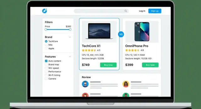
Comparison tables work best when they’re interactive:
Add short “verdict” text below the table: who should pick each option, in plain language.
Implement search with autocomplete, synonyms (e.g., “earbuds” vs “in-ear”), and misspelling handling. The goal is zero dead ends—always show close matches and popular alternatives.
Reviews are the engine of a comparison site: they influence trust, rankings, and conversions. Before you collect a single rating, define a system users can understand in a few seconds—and that you can enforce consistently.
Choose one primary format and document its meaning:
Add microcopy near the rating (“Based on X criteria” or “User average from Y reviews”) so it’s not a mystery.
Most sites use one of these approaches:
A consistent template makes reviews easier to scan and harder to spam. Common fields include: title, pros/cons, use case, and optional verified purchase (only if you have a reliable way to confirm it—otherwise don’t imply verification).
Publish simple rules at /review-guidelines. Use a mix of automated checks (rate limits, duplicate detection) and human review for edge cases. Be strict about conflicts of interest and incentivized reviews.
Decide how users will browse feedback: show most helpful and most recent views, allow filtering by rating, and explain when reviews are hidden, removed, or “pending verification.”
Trust is the difference between a site people skim once and a review platform they return to before every purchase. For comparison and review websites, trust is earned through consistency, clarity, and making your incentives visible.
At minimum, publish these pages in your main navigation or footer:
If you need a simple structure, keep these links consistent across the site (footer is ideal): /about, /contact, /privacy, /terms, /disclosure.
Readers don’t need a lab report—they need to know your process is fair.
Describe:
A short “How we review” section on every review plus a dedicated methodology page builds credibility fast.
Don’t hide the business model. Place a short note near the top of comparisons and reviews, and label sponsored posts directly in the title area.
Be specific: “We may earn a commission if you buy through links on this page. This doesn’t affect our rankings.” If a ranking is paid placement, say that plainly.
Define what you won’t do (for example: “We don’t accept payment to change ratings”). Add a corrections policy so readers know how errors are handled and how to report them.
Comparison content gets outdated quickly. Add a visible “Last updated” date on major reviews and key comparison pages. For important updates, include a small change log (e.g., “Dec 2025: updated pricing; replaced discontinued model”). This signals active maintenance—and prevents readers from feeling misled by old information.
Your tech choices affect how fast you can publish, how easy it is to maintain the site, and how well it handles growth. Aim for the simplest option that supports comparison tables, reviews, and structured content.
If you want the flexibility of a custom build without setting up a traditional dev pipeline from scratch, a vibe-coding platform like Koder.ai can be a practical middle ground: you can describe your review platform (catalog, comparison tables, user reviews, moderation, and admin workflows) in chat, iterate quickly, and export the source code when you’re ready to own the stack.
Start with managed hosting if you don’t want to handle server maintenance. If you expect heavy traffic spikes (seasonal buying guides, viral posts), prioritize:
Keep URLs predictable for both navigation and SEO:
/laptops//laptops/macbook-air-m3//compare/macbook-air-m3-vs-dell-xps-13/Avoid changing URL patterns later—migrations are time-consuming.
Decide what you’ll connect from day one: analytics, a newsletter tool, affiliate networks, and (if you sell leads) a lightweight CRM. Choose tools with easy exports so you’re not locked in.
Set up a staging environment to test new plugins, layouts, and tracking changes before they go live. Schedule automatic daily backups, store them off-site, and make sure you can restore with one click.
If you’re using a platform that supports snapshots and rollback (for example, Koder.ai’s snapshots), you can reduce risk when shipping changes to templates, table layouts, and tracking scripts.
A comparison and review site lives or dies by consistency. Before you publish your first review, decide who can create, change, and approve content—and how you’ll keep older pages accurate as products change.
Keep roles simple so responsibilities are clear:
Even if one person wears multiple hats, setting roles early prevents messy publishing later.
Use a straightforward pipeline:
Templates are how you scale without sacrificing quality. Create standard blocks for:
This also makes internal linking easier (e.g., “See the full review” → /reviews/product-name).
Set rules for images before your media library becomes chaotic: consistent dimensions, compression targets (so pages stay fast), and required alt text that describes what’s shown. Name files clearly (brand-model-angle.jpg) so your team can find them later.
Maintain a simple changelog (what changed and why) and use a pre-publish checklist: verify specs, confirm availability, test affiliate links, note conflicts of interest, and double-check comparisons use the same criteria across products. This is how you build accuracy—and keep it.
SEO is how people discover your comparison pages at the exact moment they’re ready to choose. The goal is to match search intent, answer quickly, and make it easy for search engines to understand what your page is about.
Comparison and review sites tend to win on “decision” queries. Build your keyword list around patterns like:
Map each intent to the right page type: “best” keywords to category guides, “vs” to dedicated comparison pages, and “review” to individual product pages.
Keep pages scannable: clear H1/H2s, a short comparison summary near the top, and internal links to relevant deep dives.
A simple internal linking model helps both users and crawlers:
Add schema markup where it genuinely matches the content, such as Product, Review, and FAQ. This can improve how your pages appear in search, and it reduces ambiguity about ratings, pricing, and key attributes.
Set a minimum content requirement for product pages so they’re not just a table and an affiliate button. Include who it’s for, key features, pros/cons, pricing notes, and how it compares to close alternatives (with links to those comparisons).
Build “hub” pages that consolidate authority and help users explore:
This structure makes your site easier to navigate—and easier to rank.
A comparison and review site only works if people can scan it quickly, trust it, and use it comfortably—especially on a phone. Treat performance, accessibility, and security as product features, not cleanup tasks.
Aim for a page that feels instant: meaningful content visible in ~2 seconds on mobile, and no “jumping” layout as tables load.
Keep it simple:
For comparison tables, prioritize readability over clever effects. Sticky headers and lightweight sorting usually beat complex animations.
Most users will compare on a small screen. Use horizontal scrolling for wide tables, but make it obvious and comfortable. Keep key attributes (price, rating, “best for”) near the left, and let users expand rows for details instead of cramming everything into one view.
Make the site usable without a mouse:
Always use HTTPS. Keep your CMS, plugins, and dependencies updated, and grant least-privilege access (editors shouldn’t be admins). If you collect emails or allow user reviews, protect admin accounts with strong passwords and MFA.
For privacy, decide what you truly need. If you run affiliate tracking or analytics, implement cookie consent options that match your setup, and link to your policy pages (for example, /privacy and /cookies).
Monetizing a product comparison website works best when it aligns with what visitors already want: a confident decision. The goal is to earn revenue without turning the site into a maze of aggressive buttons.
Most comparison and review sites use a mix of these:
Keep calls-to-action accurate and consistent with what happens next. If a button sends people to a partner site, say so (“Visit site,” “Check price,” “See plans”). Avoid lookalike “Download” or “Start free trial” buttons unless that’s truly the offer.
A helpful pattern is to pair the primary CTA with a secondary action, like “Compare details,” so users don’t feel forced into leaving.
Pageviews won’t tell you which comparisons actually drive revenue. Track events such as:
Then tie these to outcomes (affiliate reports, CRM leads, or ad revenue) so you can spot which categories and modules perform.
Create reusable comparison widgets—mini tables, “best for beginners,” “best value,” or “best for teams”—and place them on pages where users are close to choosing. Standardize the layout so visitors learn to trust your patterns.
Publish a simple media kit with audience stats, placements, and collaboration options at /media-kit. It saves time, looks professional, and helps you negotiate sponsorships without cluttering editorial pages.
A comparison or review site doesn’t “finish” when it goes live. Your first goal is a clean, credible launch; your second is creating a rhythm where content, SEO, and conversion improvements compound over time.
Before you announce anything, run a quick quality sweep:
Avoid publishing dozens of thin pages. A better approach is to launch with a small set that demonstrates depth and usefulness:
This structure helps users move naturally from “what should I buy?” to “is this product right for me?” without getting stuck.
On launch week, focus on channels that reward helpful content, not hype:
Your first month should be about learning. Start with the pages that matter most:
Set a refresh schedule, too. Comparisons and “best of” pages should be checked regularly (pricing, availability, new models), while evergreen guides can be updated less often.
Track a small set of metrics that map to your goals:
If you improve one flagship comparison and one hub each week, growth becomes predictable—and your review platform starts earning trust, traffic, and revenue at the same time.
Start by defining who you help and what decision you help them make. Pick a narrow niche you can cover better than broad review sites, then write a one-sentence description of the site (avoid vague claims like “best”).
Practical starter formula: “We compare [product type] for [audience], focusing on [3 criteria].”
Use measurable targets for two time horizons:
Also write down constraints (budget, time, who edits, legal/disclosure needs) so you don’t build features you can’t maintain.
Pick the format that matches your resources:
If you’re solo, start with comparison-first plus a small set of deep reviews for the top products.
Define a small, consistent set of fields so every product can be compared fairly:
Keep units consistent (e.g., minutes vs hours) to avoid misleading tables.
Use three layers:
This setup supports SEO pages like brand listings and “best for” collections without duplicating content.
Design around the fastest path to confidence:
Add a consistent “Compare” action so users can build a short list quickly.
Pick one primary model and explain it everywhere you show it:
Label sources clearly (e.g., “Editor score” vs “User rating”) and keep review templates consistent (pros/cons, use case, key tests).
At minimum, publish and link these pages in your footer:
Also add a plain-language methodology page (e.g., /how-we-review) and put a short methodology snippet on each review. If you use affiliate links or sponsorships, disclose near the top of reviews/comparisons and label paid placement explicitly.
Choose based on catalog size and feature complexity:
Whatever you choose, set up , automatic , and an easy rollback process.
Track decision-making actions, not just pageviews:
Then prioritize improvements on: