May 02, 2025·8 min
How to Create a Website for a Public Product Learning Center
Learn how to plan, build, and launch a public learning center site: structure, CMS, content types, search, SEO, analytics, and upkeep.
Learn how to plan, build, and launch a public learning center site: structure, CMS, content types, search, SEO, analytics, and upkeep.
A “public learning center” is more than a page full of articles. It’s the front door to how people understand, adopt, and succeed with your product—without needing a login or a support ticket.
Start by choosing the primary purpose:
Most teams need both, but you should decide which one wins when there’s a trade-off (for example, long explanations vs. quick fixes).
List the groups you expect to serve, and note what “success” looks like for each:
Collect your most common questions (from sales calls, onboarding sessions, support tickets, and internal experts) and tag each to an outcome:
Define what you will publish in the first release, and what waits.
Success criteria should be measurable, such as:
Information architecture (IA) is the map that helps people find answers quickly—and helps your team add new content without creating a maze. A scalable IA starts with what you already have, then turns it into a structure that stays clear as the learning center grows.
Before you create categories, gather your existing materials in one list: documentation pages, blog posts that function as guides, webinars (and their recordings/transcripts), release notes, FAQs, support macros, and onboarding emails. Note what each item is for (teach a concept, solve a task, announce a change) and who it serves (new user, admin, developer, power user). This makes gaps and duplicates obvious.
Use plain, predictable buckets that match how users think:
If you have multiple products or modules, add one level above (Product A / Product B) and keep the same subcategories under each. Consistency is what makes scaling possible.
Beginners benefit from a guided sequence: start here → set up → first task → next steps. Advanced users want direct access by feature area, plus deep-dive concept pages. Keep these as separate entry points so neither audience has to wade through content not meant for them.
Pick a simple pattern and stick to it, such as:
/getting-started/ for onboarding content/how-to/ for task guides/concepts/ for explanationsDefine naming rules (sentence case titles, consistent verbs, one topic per page) so future pages slot in cleanly without renaming everything later.
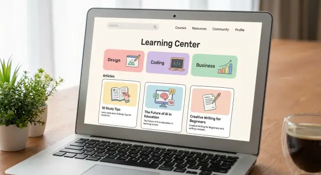
Your learning center feels “easy” when visitors can predict what they’ll get before they click. That predictability comes from a small set of content types and a consistent template for each.
Start with a handful of types that match how people learn and troubleshoot:
Keep the list tight. Too many types create confusion and slow publishing.
Each type should have a recognizable structure. For example:
Small standards prevent messy content without turning authors into editors:
Use short articles for a single question or fix (one intent, one outcome). Use long guides when users must make choices, understand trade-offs, or complete a multi-stage workflow. If a long guide grows, break out reference and troubleshooting into separate pages and keep the guide focused on the journey.
A learning center lives or dies by how quickly you can publish accurate updates. Choose a CMS and workflow that let subject-matter experts contribute without breaking the site—and that still gives your team control over quality.
Start by validating the basics:
If your learning center includes technical docs, confirm how the CMS handles code snippets (syntax highlighting, copy buttons, and safe formatting).
Headless CMS + static site generator: Great for fast performance and flexible design. Content is managed in the CMS, then built and deployed as a static site. Best when you have some developer support and want strong control over templates and structure.
Docs platforms: Often include built-in navigation, versioned docs, and search integrations. Good for documentation-heavy learning centers where structure matters more than custom design.
Website CMS section: Works well if the learning center is part of a marketing site and your team already uses the same CMS. Make sure it won’t force awkward templates or limit navigation as content grows.
If you’re building your product and learning center in parallel, consider tooling that reduces the time from “feature shipped” to “docs shipped.” For example, teams using Koder.ai (a vibe-coding platform that generates web, backend, and mobile apps from chat) often pair its planning mode and snapshots/rollback with a lightweight documentation workflow, so changes in the product and the learning center can stay in lockstep.
If you plan to support multiple languages, decide early how translations happen: manual entry per locale, translation management integration, or export/import files. Confirm locale switching, URL structure per language, and who approves translated updates.
Finally, plan media management: consistent naming, alt text fields, embed support, and a simple process for updating screenshots when the product UI changes.
A learning center succeeds when people can recognize where they are, see what to do next, and reach the right answer with minimal effort. Good UI isn’t decoration—it’s a set of predictable patterns that reduce confusion.
Use clear category navigation that mirrors how users think (tasks, problems, features) rather than your org chart. Add breadcrumbs on category and article pages so visitors can backtrack without losing context.
“Related articles” links work best when they’re intentional: show 3–6 items that continue the same task, explain prerequisites, or cover common follow-ups (setup → troubleshoot → advanced options). Avoid dumping a long, generic list.
Design the homepage around the fastest path to value:
Keep the top area focused. Too many choices can slow people down.
Most readers scan before they commit. Make that easy:
Write headings that describe the action or answer (e.g., “Reset your API key”), not vague labels (e.g., “API keys”).
Aim for:
Accessibility improvements also make the UI clearer for everyone.
Great search is the difference between a learning center that feels “instant” and one that forces people to click around. Treat search as a product feature: it should answer questions quickly, tolerate messy wording, and guide users when it can’t find an exact match.
Start by defining what users should be able to search across. At minimum, index page titles and the full body text of articles. If your learning center includes metadata, index tags and short summaries too.
If you publish downloadable resources (PDFs, release notes, templates), decide whether attachments should be searchable. If you can’t index attachment contents reliably, make sure attachments have clear titles and descriptions so people can still find them.
Users often arrive with a role-based intent (“admin setup,” “student view,” “billing owner”). Add filters that match how people think:
Then add synonyms for common terms and brand vocabulary. Examples: “login” vs. “sign in,” “invoice” vs. “bill,” “workspace” vs. “project,” and acronyms users might type. Also consider spelling variations and pluralization.
Zero results shouldn’t be a dead end. Create a dedicated “no results” experience that offers:
This turns a failure into a recovery flow—and tells you what content is missing.
Track top queries, the zero-result rate, and click-through from results to articles. Pair that with “refined searches” (when users immediately search again) to spot relevance issues. Use these signals to add synonyms, tweak titles, create missing articles, and improve summaries so the right result looks like the right answer.
SEO should make your learning center easier to find, not harder to use. The guiding rule: write for humans first, then help search engines understand what you wrote.
Use clear, specific page titles and headings that match what a user is trying to solve. A good title is “Reset your password” rather than “Account Management.” Keep one H1 per page, and use H2/H3s to break the steps into scan-friendly chunks.
Meta descriptions won’t “rank” your page by themselves, but they strongly influence clicks. Write them like a concise promise: what the page helps someone do, and who it’s for.
Internal linking is where clarity and SEO align. When you mention a prerequisite or related task, link it using plain language (“Set up SSO”) instead of “click here.” Keep the number of links reasonable so the main path remains obvious.
Learning centers often duplicate content via tags, versioned pages, or copied articles. Pick consistent, readable slugs and stick to them. When two URLs must exist, use canonical URLs so search engines know which one is the “main” page. Also avoid publishing near-identical “SEO variants” of the same article—merge them into one better page.
For true FAQ pages, add FAQ structured data so search engines can understand the question-and-answer format. Don’t force it onto non-FAQ content; it can backfire.
Generate an XML sitemap and keep it up to date as new articles launch. Make sure pages are indexable when intended (no accidental noindex settings), while keeping drafts, internal notes, and thin pages out of search.
Your first release should prove the learning center is useful, not comprehensive. Aim for a minimum viable set of content that solves the highest-frequency problems and reduces support load immediately.
A practical starter pack is:
Use real inputs: support tickets, chat transcripts, call notes, and product analytics (e.g., most-used features, common drop-off points). Prioritize topics by impact (how many users) and urgency (blocks adoption or causes churn).
Keep each article focused on one job-to-be-done. Write in plain language, with short sections and step-by-step instructions. Include:
Avoid internal jargon. If you must use a term, define it once and then use it consistently.
Add visuals only when they reduce confusion:
Make visuals durable by avoiding dates, personal data, and UI elements that change frequently.
End each piece with a “Next steps” section that points to the most likely follow-on action—such as trying the feature, comparing plans, or troubleshooting. You can reference relevant internal routes like /pricing or the next onboarding task, so the content connects naturally to product decisions and progress.
A public learning center lives or dies on trust. Governance is the practical system that keeps articles current, consistent, and safe to follow—especially when product changes move faster than content updates.
Avoid “everyone owns it,” which usually means nobody does. Define a small set of roles and make them visible to the team.
Also assign backup owners so content doesn’t stall during vacations or team changes.
Not every page needs the same schedule. High-risk or fast-changing topics (billing, security, onboarding flows) should be checked more often than evergreen concepts.
Set a cadence (for example: quarterly for most pages, monthly for critical ones) and add automatic triggers, such as:
A simple rule helps: if the product changed, the content must be reviewed before or alongside the release.
A lightweight style guide reduces rewrites and makes multiple authors sound like one team. Include:
Add “Last updated” dates and short update notes on key pages. This signals freshness and sets expectations, especially when instructions change. Internally, maintain a change log so support and product teams can quickly see what was updated, when, and why.
A learning center works best when it’s a two-way street: visitors find answers, and you learn where the content falls short. This section is about building those loops without turning every page into a noisy interface.
Place a simple “Was this helpful?” control at the end of articles (or after key steps in longer guides). Keep it fast: Yes/No first, with an optional follow-up.
If someone answers “No,” offer two quick options:
Route issue reports to a queue your content owners actually watch. If feedback disappears into an inbox, users will stop using it.
When self-serve content isn’t enough, people need clear next steps. Provide a small “Need more help?” block that can include:
Use plain language to set expectations (response times, what information to include). The goal is to reduce frustration and prevent duplicate tickets.
Create two high-traffic hubs that act as starting points:
Add CTAs that help users complete the task—download a template, check prerequisites, or view a related how-to. Avoid sales-heavy prompts inside troubleshooting articles; when someone is stuck, clarity and resolution should win.
Analytics for a learning center should answer two questions: Are people finding what they need? and Does the content reduce friction and move them forward? Set it up early so you can learn from real behavior instead of guesswork.
Start with a small set of metrics that are easy to interpret and compare over time:
Tip: Track these by content type (e.g., “How-to,” “Troubleshooting,” “Concepts”) so you can spot patterns like “troubleshooting pages have low scroll depth,” which may indicate answers are buried too far down.
A learning center is successful when it helps users complete tasks. Define a few “next step” actions and track clicks or completions, such as:
Keep outcome tracking focused: choose 3–5 primary actions to avoid noisy reporting.
Dashboards should be built for decisions, not vanity metrics. Create views that answer:
Pair search data with page performance to find “high intent, low satisfaction” areas quickly.
Use analytics to test one change at a time and compare before/after results:
Set a simple cadence—monthly review and one or two experiments—so improvement becomes routine rather than a big project.
A learning center launch is less about a big “ta‑da” moment and more about reducing surprises: broken pages, confusing navigation, missing support paths, and slow load times. Treat launch day as the start of a steady improvement loop.
Start with a staged rollout: publish the core set first (top tasks + top issues), then expand. Announce from your blog and, if you have it, in-product (tooltips, banners, or the help menu) so users discover the learning center at the moment they need it.
Schedule a monthly content audit: update anything tied to recent product changes, merge duplicates, and retire stale pages. Keep a visible backlog and prioritize using real signals: top searches with no results, high-exit pages, and recurring support questions. Over time, this turns your learning center into a living system—not a one-time publishing project.
Start by picking the primary purpose:
Decide which purpose wins when there’s a trade-off (long explanations vs. quick fixes), then define measurable success (e.g., fewer “how do I…?” tickets, faster time-to-first-success).
List your main groups and define “success” for each:
Use these definitions to prioritize what you publish first and how you organize navigation.
Create one backlog of real questions from:
Tag each question to an outcome like , , , or . Then publish the highest-frequency, highest-blocking items first (the ones that stop adoption or create repeated tickets).
Start with an inventory of what you already have (docs, guides, webinars/transcripts, FAQs, macros, onboarding emails). Then group into predictable buckets users recognize:
If you have multiple products/modules, put them one level up (e.g., Product A / Product B) and keep the same subcategories under each for consistency.
Keep page types limited and consistent so visitors can predict what they’ll get. Common core types:
Use a repeatable template: intro, prerequisites, numbered steps, expected result, and “next steps” links to related tasks.
Validate non-negotiables:
Choose a model that matches your team:
Decide early:
Also plan media upkeep: consistent naming, clear alt text fields, and a workflow for updating screenshots when the UI changes.
Index at least titles and full article text, plus tags/summaries if you have them. Improve relevance with:
Design a helpful zero-results experience with suggestions, popular links, and a clear escalation path (support/community/request an article). Track zero-result queries to drive your content roadmap.
Write for humans first, then make it legible to search engines:
Prevent duplication by keeping stable slugs and using canonical URLs when multiple URLs must exist. Maintain an XML sitemap and ensure intended pages are indexable (keep drafts/thin pages out of search).
Put a lightweight system in place:
Close the loop with: