Nov 20, 2025·8 min
How to Create a Website for a Regional Business Association
Step-by-step plan to build a regional business association website: goals, pages, member features, events, directory, SEO, accessibility, and launch.
Step-by-step plan to build a regional business association website: goals, pages, member features, events, directory, SEO, accessibility, and launch.
Before you think about pages, design, or platforms, get specific about what the association needs the website to do. This step keeps decisions practical—and prevents a site that looks nice but doesn’t move the needle.
Most regional business associations share a few recurring priorities. Choose your top 2–4 and rank them:
A simple way to test your list: if you removed one goal, would the website still feel “successful”? If yes, it’s probably not a core goal.
Different visitors arrive with different questions. Identify the few audiences you must serve well:
Write one sentence for each: what they value most, and what would make them leave the site.
Pick the primary actions you’ll highlight across the site:
If everything is “important,” nothing is.
Attach numbers to your goals so you can improve over time:
Set a baseline after launch, then review monthly so the website becomes a tool—not just a brochure.
Before you think about pages and features, get clear on what you’re saying and how you want to sound. A regional business association website works best when it quickly answers three questions: who you serve, what members get, and how to join or participate.
Aim for one plain-English sentence (plus a short supporting line) that a busy owner can understand in five seconds.
Example:
“We help businesses in the River County region connect, learn, and grow through events, advocacy, and member-to-member referrals.”
Support it with specifics visitors care about:
Decide on a voice your team can consistently maintain. For most associations, that means friendly, confident, and practical—avoiding jargon and long paragraphs.
Guidelines that keep copy readable:
Collect these items in one shared folder before design begins:
A consistent set of assets helps your membership website feel trustworthy—especially on the homepage and sponsorship pages.
Use your inbox, event desk conversations, and renewal calls to write FAQs people actually search for. Keep answers to 2–4 sentences.
Starter FAQ list:
Once this messaging foundation is set, every other decision—page content, calls-to-action, and the member directory experience—gets easier.
A regional business association website works best when visitors can answer three questions quickly: What is this association? How do I join? What’s happening next? Your structure and navigation should make those paths obvious—on mobile as well as desktop.
Start with the pages most associations need from day one:
These are useful, but don’t let them clutter the main navigation early:
Aim for a top menu like: Home, Join, Events, Directory, News, About, Contact.
If you need Sponsorship or Resources, consider placing them under About or as a button in the header rather than adding more top-level items.
Your footer should always include your address, email/phone, and social links, plus quick access to key policies (for example: Privacy Policy, Terms, Accessibility Statement).
Add a short set of links to Join, Events, and Directory so visitors can find the essentials from any page.
A regional business association website works best when every core page answers a specific question quickly: “What is this group?”, “Why join?”, “What’s happening next?”, and “How do I reach you?” Before writing, create a simple checklist for each page so you don’t miss details members and prospects expect.
Your homepage should scan well in under a minute. Include these sections:
Check for:
Make it easy to compare and join:
Include:
A membership website succeeds or fails on the “boring” parts: what members can do without emailing staff, and what staff can approve and track without spreadsheets. Before you build pages, map the key workflows end-to-end.
Start by outlining membership tiers (for example: Basic, Business, Sponsor) and what each tier unlocks.
Decide what’s public vs member-only:
Write these rules down so your platform permissions match your promises on /join and your renewal pages.
Members should be able to complete common tasks in a couple of minutes:
Add a “what happens next” message at the end of each flow (for example: “Your listing will appear after approval” or “Your renewal is active immediately”).
Plan the back-office steps staff actually need:
If approvals are required, define a service standard (e.g., “within 2 business days”) so expectations are clear.
List the fields you’ll collect and display. Common essentials include:
Member name, business name, category, location, website, and a short description.
Also decide which fields are required vs optional, and which are public. This prevents incomplete listings and makes the member directory easier to search—and easier to keep accurate over time.
Events are often the main reason people visit a regional business association website, so your event setup should be easy to browse, simple to register for, and reliable for staff to manage.
Create a consistent event template so visitors don’t have to hunt for details. At minimum, include: date/time (and time zone), location (full address + parking info, or video link), a short agenda, pricing, capacity/seat limits, a contact person, and key policies (refunds, substitutions, accessibility notes).
If your association runs recurring formats (breakfasts, mixers, workshops), add a “Who should attend?” line to set expectations and improve turnout.
Plan pricing and emails before you publish your first event.
Set up member vs. non-member pricing, promo codes (sponsor discounts, early bird), and a clear registration cutoff time.
Make the confirmation email do the heavy lifting: recap time/location, calendar invite, cancellation policy, and what to bring.
Also decide what data you actually need on the form (name, company, email—plus dietary/access needs when relevant). Keeping forms short improves completion rates.
Offer multiple ways to browse: a list view for quick scanning, a monthly view for planning, and filters by topic, location, and format (in-person vs. virtual).
These small touches make your site feel organized and save staff from answering “What’s coming up next month?”
After each event, publish a brief recap with photos, slides/recordings (if available), and a clear next step: register for the next session, join the association, or contact a committee chair.
This turns a one-time registration into ongoing engagement.
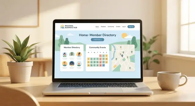
A member directory is often the most-visited part of a regional business association website. Done well, it helps members get discovered, drives referrals, and justifies dues. Done poorly, it becomes a cluttered list nobody trusts.
Start with a short set of directory fields and filters that reflect real-world questions visitors ask:
Keep the profile itself simple: business name, short description, logo, address/service area, phone/email (optional), website link, and a primary contact for member-only views.
Create standards so profiles look consistent and credible:
Publish these rules on a short page like /directory-guidelines and reference them in the submission form.
Featured placements can fund the site, but they should be clearly labeled (e.g., “Sponsored”) and limited in slots so they feel valuable.
Consider featuring by category or region so the placement stays relevant.
To avoid spam and outdated listings, define who approves changes, what gets rejected, and how updates happen. Practical options include:
Accuracy is a feature. The more current the directory feels, the more people use it—and the more members benefit.
The platform you pick determines how easy it will be to manage memberships, publish updates, and run events without relying on a developer every time. Aim for a setup your team can realistically maintain year-round.
Website builders (Wix, Squarespace, etc.) are quickest to launch and easy for non-technical admins. They work well for simple membership sign-up and basic event promotion, but can feel limiting if you need complex member permissions, recurring dues, or deep reporting.
A CMS (WordPress, Drupal, etc.) offers more flexibility and a huge ecosystem of plugins. This is a good middle path when you want strong content tools plus membership/event features—just plan for occasional maintenance and updates.
Association management platforms (AMS/CRM + website) combine member records, renewals, events, and email in one system. They can reduce integration headaches, but you may trade off design flexibility and pay higher ongoing fees.
If you want to move faster without a traditional dev cycle, a vibe-coding platform like Koder.ai can also be a fit—especially for associations that need custom membership workflows, a searchable directory, and an event calendar with registration. You describe the requirements in chat, iterate in a planning mode, and export source code if you need full ownership later.
Before you commit, write down the “must connect” tools so you don’t discover gaps later:
If two tools both store member data, decide which one is authoritative to avoid mismatched records.
Use an association-owned email address (not a vendor’s) to register the domain, hosting, payment accounts, and key SaaS tools.
Store admin logins in a shared password manager and document who has access. This prevents disruption when board members or contractors change.
If you already have a member list or legacy site, map what must move: names, emails, membership levels, renewal dates, consent/opt-ins, and directory fields.
Clean duplicates, standardize formats, and do a small test import first—then schedule the full migration close to launch to keep records current.
A regional business association website should feel immediately familiar: visitors should understand who you serve, what you offer, and what to do next—without hunting through menus.
A clear user experience isn’t just “nice design.” It’s what turns a curious visitor into an event attendee, sponsor, or member.
Start with big, specific headings and clear calls to action. Instead of “Learn More,” use buttons like “Join the Association,” “View Upcoming Events,” or “Find a Member Business.”
Keep page layouts consistent (same header, same footer, same placement for key info) so users don’t have to re-learn the site on every page.
A simple rule: if a page has one main goal, it should have one primary button.
Stock photos can make an association feel generic. Use real photos from the region—events, member storefronts, ribbon cuttings, volunteers, and recognizable local landmarks.
It signals you’re active and credible, and it helps members feel represented.
If you publish event recaps, include 3–5 photos with captions (who/what/where). This builds social proof naturally.
To keep the site consistent (and easier to maintain), create a small set of reusable blocks you can place on many pages:
These components make pages faster to scan and reduce the temptation to write long, dense paragraphs.
Many members will visit from a phone between meetings. Use mobile-first layouts: large tap-friendly buttons, short sections, readable font sizes, and event details that don’t require zooming.
Test your top tasks on mobile—finding an event, registering, and contacting the association—until they feel effortless.
A trustworthy experience is calm, consistent, and practical. When users can complete a task in under a minute, your association feels organized and reliable.
A regional business association website should be easy to find, easy to understand, and easy to measure. That starts with clear page wording (for search engines and humans), accurate local details, and simple tracking that tells you what’s working.
Create page titles and headings that match what people search for—without sounding spammy. Keep one clear H1 per page, then use H2/H3 to organize sections.
Examples you can copy:
On each of these pages, add a short intro paragraph that includes your region naturally (e.g., “Serving businesses across the Tri-County area”).
If you have a physical office, publish consistent name, address, and phone details in the site footer and contact page. If you serve a broader area, state it clearly (“We support employers in…”) and list key cities/areas you cover.
If relevant, embed a map on the contact page and keep your address formatting consistent with any directory listings and your Google Business Profile.
Set up analytics early so you can measure growth:
Use a simple monthly dashboard: total visits, top pages, joins, renewals, registrations, and which channels drove them (search, email, social, referrals).
Plan updates that keep the site fresh without overwhelming staff:
Consistency beats volume—publish what you can sustain.
Getting these basics right protects your members, reduces support requests, and helps more people actually use your site—especially on mobile and with assistive technology.
Start with practical checks that improve usability for everyone:
If your site includes a member directory or event calendar, test those pages specifically—filters, search boxes, and “Register” buttons often cause the most issues.
Membership applications, event registrations, and contact forms should feel straightforward:
Good form feedback can significantly reduce abandoned registrations.
If you collect personal data (directory profiles, emails, payments, analytics), add a plain-language Privacy Policy and, if needed, a short cookie notice explaining what’s tracked and how to opt out.
Link to it in the footer and near forms.
These steps are small, but they prevent the most common site takeovers and data leaks.
Launching a regional business association website isn’t a one-and-done task. A smooth rollout builds trust quickly, and a simple maintenance rhythm keeps the site accurate for members, sponsors, and the public.
Before you announce anything, run a short checklist that focuses on real member actions:
Plan a soft launch for staff and board members. Give them a short feedback form and a clear deadline (48–72 hours) so you can act fast.
Ask them to check:
Fix the quick wins immediately: broken links, confusing labels, missing confirmations, and unclear calls to action.
When you go public, keep the announcement simple and action-oriented:
If you have partners (chamber, city, major sponsors), ask them to share your launch post or link to your new site.
A practical maintenance plan prevents the most common association website problems—outdated events, incorrect member info, and stale content.
Treat maintenance as part of operations, not a special project. A site that stays current becomes a tool your association can confidently point to all year.
Start with 2–4 primary goals (e.g., grow memberships, increase event registrations, support advocacy). Then choose 2–4 key audiences (current members, prospects, sponsors, media/public) and define the top actions you want them to take (Join/Renew, Register, Contact). Tie each goal to a trackable metric (conversion rate, registrations per event, contact submissions) so the site can be improved over time.
Prioritize pages that answer the fastest questions: what you are, why join, and what’s next. A practical core set is:
Keep the main navigation to 5–7 items so visitors can find Join and Events quickly—especially on mobile.
Keep it plain, specific, and scannable. Write one clear sentence that says who you serve (your region) and what members get (events, advocacy, referrals, education). Add a short supporting line with 3 concrete benefits.
Avoid vague labels like “Learn More.” Use action language like Join, View Upcoming Events, and Find a Member Business.
Limit the site to one primary action per page and make it obvious with a single main button. Across the whole site, most associations should emphasize:
If everything is treated as equally important, visitors won’t know what to do next.
Collect the basics in one shared folder before design starts:
Having these ready prevents delays and makes the site feel credible from day one.
Design the common tasks to be self-serve so staff aren’t stuck in email threads:
Add a short “what happens next” message at the end of each flow (e.g., approval timing).
Use a consistent event template so people don’t have to hunt for details:
Keep registration forms short—only ask for what you truly need.
Start with fields and filters that match how people search:
Protect trust with simple standards (name format, logo requirements, description length) and a refresh process (self-edit + approval, periodic reminders, “report an issue” link).
Choose based on how complex your membership, events, and reporting needs are:
Before deciding, list your must-have integrations (payments, email marketing, CRM/AMS, event tools) and pick one system as the for member data.
Set up tracking for the actions tied to your goals:
Review a simple monthly dashboard: visits, top pages, conversions, and traffic sources (search, email, social, referrals). Use it to adjust copy, CTAs, and navigation—rather than guessing.