Nov 15, 2025·8 min
How to Create a Website for a SaaS Education Hub
Learn how to plan, design, and launch a SaaS education hub website: structure, content, UX, SEO, tooling, analytics, and governance for growth.
Learn how to plan, design, and launch a SaaS education hub website: structure, content, UX, SEO, tooling, analytics, and governance for growth.
A SaaS education hub is more than “a bunch of articles.” It’s a coordinated place where people learn what your product does, adopt it quickly, and succeed with it over time. That definition matters because it determines what you publish, how you organize it, and what you measure.
Most SaaS education hubs serve three jobs at once:
If you’re building a knowledge base website and a resource center design in one, be explicit about which job is primary. Otherwise, the hub becomes hard to navigate and hard to maintain.
Pick 1–2 primary outcomes, then treat everything else as secondary:
This is the foundation of your SaaS content strategy and will shape your information architecture and prioritization.
Choose metrics tied to user behavior, not just pageviews:
List your primary audiences and their intent:
A clear audience mix prevents you from writing one-size-fits-none content and keeps your documentation site focused.
An effective SaaS education hub starts by focusing on what visitors are trying to accomplish, not what you want to publish. When you design around real “jobs,” your knowledge base website becomes intuitive—and your content strategy stays focused.
Pick 3–5 jobs that cover most visits to your help center or resource center. Common examples:
Different jobs need different answers. Map them deliberately:
This keeps your resource center design balanced: fast help for urgent needs, deeper learning for growth.
Use existing signals to choose topics with proven demand:
Personas don’t need to be complex—just actionable:
With jobs, formats, top questions, and personas aligned, your learning paths become clear—and your education hub stays relevant as the product evolves.
Before you design pages or write content, decide what “hub” you’re actually building. Most SaaS companies end up with multiple education formats over time—if you don’t set boundaries early, you’ll publish the same answer in three places and confuse everyone.
Common models include:
You don’t need all of these on day one. Choose what matches your product complexity and customer journey.
Create clear “rules of residence.” For example:
When you must cover the same topic in two places, publish one “source” page and link to it rather than rewriting.
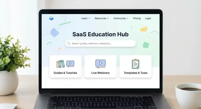
Keep your top navigation tight. A typical education hub sitemap might be:
Agree on consistent, readable URLs before content scales:
Use one naming style (sentence case titles, consistent product terms) and avoid renaming categories later—it breaks links and search habits.
A SaaS education hub fails when people can’t predict where an answer lives. Scalable information architecture isn’t about organizing by internal teams (“Product,” “Support,” “Marketing”); it’s about mirroring how customers describe their problems.
Start by collecting real phrases from support tickets, sales calls, in-app searches, and community posts, then turn those into categories.
Use 5–9 top-level categories that map to customer intent, not your org chart. For a knowledge base website, categories like “Getting started,” “Integrations,” “Billing,” and “Troubleshooting” often work better than feature names.
A quick test: if a new user can’t place an article in 3 seconds, your category label is too internal.
Build topic clusters: a parent page that explains the topic end-to-end, plus child articles that answer specific questions. This supports customer education and improves help center SEO by keeping related content together.
Example structure:
Cross-links are your “navigation for humans.” Add consistent modules:
This reduces pogo-sticking and turns a documentation site into a guided learning path.
Before publishing at scale, create a simple content matrix: topic × funnel stage × format (e.g., overview page, tutorial, video, checklist). It keeps your SaaS content strategy balanced and prevents over-investing in one format while leaving key topics uncovered.
A SaaS education hub succeeds when people can solve a problem in under a minute—without learning your site first. UX patterns should reduce scanning time, minimize clicks, and make the next step obvious.
Put search front and center on every hub page (not just the homepage). Make it forgiving: autocomplete, typo tolerance, and “did you mean” suggestions.
Keep navigation short and predictable. Instead of deep menus, use clear category pages with filters (product area, role, plan, platform, difficulty). Filters should be sticky on desktop and easy to reset on mobile.
Consistency is speed. Create a small set of templates and apply them everywhere:
This makes scanning predictable and reduces “where am I?” friction.
On content-heavy pages, small elements do a lot of work:
Also add “Was this helpful?” feedback plus a clear next step: “Search again,” “Contact support,” or “Start the onboarding guide.”
Readable typography and spacing help everyone. Use strong color contrast, meaningful headings (H2/H3), visible focus states, and full keyboard navigation. Ensure components like filters, accordions, and TOCs are usable with screen readers.
When these patterns are baked into the hub, your content works harder—because people can actually find and use it.
Your SaaS education hub will only stay useful if publishing is easy, updates are safe, and content is measurable. The “best” tech stack is the one your team can actually run every week.
Most education hubs fit into one of these models:
A simple rule: if your content is mostly “read and understand,” a CMS may be enough. If it’s “follow exact steps and keep them accurate over time,” prioritize a docs-focused setup.
If you’re building the hub alongside product experiences (like onboarding checklists, embedded guides, or a searchable help widget), a faster build loop can matter as much as the CMS choice. Teams sometimes use a vibe-coding platform like Koder.ai to prototype and ship the hub UI and supporting services quickly—then iterate on templates, search UX, and integrations without waiting for a full traditional dev cycle. (Koder.ai can generate React frontends, Go backends, and PostgreSQL-backed features via chat, and supports source code export if you want to take over maintenance later.)
Write requirements down early so you don’t choose tools based on demos alone:
A SaaS education hub should reduce support tickets and increase activation, so connect it to the systems your team already uses:
Use this before final selection:
A SaaS education hub feels “easy” to users when every page sounds consistent, looks familiar, and stays accurate as the product changes. That doesn’t happen by accident—it’s the result of clear standards and a lightweight governance system.
Start with a one-page style guide that answers the common questions writers stall on:
If you already have brand guidelines, link to them and add only what’s specific to documentation and tutorials.
Consistency reduces cognitive load. A reliable template also makes writing faster.
A practical default structure:
Keep exceptions rare (for example: release notes, API docs, long-form guides).
Use a simple pipeline: Draft → SME review → Publish → Scheduled update.
Make responsibilities explicit:
Assign an owner per category (Billing, Integrations, Admin, etc.) and set an update rhythm—monthly for fast-changing areas, quarterly for stable topics.
Add “Last reviewed” metadata on pages and a small backlog of flagged items (support tickets, product changes, broken steps). Governance isn’t bureaucracy—it’s how your education hub stays trustworthy.
If you’re iterating quickly, make governance compatible with speed: snapshots, rollback, and clear approvals. For example, teams using Koder.ai often rely on its snapshots and rollback to safely test navigation changes or template updates without risking the entire hub experience.
A SaaS education hub only works when people can quickly find the right answer—whether they arrive from Google or use your site search. Treat “findability” as product work, not a final polish step.
Start with keyword themes, not one-off keywords. Map themes to your main content types:
Create clean URLs that match intent and remain stable, e.g. /help/integrations/slack instead of /help?id=123. Use consistent, descriptive page titles and meta descriptions that promise a clear outcome (“Connect Slack in 5 minutes”) rather than generic marketing copy.
Build internal linking into your writing flow: every article should point to one “next step” and one “related concept.” This helps readers and improves crawlability. Example: a setup guide links to the troubleshooting page for common errors, and to the glossary definition of key terms.
Add structured data only when it matches the page:
Keep it accurate and limited to what’s visible on the page. Over-marking everything as FAQ can backfire.
On-site search is often the fastest path to a solution. Improve it with:
Create a glossary for your core terms and link to it from across the hub (e.g., /glossary/seat, /glossary/workspace). Use one agreed definition per term, and reference it everywhere—this reduces confusion, improves search matching, and makes new content faster to write.
An education hub shouldn’t sit apart from the rest of your SaaS experience. The best hubs help people succeed quickly and naturally move them toward the next commitment—without turning every page into a sales pitch.
Gate resources when there’s a clear value exchange: a deep template pack, a live workshop, an industry report, or a certification path. Keep core “how do I…?” education open—setup guides, fundamentals, and troubleshooting—so new users can solve problems immediately.
A simple rule: if someone needs it to evaluate or use the product, keep it ungated. If it’s a bonus that’s valuable even outside your product, consider gating.
Every page should help the reader take one clear next action based on intent:
Place one primary CTA near the top (especially on cornerstone guides) and a softer CTA near the end once the reader has gotten value.
Connect learning to activation. Link prominently to a “Getting Started” path and practical checklists that map to your onboarding milestones (first project, first integration, first teammate invited).
Good patterns include:
When a guide mentions a feature, link to the exact in-app area (or a product page) so readers can apply what they learned immediately.
Also use thoughtful cross-links to related explainers and deeper articles in /blog—especially for strategy topics that support adoption (setup best practices, onboarding frameworks, common mistakes).
Done well, your hub becomes part of the customer journey: learn → apply → succeed → upgrade.
Publishing an education hub is only half the job. The other half is learning which pages actually help people complete a task—and which ones quietly send them back to support, to Google, or out of your product.
Start with metrics that explain intent and outcomes, not vanity traffic:
Define what “good” looks like per page type. A troubleshooting article may naturally have a higher exit rate (people got the fix and left), while an onboarding guide should lead to another step.
Add lightweight feedback options that produce specific follow-ups:
Route feedback to the right place (content owner, support lead, product docs) with clear tags like “outdated,” “unclear,” “bug,” or “missing topic.”
Create separate views for prospects (pricing, comparisons, use cases) and customers (setup, integrations, troubleshooting). The same metric can mean different things: a prospect searching “SSO” may be evaluating, while a customer searching “SSO” may be stuck.
Once a month, review:
Keep a simple backlog: what you’ll fix, who owns it, and when it ships. This turns your hub into a living product—not a one-time project.
A SaaS education hub is never “done.” A good launch sets expectations internally (who owns what) and externally (where people can reliably find answers), then makes updates a normal operating rhythm.
Before you announce the new hub, run a short checklist that prevents the most common trust-killers:
Migration is where most hubs accidentally “reset” their search equity. Plan it like a mini project:
Set a lightweight cadence that keeps content accurate:
Plan your first three months to build momentum:
If you want to accelerate this roadmap, consider tools that reduce the cost of iteration. For example, Koder.ai’s chat-based build flow can be useful for spinning up hub components (search UI, feedback widgets, admin dashboards), deploying quickly, and iterating safely with planning mode and rollback—while still keeping an escape hatch through source code export.
Start by choosing 1–2 primary outcomes, then let those drive everything else:
If you try to optimize for all four equally, navigation and prioritization get messy.
Treat the hub like a product and track behavioral metrics, not just traffic:
Define what “good” looks like per page type (onboarding vs. troubleshooting behave differently).
List your primary audiences and align content to their intent:
Keeping these separate prevents one-size-fits-none pages and makes your navigation more predictable.
Start with 3–5 “jobs” that explain most visits:
Then map each job to the right format (quick answers vs. step-by-step guides vs. webinars). This keeps your hub focused on what visitors are trying to accomplish.
Use existing demand signals before you write anything:
Turn the highest-volume items into “source” articles and link to them across the hub to avoid duplicate answers.
Most SaaS teams need only 1–2 models at launch:
Create simple “rules of residence,” for example:
When overlap is unavoidable, keep one canonical “source” page and link to it rather than rewriting the same instructions.
Keep the top navigation tight (usually 5–7 categories). A common baseline:
Name categories in the user’s language (not internal team names), and lock URL patterns early so you don’t break links later.
Design for “find first, browse second”:
The goal is solving a problem in under a minute without learning your site.
Choose the platform your team can run weekly, not the one that demos best:
Confirm requirements like roles/approvals, versioning, localization, search quality, analytics, and integrations with your app and support tools.
Pick what matches your product complexity now, and add others later with clear boundaries.