May 16, 2025·8 min
How to Create a Website for SaaS Changelog Release Notes
Learn how to create a SaaS changelog and release notes website: structure, writing tips, categories, search, subscriptions, SEO, and maintenance steps.
Learn how to create a SaaS changelog and release notes website: structure, writing tips, categories, search, subscriptions, SEO, and maintenance steps.
A SaaS changelog site is a public page (or mini-site) where you publish product updates in a consistent, easy-to-browse archive. Think of it as your “what changed, when, and why” home base—especially valuable for customers who rely on your app for daily work.
Users look for a changelog when something feels different (“Where did that button go?”), when they’re deciding whether to enable a feature, or when they’re evaluating how actively the product is maintained. A clear update history reduces confusion and helps people trust what they’re using.
These terms get mixed up, but they serve slightly different jobs:
Many SaaS teams publish both on the same site: a quick summary at the top, with expandable details for people who need them.
A well-run changelog site supports multiple goals at once:
Decide what’s customer-facing versus internal. Public notes should focus on user impact, avoid sensitive details, and use plain language. Internal notes can be more technical (e.g., infrastructure changes) and belong in your internal docs—not your public changelog.
Before you pick a template or start publishing, decide who the changelog is for. A single “release notes page” often tries to serve everyone—and ends up helping no one.
Most SaaS changelogs have at least three audiences, each needing different information:
You may also have an internal audience (Support, CS, Sales). Even if the changelog is public, writing with internal reuse in mind saves time: support can link to a specific entry instead of rewriting explanations.
Match the writing style to product complexity and user expectations:
Keep the voice consistent: if your UI is friendly, your changelog can be friendly too—without being casual or vague.
A public product updates page helps with transparency, trust, and sharing links. A login-only changelog may be better if you ship sensitive enterprise features, customer-specific work, or security details that shouldn’t be indexed.
If you’re unsure, publish publicly but reserve certain entries for authenticated users.
Define what “good” looks like. Common goals include fewer “what changed?” tickets, faster rollout adoption, and higher feature usage. Pick one or two metrics (support ticket volume, feature activation rate, changelog page visits) and review them monthly so the changelog stays useful—not just busy.
A changelog only works if people can consistently find it—and quickly get to the update that affects them. Before you write a single release note, sketch the pages and the paths users will take from your main site, app, and help center.
For most SaaS products, you don’t need a complex information architecture. Start with a small set of predictable URLs:
If you prefer even fewer pages, you can merge /subscribe into /changelog as a sticky call-to-action.
Put your changelog where users already expect it:
Whichever you choose, keep the URL short, permanent, and easy to type.
Add a clear link to the changelog from:
Default to a latest-first list so users instantly see what’s new. Then support browsing with simple filters (for example: by product area or “Bug fixes” vs “New”). This balances speed for casual readers and control for users looking for one specific change.
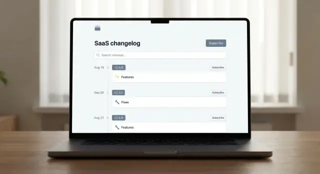
A good release note format is predictable: readers should be able to scan the first few lines and immediately understand what changed, when, and whether it affects them. Before you write anything, decide on a small set of required fields and stick to them for every post.
If you keep these fields consistent, your release notes page becomes a reliable index, not a stream of unstructured announcements.
Use versions when you ship build-based software or when support needs a precise reference point (mobile apps, desktop apps, API versions, self-hosted deployments). A user reporting a bug can say “I’m on 2.14.3,” and your team can reproduce it.
Use date-based releases when you ship continuously and changes roll out behind feature flags. Many SaaS teams still add an internal build number, but they present releases publicly by date because that’s easier for customers to follow.
A hybrid works well: show a date as the primary anchor, and include a version/build in smaller text for support.
Optional fields are valuable, but only if they stay purposeful:
Title
Date • Version • Category • Affected area (optional)

Summary (1–2 sentences)

Details
- Bullet 1
- Bullet 2

Rollout status (optional)
Known issues (optional)
This structure keeps every entry readable, makes filtering easier later, and sets you up for consistent tags and search in the next steps.
A changelog is easiest to scan when every update answers two questions quickly: what kind of change is this? and what part of the product does it affect? Categories and tags are how you do that—without forcing people to read every post.
Use a small taxonomy that covers most releases and stays consistent over time:
Keep categories limited. If a change doesn’t fit, adjust the wording of the note before inventing a new category.
Tags should describe where the change happened, using words customers already recognize from your UI and docs. Common examples include Billing, API, Dashboard, and Mobile.
A good rule of thumb: each release note gets 1–3 tags. Enough to filter, not enough to overwhelm.
Tag sprawl makes filters useless. Set lightweight guardrails:
People search by the words they see in-product. Use the same feature names across UI, help docs, and notes (e.g., “Saved Views,” not “View Presets” in one place and “Saved Filters” in another). Consider a short internal naming guide so everyone ships updates with the same vocabulary.
Release notes aren’t a diary of what your team built—they’re a guide to what changed for users. The goal: help people quickly understand the value, whether they’re affected, and what (if anything) they need to do next.
A good title answers “why should I care?” in one line.
Bad: “Project Falcon rollout”
Better: “Faster invoice exports (up to 3× quicker)”
Better: “New: Share dashboards with view-only links”
If you need extra context, add a short subtitle that stays user-focused: “Available for Pro and Business plans.”
Lead with 2–5 short bullets so users can skim. Then add a Details paragraph for the “what/why/how” context.
Example structure:
Details: You can now generate a secure link to share a dashboard without creating a new user. Links can be revoked anytime from Settings → Sharing.
Include these when the change affects behavior, permissions, billing, or workflows.
Who is impacted? Admins managing sharing settings; anyone receiving shared links.
What do I need to do? Nothing by default. If you want to restrict link sharing, disable “Public links” in Settings → Sharing.
Write in user terms, not internal project labels. Replace “migrated to v2 pipeline” with “uploads are more reliable” (and explain how it changes the user experience). If you must mention a technical term, define it in one short sentence.
Aim for clarity over completeness: if it’s not actionable or meaningful to users, leave it out.
A changelog is easy to skim when you have five posts. Once you have fifty, it turns into “I know you shipped it… but where is it?” Search and browsing tools keep your release notes page useful long after launch—especially for support teams, customers evaluating your product, and anyone returning to find a specific fix.
Add a prominent search box at the top of the changelog list. Prioritize searching titles, tags, and the first paragraph of each note. Consider highlighting matches and supporting common queries like feature names, integrations (“Slack”), or error codes.
If your changelog has multiple products or modules, allow searching within a selected product area to reduce noise.
Filters should reflect the vocabulary your users use, not internal team names.
Useful controls include:
Keep filters multi-select when possible, and make the “clear all” button obvious.
For longer release notes, include anchor links at the top (e.g., New features, Improvements, Fixes). Also add “Copy link” anchors on headings so support can point users to the exact section.
Use pagination or “Load more” after a reasonable number of posts (10–20) and show the total count. Keep pages fast: server-render the list, lazy-load heavy elements, and avoid complex client-side filtering that blocks on large archives. Fast loading isn’t just nice—it’s what makes browsing feel trustworthy.
A changelog is most useful when people don’t have to remember to check it. Subscriptions turn your release notes page into a lightweight communication channel—without forcing users into social media or support tickets.
Aim for three options:
Place clear calls to action near the top of the page (above the list of entries): “Subscribe” and “View latest updates.” If you have a dedicated updates index, link it as well (for example, /changelog).
If you support it, offer Immediate, Weekly digest, and Monthly digest options. Immediate works well for critical changes and fast-moving products; digests are better for busy stakeholders.
Subscriptions are more valuable when users can filter what they receive. If your changelog uses tags or categories (like Billing, API, Security, Mobile), let subscribers pick areas they care about—then tell them how to adjust later in the email footer.
If you publish a feed, keep it predictable and easy to remember, such as /rss (or /changelog/rss). Link it next to the Subscribe button, and label it clearly (“RSS feed”) so non-technical users know it’s optional.
A changelog only helps if people can find it—via search engines, your in-app links, and even “site:yourdomain.com” queries from support teams. Good SEO here isn’t about marketing tricks; it’s about clarity and consistency.
Treat each release note as its own page with a descriptive title that matches what users search for (and what they’ll scan in browser tabs). Use clean, readable URLs that won’t change later.
For example:
/changelog/new-permissions-controlsAdd a unique meta description per post. Keep it simple: what changed, who it affects, and the main benefit.
Your changelog page should have a clear structure:
Always show a visible publish date (and keep its format consistent). Search engines and users both rely on it for freshness and context.
Even small releases should answer two questions: what changed and why it matters. If there’s setup involved, add internal links to supporting docs (relative only), like /docs/roles-and-permissions or /guides/migrate-api-keys.
Create a changelog index page (e.g., /changelog) that lists releases with titles, dates, short summaries, and pagination. This helps indexing, makes older updates discoverable, and prevents valuable notes from disappearing into an infinite scroll.
A changelog is only useful if people can quickly scan it, understand what changed, and navigate it without friction. Good design here isn’t about decoration—it’s about clarity.
Use readable typography: a comfortable font size (16–18px for body text), clear line height, and strong contrast between text and background. Release notes often include dense details, so generous spacing helps users scan headings, dates, and bullet points without losing their place.
Keep headings consistent (e.g., version/date → summary → details). Avoid long, full-width paragraphs; short blocks read better on both desktop and mobile.
Make the changelog usable without a mouse. Ensure all interactive elements—search, filters, tag chips, “Load more,” and pagination—are reachable with the Tab key in a logical order.
Use accessible labels on links and buttons. “Read more” should become “Read more about API improvements” so it makes sense out of context. If you have icons-only buttons (like a filter icon), add an aria-label.
If you include screenshots, add alt text that describes what changed, not what the image looks like (e.g., “New billing settings toggle for annual plans”). Avoid text-only images: if the only way to read the update is inside a screenshot, many users won’t be able to access it.
Use unambiguous dates such as 2025-12-26. This prevents confusion for global users and helps support teams reference releases accurately.
Your filters and tables must work on small screens. Prefer responsive layouts where filters collapse into a panel, tags wrap cleanly, and tables turn into stacked cards when needed. If users can’t quickly find “Bug fixes” on their phone, they’ll assume the changelog isn’t maintained.
A changelog only builds trust when it’s predictable. That doesn’t mean it has to be frequent—it means users should know what to expect: how updates are written, who signs off, and what happens when something changes after publication.
Your workflow starts with the platform:
Pick one that matches your team’s real habits. The “best” tool is the one you’ll actually use every release.
If you’re building from scratch, a vibe-coding platform like Koder.ai can speed up the initial implementation: you can describe the pages you want (e.g., /changelog, search, tags, RSS, email subscribe) in chat and generate a working React-based frontend with a Go + PostgreSQL backend under the hood. That’s especially useful when you want a custom changelog experience without dedicating weeks of engineering time.
Keep stages explicit so nothing gets stuck in someone’s head. A common, lightweight flow is:
Draft → Review → Approve → Publish → Update (if needed)
Write down what each stage means (one sentence each is enough) and where work happens (doc, issue, CMS draft, pull request). Consistency matters more than formality.
If you do phased releases, reflect it clearly:
This prevents “I don’t have this feature” support tickets and reduces frustration.
Edits are normal—silent rewrites are not. Decide:
Assign roles so the changelog doesn’t become “everyone’s job” (and then no one’s job): who writes, who approves, and who maintains categories/tags over time.
A changelog only earns its keep if it’s used—and if it stays trustworthy over time. A light measurement plan and a simple maintenance routine will help you spot what users care about, reduce support load, and keep older notes from becoming a mess.
Start with a few signals you can act on:
If you have a “What’s new” link inside the product, measure click-through rate to your release notes page and which entries users open.
Your changelog can reduce repeated questions—if it answers them clearly. After each major release, keep an eye on:
If ticket volume doesn’t drop, treat it as a writing problem (missing context, unclear impact) or a discovery problem (users can’t find the relevant note).
Every entry should give readers a next step:
Keep feedback lightweight. One open text box often beats complex surveys.
Once a month (or quarterly for smaller products):
Don’t delete history. Instead:
A well-kept archive builds credibility—and saves your team from re-explaining the same changes again and again.
A SaaS changelog site is a public page (or small site) that keeps an ongoing, easy-to-browse archive of product updates—what changed, when it changed, and (briefly) why it matters. It helps users confirm whether something is a bug or an intentional change, and it signals that the product is actively maintained.
Changelog entries are usually short and scannable (e.g., Added, Improved, Fixed, Deprecated) and answer “What shipped?”. Release notes add context and guidance—who is impacted, how to use the change, and any actions required—answering “How does this impact me?”. Many teams publish both on the same page by showing a summary first and expandable details below.
A well-run changelog can:
If you measure just one thing, start with ticket volume around major changes.
Most products serve multiple audiences:
Write for the primary audience first, then add optional sections (like “Who is impacted?”) when needed.
Default to public when transparency and shareable links matter, and use login-only when notes could expose sensitive enterprise features, customer-specific work, or security details you don’t want indexed.
A practical compromise is to keep the main changelog public while marking certain posts as authenticated-only.
Keep the structure simple and memorable:
Also link to it from your footer, in-app help menu, and help center homepage so users can find it fast.
A predictable “always include” set typically looks like:
Use versions when support needs precision (mobile/desktop apps, APIs, self-hosted) so users can report “I’m on 2.14.3.” Use date-based releases for continuous delivery and feature-flag rollouts.
A good hybrid is date-first for readability, with the build/version shown in smaller text for support.
Start with a small, stable category set (e.g., New, Improved, Fixed, Deprecated, Security) and add product-area tags that match your UI vocabulary (Billing, API, Dashboard, Mobile).
To prevent tag sprawl:
Offer multiple subscription paths:
If possible, let users choose Immediate, , or delivery, and allow tag/category-based preferences so updates stay relevant.
Consistency turns your changelog into a reliable index instead of a stream of announcements.