Dec 06, 2025·8 min
How to Create a Website for a Side Project Validation Page
Learn how to build a simple validation website for your side project: define the offer, write clear copy, set up signup forms, and track results.
What a Side Project Validation Page Should Do
A side project validation page is a single, focused web page that helps you learn whether your idea is worth pursuing—before you spend weeks building. It should quickly explain what you’re offering and invite the right people to take one clear action.
What it is (and what it’s not)
A validation page is not a full product website, a detailed feature tour, or a portfolio of everything you might build someday. It’s closer to a “testing page” for your idea: one promise, one audience, one next step.
It is a place to:
- State the problem you solve and who it’s for
- Describe the outcome people get (not the mechanics)
- Ask for a commitment that matches your goal (signup, waitlist, survey, pre-order)
When you need one
Use a validation page when you’re still uncertain about any of these:
- Idea: Is this problem painful enough that people want a solution?
- Audience: Which group responds most strongly to the promise?
- Pricing: Will people accept the price range you’re targeting?
- Feature focus: Which one or two benefits matter most right now?
What success looks like
Success isn’t “going viral.” It’s hitting a learning goal, such as: “At least 20 qualified people join the waitlist this week,” or “5 people book a call after seeing the pricing.” Vanity metrics (pageviews, likes) are only useful if they help you compare experiments.
Common mistakes to avoid
The fastest way to waste a validation page is to:
- Build too much: multiple pages, long menus, extra features
- Make the offer unclear: vague copy, no specific audience, no concrete outcome
- Skip tracking: no way to measure signups, clicks, or which message worked
Think of your validation page as a simple experiment: a clear promise, a clear ask, and a clear way to learn what to do next.
Define Your Validation Goal and Hypothesis
A validation page works best when it answers one clear question. If you try to measure everything at once, you’ll get noisy results and vague next steps.
Pick one primary question
Choose the single most important uncertainty to reduce right now:
- Demand: Do enough people want this to exist?
- Audience: Which type of person is most interested?
- Pricing: Will people accept $X/month or $Y one-time?
- Problem fit: Is the problem painful enough to justify switching or paying?
Commit to just one. For example, don’t test pricing and audience simultaneously unless you can split traffic cleanly.
Define one target segment (not “everyone”)
Write your audience as a specific slice you can actually reach:
“Freelance designers who send 5+ invoices/month” beats “small businesses.”
A tight segment helps you write sharper copy, choose the right communities/ads, and interpret results without guessing.
Write a one-sentence hypothesis
Your hypothesis should connect audience + promise + measurable behavior.
Template:
“If we show [audience] a page that promises [outcome], then at least [number/%] will [take action] within [timeframe] from [traffic source].”
Example:
“If freelance designers see an invoicing assistant that ‘sends payment reminders automatically,’ then 8% of visitors from r/freelance will join the waitlist within 10 days.”
Time-box it and plan traffic upfront
Set a short window (often 7–14 days) and decide exactly how you’ll get visitors. A goal without a traffic plan becomes “validation by vibes.”
Keep it concrete: “3 partner newsletters + 2 relevant Reddit posts + $50 in targeted ads” is better than “social media.”
If you want, capture your hypothesis and traffic plan in a simple checklist and keep it next to your analytics setup (/blog/set-up-analytics-and-event-tracking).
Craft a Clear Value Proposition
A side project validation page has one job: help the right people instantly understand what you’re offering and why it matters to them. Your value proposition is the sentence (or two) that does that heavy lifting.
Start with the problem in their words
Use the language your audience already uses in forums, reviews, and Slack groups. If you say “automate workflows,” but they say “I waste hours copying data between tools,” mirror their phrasing. This makes visitors feel understood and reduces the “wait, is this for me?” moment.
Lead with the outcome, not the feature list
A good value proposition describes the result someone gets after using your product.
Bad: “AI-powered scheduling with smart templates.”
Better: “Book client meetings in half the time—without the back-and-forth emails.”
You can add features later on the page, but your first promise should be a benefit someone can picture.
Be specific about who it’s for (and who it’s not)
Clarity beats broad appeal. Add one short line that names the audience and optionally excludes a group that won’t benefit.
Example: “For freelance designers managing 3–10 active clients. Not built for large agencies with dedicated project managers.”
This improves signup quality and helps you interpret results when you measure validation metrics.
Add 1–2 believable differentiators
Different doesn’t mean fancy. It means “why this instead of what I already do?” Pick one or two points you can actually support during validation.
Examples:
- “Works with Google Sheets—no new system to learn.”
- “Set up in 5 minutes (no code).”
- “Designed for solo operators, not teams.”
Keep it tight: one clear promise, one clear audience, one clear reason to choose you.
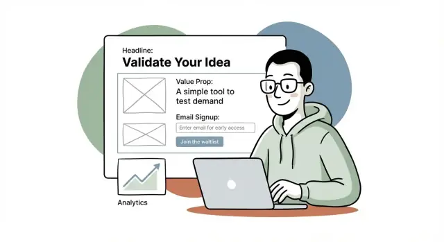
Pick a Simple Page Structure That Converts
Your validation page isn’t a mini website. It’s a focused tool to answer one question: “Do the right people care enough to take the next step?” The best structure is the one that removes choices and makes that next step obvious.
A recommended structure (in order)
Use a straightforward flow that matches how people decide in seconds:
- Headline: Say what it is and who it’s for.
- Subhead: Add a concrete outcome or differentiator.
- Primary CTA: One clear action (usually email signup).
- Proof: Light credibility (logos, numbers, short quote, or “built by…”).
- Details: 3–6 bullets or short blocks explaining what they get.
- FAQ: Handle the top objections (price, timing, effort, privacy).
If you’re unsure what to put where, think of it like this: promise → action → reassurance → explanation → objections.
Keep it to one scroll (where possible)
For early validation, aim for a page people can understand without scrolling much. One screen is ideal, one scroll is fine. The more they scroll, the more chances they have to abandon.
A practical approach:
- Make the headline + subhead + CTA visible above the fold on mobile.
- Keep “Details” tight—save long explanations for after signup.
Use one primary CTA, repeated 2–3 times
Pick a single action and make it the default everywhere. For most validation pages, that’s:
- “Join the waitlist”
- “Get early access”
- “Notify me when it’s ready”
Place the same CTA:
- near the top, 2) after the details, and 3) after the FAQ.
Avoid competing CTAs
Multiple CTAs (download, book, buy, follow, contact) dilute your data and confuse visitors. If you must include a secondary option, make it clearly secondary (smaller, less prominent) and keep it aligned with your goal—e.g., “See examples” rather than “Book a call.”
Write Copy People Understand in 10 Seconds
Your validation page isn’t the place for clever. It’s the place for clarity. Assume visitors will skim for 10 seconds and decide: “Is this for me, and what do I do next?”
Start with a headline that says who + what benefit
Use a simple formula: Benefit + audience (optionally add a proof-ish detail you can stand behind).
Examples you can adapt:
- “Plan meals in 5 minutes a week — for busy parents.”
- “Turn messy client notes into a clean proposal — for freelance designers.”
- “Track your workouts without spreadsheets — for home gym beginners.”
- “Collect customer feedback in one link — for indie founders.”
Follow with a supporting line that removes ambiguity:
“A lightweight tool that [does X] so you can [outcome], without [common pain].”
Explain the offer in 3–5 skim-friendly bullets
Keep bullets concrete and outcome-focused. Avoid feature labels like “AI-powered dashboard” unless you can clearly connect them to value.
Good bullet patterns:
- Save time: “Create your weekly plan in under 10 minutes.”
- Remove steps: “No templates to set up. Answer 6 questions and you’re done.”
- Reduce risk: “Preview results before you sign up.”
- Deliver an outcome: “Leave with a ready-to-send email (not ‘ideas’).”
- Fit the real world: “Works on mobile. Use it while commuting.”
If you can’t write at least three bullets without vagueness, your concept may be too fuzzy—tighten it before you drive traffic.
Use specific wording (and avoid “better”)
Replace generic claims with measurable or observable language:
- Instead of “Increase productivity” → “Finish invoices in 15 minutes.”
- Instead of “Simplify onboarding” → “One link for forms, docs, and next steps.”
- Instead of “Get insights” → “See which feature request appears most this week.”
Add microcopy that reduces anxiety
Tiny text near your form and CTA can boost signups.
Examples:
- Under the email field: “No spam. Unsubscribe anytime.”
- Near the button: “Join the waitlist — we’ll email only when there’s something to try.”
- Privacy note: “We don’t sell emails.”
- If you’re pre-charging: “Cancel anytime before launch.”
Clarity beats persuasion: make it easy for the right people to say “yes” quickly.
Design the Call to Action and Signup Flow
Iterate with less risk
Save versions and roll back quickly when an experiment doesnt work out.
Your call to action (CTA) is the moment of truth on a side project validation page. A good CTA makes it easy for the right people to raise their hand—without forcing a commitment they’re not ready for.
Pick a CTA that matches your stage (and risk level)
Choose one primary CTA and commit to it. Mixing multiple “main” buttons usually dilutes results.
Common options:
- Email waitlist: best when you’re early and validating demand.
- Demo request: best when you need conversations to understand workflows (especially B2B).
- Pre-order / deposit: strongest validation, but requires more trust and clarity.
- Short survey: useful when you’re exploring the problem space—just don’t hide behind endless questions.
As a rule: the earlier you are, the lower the ask should be. You can always follow up to deepen commitment.
Keep the form friction low
Only collect what you will actually use in the next 1–2 weeks. For many projects, that’s just an email.
If you need segmentation, add one optional field (e.g., “Role” or “Company size”). Avoid long forms that feel like a sales intake before you’ve earned trust.
Practical defaults:
- Email field + single button (“Join the waitlist”)
- Clear privacy hint (“No spam. Unsubscribe anytime.”)
Design the signup flow so people know what happens next
After submission, don’t dump people on a generic confirmation. Use a thank-you state that guides the next step:
- Ask a single follow-up question (“What are you trying to achieve with X?”)
- Offer a calendar link if you’re doing demos (only if you can respond fast)
- Add a share prompt (“Know someone who’d want this?”)
Also set expectations: tell them what they’ll receive and when (e.g., “We’ll email early access invites in January”). A clear CTA plus a clean, low-friction flow turns curiosity into measurable validation.
Add Trust Without Making Unverifiable Claims
Trust is a conversion feature. The goal isn’t to “sound big”—it’s to help a visitor believe you’re real, you understand their problem, and you can deliver what you’re offering.
Show lightweight proof you can honestly support
If you don’t have customers yet, don’t pretend you do. Instead, show something concrete:
- A short founder story: why you’re building this and what experience led you to it
- A prototype link, a short demo video, or a few screenshots (even Figma screens help)
- A clear status label like “In development” or “Private beta” so expectations match reality
A simple line like “Built by a former [role] who ran into this problem weekly” can outperform vague hype.
Use social proof only when it’s real
Social proof works best when it’s specific and verifiable. Only add it if you can stand behind it:
- Real quotes with names (and roles/companies if allowed)
- Logos only with permission
- Numbers only if accurate (e.g., “142 people on the waitlist”)
If you’re early, replace testimonials with “Seeking 10 design partners” and explain what they get.
Add credibility signals people look for
Visitors often scan for basic legitimacy markers:
- A visible contact method (email is enough)
- A short About section (who’s behind it)
- Privacy/terms links if you collect emails (e.g., /privacy, /terms)
Include a simple “How it works” (3 steps)
A quick 3-step block reduces uncertainty:
- Join the waitlist
- Get early access and onboarding
- Use the product and share feedback
Keep it plain, specific, and aligned with what you can deliver right now.
Choose Design, Domain, and Basic UX
Add a clean signup flow
Build the waitlist flow and thank you step so signups turn into real feedback.
Good design for a validation page isn’t about being fancy—it’s about removing friction so visitors can understand the idea and take one clear action.
Domain: buy now or use a subdomain?
If you’re testing whether anyone cares, a subdomain is often enough (e.g., yourname.notion.site or yourproject.carrd.co). It’s fast, free/cheap, and avoids commitment.
Buy a domain when you’re confident you’ll keep iterating on the idea, you want the page to feel more “real,” or you plan to run ads and want a cleaner URL. A good middle path: buy the domain but point it to a simple hosted page so you can ship today.
Mobile-first layout and readable text
Most validation traffic arrives on phones, so design for small screens first:
- Keep the main content in a single column.
- Use large, readable font sizes (aim for ~16–18px body text).
- Make the primary button easy to tap (not tiny, with enough spacing around it).
Choosing images that help (not distract)
Pick one visual that supports understanding:
- A screenshot if the product already exists.
- A simple mockup if it’s early (show the “before/after” or the key screen).
- A clean illustration if the concept is abstract.
Avoid stock photos that don’t match the product—they reduce trust.
Accessibility basics you can do in minutes
Accessibility also improves conversions:
- Ensure text/button contrast is high enough to read quickly.
- Use visible labels for form fields (not just placeholder text).
- Write clear button text (e.g., “Join the waitlist”), and make the whole button area clickable.
Build Options: No-Code, Templates, or Simple Code
You don’t need a “perfect” stack to validate an idea—you need something you can ship quickly, change easily, and measure.
No-code options (fastest to publish)
If your goal is to get a pre-launch landing page live today, these are the usual winners:
- Carrd: fastest for a single page; great for simple email signup form flows.
- Webflow: more control over layout and CMS-style content; steeper learning curve.
- Framer: modern design workflow; quick iterations; good for polished UI.
- Notion + Super: quickest for content-heavy pages; less control over conversion-focused layout.
- WordPress: flexible and familiar; can be overkill if you only need one page.
If you want the speed of no-code but still want a real application foundation later, a vibe-coding platform like Koder.ai can be a practical middle ground: you describe the landing page (and any follow-on MVP flows) in chat, iterate quickly, and still end up with a deployable app you can evolve—without committing to a full traditional dev cycle on day one.
Tradeoffs to consider (before you commit)
Speed vs. customization is the main tension. Carrd/Notion setups publish quickly but can feel limiting once you want custom sections, A/B tests, or advanced forms.
Cost vs. learning curve is the second. Webflow/Framer can replace a developer for many cases, but you’ll spend time learning their editor.
Hosting basics (don’t skip https)
Whatever you use, make sure the page loads over SSL (https). It affects trust, form submissions, and some analytics/referrer data.
If you’re using a template or simple code site, choose hosting that offers one-click SSL (common on Netlify/Vercel/GitHub Pages).
Quick-build essentials that still matter
Even for a one-day build, set up:
- Favicon (looks more legitimate in tabs and bookmarks)
- Page title (clear benefit + product name)
- Social preview (Open Graph/Twitter image so shares don’t look broken)
These small details increase clicks and signups without adding much work.
Set Up Analytics and Event Tracking
If you don’t measure actions, you can’t validate anything—you’re just collecting opinions. Your goal here is simple: confirm that real visitors take the next step (click, sign up, or book), and understand where those visitors came from.
Pick one analytics tool and install it correctly
Choose a lightweight setup you’ll actually check daily: GA4, Plausible, or a similar tool.
After installation, verify it’s working by opening your validation page in an incognito window and confirming you see an active visitor or a new page view in the dashboard. Do this before you spend time driving traffic.
Track the events that map to “intent”
Page views are not validation. Track actions that signal interest:
- Page view (baseline)
- CTA click (e.g., “Join the waitlist”, “Get early access”)
- Form submit (successful email signup)
- Calendar booking (if you’re validating via calls)
Most tools let you track button clicks and form submissions without code, but double-check that the event fires only once per action (no double-counting when a page reloads).
Add UTMs to every traffic source
UTM tags let you see what’s working without guessing. Create a habit: every tweet, post, community comment, and small ad gets a tagged link.
/your-page?utm_source=twitter&utm_medium=social&utm_campaign=validation&utm_content=post-1
Keep the naming consistent (e.g., always use twitter, not sometimes x). Consistency matters more than perfection.
Build a simple daily dashboard
Create a basic spreadsheet with one row per day. Track: sessions, CTA clicks, signups, bookings, and conversion rate (signups ÷ sessions). Add columns for your top UTMs so you can spot winners quickly.
The point isn’t fancy reporting—it’s making the next decision obvious: which channel to repeat, which message to rewrite, and whether your hypothesis is holding up.
Drive Targeted Traffic and Run Small Experiments
Go from page to product
When demand is real, evolve the page into a small MVP in the same workspace.
A validation page only works when the right people see it. The goal isn’t big traffic—it’s qualified traffic that resembles your future customers.
Start with 2–3 traffic sources you can reach this week
Pick channels where your audience already hangs out, and where you can show intent (not just impressions):
- Communities: niche subreddits, Slack/Discord groups, forums, indie maker spaces
- Newsletters: small creators who serve your audience (offer a concise blurb and a clear benefit)
- Partners: adjacent tools, agencies, or creators who can refer users in exchange for early access or a cross-promo
- Short-form video: quick demos, “before/after,” or problem-focused clips that link to your page
- Ads: small-budget search or social ads to test demand keywords or specific job titles
Post without spamming: lead with a learning goal
People are far more receptive when you’re transparent. Instead of “Sign up for my product,” try:
“I’m validating an idea to help [audience] with [pain]. I built a 1-page preview and I’m looking for feedback: what’s missing, what’s unclear, and would you use it?”
That framing earns clicks and comments—and comments are data.
Run small A/B tests that actually change decisions
Keep experiments focused and cheap. Test one variable at a time for a short window:
- Headline: problem-first vs outcome-first
- CTA text: “Join the waitlist” vs “Get early access” vs “Notify me”
- Pricing anchor: show an expected price range vs “Free during beta” vs no pricing mention
Define simple stop rules before you start
Decide what “enough signal” looks like so you don’t endlessly tweak:
- Iterate if you’re getting the right visitors but they don’t act (low signup/CTA rate) → messaging problem.
- Pivot channel if signups happen from one source but not others → distribution mismatch.
- Pivot idea if you’ve tested multiple sources and messages and still see little intent (few clicks, no signups, no meaningful feedback).
Small experiments, clear thresholds, and tight feedback loops beat big launches every time.
Follow Up, Learn, and Plan the Next Iteration
A validation page doesn’t work when it’s published—it works when you follow up. A signup is a signal, not a sale. Your next iteration should be based on what people did (clicked, signed up, replied), not what you hope they meant.
Turn results into a clear next step
Before you look at numbers, decide what each outcome means. For example: if you hit your signup goal, you build a small MVP. If you get traffic but weak conversion, you refine the niche or rewrite the offer. If you get signups but no one replies to follow-ups, the offer might be unclear or not urgent.
A simple rule:
- Strong conversion + engaged replies → build a basic MVP
- Decent traffic + low conversion → change positioning (problem, audience, promise)
- Signups + low engagement → adjust the offer and expectations (what happens after signup?)
Email follow-up that gets real answers
Send a short email within 24 hours. Keep it personal and easy to reply to—no surveys to start.
Ask one question that helps you understand intent, like:
“What were you hoping this would help you do?”
Then offer an optional next step:
- a 10–15 minute call to see if the idea fits their situation
- a quick “reply with A/B” choice (e.g., “Is your main goal X or Y?”)
If you’re not ready for calls, share a small update every week or two (progress, a mockup, a new angle) so you can measure continued interest.
Document learnings and update the page for round two
Write down what you learned in a running doc: top sources of traffic, best-performing headline, common objections from replies, and where people dropped off.
Then update one major thing at a time (headline, CTA, audience, or pricing signal) and rerun the experiment. If you already have a plan for monetization, consider adding a simple “starting at” range or link to /pricing to test willingness to pay.
For a structured next-pass plan, keep a lightweight checklist handy (see /blog/launch-checklist).