May 01, 2025·8 min
Create a Website for Small Retail Shops with Online Catalogs
Step-by-step guide for small retailers to plan, build, and launch a website with an online catalog, pickup options, and easy ongoing updates.
Decide What Your Website Needs to Do
Before you choose a theme, write copy, or take product photos, decide what the site is for. Many small retail shops end up with a website that looks fine—but doesn’t reduce phone calls, increase foot traffic, or help customers decide what to buy.
Online catalog vs. full online store
An online catalog (browse-only) is a product showcase: customers can view items, prices (optional), sizes/colors, and availability notes, then contact you or visit the shop. It’s ideal when inventory changes fast, products are custom, or you prefer selling in-person.
A full ecommerce store lets customers add to cart and pay online. It can increase after-hours sales, but it adds ongoing work: payment setup, taxes, shipping rules, returns, and customer support.
A practical middle path is “reserve / request / pickup”: customers browse online, then place an inquiry or hold request so your team confirms availability.
Define what “success” looks like
Pick 1–2 primary outcomes and design everything around them. Examples:
- More calls about specific products (with model numbers ready)
- More store visits from people who already know what you carry
- More quote requests for high-ticket or custom items
- More reservations (appointments, fittings, repairs)
- More online orders (if you go full checkout)
Write down how you’ll measure success: “20 quote requests/month” or “reduce ‘Do you have X?’ calls by 30%.”
Check constraints early
Be honest about what you can support week to week:
- Time: Who updates products and hours?
- Budget: Platform fees, photography, occasional help
- Staff skills: Comfort with editing items and responding to inquiries
- Inventory size: 30 hero products vs. 3,000 SKUs
- Photos/content: Do you already have usable images and descriptions?
A realistic timeline
For most shops, plan a simple cycle: Plan (1–3 days) → Build (1–2 weeks) → Launch (1 day) → Maintain (30–60 minutes/week).
A site that stays accurate beats a perfect site that’s outdated.
Know Your Customers and the Jobs They Visit For
Before you choose features or start uploading products, get clear on who the site is for and what they’re trying to do. Small retail sites work best when they mirror the real questions you hear at the counter.
Identify your main customer groups
List 2–4 core groups (not 12). Keep them specific and based on what you actually see in-store.
For example:
- Regular locals who already trust you and just need quick info
- New customers nearby who want to check prices, availability, or “do you carry X?”
- Time-poor shoppers who prefer to reserve and pick up
- Gift buyers who need ideas and reassurance (budget, bestsellers)
For each group, write what they usually ask in person: “Are you open today?” “Can I see sizes/colors?” “Where do I park?” “Do you do repairs?” Those questions should become website content.
Define the “60-second tasks”
Your website should help someone succeed quickly, especially on a phone. Write the top five tasks a visitor should complete in under 60 seconds. A practical default list is:
- Find opening hours (including holiday exceptions)
- See products (or at least categories and price ranges)
- Get contact options (call/text/email)
- Find directions and parking/public transit notes
- Understand how to buy (in-store, reserve, delivery, pickup)
These tasks should be obvious from the home page and top navigation—no hunting.
Collect competitor examples (and be picky)
Search for other local shops in your category and screenshot examples.
Note what you like (clear categories, simple “Reserve” button, clean photos) and what to avoid (pop-ups, tiny text, hiding hours, “Contact us” forms that don’t show a phone number). This saves time later when you’re making design decisions.
Choose one primary call to action
Pick the main action you want most visitors to take: Call, WhatsApp/SMS, Email, Book, or Visit.
Make it consistent: one primary button style across the site, placed prominently on mobile. Secondary actions can exist—but your site will convert better when the next step feels obvious.
Plan Site Structure and Navigation
A small retail website works best when shoppers can answer three questions quickly: What do you sell? Is it in stock (or can I order it)? How do I visit or contact you?
Your site structure and navigation should support those questions first—everything else is secondary.
Start with the essential pages
Keep the base set of pages simple and familiar:
- Home (a quick “what you sell + why you” overview)
- Catalog (the main entry to products)
- About (your story, trust, and what makes your shop different)
- Contact (phone/email plus a simple form)
- Store Info (address, hours, parking, accessibility, pickup details)
- Policies (returns, exchanges, delivery, privacy)
If you want to keep the top menu short, “Store Info” and “Policies” can live in the footer.
Keep the top navigation to 5–7 items
Aim for one clear path to the catalog and avoid clutter. A common setup is:
Home · Shop/Catalog · New Arrivals · About · Store Info · Contact
If you have many categories, use a dropdown under Shop rather than adding more top-level items.
Choose a catalog structure shoppers understand
Pick the organizing method that matches how customers talk about your products:
- Categories (e.g., Shoes, Skincare, Gifts)
- Collections (Seasonal Picks, Staff Favorites)
- Brands (if brand matters in your store)
- New Arrivals (great for repeat visitors)
Use one primary structure and add the others as optional filters or collection pages.
Plan product discovery: search, filters, sorting
Even a small online catalog benefits from:
- Search (especially if you carry many SKUs)
- Filters like size, color, price, and availability
- Sorting like Newest, Price (low to high), Best sellers
Draft a simple internal link map
Before building pages, sketch how people move through your site:
Home → /catalog → /catalog/category-name → /product/product-name → /contact
Add supporting links where they naturally help, such as “Questions?” linking to /contact, or a short note on policy pages linking back to /catalog.
Choose a Platform: Catalog-Only vs. Full Ecommerce
Before picking a builder, decide what you’re really selling online: information (a browsable catalog) or transactions (checkout, payment, fulfillment). The right choice saves you weekly headaches.
Option A: Catalog-only (inquiry-first)
A catalog-only site lets customers browse products, then call, message, or submit an inquiry to order. This works well for stores with changing stock, custom items, or prices that vary.
You’ll want fast product search and filters, clear “How to buy” prompts, and quick contact actions (call/text/email). It’s also simpler to maintain and avoids payment and shipping setup.
Option B: Full ecommerce (checkout)
If customers expect to buy immediately, choose checkout. This supports cards, digital wallets, taxes, shipping rates, click and collect, and automated order emails. It’s more setup work, but it can reduce back-and-forth and capture impulse purchases.
Beginner-friendly platforms (and what they’re good at)
Shopify: Best if you want checkout, inventory tools, discounts, and lots of integrations.
Wix / Squarespace: Good all-in-one builders with easier design control; solid for catalog-only or lighter ecommerce.
WordPress + plugins (WooCommerce, etc.): Flexible and powerful, but usually needs more ongoing care (updates, plugins, backups).
A modern alternative for custom workflows
If you want something more tailored than a template—like reserve/pickup, custom inquiry forms per category, or a catalog that matches how your staff actually sells—Koder.ai can be a practical option. It’s a vibe-coding platform where you describe the site in chat and generate a real application (React frontend with a Go + PostgreSQL backend), with features like source code export, hosting/deployment, custom domains, and snapshots/rollback for safer updates.
The key advantage for small retail is flexibility: you can start with a catalog + inquiries, then add checkout later without rebuilding from scratch.
Must-haves to check before you commit
Don’t choose based on a demo theme—choose based on weekly operations:
- Mobile editing (you may update products from the shop floor)
- Product variants (sizes, colors, bundles)
- Inventory tracking (even “low stock” alerts)
- Coupons and promotions
- Gift cards (big for local retail)
Integrations you may need later
Confirm support for your POS, Instagram shopping, Google Business Profile, and email marketing (welcome offers, back-in-stock, local events).
Finally, pick a platform based on who will maintain it every week, not just who can build it once. If updates won’t happen, the best features won’t matter.
Set Up Domain, Hosting, and Business Email
Build your retail site fast
Describe your shop site in chat and generate a working catalog app in minutes.
Getting these basics right makes your shop look established, helps customers trust the site, and prevents avoidable headaches later.
Choose a domain customers can remember
Start with your shop name. If it’s taken or too generic, add a simple modifier like your neighborhood, city, or specialty (for example, “oakstreetbooks.com” or “brighton-bikes.com”). Keep it short, easy to spell, and avoid hyphens if you can.
If you already have social handles, try to match them closely so people don’t wonder if they found the right business.
Hosting and HTTPS (SSL)
If you’re using a hosted website platform, hosting is included—your main job is connecting your domain.
If you’re self-hosting (WordPress on your own server), choose a reputable host with:
- Good support (chat or phone)
- Automatic updates and backups
- Easy SSL setup
Either way, make sure your site loads with HTTPS. That “padlock” matters: customers are more likely to browse, submit forms, and click “Call” or “Directions” when the site looks secure.
Set up a branded email address
A business email like [email protected] looks more trustworthy than a free personal address and keeps staff turnover cleaner.
Most domain registrars and platforms let you create an address and forward it to the inbox you already use, so you don’t have to change your routine. Consider creating two addresses:
- hello@… for customer questions
- orders@… for catalog inquiries or order messages
Basic security that small shops shouldn’t skip
Use strong passwords and turn on two-step login wherever possible. Give staff their own logins with the right level of access (avoid shared admin passwords).
If you self-host, confirm backups are automatic and restorable—backups only help if you can actually roll back after a mistake or issue.
Design for Mobile Shoppers and Walk-In Customers
Most people will discover your shop on a phone—often while they’re already out shopping. Your website should work for two mindsets at once: quick “where is it and is it open?” checks, and deeper browsing of your catalog.
Start mobile-first (not desktop shrunk down)
Design the smallest screen first. A simple header with your logo, a search icon (if you have it), and one primary action (like Call or Get Directions) beats a crowded menu.
Make every tap easy:
- Use large, tap-friendly buttons (especially for phone numbers and directions)
- Pick readable fonts and comfortable spacing
- Keep key info above the fold so visitors don’t have to hunt
Build trust in the first 10 seconds
For local retail, trust is practical. Put your address, hours, phone number, and a clear “How to find us” link near the top of the homepage and your catalog pages.
Add a few authentic photos—your storefront, aisles, staff, or best-sellers—so customers recognize your place when they arrive.
If you have reviews, surface them early (even a small snippet). It reassures new visitors that you’re real and reliable.
Keep the style consistent and calm
A consistent visual system makes your catalog feel easier to use:
- Limit yourself to two fonts (one for headings, one for body text)
- Choose 2–3 brand colors and stick to them
- Reuse the same button styles everywhere (for example: one primary color for “Reserve” or “Check availability”)
Don’t skip accessibility basics
Accessibility also improves clarity for everyone:
- Ensure good text/background contrast
- Add alt text to product and storefront images
- Use clear labels on forms (not just placeholder text)
Protect page speed (especially on cellular)
Mobile shoppers are often on a weaker connection. Compress images, avoid heavy animations, and keep pages focused.
Fast pages make browsing your catalog feel effortless—and reduce drop-offs before people even see what you sell.
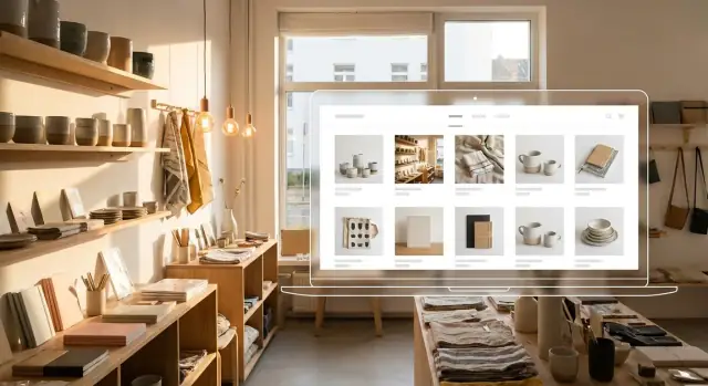
Build an Online Catalog That People Can Actually Use
A good online catalog does the same job your best staff member does: it helps a shopper quickly figure out what it is, whether it will work for them, and how to get it.
The goal isn’t to list everything perfectly on day one—it’s to make the catalog easy to browse, search, and trust.
Start with the minimum product data (and keep it consistent)
Every product page should have a clear set of basics that you fill in the same way each time:
- Product name (use real-world names people search for, not internal nicknames)
- Price or price range (even “$40–$60” reduces “how much is it?” calls)
- Availability (in stock, limited, preorder, or “call to confirm”)
- SKU (helps customers reference the right item on the phone and helps you find it fast)
- Options (size, color, finish, scent, etc.)
Consistency matters more than perfection. If one item has sizes listed as “S/M/L” and another uses “Small/Medium/Large,” filters and customer scanning both get harder.
Write descriptions that answer the questions you hear in-store
If your staff repeats the same answers all day, those answers belong on the product page.
Aim for short, helpful descriptions that cover:
- Size / dimensions (and what those measurements mean in real use)
- Materials (and any allergy, safety, or durability notes)
- Care instructions (wash/cold, wipe clean, battery type, refills)
- Warranty / returns (keep it simple and link to your policy page)
A practical structure is: one plain-English paragraph, then a few quick specs. That’s enough for most shoppers to decide if they should visit or message you.
Make browsing easy with categories and tags
Your categories should match how customers think, not how you stock shelves. Keep top-level categories limited (often 5–8 is plenty), then use tags for details like “giftable,” “eco-friendly,” “new,” “under $50,” or “local maker.”
Good tags improve filtering and also support local retail marketing ideas like seasonal collections (e.g., “Holiday hosting” or “Back-to-school”).
Handle variants and stock notes clearly
If an item comes in multiple sizes or colors, add variants so customers don’t need separate pages for each version. Then be explicit about stock:
- In stock (ready today)
- Limited (say “only 2 left” if your platform supports it)
- Preorder (include expected timing)
This reduces frustration and sets expectations before someone makes the trip.
Add “Pairs well with” and “Similar items” to keep shoppers moving
Cross-sells don’t have to feel salesy. Use gentle suggestions like:
- Pairs well with: accessories, refills, matching pieces
- Similar items: alternatives at different price points or styles
This helps when something is out of stock and keeps customers engaged—especially on mobile—without forcing them to start over from the homepage.
Create Product Photos and Content Efficiently
Own your app stack
Keep control by exporting source code whenever you want.
Good catalog photos don’t require a studio—they require consistency. When every item is shot the same way, your catalog feels trustworthy and customers can compare products quickly.
A simple photo setup that stays consistent
Pick one spot and keep it “locked in” for repeat shoots. A reliable setup: a table near a window for soft natural light, a consistent background (plain wall, poster board, or fabric), and your phone on a small tripod or stack of books.
For each item, aim for 3–6 angles:
- Front (or main view)
- Side/profile
- Back/closure/label
- Detail shot (texture, pattern, hardware)
- Size reference (handheld or next to a common object)
Add one in-context photo when it helps people understand scale or use—on a table, on a shelf, worn, or next to everyday items.
Fast content that answers the real questions
Write product copy like you’re helping someone decide in 10 seconds. Use a repeatable template:
- What it is (plain-language name)
- Key benefit (why someone would want it)
- Size and materials (include measurements)
- Variations (color, scent, fit)
- Care or warranty notes
Keep descriptions short, but always include the information that prevents returns and back-and-forth messages.
Don’t let updates turn into chaos
Create a naming workflow before you upload anything. For example:
category_productname_color_size_01.jpg
Match photo names to SKU or barcode when you have one. Put originals in one folder and edited versions in another, so you can re-export later without guessing.
Make categories feel “designed”
Give each category one key visual: a simple banner photo, a small icon, or 1–2 lines of intro copy that sets expectations (price range, best uses, what’s included).
Keep edits honest
Avoid misleading edits—customers notice. Don’t push saturation to “prettier” colors, and always show accurate scale. If lighting changes color, add a quick note like “shown in natural light” and include a second angle for clarity.
Choose Ordering Options: Inquiry, Pickup, Delivery, or Checkout
Your ordering setup should match how your shop actually operates day to day. Many small retailers do best by starting simple (inquiries + pickup) and adding checkout later once fulfillment is predictable.
Option 1: Catalog inquiries (fastest to launch)
If stock changes quickly—or items are one-of-a-kind—add lightweight buttons on every product:
- Request availability (customers submit size/color, quantity, and preferred pickup time)
- Ask a question (customers ask about fit, compatibility, or alternatives)
Route these to a shared inbox (or a form that creates an email). Set expectations near the button: “We typically reply within 2 business hours.”
Option 2: Local pickup or reservation (great for walk-in shops)
A simple “Hold for pickup” flow can increase foot traffic without the complexity of shipping. Be very clear about the rules:
- Hold window: 24–48 hours
- What’s required: name + phone/email (and optional deposit if you use one)
- Pickup location and hours
Repeat these details on the product page and again in the confirmation message so there’s no confusion.
Option 3: Delivery or shipping (only if you can fulfill reliably)
Don’t offer shipping everywhere “just in case.” Set shipping rules that reflect real capacity:
- Regions you serve
- Rates (flat, by order total, or carrier-calculated)
- Delivery times (and cutoff times)
If you offer local delivery, define the radius and minimum order.
Option 4: Full checkout (when you’re ready to sell online)
Before enabling checkout, decide payment methods, transaction fees, and how refunds are handled.
Create a clear returns/exchanges policy page and link it from product pages (e.g., “Returns & exchanges”). A visible policy reduces hesitation and prevents awkward disputes later.
Get Found Locally with Simple SEO
Plan the site structure
Use Planning Mode to map pages, navigation, and your primary call to action before building.
Local SEO is about making it easy for nearby shoppers to discover you when they search “near me” or include a place name. The goal isn’t to game search engines—it’s to clearly describe who you are, where you are, and what you sell.
Put your location where it naturally belongs
Work your city or neighborhood into key pages in a way that reads normally:
- Your homepage intro (e.g., “A stationery shop in River North, Chicago”)
- Contact page and footer
- A couple of top category pages (e.g., “Running Shoes in Austin”) if you genuinely serve that area
Avoid stuffing the same phrase everywhere. A few clear mentions beat repetition.
Keep your NAP consistent (Name, Address, Phone)
Make sure your business name, address, and phone number match everywhere—your website, Google, and social profiles.
Add NAP in:
- The site footer (visible on every page)
- A dedicated contact page (include hours and parking/pickup notes)
If you have multiple locations, give each one its own page with its own details.
Set up Google Business Profile (and earn reviews ethically)
Claim and complete your Google Business Profile, then link to your website’s contact/location page.
After purchases, invite customers to leave a review—no incentives, no pressure. A simple method is adding a “Review us” link on receipts or follow-up messages.
Write better titles and descriptions for your main pages
Your page title and meta description often show up in search results. Write unique ones for your top categories:
- Title example: “Gift Candles in Brooklyn | Pine & Co.”
- Description example: “Hand-poured candles, quick pickup, and seasonal scents. Visit our Brooklyn shop or browse the catalog.”
Publish a few helpful posts that link to products
Create 3–6 short posts that answer common questions and guide shoppers to items in your catalog:
- Care tips (“How to clean leather boots”)
- Sizing guides (“How our denim fits”)
- Gift guides (“Gifts under $25 for teachers”)
Link from each post to relevant catalog pages (and consider a simple /blog index so people can find them later).
Launch, Measure Results, and Keep the Site Updated
Launching your site isn’t the finish line—it’s when you finally get real feedback. A smooth launch, basic measurement, and simple routines will keep your catalog helpful.
Run a pre-launch checklist (so opening day is calm)
Before you share the link anywhere, do a quick quality pass:
- Broken links and missing pages: click every menu item, category, and footer link.
- Speed check: test on mobile data; heavy photos are the usual culprit.
- Legal and trust basics: contact info, returns/exchanges, privacy policy, and terms if you take orders.
- Backup plan: know how to restore your site (or how to reach support) if an update goes wrong.
If you’re on a platform that supports snapshots/rollback (for example, Koder.ai includes this), use it before major edits so you can revert quickly if something breaks.
Add analytics and define “success”
Install GA4 (or use your platform’s built-in analytics) and set a few clear goals you can actually act on:
- Phone clicks (calls)
- Contact form submissions
- “Get directions” clicks
- Purchases (if you have checkout)
If you offer click and collect, track taps on “Reserve,” “Pickup,” or “Availability” buttons—those are strong buying signals.
Test the full journey on a phone
Do this yourself and ask a friend to try it too:
Search → open a product → find price/availability → contact/checkout → confirmation.
You’re looking for friction: tiny buttons, confusing options, missing confirmation messages, or forms that feel endless.
Keep a simple monthly maintenance checklist
Once a month, spend 30 minutes:
- Update hours (seasonal changes and holiday closures)
- Refresh featured items (what you want to sell now)
- Clean up out-of-stock items (hide, mark “sold out,” or suggest alternatives)
- Verify contact details and pickup/delivery notes
Improve based on real data
Use analytics to guide small upgrades:
- Which pages get the most views?
- What search terms bring people in?
- Which items get attention but don’t convert?
Then adjust: rewrite unclear product titles, add better photos to top items, and make your best-sellers easier to find from the homepage.