Nov 09, 2025·8 min
How to Build a Website That Guides Software Buying Decisions
Learn how to plan, design, and launch a website built around a software buying checklist—structure, templates, interactive features, SEO, and analytics.
Learn how to plan, design, and launch a website built around a software buying checklist—structure, templates, interactive features, SEO, and analytics.
A checklist site can’t be everything to everyone on day one. If you’re vague about what it’s for, you’ll end up with generic advice, unclear calls to action, and visitors who leave without taking the next step.
Decide what “success” looks like for the site. Pick the main job it should do, and let every page reinforce it.
Common goals for a software buying checklist website include:
If you choose more than one, set a priority order. For example: educate first, then convert.
Most software purchases involve multiple roles. Your checklist should speak to each one’s “why,” not just the product features.
Choose a primary audience to write for, and treat the others as secondary paths (for example, separate “Security & IT” criteria blocks).
Start with one category where you can go deep—such as CRM, HRIS, project management, or billing. A focused first checklist builds credibility and gives you a template to replicate across other categories later.
Tie your goal to measurable behaviors:
These metrics will guide what you build next—and what to remove.
A checklist site is most effective when the content mirrors how people actually buy software. Before you write individual items, define the “spine” of the checklist: the stages, the categories within each stage, and the evidence a buyer should collect to answer each question confidently.
Organize your framework around the typical decision flow so readers always know what to do next. A practical set of stages is:
This structure also makes it easier to create dedicated pages later (for example, an “Approval” page focused on security reviews and procurement questions).
Within each stage, group items into stable categories buyers expect to compare:
Keeping the same categories across different software types (CRM, HRIS, analytics, etc.) makes your site feel predictable and speeds up comparison.
Each checklist item should be something a buyer can answer with proof, not a vague preference. Aim for question formats like:
Add a short “Why it matters” note under technical topics (security, APIs, data retention) so non-technical readers understand the impact on risk, cost, or daily work.
Choose the format based on how your audience shares decisions:
Design the framework once, then publish it in whichever format matches how buyers actually move information through their team.
Visitors should be able to reach the right checklist in two or three clicks. Your structure should mirror how people buy software: pick a category, understand options, evaluate, then decide.
Start with a small set of pages you can keep consistent as the site grows:
If you’re starting out, begin with one software category (e.g., CRM or help desk). You’ll learn what users search for, which criteria matter, and what language they use. Once you have repeatable templates and a few high-performing pages, expand into adjacent categories.
If you support multiple categories from day one, keep the hub page strong: consistent naming, tags, and an obvious way back to the index.
Use a top navigation that matches intent:
Add breadcrumbs on checklist pages so visitors can move between category → checklist → related comparisons.
A glossary reduces confusion and builds confidence—especially for acronyms buyers see in vendor sales pages. Include short definitions for terms like SSO, SOC 2, SLA, DPA, HIPAA, and uptime. Then reference those terms consistently across checklist items so readers don’t feel lost mid-evaluation.
The best platform for a checklist site is the one that lets you publish, update, and standardize pages quickly—without turning every change into a mini project. Start by deciding how often you’ll edit checklists, how many people will contribute, and how comfortable you are with ongoing maintenance.
No-code tools work well when you want speed and simple editing (and you can accept some limits). They’re a good fit for a small team publishing a few high-quality checklists.
Website builders are often the fastest path to a polished site. They usually include hosting and security, and they’re friendly for non-technical editors. The tradeoff is less flexibility if you later want deeper search, filtering, or custom interactions.
A CMS (hosted or self-hosted) makes sense when you’ll scale to many pages, multiple content types, and workflows (drafts, reviews, approvals). It takes more setup, but it’s often the most sustainable for a checklist library.
If you want to ship an interactive experience without assembling a full stack first, a vibe-coding platform like Koder.ai can be a practical middle ground: you can describe the checklist workflow in chat, generate a React-based web app with a Go + PostgreSQL backend under the hood, and iterate quickly as you learn what buyers actually use (with options like planning mode, snapshots, rollback, deployment/hosting, and source code export when you’re ready to own the code).
Before you choose anything, confirm you can create reusable templates for:
If your platform makes consistent templates hard, your content will drift and become harder to maintain.
Make sure the stack covers the basics from day one: fast hosting, SSL, automated backups, spam-protected forms, and basic analytics. Also verify that editors can update content without breaking layouts.
You don’t need everything at launch, but you should avoid dead ends. Validate whether the platform can support later additions like on-site search, filters, saved shortlists, or user accounts. Choose tools that can grow with you while keeping the first version simple and shippable.
A checklist site succeeds or fails on readability. People arrive with a goal (pick the right tool, compare options, justify a budget), and your page design should help them move step-by-step without feeling lost.
Make every item predictable so users don’t have to relearn the page as they scroll. A simple pattern works well:
Question → Explanation → How to verify
For example: “Does it support SSO?” (question), a one-paragraph plain-English reason (explanation), then a concrete action like “Ask for their SSO documentation or a demo showing SAML setup” (how to verify). This structure turns a software selection checklist into decisions, not just opinions.
Use clear headings and short sections, and group related criteria (security, pricing, onboarding, integrations). Accordions can help when explanations would otherwise make the page feel endless—especially on a SaaS comparison page—but keep the titles descriptive so users can skim effectively.
Checklists feel lighter when users can see momentum. Add a simple progress indicator (e.g., “12 of 30 criteria reviewed”) and a “save your place” option. Saving can be as basic as remembering progress on the device, or offering an optional email send of the current state—only when it truly helps.
Most checklist UX problems show up on phones: cramped tap targets, hard-to-read text, and jumpy layouts. Use generous spacing, large checkboxes/toggles, and avoid tiny inline controls.
Cover accessibility basics: strong contrast, full keyboard navigation, and descriptive labels for every interactive element. This also improves clarity for everyone using your interactive checklist builder.
Reusable templates keep your checklist site consistent, faster to update, and easier to scale as you add new categories and vendors. The goal is to standardize the “shape” of each page so visitors always know where to find what they need.
Create one master template for any “software selection checklist” page. Use reusable blocks you can rearrange without redesigning:
Aim for a predictable rhythm: brief context → criteria → how to act on the result.
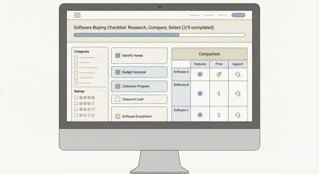
A comparison table template turns research into a quick yes/no/maybe shortlist. Keep the columns stable across pages:
Design it so it works on mobile: allow horizontal scroll, and prioritize the first 2–3 columns for quick scanning.
Each vendor profile should answer the same questions in the same order:
Small CTA text changes can improve action rates without being pushy:
Include 3–5 questions such as: “How do I score this?”, “What if I don’t need every feature?”, and “How often is this updated?” Keep answers to 2–3 sentences each.
A checklist site is most useful when it doesn’t just display criteria—it helps visitors turn criteria into a decision. The goal is to add interactions that feel like a helpful worksheet, not a heavy app.
Start with simple checkboxes for each evaluation item (security, integrations, onboarding, support, pricing model). Then add two lightweight upgrades:
Keep scoring optional—many buyers want clarity, not math.
If your checklists cover more than one scenario, filters prevent overwhelm. Useful filters include:
When a filter is selected, update the page instantly: hide irrelevant criteria, adjust recommended weights, or swap examples (for instance, “audit logs” means different things in regulated industries).
Buying decisions are collaborative. Offer an export option that doesn’t require an account:
Make the output clean: chosen must-haves, top scored criteria, and any notes.
Add a small panel that updates as users interact. Examples:
Use instant feedback, save progress locally, and avoid long loading spinners. A checklist should feel like paper: responsive, simple, and easy to revise.
People arrive on checklist pages with a specific job to do: make a decision faster. If your lead capture interrupts that job, they’ll leave. The goal is to offer help that feels like the natural next step after they’ve made progress.
A good lead magnet is a direct extension of the checklist—not a generic “subscribe for updates.” Make it something the visitor can use immediately:
Position it as a time-saver: “Take this to your team” or “Turn your answers into a scorecard.”
Use a few well-timed calls-to-action instead of a constant banner.
Keep the design consistent with the checklist so CTAs look like part of the experience, not ads.
Ask only for what you truly need—often email + role/company is enough. Add one sentence that explains what happens next, for example:
If there will be follow-up, say so plainly. Clarity reduces hesitation.
After submission, don’t drop users on a generic “thanks” page. Send them to a page that continues their buying journey, such as:
Include a lightweight “request a review” or “suggest an item” form. It captures high-intent visitors and improves your checklist content over time—without forcing everyone into a sales path.
People use a software buying checklist to reduce risk. Your site should reduce risk, too—by making it obvious how decisions are supported, how the site is funded, and how readers can reach you.
Don’t treat your checklist criteria as “common sense.” Briefly explain where they come from: buyer interviews, vendor documentation, support tickets, security questionnaires, or product demos.
Add a short “How this checklist is maintained” note on each checklist page:
This makes your evaluation criteria feel like a living process rather than a static opinion.
Instead of “Best,” “Guaranteed,” or “Fully compliant,” use language that invites validation:
Where possible, include a simple “How to verify” step next to key checklist items (security, uptime, data residency, integrations). For example: “Request the current SOC 2 report,” or “Confirm SSO support with a test tenant.” You’re not just ranking tools—you’re helping buyers confirm fit.
If you use affiliate links, sponsored placements, or paid inclusion, disclose it clearly near comparison content and in a dedicated policy. Say what “sponsored” means (placement, review access, or compensation) and what it does not mean (no control over conclusions).
In the footer, include easy-to-find policy pages such as /privacy and /cookies. Keep the language plain: what data you collect, why, and how users can opt out.
Add contact information (a simple email is fine) and publish an editorial policy page like /editorial-policy. Explain who writes, how products are evaluated, and how conflicts of interest are handled. Trust grows when readers can see the rules you follow.
A checklist site only works if the right people find it at the moment they’re evaluating options. Your SEO plan should focus on buyer-intent searches and make it easy for visitors (and search engines) to understand what each checklist page is for.
Start with terms that signal evaluation and purchasing work, such as “software buying checklist website,” “software selection checklist,” “RFP checklist,” “vendor evaluation,” and “software evaluation criteria.” Map each keyword cluster to a specific page type:
This keeps your content focused and reduces keyword cannibalization.
For each page, write:
Use internal links deliberately. Link from supporting articles to the relevant checklist, and from each checklist back to the hub and adjacent checklists (“Next: Vendor Demos Checklist”). Keep anchor text descriptive (e.g., “implementation readiness checklist,” not “click here”).
Create short, specific articles that answer the questions people ask right before they need a checklist: defining requirements, setting evaluation criteria, avoiding common procurement mistakes, and running a fair scoring process. Each article should point to the most relevant interactive checklist as the next step.
If a checklist page includes an FAQ section, use FAQ schema to help search engines understand the Q&A structure. Don’t force schema onto pages that aren’t actually FAQs.
Treat each new checklist as an asset to distribute:
Consistency beats bursts: publish, distribute, measure what drives engaged sessions, then repeat.
A checklist site is never “done.” Buying criteria change, vendors shift pricing, and your visitors will tell you (quietly) where the page is confusing. The goal is a lightweight measurement loop that shows you what to fix next—without turning your team into full-time analysts.
Set up analytics that reflect real progress through the checklist, not just pageviews. At minimum, track:
If your checklist is interactive, also track which criteria get selected most often. That data can guide future content updates and the default order of sections.
Numbers tell you where people drop off; qualitative tools help explain why. Heatmaps or session recordings are optional, but they’re a quick way to spot issues like:
Make changes you can evaluate in a week, not a quarter. Good candidates:
Keep a simple log: what changed, when, and what metric you expected to move.
Set a recurring update schedule (monthly or quarterly) for evaluation criteria, screenshots, and vendor notes.
Before every launch, run a basic checklist: page speed, mobile QA, broken links, backups, and a quick end-to-end test of interactive elements and form delivery.
Pick one primary outcome and prioritize it.
Choose a primary audience and write directly to their job-to-be-done.
Then add secondary paths (like separate “Security & IT” blocks) instead of mixing everything into one generic checklist.
Launch with one “hero” use case so you can go deep and build credibility.
Examples: CRM, HRIS, project management, billing. A focused first checklist becomes the template you replicate across categories later.
Track behaviors that match your goal, not vanity metrics.
Practical metrics include:
Use buying-journey stages so readers always know what to do next.
A useful spine is:
This also makes it easy to create dedicated pages later (e.g., an Approval page for security + procurement).
Write each item as a testable question with required evidence.
Example pattern:
Add a short “Why it matters” note for technical items so non-technical stakeholders understand the risk/cost impact.
Make it easy to reach the right checklist in 2–3 clicks.
A solid starter set:
Choose the stack that lets you publish and standardize quickly.
Before committing, confirm you can reuse templates for checklist pages, vendor profiles, and comparison pages.
Use a consistent item layout that supports scanning and verification.
A practical pattern is:
Also keep it scannable (clear grouping, short sections), mobile-first (big tap targets), and accessible (contrast, keyboard navigation, descriptive labels).
Offer help after users make progress, not before.
Tactics that stay low-friction: