Jun 15, 2025·8 min
How to Create a Website for a Step-by-Step Migration Guide
Learn how to build a clear website for a step-by-step product migration guide—structure, templates, navigation, SEO, and launch checks to keep users moving.
Clarify the migration goal and audience
Before you design pages or write steps, get clear on who is migrating and what “done” looks like. A migration guide that tries to serve everyone at once often ends up serving no one: it becomes either too shallow for experts or too complex for beginners.
Define the primary audience (and secondary readers)
Start by naming your core reader types in plain language. For a product migration guide, common audiences include:
- Admins who need planning, permissions, backups, and risk management
- Developers who need API changes, config examples, and integration steps
- End users who need what will change, what to click, and how to confirm success
Pick one primary audience for the main step flow. Then decide how the other audiences will be supported: separate tracks, callouts (“For admins”), or prerequisite pages. This keeps the main journey clean while still providing depth.
List the migration types you must support
Not all migrations happen the same way. Write down the migration “modes” your website must cover so you don’t discover missing paths mid-build:
- Self-serve: customers follow the guide without human help
- Assisted: steps plus checkpoints for working with your team or partner
- Phased: migration in stages (pilot → partial rollout → full cutover)
Each type may need different entry points, prerequisites, and verification steps. Capturing this early informs your navigation and template design later.
Set success criteria that you can measure
Define success criteria that align with why the guide exists. Useful metrics include:
- Completion rate: how many users start and finish the guide
- Reduced support tickets: fewer “how do I migrate?” and “it failed” requests
- Time to migrate: median time from starting to successful cutover
Turn these into a short “definition of success” statement you can share with stakeholders. It will help you prioritize what to write first.
Decide what’s in scope vs. out of scope
A step-by-step migration site should feel dependable because it’s specific. Make explicit decisions about what the guide will and won’t cover—for example, supported source versions, optional advanced optimizations, unsupported third-party tools, or edge cases.
Write an “Out of scope” note for internal alignment, and plan a short public-facing statement (“This guide covers X and Y; for Z, contact support”). Clear boundaries prevent endless additions and keep the guide maintainable.
Collect requirements and migration knowledge
Before you write a single step, collect what “success” looks like and what can break. This is the point where you turn scattered tribal knowledge into a clear, shared plan for the guide.
Build a single source of truth
Create one place where every migration requirement and decision is captured—your draft site, a working doc, or a project board. The format matters less than the rule: one authoritative list of steps, prerequisites, and owners.
Include:
- What users are migrating from and to (versions, plans, environments)
- The “happy path” steps, in order
- Required inputs (exports, credentials, keys)
- Who approves changes when the steps evolve
Interview the teams who see real failures
Support, onboarding, solutions engineering, and customer success know where migrations go sideways. Run short interviews focused on specific cases:
- Top 10 ticket themes related to migration
- Steps users often skip or misunderstand
- Common time estimates (and why they’re wrong)
- Workarounds that should become official guidance
Capture each pitfall with: symptom, likely cause, how to confirm, and the safest fix.
Map dependencies and prerequisites
List every dependency that can block a step so you can surface it early:
- Accounts, roles, and permissions
- Data export/import formats and limits
- Integrations (SSO, billing, webhooks, APIs)
- Network and security constraints (IP allowlists, domains)
Draft a lightweight glossary
Migrations are full of acronyms and overloaded terms. Create a simple glossary that defines product-specific words in plain language and notes synonyms users might search for. This reduces confusion and keeps terminology consistent across the guide.
Design the information architecture
A migration guide succeeds when people can quickly answer two questions: “Where do I start?” and “What do I do next?” Information architecture (IA) is how you organize pages so those answers are obvious, even for someone seeing the guide for the first time.
Choose a structure that fits real usage
Most migrations need two reading modes: people who want to follow the steps in order, and people who want a quick answer to a specific problem.
Use a hybrid structure:
- Linear path (Start → Finish): a clear sequence that guides users from preparation through completion.
- Reference pages: standalone pages for concepts, edge cases, and common issues that users can jump to when stuck.
This keeps the main journey simple without hiding important details.
Plan top navigation around the job to be done
Keep the top navigation consistent and task-based. A practical set is:
- Overview
- Prepare
- Migrate
- Verify
- Troubleshoot
- FAQ
These labels match how users think during a migration, and they reduce time spent hunting for the right section.
Add a “Start here” page that sets expectations
Create a dedicated Start here page near the top of the flow. It should explain:
- Time estimate (best case vs. typical)
- Roles and responsibilities (who does what)
- Prerequisites (access, permissions, backups, supported versions)
This page prevents frustration by making hidden requirements visible before users commit.
Use consistent URLs and predictable page types
A clean URL pattern helps users orient themselves and supports easy sharing and search. For example:
/migration/prepare/migration/migrate/migration/verify
Keep page types consistent (Step, Concept, Checklist, Troubleshooting). When every page “feels” familiar, users spend less effort learning the site and more effort completing the migration.
Select the website platform and publishing workflow
Choosing the right platform is less about trendy tools and more about how quickly your team can publish accurate steps, fixes, and updates. A product migration guide changes often—so your platform must make editing and releasing changes routine, not a special event.
Platform options (pick what fits your team)
A traditional CMS works well if multiple people need a friendly editor, scheduled publishing, and page management. A static site generator can be ideal if you want speed, a clean structure, and changes controlled through reviews (often via Git). A help center platform is a strong choice when you need built-in search, categories, and support-style workflows.
If your team also needs to spin up small internal tools to support the migration journey—like a “readiness checker,” a data validation dashboard, or a guided checklist app—Koder.ai can help you prototype and ship those quickly via a chat-based workflow. It’s a practical way to reduce engineering overhead while keeping the migration experience consistent across docs and tooling.
Confirm the essentials before you commit
Make sure the platform supports:
- Search that works well with step-by-step tutorial pages and troubleshooting terms
- Versioning (or a practical alternative) so users can follow steps that match their product version
- Redirects to prevent broken bookmarks when you rename or move pages
- Analytics to see where users drop off, what they search for, and which steps cause confusion
- Access control, if your migration checklist includes internal-only notes or partner content
Define roles and a lightweight workflow
Decide who can draft, review, approve, and publish. Keep the workflow simple: one owner per section, a clear reviewer (often support or product), and a predictable release rhythm (for example, weekly updates plus urgent fixes).
Document the decision and keep the toolset simple
Write down why you chose the platform, who owns it, and how publishing works. Avoid piling on extra tools unless they solve a specific problem; a smaller toolset makes updates faster and reduces “process debt” over time.
Create reusable page templates for steps
Reusable templates keep your migration guide consistent, scannable, and easier to maintain. They also reduce writer-by-writer variation, which is where users start missing critical details.
A step page template that users can predict
Aim for one “unit of work” per page: a single action the user can complete and verify. Use a fixed structure so readers always know where to look.
**Goal:** What this step achieves in one sentence.
**Time estimate:** 5–10 minutes.
**Prerequisites:** Accounts, permissions, tools, or prior steps.

### Steps
1. Action written as an imperative.
2. One idea per line.
3. Include UI path and exact button/field labels.

### Expected result
What the user should see when it worked.

### Rollback (if needed)
How to undo safely, and when to stop and ask for help.
This “goal, time estimate, prerequisites, steps, expected result, rollback” pattern prevents two common failures: users starting before they’re ready, and users not knowing whether they succeeded.
Reusable callouts for common moments
Define a small set of callouts and use them consistently:
- Important: required constraints (permissions, downtime windows, irreversible actions)
- Tip: speed-ups or optional best practices
- Warning: risk to data, billing, access, or security
- If you see this error…: plain-language symptom + likely cause + next action
Keep callouts short and action-oriented—no essays inside callouts.
Standardize screenshots, labels, and change history
Create rules for screenshots (same resolution, same theme, cropped to the relevant UI). Match UI labels exactly to the product, including capitalization, so users can search and visually confirm.
Add a small changelog block on every step page with a Last updated date and a one-line summary of what changed. This builds trust and makes support and maintenance far easier.
Build user-friendly navigation and step flow
Publish troubleshooting faster
Build a troubleshooting hub that maps symptoms to safe fixes and escalation details.
A migration guide works best when users always know three things: where they are, what’s next, and how to recover if they need to pause. Your navigation should reduce decision-making, not add to it.
Make progress obvious
Use clear step numbering that matches page titles and URLs (for example, “Step 3: Export data”). Pair it with a progress indicator at the top of each step (for example, “Step 3 of 8”). This is especially helpful for long migrations where users may return days later.
Keep the “current step” visually highlighted in the navigation so users can re-orient instantly.
Provide multiple ways to move forward
Add “Next” and “Previous” buttons at the bottom of every step page, and consider repeating them at the top for lengthy steps. Users should be able to follow the happy path without opening the sidebar.
Alongside that linear flow, include a step list sidebar that shows the full sequence. This helps experienced users jump directly to a step and helps cautious users preview what’s coming.
Design each step for scanning
Keep paragraphs short, and separate actions from explanations. Use checklists for tasks and a small prerequisites table near the top so users can verify they’re ready before they start.
Example prerequisites table:
| You’ll need | Why it matters |
|---|---|
| Admin access | To change settings |
| Backup completed | To restore if needed |
Reduce typing and errors
Where users must run commands or enter settings, provide copy-paste snippets and label what each snippet does. Keep snippets minimal and safe by default.
# Verify connection before migrating
mytool ping --target "NEW_SYSTEM"
Finally, make “Save and resume later” easy: show what’s already completed and remind users where to pick up next time.
Write preparation and prerequisites content
Preparation content is where migrations succeed or fail. Treat it as a first-class part of the guide, not a short note at the top of Step 1. Your goal is to help readers confirm they’re eligible to migrate, understand what will change, and gather everything they need before any irreversible action.
Add a dedicated “Before you start” checklist page
Create a single page that readers can complete in one sitting. Keep it scannable, and make each item testable (something they can confirm, not just “be ready”). Examples include confirming the current plan/tier, required integrations, access to email/domain/DNS, and whether test/staging is available.
If your audience includes teams, add a short “Who needs to be involved” block so a reader can quickly loop in the right people.
Clarify data ownership, permissions, and roles
Spell out:
- Who owns the data (team/org vs. individual account) and what that means for exporting, deleting, and re-importing.
- Required permissions for each task (admin, billing owner, workspace owner, database admin). If a step must be performed by a specific role, say so upfront.
- Separation of duties for sensitive actions (for example, one person exports data, another validates and approves the cutover).
This prevents readers from getting stuck mid-process due to missing access.
Time estimates and downtime expectations (only when verified)
Include time and downtime notes only when you can validate them through testing, analytics, or support history. Present them as expected ranges and list what affects them (data size, number of users, third-party syncs). Clearly distinguish:
- Preparation time (gathering access, backups)
- Execution time (migration steps)
- Validation time (checks before reopening access)
Offer a printable checklist or PDF
For teams that run migrations as a project, provide a printable checklist (and optionally a downloadable PDF) that mirrors the “Before you start” page and includes sign-off fields like “Export complete,” “Backup verified,” and “Rollback plan approved.”
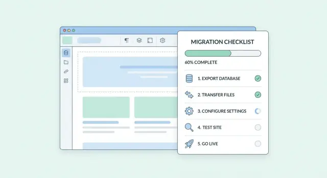
Add verification, troubleshooting, and rollback pages
Go live when ready
Deploy and host your guide companion app so teams can use it during real cutovers.
A migration guide isn’t finished when the steps are done. Readers need confidence that the change worked, a clear path when it didn’t, and a safe exit when it must be undone. Treat these as first-class pages, not footnotes.
Verification pages (prove it worked)
Create a dedicated “Verify your migration” page for each major milestone. Write verification as concrete checks with clear outcomes:
- What to check: specific settings, data counts, permissions, integrations, or key user journeys.
- Where to check it: exact screen names, report names, or URLs inside the product.
- Pass/fail criteria: “Pass if X equals Y” or “Fail if errors appear in Z.”
Keep checks quick, ordered, and written so a non-expert can follow them. If a check can take time (syncing, indexing), state the expected wait and what “normal” looks like.
A troubleshooting hub (symptoms → causes → fixes)
Add a central troubleshooting page organized by symptoms people actually report (for example: “Users can’t log in,” “Data is missing,” “Import stuck at 0%”). For each symptom, provide:
- Likely causes (ranked from most common to least)
- Fix steps that are safe to try without risking data
- What to collect if the fix doesn’t work (screenshots, timestamps, account IDs, logs)
Rollback guidance (when safe)
If rollback is possible, document it explicitly: what can be reversed, what cannot, and the deadline (for example, before data is overwritten). Include warnings for irreversible actions and a “stop and contact support” note where appropriate.
Escalation paths (when to contact support)
Add a “Get help” section with clear triggers (business impact, security concerns, repeated failures) and a checklist of information to include so support can act fast.
Optimize for SEO and findability
A migration guide only helps if people can find it quickly—via search, your site navigation, and even “search within the guide.” Optimize for the exact questions users ask while they’re under time pressure.
Map content to real search intent
Start by listing the phrases your audience actually types when they’re stuck. For migration guides, search intent is often action-based and urgent:
- “migrate from X to Y”
- “import data”
- “move users”
Turn each intent into a dedicated page (or clearly labeled section) rather than burying it in a long article. If you support multiple source systems, consider separate “From X” entry pages that funnel into the same core steps.
Use step-matching headings people can scan
Write descriptive H2/H3 headings that match the steps users need to complete. Good headings work as both an outline and a set of “mini search results” on the page.
For example, prefer “Step 3: Export users from X” over “Exporting.” Include the product names and objects (“users,” “projects,” “billing data”) in headings where it’s natural.
Add FAQ blocks that are schema-ready
Where users routinely hesitate (limits, downtime, data loss, permissions), add short Q&A blocks written in a consistent format. Keep answers direct, and ensure each question can stand alone.
This structure makes it easy to later add FAQ schema without rewriting content.
Prevent broken paths with redirects and naming discipline
Migration docs change often. Plan redirects for renamed pages to avoid broken links, especially for:
- renamed step pages
- moved troubleshooting articles
- consolidated checklists
Use stable, human-readable URLs (avoid version numbers in the path when possible), and keep page titles aligned with those URLs so users recognize they’re in the right place.
Add analytics and feedback loops
A migration guide isn’t “done” at launch. The fastest way to improve it is to watch what real users do and ask them what didn’t work. Analytics tells you where people struggle; feedback tells you why.
What to track (and why)
Focus on a small set of events that map to user progress:
- Page views and unique visits: spot the most-used steps and the pages nobody finds.
- Step completion clicks (for example, “Mark step as done”): measure drop-off and identify the steps that cause stalls.
- On-page search terms: learn what users expect to find and what your navigation isn’t surfacing.
- Outbound link clicks (to tools, downloads, or support): see where the guide depends on external resources and where users go for help.
If you can, segment by audience type (admin vs. end user), migration path, and device. Keep the setup privacy-conscious: avoid collecting sensitive input values and prefer aggregated reporting.
Add lightweight feedback on every step
Place a simple widget at the bottom of each step:
- “Was this step helpful?” (Yes/No)
- An optional open text field (“What was missing or unclear?”)
Route responses to a shared inbox or dashboard, and tag them by page so writers can act quickly.
Turn signals into a steady improvement cadence
Set a recurring review (weekly at first, then monthly):
- Check top exit pages and low completion steps.
- Review search queries and add missing pages or clearer headings.
- Update wording, prerequisites, and screenshots where confusion repeats.
- Publish a short change note so stakeholders know the guide is improving.
This loop keeps the guide aligned with how migrations actually happen, not how you imagined they would.
QA, accessibility, and launch checklist
Get rewarded for sharing
Share what you built with Koder.ai and earn credits for helpful content or referrals.
A migration guide is only as trustworthy as its accuracy under real conditions. Before launch, treat the website like a product release: test the steps end-to-end, verify the content matches the current UI, and confirm the site is usable for everyone.
Test the guide like a customer
Follow the full migration on a fresh account or a sandbox environment, exactly as written. Don’t rely on “it should work.” Capture where you hesitated, where expectations didn’t match reality, and where steps depended on hidden defaults (permissions, plan level, pre-existing data).
As you test, verify that copy-paste commands, file names, and example values are consistent across every page. A single mismatch can break a customer’s progress.
Content QA: keep the details aligned
Check for broken links, outdated screenshots, and UI label mismatches (button names, menu paths, dialog text). If your product UI changes frequently, prefer annotated screenshots only when they clarify a complex screen; otherwise use text instructions that survive minor UI shifts.
Also confirm terminology: if you use “workspace” in one page and “project” in another, readers will assume they’re different.
Accessibility basics to validate
Review headings for a clear structure (one main page title, then logical subheadings). Check color contrast, ensure images have meaningful alt text, and confirm the guide works with keyboard navigation (tab order, visible focus states, no keyboard traps). Forms and expandable sections should be reachable and understandable without a mouse.
Launch checklist
Before publishing, validate metadata (page titles and descriptions), redirects for any moved pages, and that search indexing is allowed where appropriate. Test internal navigation paths and key site destinations referenced in the guide (for example, /pricing or /contact) to ensure they land on the intended pages.
Finally, do a last “cold read” for clarity: can someone unfamiliar with your product complete the migration without asking for help?
Maintain and evolve the migration guide website
A migration guide is only useful if it stays aligned with the real product and the real process. Treat the website as a living asset, not a one-time launch.
Assign clear ownership
Set explicit ownership for updates whenever the product UI, naming, permissions, or migration steps change. Choose a primary owner (often product documentation or enablement) and a backup owner for coverage.
Define what triggers an update, for example: a UI release, a new supported source system, a changed prerequisite, or a newly discovered failure mode. If ownership is unclear, the guide will drift and users will lose trust.
Keep a visible changelog (and version history)
Maintain a changelog page that highlights what changed and when—especially changes that affect outcomes (new prerequisites, renamed screens, updated commands, or revised “do not do this” warnings).
If your product or migration path has meaningful versions, archive older guide versions so customers on older releases can still succeed. Mark old versions clearly and note end-of-support dates to avoid confusion.
Make it easy to request new scenarios
Create a simple request process for new migration scenarios: a short form or ticket template that asks for source/target, constraints, sample data size, and desired cutover approach. Route requests to an intake owner and review them on a predictable cadence.
Schedule periodic reviews
Plan regular reviews (monthly or quarterly) to confirm accuracy. Use a checklist: prerequisites still valid, screenshots current, steps match the product, troubleshooting reflects recent incidents, and success criteria are measurable.
Small, frequent updates keep the guide credible—and keep support teams from reinventing the same answers.
FAQ
What should I clarify before I start building a migration guide website?
Start by defining a single primary audience (admins, developers, or end users) and what “done” means.
Then choose the migration modes you must support (self-serve, assisted, phased) and write measurable success criteria (completion rate, fewer tickets, time to migrate).
How do I design the guide for admins, developers, and end users without overwhelming everyone?
Pick one primary audience for the main step-by-step flow, then support other readers with:
- Separate tracks (e.g., “Admin track”)
- Callouts like “For developers”
- Prerequisite/reference pages linked from steps
This keeps the happy path readable without losing depth.
What’s the best way to collect and organize migration requirements?
Maintain one “single source of truth” for:
- The ordered happy-path steps
- Prerequisites and required inputs (exports, credentials)
- Supported versions/environments
- Ownership (who approves changes)
A shared doc, project board, or the draft site itself can work—what matters is one authoritative list.
How can I uncover the most common migration failures to document?
Interview support, onboarding, solutions engineering, and customer success.
For each real failure, capture:
- Symptom
- Likely cause
- How to confirm
- Safest fix
Use ticket themes to prioritize what needs clearer prerequisites, warnings, or troubleshooting entries.
What information architecture works best for a step-by-step migration guide?
Use a hybrid structure:
- A linear Start → Finish path for people following steps in order
- Reference pages for concepts, edge cases, and common issues
Pair this with task-based top navigation like Overview, Prepare, Migrate, Verify, Troubleshoot, FAQ.
What should a “Start here” page include for a migration guide?
Include a dedicated Start here page that sets expectations:
- Time estimate (best case vs typical)
- Roles and responsibilities
- Prerequisites (permissions, backups, supported versions)
This reduces drop-offs by making hidden requirements visible before Step 1.
What platform capabilities matter most for publishing migration documentation?
Confirm the platform supports the essentials:
- Strong search for step and error terms
- Versioning (or a practical alternative)
- Redirects for renamed/moved pages
- Analytics to identify drop-off and confusion
- Access control if you have partner/internal content
Choose the tool that makes frequent updates routine, not painful.
What should a reusable migration step page template look like?
Use a predictable step template with one “unit of work” per page:
- Goal
- Time estimate
- Prerequisites
- Numbered steps with exact UI labels
- Expected result
- Rollback guidance
Add consistent callouts (Important/Tip/Warning/Error) and a small “Last updated” changelog on each page.
How do I make navigation and progress tracking clear during long migrations?
Make it hard to get lost:
- Step numbering that matches titles and URLs
- “Step X of Y” progress indicator
- Sidebar step list showing the whole sequence
- Next/Previous buttons on every step
Also make pausing easy by showing what’s completed and where to resume.
How do I build verification, troubleshooting, and rollback content that users trust?
Create first-class pages for:
- Verification (concrete pass/fail checks and where to run them)
- Troubleshooting organized by symptoms → causes → safe fixes
- Rollback (what’s reversible, what isn’t, and deadlines)
- Escalation (when to contact support and what info to include)
These pages turn “completed steps” into “successful outcomes.”